Houzz Tour: Water and Openness Inspire a San Francisco Remodel
Past and the present exist side by side in this San Francisco home. The house was built in a Craftsman-influenced style during the dawn of the 20th century. A lot can happen in 100 years, and this house saw its share of changes — including the obscuring and removal of original details and the installation of a new kitchen whose style owed more to French country houses than the Arts and Crafts movement.
Architect Stephen Sutro was asked to preserve and replicate original details in the house to unify the rooms. He was also charged with enlarging and redesigning the kitchen, adding spaces for family gathering and creating a master bedroom suite. Playing off the family’s love of the ocean, interior designer Lauren Nelson used the colors and forms of water to make a casual interiors that incorporated a collection of art and midcentury modern furniture.
Photography by Aaron Leitz
Houzz at a Glance
Who lives here: A family of 5
Location: San Francisco
Size: 5 bedrooms, 3½ bathrooms
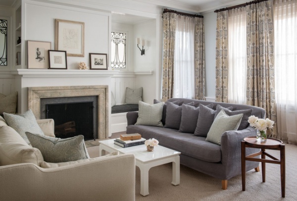
Before the remodel two bookshelves hid the original leaded glass windows and bench seats in the living room. “The bookshelves had been added at some point. On one side, when you removed a nail and fiddled with it a bit, the shelf swung out on hinges to reveal the window and a bench seat,” says Sutro. “It was a surprising discovery.”
The architect redesigned the fireplace, adding bookshelves on the sides of the chimney and restoring the built-in seating and long-hidden windows.
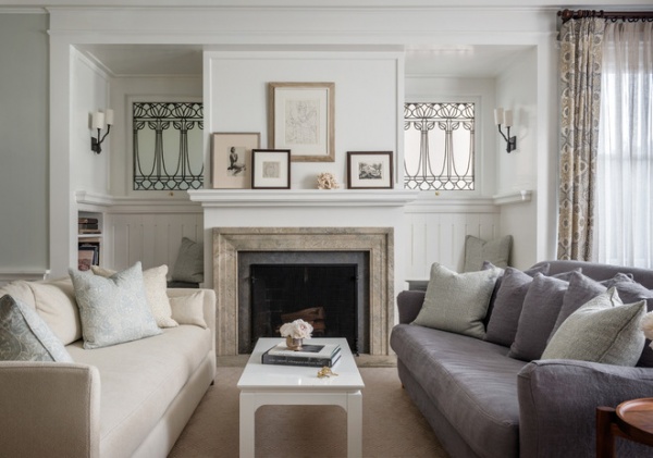
The original home was constructed with molding in the public spaces and no ornamentation in private rooms —a customary practice at that time. Over the years and through remodels large and small, trim had been added and deleted, resulting in an eclectic array. “We edited the molding in some rooms and added matching molding in others,” says Sutro. “We created a consistency throughout the house.”
Technically, this is the formal living room, although Nelson notes, “It is the least formal living room you can imagine.” Two sofas flank the fireplace, but they are anything but a matching set. Both are covered with linen treated to resist stains, but one has a blue-gray fabric and the other has off-white. Occasional tables and floor lamps are mostly absent to allow children to run easily around the furniture. “What you can’t see in this photo is the toy box tucked behind the sofa,” says Nelson. “This is a room that’s meant to be inviting to everyone in the family.”
The symmetrical lines of the architecture are challenged and enlivened by asymmetrical moves — such as the diverse grouping of framed art the interior designer installed over the fireplace.
Sofas: Cisco Brothers; curtain fabric: Galbraith & Paul; coffee table: Harlow, Bungalow Five
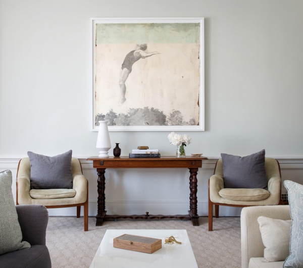
The unexpected continues on the wall across from the fireplace, where art by Jane Hambleton hangs over an antique console (a family heirloom) and two midcentury modern chairs. Look twice at the art, and you’ll see that the perspective of the back dive is slightly off, with the athlete leaping up into a water-filled sky. To Nelson, it’s these elements that are the spice of design. “Mixing modern pieces with more traditional architecture and antiques gives the home a bohemian feeling that’s inviting and not fussy,” she says. “The dichotomy makes it interesting.”
Art: Jane Hambleton, Seager Gray Gallery
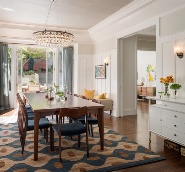
Before the remodel the dining room was cloaked in dark paneling and cut off from the kitchen, accessed by a single door. “We removed the fireplace to make easy and direct access to the kitchen, although we installed pocket doors so they can close it off if they like,” says Sutro. “It was the right move for this family, who wanted to use the dining room often.” After much discussion the decision was made to paint the woodwork white. “For the owners, it felt fresher and it made the dark room lighter,” says Sutro. “And by painting it white, you can see the detail of the molding much better.”
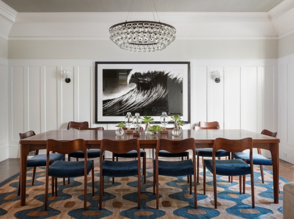
The family owned this black and white artwork depicting a giant wave, and that inspired Nelson to fill the room with watery lines. The grasscloth-covered ceiling has the nearly smooth surface you would see on a still lake, while the backs of the vintage chairs and the rug pattern are like rippling water.
Arctic Pear Chandelier: Ochre; Bubble Square Elbow Sconces: Siemon & Salazar; table: custom
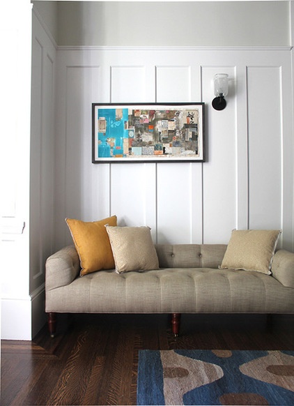
The intent of opening up the dining room is that it would be used for more than formal meals — such as a place for doing homework or working on a laptop. Nelson installed a tufted bench on one side of the room as a place for relaxing before or after dinner. “It’s meant to take the formality out of the dining room by creating a cozy nook,” she says.
Field Bench: John Derian
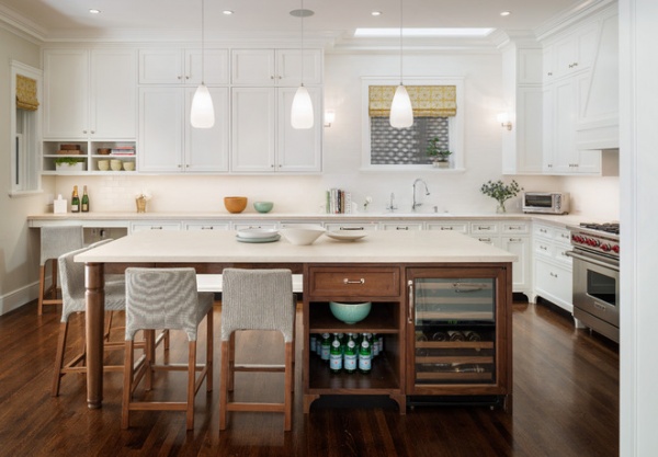
The architect describes the kitchen before the remodel as Normandy inspired; it had terra-cotta tiles and heavy wood beams. The room was narrow, so the architect widened it by 3 feet. He fitted the window over the kitchen sink with obscured glass for privacy, and installed a skylight to let more light in.
The island and cabinetry are detailed to relate to the period in which the house was built — including the long island legs, which were inspired by an Arts and Crafts–era newel post. The finish on the island was chosen to match the color of some of the owners’ Danish modern furniture. “Keeping the island in a wood finish makes it more casual and furniture-like,” says Sutro.
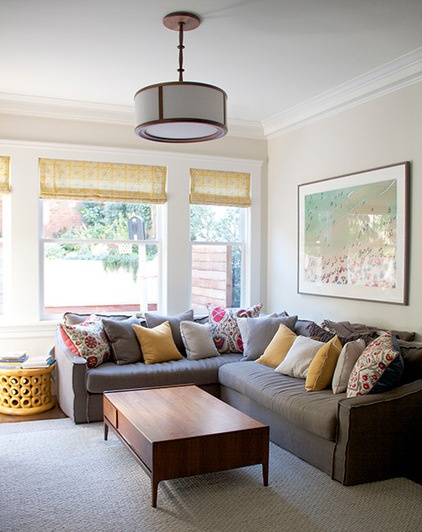
A 175-square-foot addition houses a family room just off the kitchen. “There was no real place for them to gather,” says Sutro. “Now they hang out as a family in this room and the kitchen.”
Nelson adds that the entire clan can share the sectional sofa at the same time. “We chose extra-deep, down-wrapped cushions so it feels like a comfortable, cozy nest,” she says.
Sofa: Verellen; pillows: Tony Kitz; photograph on wall: Gray Malin
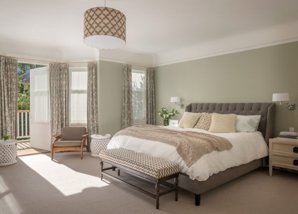
The master bedroom has the soothing gray-green tones of water.
Bed: Cisco Brothers; curtain fabric: Galbraith & Paul
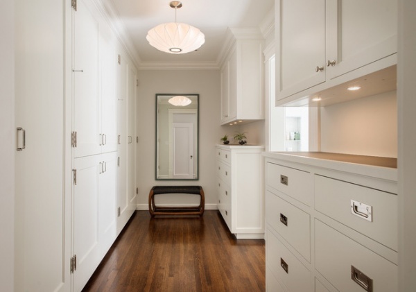
A new closet off the master bedroom serves as a dressing area and a passage to the master bath. “I feel that hardware can make or break cabinetry,” says Nelson. “Here it is the jewelry of the space.”
A countertop gives the occupants a convenient surface to place accessories on while getting dressed. Sutro, mindful of the way dresser tops can scratch and chip, suggested these surfaces be covered in leather.
Hardware: White Chapel
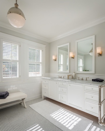
Before the remodel there was a single bathroom on the second floor. Sutro designed a small addition (it sits over the dining room) to make way for a master bathroom. Cabinet detailing and traditional hex tile give the new room a Craftsman flavor.
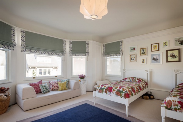
This room, done for a pair of children who love animals, features whimsical illustrations of beasts dressed in human finery and sofa pillows patterned with avian and canine silhouettes.
Twin beds: Land of Nod; artwork: Berkley Illustration
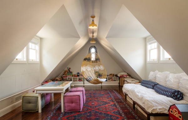
Before the remodel a third-story attic was a utilitarian storage space. With the addition of large dormer windows on either side of the room, there’s now enough headroom for it to be a play area. “After we carefully thought through the storage bins and the addition of the platform bed, I thought the room needed a hanging element,” says Nelson of the now-beloved hanging chair.
Moves like this make a modern family at home in a classical dwelling. “We worked hard to keep the spirit of the original house,” says Nelson. “Now it’s a clean-lined, bright home that respects the past.”
Hanging chair: Melati, Anthropologie


