8 Statement Walls to Make You Swoon
http://decor-ideas.org 05/30/2014 22:06 Decor Ideas
When I dress I like to wear comfortable, basic pieces kicked up by a chunky necklace, a bright skirt or sky-high heels. I tend to approach my home decor the same way, dressing spaces in neutrals livened up by an over-the-top focal point.
And yet there’s a whole lot of white in our house — from the kitchen backsplash to literally every single wall. I think that’s why I’m finding myself increasingly drawn to statement walls as I seek to add a splash of style to my decor. Here are eight favorites and why they work.
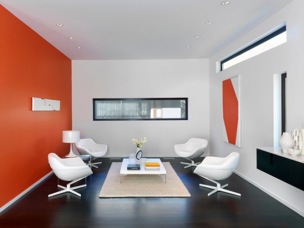
Perhaps the easiest way to create a statement wall is to paint one wall in a cheerful hue. The artwork mirrors the walls here, tying the room together.
Why it works: Not only is the room completely neutral without this splash of color, but it also doesn’t get a lot of light. Because the wall opposite one of the windows is painted a bright hue, light is reflected throughout the room, making it appear larger.
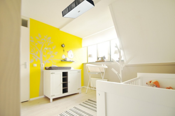
It’s also a great idea for a baby’s room. Here a removable wall decal (similar to this one) breaks up the yellow to soften the impact.
Why it works: Sunny yellow adds playfulness and light to any baby’s room, regardless of gender.
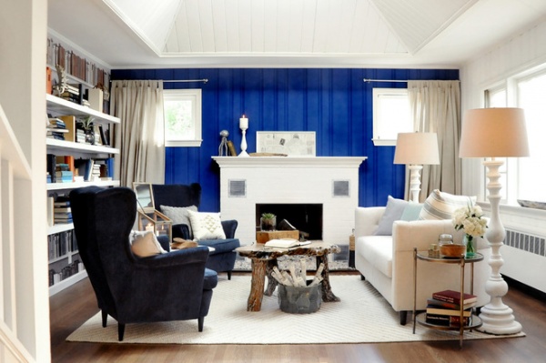
Fireplace walls are just begging to make a statement. Don’t shy away from painting existing wood paneling a bright color — there’s no rule that says it needs to be neutral.
Why it works: The bright blue echoes the more subdued navy of the armchairs, waking things up while tying them together.
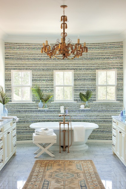
If the idea of a bright wall makes you nervous, consider using texture or pattern — or both — to make one wall stand out. This understated mosaic was created using glass tile from Artistic Tile.
Why it works: Used alone, green or blue tile would’ve seemed too jarring for this regal, spa-like space. But the striped mosaic effectively looks neutral while still adding color.
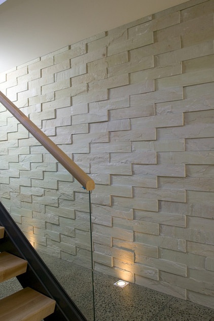
This textural geometric relief was created using Island Stone sandstone. It proves that even the most color-phobic among us can express ourselves boldly.
Why it works: On a wall this big, color could have seemed overwhelming and could have detracted from the minimalist architecture. The textural, tonal stone adds interest without speaking too loudly.
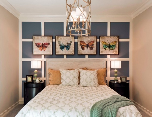
The wall behind your bed also creates an excellent opportunity to express yourself. While this accent wall has molding in a grid pattern to offset the artwork, all that’s needed to create a similar effect is a can of paint and painter’s tape — or a very steady hand.
Why it works: Stephanie Henley of Beasley & Henley Interior Design says she wanted to keep things symmetrical in this small guest bedroom. “The wall details add to that goal and also create interest and a focal point,” she says. “The blue paint and molding add a hint of masculinity, while the butterflies and bedding add that feminine touch. It appeals to everyone.”
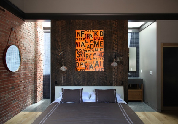
Union Studio maximized both space and impact in this small master bedroom by tucking the bathroom behind a wall of rough-sawn white oak.
Why it works: “Rather than leaving the wall plaster and paint, we used the texture and softness of the wood to play off of the dark blue Heath Ceramics tile behind and the raw brick outer walls, creating a more intimate, less austere space,” says owner Matthew Bear.
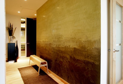
Tromp Decorative Finishes brought drama to this entryway by transforming the wall into a Rothko-inspired Venetian plaster art piece. The artisan created various shades by starting with two colors of plaster, then mixing more containers using the two original shades and applying them horizontally to create a gentle ombré effect.
Why it works: Large, unadorned walls can make entryways feel empty, but transforming a wall into a fresco adds warmth and interest.
Related Articles Recommended


