Houzz Tour: Dialing Back Awkward Additions in Denver
In the land of home remodeling, the actions taken by previous homeowners sometimes make you go, “Huh?” The 1969 Denver home of Tim and Clare Langley-Hawthorne and their 9-year-old twin boys is a fitting example. Multiple additions over previous decades had greatly increased the square footage of the home, but they had also created a layout headache.
The main culprit was a long, straight addition that supplied the home with a new master suite, kids’ bedrooms and a second full basement. Sounds enticing enough. The only problem was that the only way to access this new wing was through a front bedroom. “You had to open a door, cross through a bedroom, then open another door just to get to the other side of the house,” says Jonas DiCaprio, the architect who helped the homeowners open the house and create better flow between the addition and the main house.
After discovering the original plans to the midcentury gem, DiCaprio was able to expose original brick masonry and reestablish an open floor plan. No more headaches.
Houzz at a Glance
Location: Cherryhill neighborhood of Denver
Who lives here: Tim and Clare Langley-Hawthorne (he works for Western Union; she’s a fiction writer) and their 9-year-old twin boys, Sam and Jasper
Size: 4,202 square feet (390 square meters); 5 bedrooms, 3 bathrooms
“After” photography by David Lauer
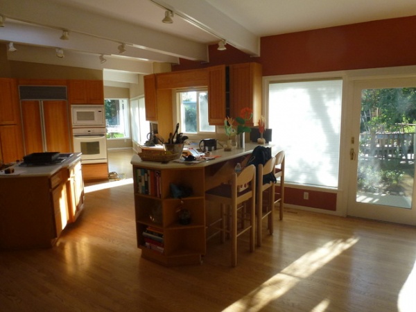
Before the remodel, an enclosed kitchen, awkward half walls and strange angles divided the house. The couple saw DiCaprio’s Houzz profile, viewed his other projects and contacted him. “They had just purchased the home and were trying to assess the complexities of the strange layout with multiple additions, an outdated kitchen and other really choppy things going on,” DiCaprio says.
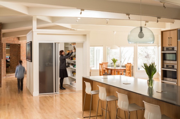
AFTER: DiCaprio opened the space to combine the living, dining and kitchen areas. He had to keep the central structural post, so he built a standing pantry (in which Clare stands in this photo) that loosely separates the spaces and creates a backdrop for the entryway and a spot for artwork.
The floors had been a patchwork of red oak, carpet and laminate. DiCaprio pulled everything out and brought the red oak throughout the main level.
Wall paint: Moderne, Benjamin Moore
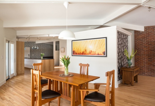
“I tried to take it back by working off the original plans they had,” DiCaprio says. “We uncovered the brick and reestablished the original layout for the kitchen and dining area, and tried to dial the rest back to the original.”
The large photograph hanging on the pantry wall was done by a family friend in Australia, where the Langley-Hawthornes are from. DiCaprio made sure that the dimensions of the pantry walls would accommodate large pieces of artwork. He then created a recess for a wallpapered niche on the living room side.
The homeowners brought the dining table and chairs with them from Australia, where the pieces were made. Many of the other furnishings in the home are heirloom pieces from Clare’s parents.
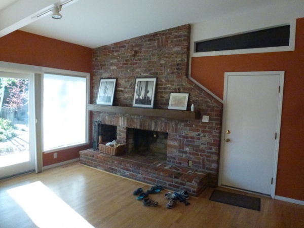
A fireplace in the kitchen was a neat element, but it was in bad shape and unusable. Meanwhile, multiple doors took up wall space and created redundant exits that led to the same spot on the outdoor patio.
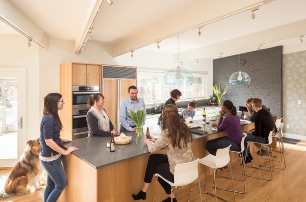
AFTER: This photo shows the project completion party, at which the Langley-Hawthornes mingled with DiCaprio’s team. You can see how functional the extra-large island is. To keep the countertop uncluttered, DiCaprio added outlets for all the appliances in the pantry.
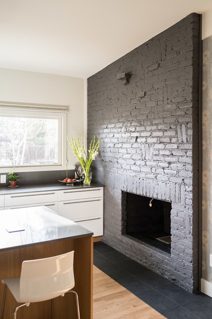
DiCaprio had the fireplace repainted, the flue rebuilt and the 1980s tile removed. He then put in a slate hearth. It’s now a fully functioning wood-burning fireplace right in the kitchen.
He also removed the set of doors by the fireplace to expand the kitchen, and put in a larger three-slider window that connects to the outside pool area and forms an eat-at bar. To bring light in, he eliminated all the upper cabinets and focused on maximizing lower storage.
The units are a combination of Ikea high-gloss white cabinets with custom handles and two rift white oak cabinets custom made locally by avenuetwo.
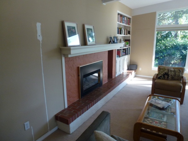
Consulting the original plans, DiCaprio found that previous owners had drywalled over a brick masonry wall in the living room.
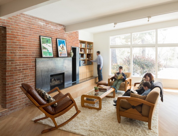
AFTER: He restored the space by uncovering the original brick, removing the fireplace trim and adding a custom steel surround with a floating steel mantel. He then removed the brick hearth and added Caesarstone with a white oak face.
Though this fireplace is gas, the wood storage box is used for the wood-burning kitchen fireplace. The built-in bookcase stores family books and games.
In this photograph you can see how the floorboards show how the home takes a 30-degree angle in an open L shape. “They line up perfectly linear in the kitchen, then as they extend you can see how the house takes a turn,” DiCaprio says.
Bookcase: avenuetwo
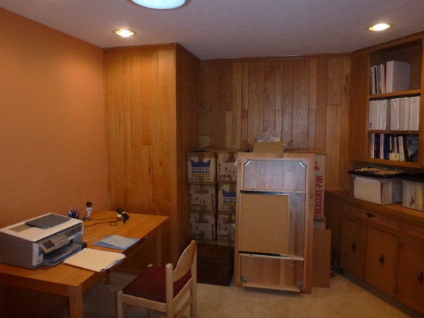
This room was originally a dark, wood-paneled internal office space the family didn’t use. There are no windows. DiCaprio opened it to the living room to bring in light, and connected it to a hallway on the opposite side, where patio doors help bring in more sunshine.
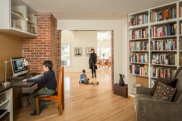
AFTER: DiCaprio ripped off the paneling to reveal the brick wall, then cut a doorway in the masonry to connect the room to the living room. This library now acts as the pathway to the bedroom addition built by previous homeowners.
DiCaprio continued the floorboard angle into the library to maintain continuous flooring without a threshold. For the bookcase he removed the backing from off-the-shelf Ikea bookcases and replaced it with rift white oak to create a custom-looking built-in unit. “It was low cost and looks great,” he says.
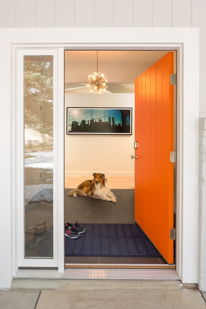
Before, a 1980s oak door with stained glass felt like it didn’t match the house. DiCaprio added a 42-inch wide door with a sidelight. The back wall of the pantry helps define the entry space, “so you didn’t feel like you were standing in the dining or living room as soon as you step inside,” DiCaprio says.
Door paint: Energetic Orange, Sherwin-Williams
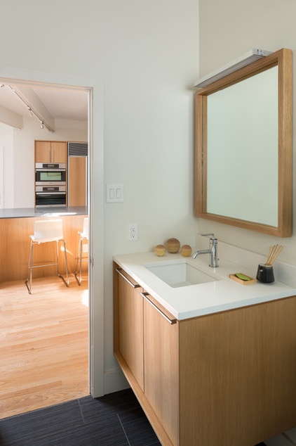
The arrangement of the powder room off the kitchen remained, but the room was updated with a new vanity and a Caeserstone countertop.
Countertop: Blizzard, Caesarstone; cabinets: custom, avenuetwo; tile: slate
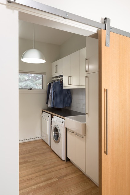
A laminated gray Formica countertop in the laundry room is a throwback to the era in which the house was built. Large-format (4- by 12-inch) white ceramic subway tiles keep the room simple.
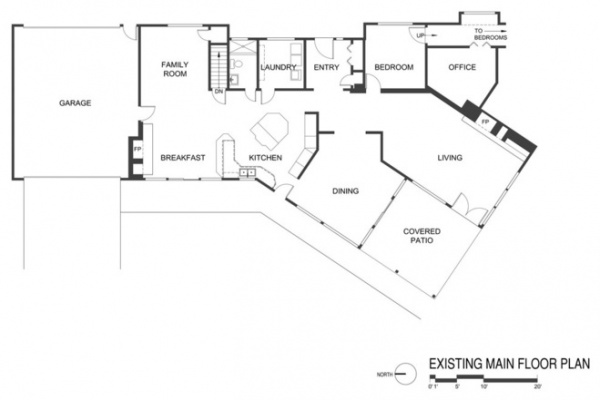
In the floor plan for the former layout, you can see how the only access to the hallway that connected to the back addition was through a bedroom off the living room. You can also see how various half walls blocked off the kitchen and dining rooms.
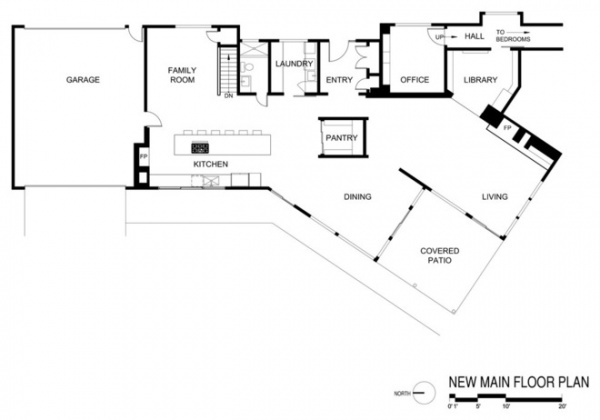
Now the kitchen is open. The bedroom became a home office, and DiCaprio punched through the previous office to create a library and a better connection to the back bedrooms.
Browse more homes by style:
Small Homes | Colorful Homes | Eclectic Homes | Modern Homes | Contemporary Homes | Midcentury Homes | Ranch Homes | Traditional Homes | Barn Homes | Townhouses | Apartments | Lofts | Vacation Homes
More: Houzz Tour: Getting to the Bottom of a Midcentury Los Angeles Home


