Architecture and the Art of the Wall
http://decor-ideas.org 05/28/2014 00:05 Decor Ideas
One of the downsides of modern architecture is that expression is often relegated to manufacturers’ products. Choices of glass, metal panel, brick, whatever the case may be, determine a modern house’s character to a large degree. Still, architects find ways to create unique expressions through how they use these very common materials. This ideabook looks at different ways of creating artistic walls through texture, greenery, color and pattern.
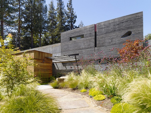
The first example is a house made from cast-in-place concrete, but Cheng Design used this material as an opportunity to explore varying textures. A couple of types — rough above smooth — can be seen at the front of the house.
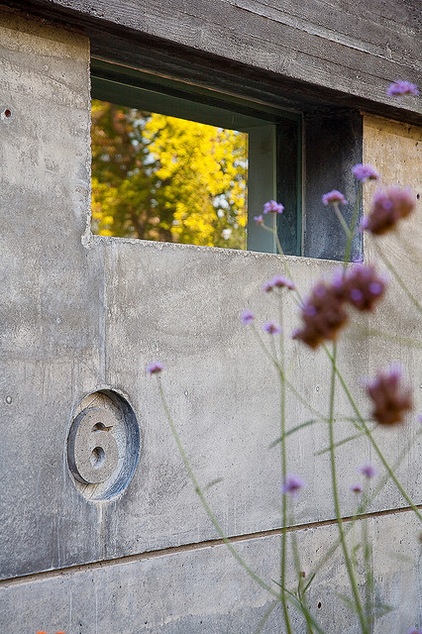
The liquid nature of concrete that is poured into forms onsite is expressed in the house number set into the front wall.
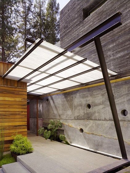
The smooth and rough walls at the front of the house are visible here, with the glass canopy marking the change between the two. The roughness of the wall above comes from the type of wood used for the formwork, which is narrower and has a more pronounced grain than the smoother wall below. The round openings are another nice touch that comes from concrete’s plasticity.
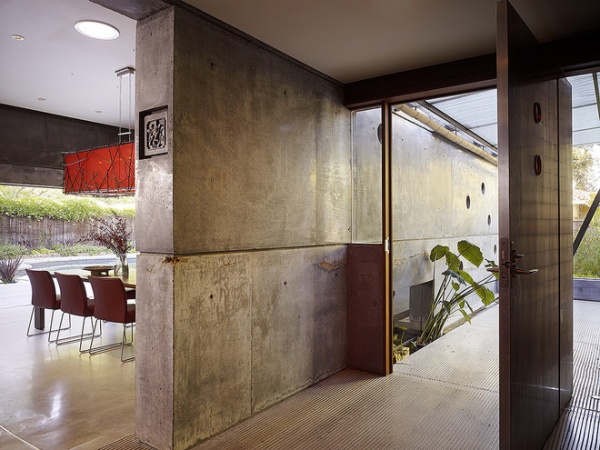
Here we can see the concrete wall extending inside, ending in an insignia imprinted into the concrete.
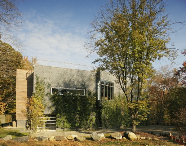
This second example is an art studio set into an environment of woods and wetlands; the exterior walls are primarily concrete block.
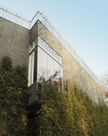
To soften its presence in the landscape, a trellis has been mounted onto the concrete block walls as an armature for climbing plants.
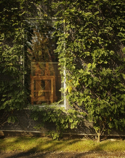
The house really blends into the woods now that the plants have had a chance to take hold.
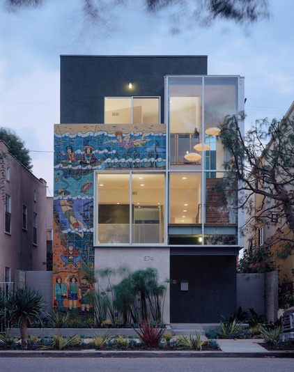
One way to overcome the limitations of modern materials is to customize some of them, using them as a canvas for art. The tiles of this facade are a building-size mural that wraps part of the large window facing the front.
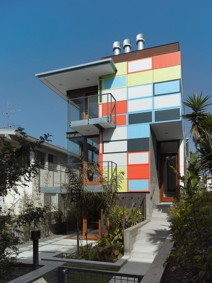
Another project by the same architects does something similar, yet it uses different colors on each panel, à la Charles and Ray Eames so many years ago.
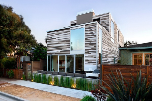
Manufacturers of metal, ceramic, fiber cement and other panels now provide many standard color options, allowing architects to design patterns across facades. This house has painted wood siding stacked randomly as its primary means of expression.
Fiber Cement Siding Takes a Front Seat
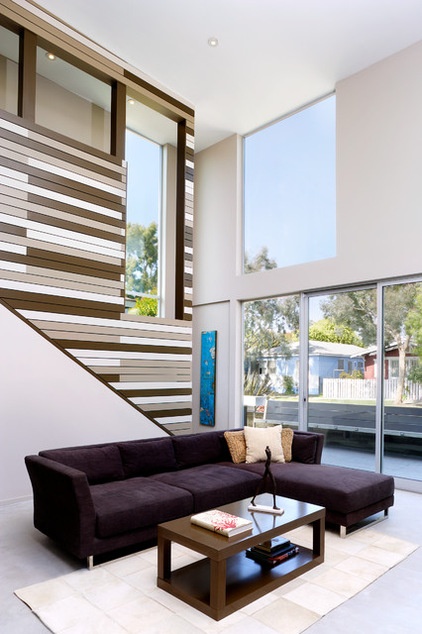
The architects continued the expression into the living spaces, uniting outside and inside.
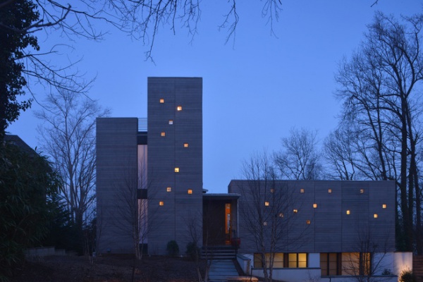
Many modern residences have large, primarily solid walls on their public sides for privacy. On this house those walls were used as an opportunity for artistic expression, particularly evident after the sun goes down, when a random smattering of dots glows from inside the house.
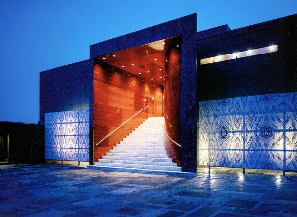
Translucent printed panels at the front of this house maintain privacy while creating a strong graphic flanking the portal-like entry.
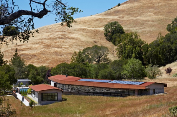
This last example illustrates how a wall can be both functional and artistic. A layered facade of horizontal pieces of wood filters the sunlight on this house’s long facade.
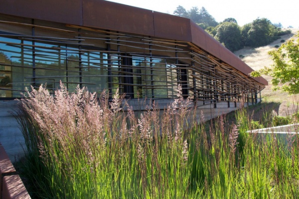
Here’s a close-up showing those pieces sitting below the overhanging roof and in front of the expansive glass walls.
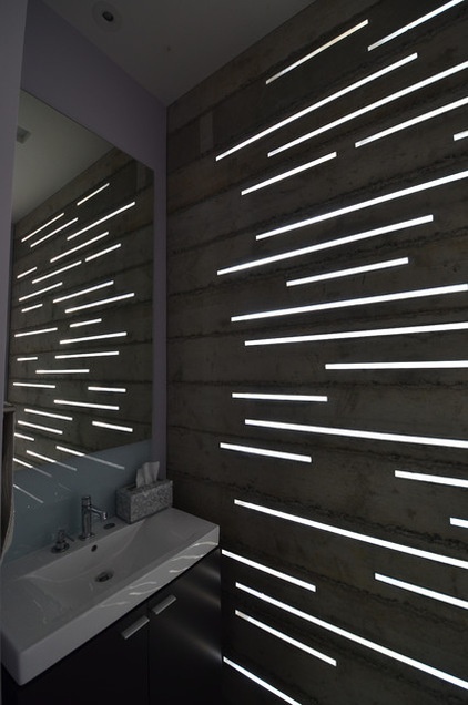
Yet what I find particularly artistic is the way the designers extended the graphic — overlapping horizontals of different lengths — into the rest of the house. These slots of light in the bathroom recall the sunshade, yet they are like an inverse of them, where solid is void and void is solid.
More: Design Workshop: The Art of Joining Materials
Related Articles Recommended


