Houzz Tour: Steering Toward Subtle Nautical in Los Angeles
http://decor-ideas.org 05/24/2014 23:04 Decor Ideas
At a design meeting, clients of architect Jeff Troyer of JWT Associates handed him a striped Paul Smith shirt and asked, “Can you make the stairs look like this?” Troyer let this request, along with one for incorporating an antique porthole window, complement an extensive remodel of a 1940s home in Los Angeles. The result is a vibrant yet relaxing home with a nautical thread — and plenty of personality.
Photography by Lee Manning Photography
Houzz at a Glance
Who lives here: A couple — she’s in the television industry; he’s an artist and a web designer
Location: Los Angeles
Size: 3,026 square feet (281 square meters); 3 bedrooms, 3 bathrooms
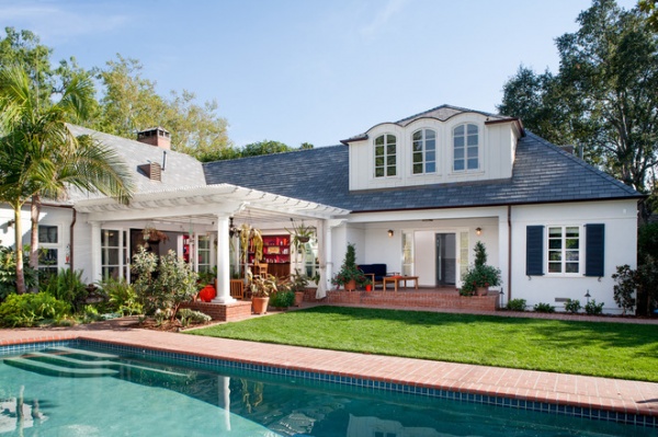
“My clients bought the home for the large, private backyard and pool, and wanted easy access to the exterior from any room,” Troyer says. The existing home had a beautiful elevation, but the interior was a series of dark, choppy spaces.
Troyer and his clients worked on this house in two phases over nearly 10 years. Phase one was completed in 2006 and focused on the living room and master bedroom. Phase two, completed last year, involved adding a second-story loft studio; putting in a new indoor pool/guest bath, guest bedroom, kitchen and dining room; and connecting the interior of the home to the exterior space. Troyer also rebuilt a rotted, vine-choked pergola in the backyard to provide shade.
The two renovations took one year each, and each time the homeowners bravely weathered the construction and lived in the house.
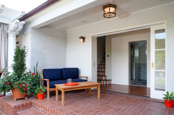
To connect the indoor spaces with the outdoors, Troyer used large doors to create openings that read more as porous facades than traditional door passageways. Here a pocket door connects a covered outdoor patio with the new indoor pool/guest bath — and offers a peek of the new loft stairway.
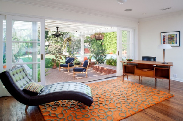
In the living room, wall-sized telescoping French doors flawlessly bridge the outdoor pergola seating area with the home’s interior.
Floors: hand-scraped hickory
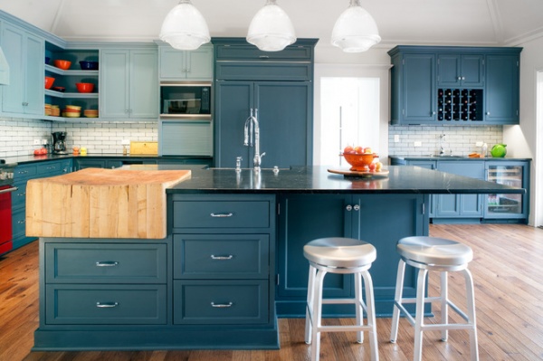
The kitchen palette is refreshingly different. Watery blues in two hues are set against pale subway tile and crisp white walls. A vivid red stove and exposed shelving showing off the client’s flame-hued earthenware add an unexpected color.
Paint: Nimbus Gray (upper cabinets); Lead Gray (lower cabinets), both by Benjamin Moore
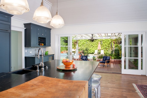
While on vacation in Michigan, the homeowners found the butcher block for the kitchen island at an antiques store. Troyer designed the island around the butcher block, its overall size dictated by the largest single piece of soapstone he could find. The well-worn wood surface contrasts nicely with the soapstone, a marriage of old with new — like the house itself.
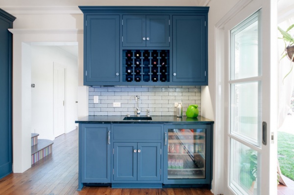
A bar, valuable in the kitchen, is also close to the outdoor seating area.
Backsplash tile: Grove Brickworks, Waterworks
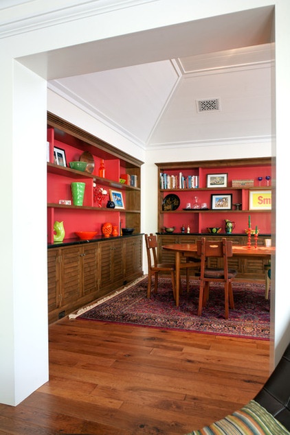
Stained louvered alder cabinets in the new dining room lend to the subtle nautical theme. Troyer painted the backs of the shelf walls a cheery red, grounding the space despite the 11-foot vaulted ceiling.
Shelf walls paint: Santa’s Suit, Benjamin Moore
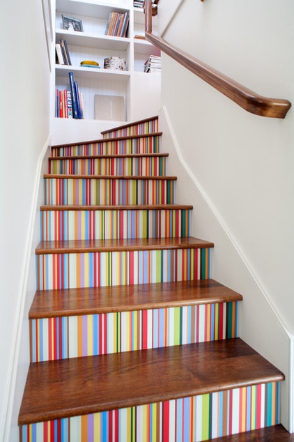
The staircase inspired by the Paul Smith shirt leads to the upper loft/studio.
Troyer says the initial estimate to paint the stair risers was really high — likely requiring a boatload of blue painter’s tape and even more patience. Then they got a bright idea: The homeowner who is a graphic designer and an artist designed a template that Troyer then made into a vinyl wall covering.
It was durable and much more economical. “I love when the final product has the personal stamp of everyone involved,” Troyer says.
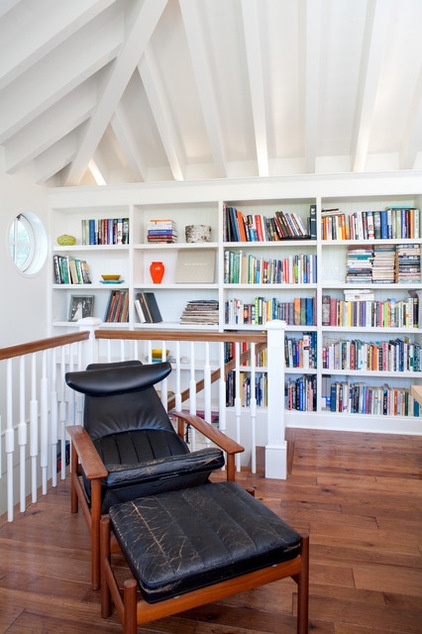
The loft is the space Troyer is most pleased with, but also the one that gave him the greatest challenge. He wanted it to look original to the house from the outside and wanted to keep the profile very low, like a dormer. However, observing structural code requirements meant keeping the structure of the ceiling exposed — which, he says, “left little room for error.”
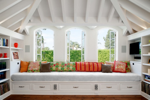
With a view of the pool from the loft, a built-in daybed is filled with an array of fun throw pillows. Troyer integrated custom bookshelves throughout the room and a wall-mounted TV at one side of the daybed, which also has deep drawers and hidden A/C ducting.
Woodwork paint: White Dove, Benjamin Moore
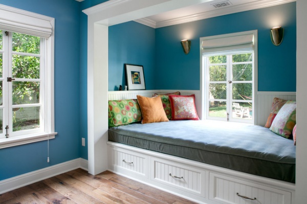
Teal walls contrasted by crisp white woodwork create a tranquil setting for guests. A second built-in bed with its beadboard-clad storage drawers and with wall sconces above nods toward maritime. The bed also has a spectacular view of the pool.
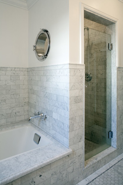
The clients owned an antique porthole window that they wanted to be included in the renovation. “It was the genesis of the nautical ideas used throughout,” Troyer says. The porthole not only adds light to the guest shower but a little fun too.
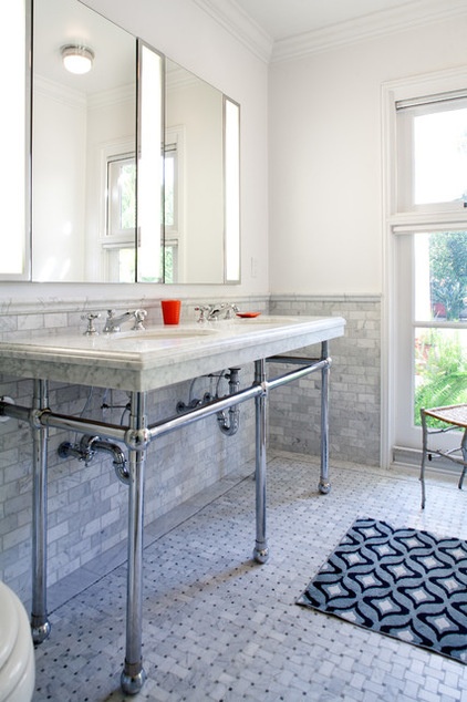
The marble open double vanity in the master bathroom is a throwback to traditional style. Custom light boxes built between sleek Robern medicine cabinets flawlessly integrate function while keeping with the clean lines of the bathroom.
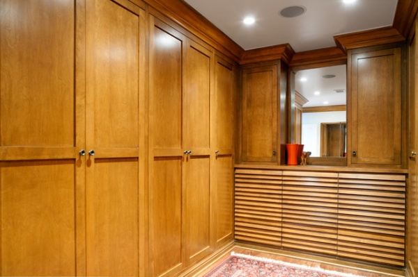
Stained louvered alder cabinets in the master bedroom walk-in-closet offer ample storage. Troyer says the original master bedroom was actually too large and had a lot of wasted space in the middle. Reconfiguring the bedroom created enough room for this closet, which is also roomy enough to practice yoga in.
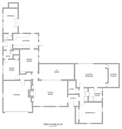
The house, the original plans for which are seen here, was renovated in the 1980s — “much of which we had to undo,” Troyer says.
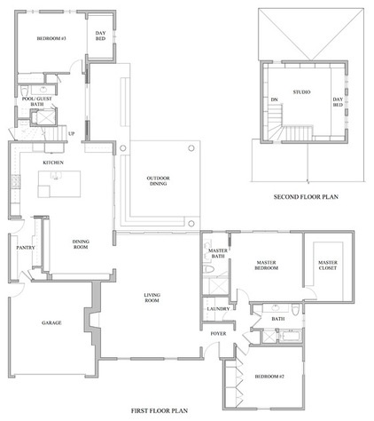
AFTER: With almost the same footprint, the house is now more open and benefits from a more logical, cleaner flow.
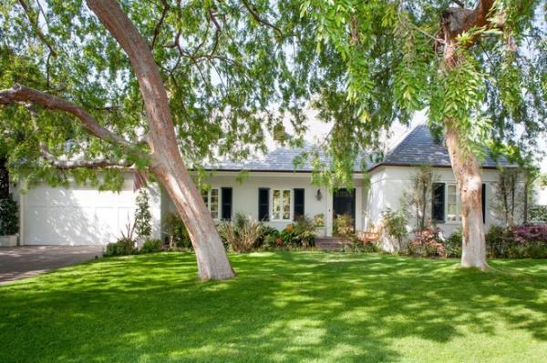
While the front elevation of the home was kept relatively intact, it got a new roof and front door as well as new windows and shutters.
Browse more homes by style:
Small Homes | Colorful Homes | Eclectic Homes | Modern Homes | Contemporary Homes | Midcentury Homes | Ranch Homes | Traditional Homes | Barn Homes | Townhouses | Apartments | Lofts | Vacation Homes
Related Articles Recommended


