My Houzz: Putting the Craft in an Ohio Craftsman
Chelsea and Kiel Mohrman had a clear idea of what they were looking for in their first home together. “We wanted an older home with a history that tells a story,” says Chelsea, a nurse who enjoys dabbling in DIY projects at home and for her blog, Farm Fresh Therapy. With an affinity for well-established pieces, the creative couple found their perfect match in a 1918 Craftsman bungalow in the laid-back neighborhood of Clintonville, Ohio.
The house already had new roofing and windows, so the couple just had to make a few cosmetic updates, like stripping the carpeting, painting the walls and refinishing the floors. Kiel works as an industrial designer and custom furniture maker, and relied on his skills to help personalize their home. Says Chelsea, “This was just up our alley.”
Houzz at Glance
Who lives here: Kiel and Chelsea Mohrman, and their cats, Peanut and Chloe
Location: Clintonville neighborhood of Columbus, Ohio
Size: 1,620 square feet (151 square meters); 4 bedrooms, 2 bathrooms
Year built: 1918
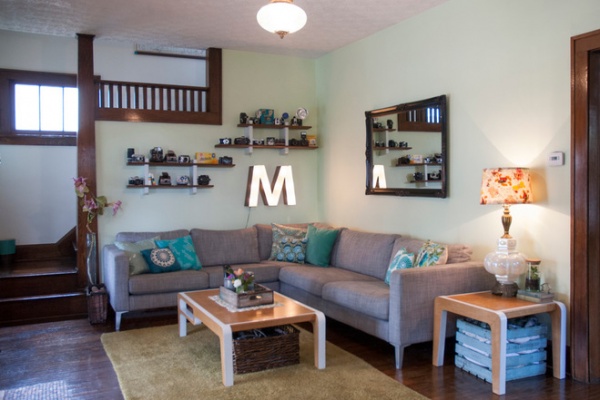
In the living room, the sectional provides a neutral gray backdrop for Chelsea’s colorful array of handmade pillows and lampshades. “We enjoy easy decorating with budget-friendly items or fun DIYs,” says Chelsea, who shares instructions for many of her crafting projects on her blog.
The couple searches antiques malls, flea markets and the Internet for a lot of their decor, oftentimes adapting their finds for a new purpose. For example, the “M” is vintage, purchased on Etsy; the couple added lighting components to create a glowing marquee effect.
Sofa: Karlstad, Ikea; tables: MidWest Woods Furniture
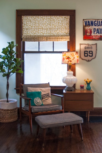
The couple’s individual styles come together in an eclectic way. “Kiel tends to gravitate toward more masculine, rustic and industrial pieces, while I like more bright, colorful and whimsical pieces,” says Chelsea.
The midcentury chair and ottoman were bought at a garage sale for $5, and Kiel’s mother reupholstered them.
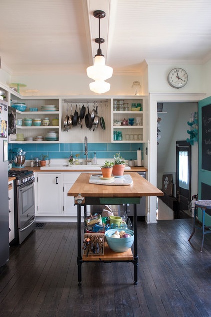
The kitchen feels light and airy, thanks to a soft color palette and open shelving. Rather than create a massive center island, Kiel built an island worktable with open shelving using a variety of inexpensive materials. With the unit open down below, the kitchen has a feeling of more space.
Wall paint: Lightest Sky, Pantone for Valspar; countertop: Ikea; pendants: The Home Depot
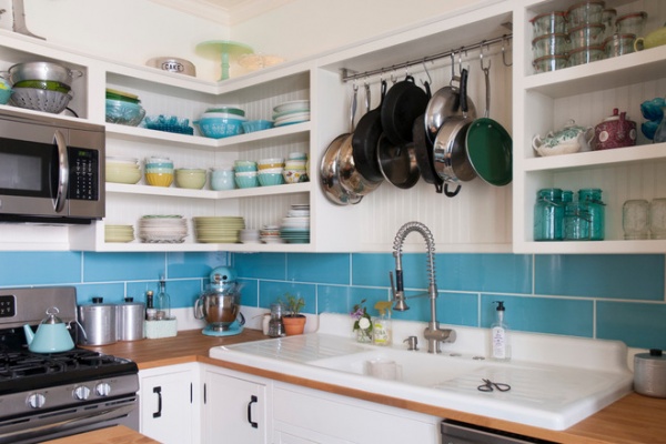
Instead of installing prefabricated cabinets in the newly rebuilt space, Kiel created custom shelves. “It didn’t make sense to put in the same fiberboard cabinetry that was there before,” he says. The cabinets were left open to show off Chelsea’s colorful plate collection. “One of the perks of being married to a woodworker,” she says, “is having an entire kitchen worth of cabinets for the cost of wood and paint!”
The antique enameled cast iron sink is outfitted with a modern spray fixture from Ikea. The sink was a $25 find. “Often we buy older pieces which have been around for 50-plus years, because we know that if they survived this long, they will likely survive another 50,” says Chelsea.
Backsplash tile: Hamilton Parker
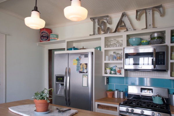
The highlight of the kitchen is an appropriately placed collection of vintage channel letters that the Morhmans found on one of their scrapyard excursions.
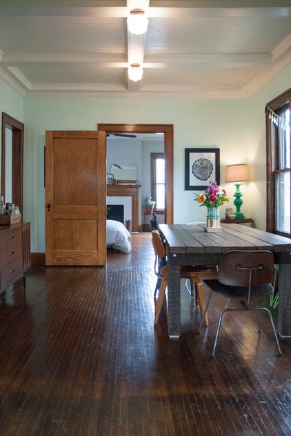
Instead of placing the table in the center of the dining room, the Mohrmans pushed it to one side. This orientation allows direct passage into the kitchen and the rooms beyond, and also makes the area feel more spacious.
The house sported textured popcorn ceilings until recently, when Kiel designed and built the coffered ceiling. “It was the best way we could think to deal with wiring issues in the ceiling,” says Chelsea. “The new wiring runs through the beams, and it all adds to the charm of the home.”
The same ceiling treatment runs throughout the other rooms downstairs, unifying the first floor.
Dining table: MidWest Woods Furniture
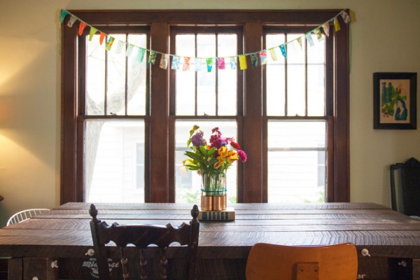
A mix of chairs lends a playful note to the dining table, which Kiel designed and built out of reclaimed barn wood. Its straightforward construction features exposed fasteners. A bench under the window provides flexible seating for guests. The simple DIY bunting adds a subtle kick of color.
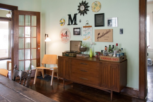
A gallery wall above the period credenza displays some of the couple’s favorite vintage finds. A wooden pant hanger holds a map in place.
Credenza: Eclectiques Antique Mall
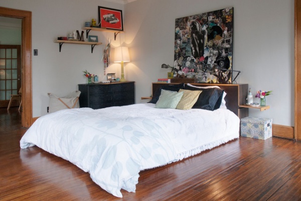
The light-filled master bedroom reflects a casual spirit, thanks to pale walls punctuated with spots of black.
Staggered open shelves and oversize original artwork (a collaboration by the couple) give the room the illusion of added height.
Wall paint: Aloof Gray, Sherwin-Williams
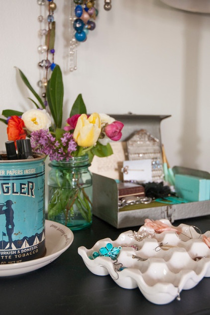
When it comes to storing bits and bobs here, the more creative, the better. A ceramic egg crate from Cost Plus World Market serves as an earring organizer.
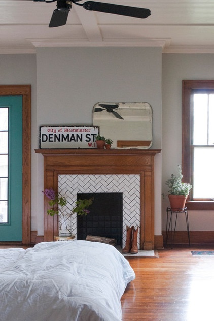
While renovating the master bedroom last year, the Mohrmans replaced the fireplace surround with white ceramic tile. Set in a herringbone pattern, the tile and dark grout work together to lend a period feel to the room.
As with many renovations, there were some surprises along the way. “From what we could tell, the mantel had never been removed,” says Chelsea. “We removed the mantel and found bits and pieces of photos, ticket stubs and coins that had fallen back there over the years. Some of the items dated back to the 1930s.”
Being the eighth owners of the home, they couldn’t tell whether there was something there from every previous owner. “We gathered it all, placed it in a tin, added our own piece and placed it back inside the mantel as a time capsule for future owners to find in decades to come,” says Chelsea.
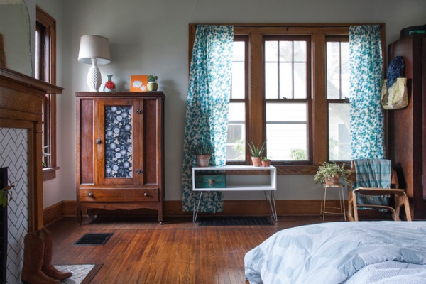
Heavy built-in storage was also removed as part of the master bedroom’s facelift. When the Mohrmans moved in, the wall surrounding the window held massive shelving that covered all but the window.
This provided Chelsea with an opportunity to get creative. She found the former pie safe at Eclectiques Antique Mall in Columbus, and revamped it by adding a floral motif to the front and painting the interior.
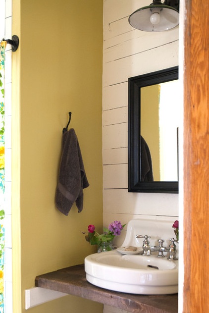
The Mohrmans gave the compact vanity in the master bathroom loads of style by combining natural materials and bold color. Kiel fashioned the countertop out of reclaimed barn wood, and the couple used repurposed tongue and groove paneling for a rustic look.
The sink was a score from Scott Antique Markets, a monthly local antiques show; the lampshade is another flea market find.
Wall paint: Light Avocado, Valspar
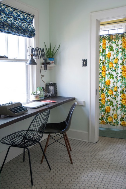
Utilizing extra space in their mudroom, the Mohrmans created a workspace for daily operations and for Kiel’s at-home furniture business, MidWest Woods Furniture. “We had had our previous office in one of the upstairs bedrooms, but realized after some time that this made the office feel somewhat unaccessible,” says Chelsea.
Kiel created a simple workspace by spanning the length of the wall with reclaimed barn wood that he received from a friend. He scooped up the black molded chair when his former school was getting rid of them. At the time there was only the seat, but the couple was able to acquire the Eames DSW base from Design Within Reach.
Wall paint: Lightest Sky, Pantone for Valspar
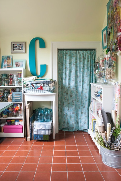
When it comes to Chelsea’s craft supplies, it can be a challenge to keep everything well organized. One thing that she can’t get enough of is wire baskets. “I just can’t seem to get rid of [them],” she says. “I have way more than I need at the moment, but I can’t bear to part with them, because they can be so handy.” In her upstairs craft room, she uses the baskets to contain fabric samples, card stock and small boxes.
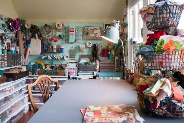
With a window view and everything at her fingertips, this is Chelsea’s favorite room in the house. “It is a place where I am inspired — free to create — and that is totally me,” she says.
Although she also considers this the “mess room,” Chelsea has employed an organizing system to make projects run smoothly. “My solution to clutter is storage, storage, storage — that’s where those baskets come in,” she says. Shelves and bins combined with pegboard and hooks mean her creativity will never be stymied by the need to search for supplies. “We also ensure that everything has a home and gets back there if it is out,” she notes.
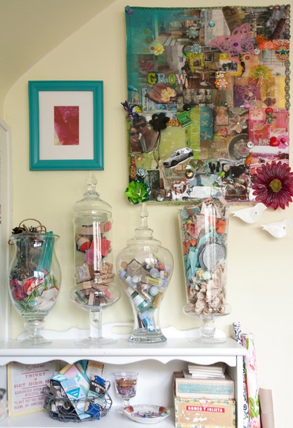
Decorative glass canisters store loose crafting items, keeping them readily accessible and visible.
Apothecary jars: HomeGoods and Marshalls
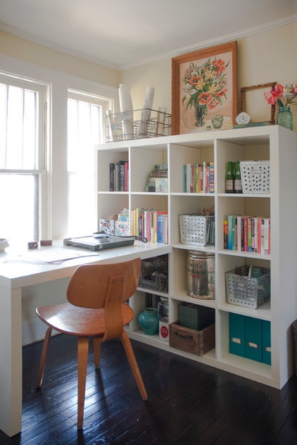
This office space is a temporary solution, as the Mohrmans are planning an addition at the back of the house. Accessed through the downstairs bedroom, the new studio will house everything needed for Chelsea’s blogging and home decor business. Until the project is finished, however, this bookcase and desk provide space for project planning and research.
Metal bins and labeled magazine files help to keep Chelsea’s work organized.
Bookcase and desk combination: Expedit, Ikea
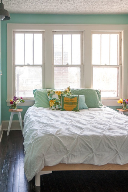
A vibrant color scheme creates a welcoming impression in the guest bedroom.
Kiel made the metal and wood bed frame and side tables. With clean lines and light-colored materials, the furniture adds to the airy quality created by the layering of textiles.
Wall paint: Robin’s Nest, Benjamin Moore for Pottery Barn
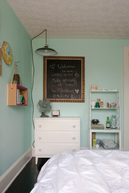
Industrial elements mix with family hand-me-downs in the guest bedroom (the dresser was passed down from Chelsea’s mother). A chalkboard bearing thoughtful messages helps make guests feel welcome. The hanging box shelf was a DIY project.
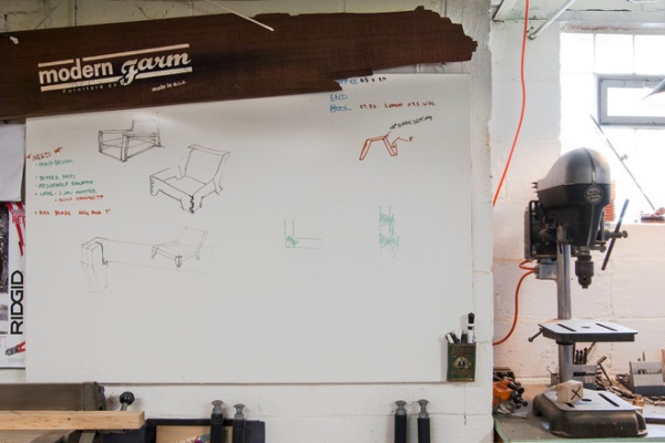
Kiel works as an industrial designer during the day, and spends his evenings and weekends designing and building pieces out of a basement workshop for his firm, MidWest Woods Furniture. The business specializes in handmade pieces constructed with reclaimed and locally sourced wood.
This giant dry-erase board helps Kiel work out design solutions throughout the building process.
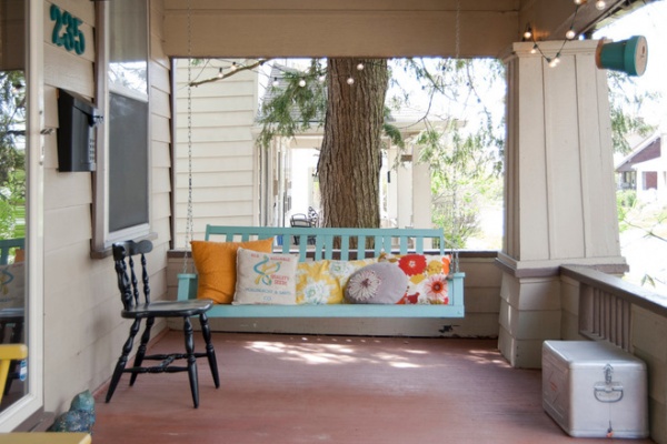
A wide front porch eases the transition from outside to inside, creating an almost room-like area. The Mohrmans repainted a former kitchen chair in a glossy black and added string lighting to create a welcome glow on Midwest evenings.
Colorful handmade pillows adorn the swing, making it a comfortable place for relaxing on balmy days. The couple gave new life to the existing swing with a refreshing lick of robin’s egg blue paint.
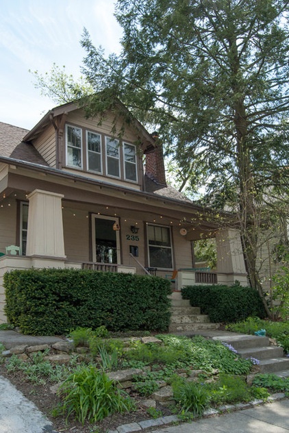
The front facade has many classic bungalow characteristics. Wide eaves and a low roofline give the illusion of a more modest structure.
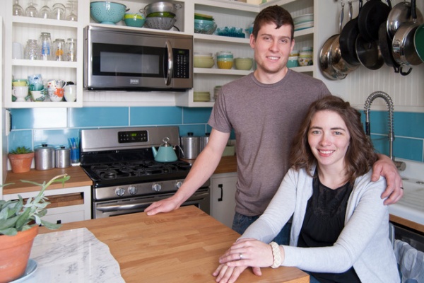
Kiel and Chelsea take a break in the kitchen.
Show us your home!
Browse more homes by style:
Small Homes | Colorful Homes | Eclectic Homes | Modern Homes | Contemporary Homes | Midcentury Homes | Ranch Homes | Traditional Homes | Barn Homes | Townhouses | Apartments | Lofts | Vacation Homes
More: My Houzz: Lighthearted Charm Boosts a 1920s Bungalow


