Houzz Tour: Getting to the Bottom of a Midcentury Los Angeles Home
http://decor-ideas.org 05/19/2014 02:24 Decor Ideas
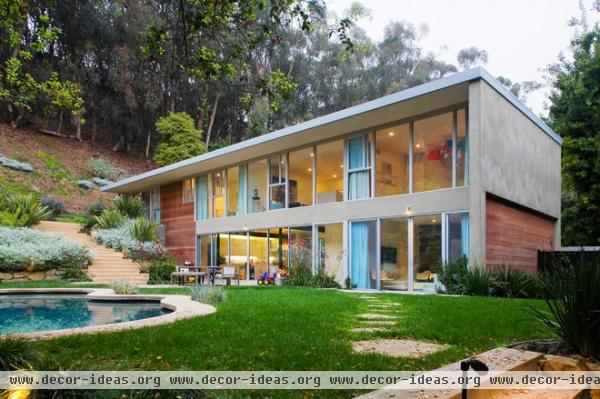
Architects do a lot of second-story additions. But architects Russell Shubin and Robin Donaldson had a head-scratcher with a home in Los Angeles that consisted of only a second story. “It was just one top floor built on a steel frame, and basically everything was open air down below, but it was dank and dark — not a great area,” says Shubin.
His clients, a couple with three young boys, thought about tearing down the 1960s structure and building new, but Shubin and Donaldson urged them to reconsider. “There was smart, easy square footage to gain here,” Shubin says. “The point was just not to screw up the look.”
Photography by Ciro Coelho
Houzz at a Glance
Who lives here: A couple — he’s in motion graphics, and she’s a former business owner — and their 3 sons
Location: Pacific Palisades area of Los Angeles
Size: 2,400 square feet; 3½ bathrooms
Cost: About $250 per square foot
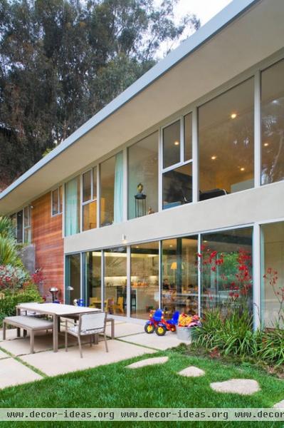
Shubin and Donaldson’s approach was to fill in the bottom floor but preserve the original sense of transparency. “It was this beautiful, sculptural piece that floated across open air,” Shubin says. “The idea was, how do you fill it in so that a family can live in this?”
All the bedrooms are on the second floor. The ground floor holds the public spaces — a combined kitchen and eating space and a living room.
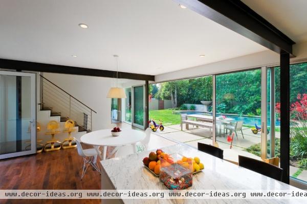
For the interiors the architects riffed on one word the clients kept repeating: pure. A simple palette of materials, minimal furnishings and abundant light help hammer this idea home. “We tried to make everything strong, pure and elemental, not fussy,” Shubin says. “There are no frills here. It wasn’t about making a bunch of moves and gyrations in the architecture itself. It’s stronger when you can distill the architecture down. That takes discipline.”
The framing seen here is all that showed on the original ground floor. Naturally, there was a big emphasis on keeping the home as open as possible to the backyard; the sliding doors get close to the open-air feeling of the original home. “In this California climate, you can have that,” Shubin says.
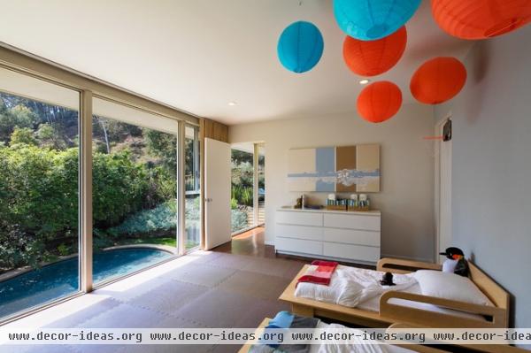
The couple’s twin boys share this room. Operable windows were placed higher up to prevent the young boys from opening them and to provide cross ventilation.
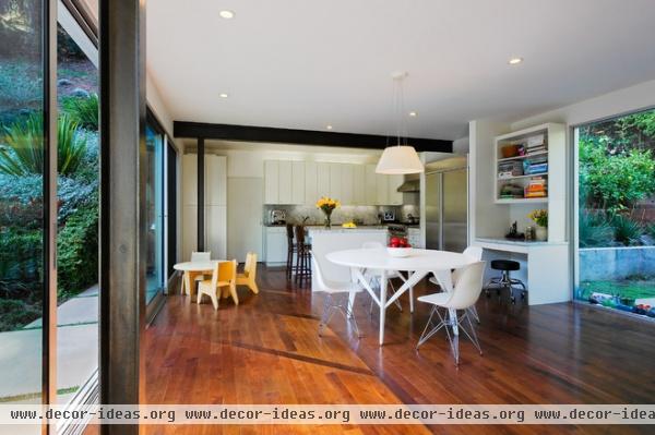
The architects extended the sliding doors outside the beams to expose the structure. A professional metal colorist restored the steel back to a gunmetal color and a patina that felt more natural. “With the natural material palette, I liked the idea of everything having authenticity,” Shubin says.
The natural stone kitchen island and natural walnut floors follow this line of thinking too.
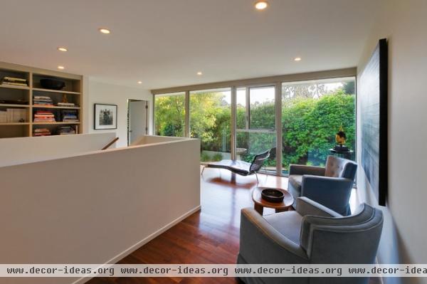
Stairs lead to a library hangout area. To the left are the kids’ rooms; to the right, the master bedroom. “We did this because the natural light gives a sense of arrival, which we liked,” Shubin says.
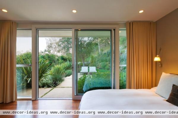
The master bedroom is on the second floor, but the architects created a landscaped hill that provides the homeowners with a private outdoor area that leads down to a pool zone.
Browse more homes by style:
Small Homes | Colorful Homes | Eclectic Homes | Modern Homes | Contemporary Homes | Midcentury Homes | Ranch Homes | Traditional Homes | Barn Homes | Townhouses | Apartments | Lofts | Vacation Homes
More: My Houzz: Quirky Charm on Aussie Farmland
Related Articles Recommended


