Inside Houzz: A Chopped-Up Bathroom Goes Streamlined and Swank
http://decor-ideas.org 05/18/2014 04:23 Decor Ideas
Robert Anderson started planning his remodel even before he closed escrow on his downtown Atlanta house last spring. He anticipated that the project would happen in stages, but the upstairs master bathroom had to go — fast. It lacked character, had generic finishes and had a claustrophobic layout.
Anderson had seen dramatic transformations on Houzz, browsing photo after photo to see how homeowners and designers had transformed difficult rooms and layouts into well-thought-out and comfortable spaces. He knew this bathroom could be saved.
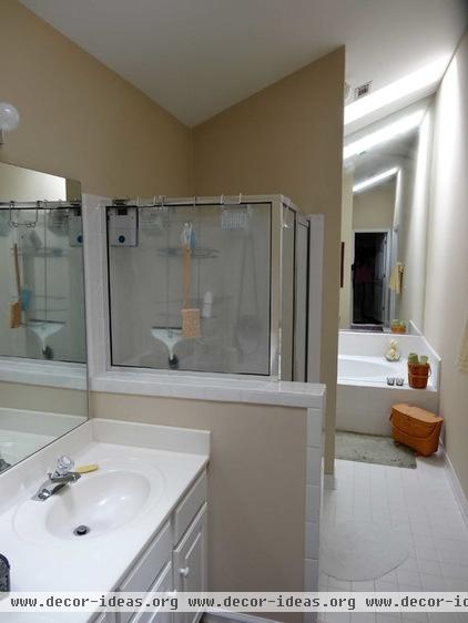
The stacked layout of the vanity, pony wall, shower stall, divider wall, toilet and soaker tub meant an unnecessarily tight and dark passage in the 7-foot-wide room.
The bathroom functioned like an assembly line, with features that moved along like car parts along a conveyor belt. Maybe the mirrored wall at the end of the room was a last-ditch effort to open up the space, but it only reinforced the bathroom’s anonymity.
Anderson envisioned a clean, open space, with modern conveniences that would simplify the bathroom and, above all, make it easy to use.
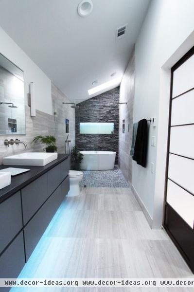
AFTER: Designer Michelle Gann and the crew at Change Your Bathroom tore the bathroom down to the studs, removing all existing partial walls, and started from scratch. After reworking some of the plumbing, Gann played with the room’s layout, placing the toilet next to the vanity and pushing the shower and bathtub to the back of the 20-foot-long space. She kept the existing skylights for natural light. A Japanese-style shoji screen Anderson had purchased adds to the bathroom’s contemporary Asian theme.
Anderson had handled smaller home improvement projects in previous homes, but felt this project’s scope called for a professional. He found Gann and Change Your Bathroom on Houzz by browsing bathroom photos in the Atlanta metro area. “[I was] guided down a good path,” he says. Instead of trying to figure things out as he went, he could say, “Here is what I want done,” and the team would work to make that happen.
Their collaboration throughout the project focused on vision and execution — Anderson would add notes about features he liked or didn’t like, and Gann would share details and refine materials.
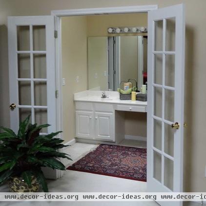
French doors connected the original master bathroom to the bedroom, revealing a view of the white vanity with knobs.
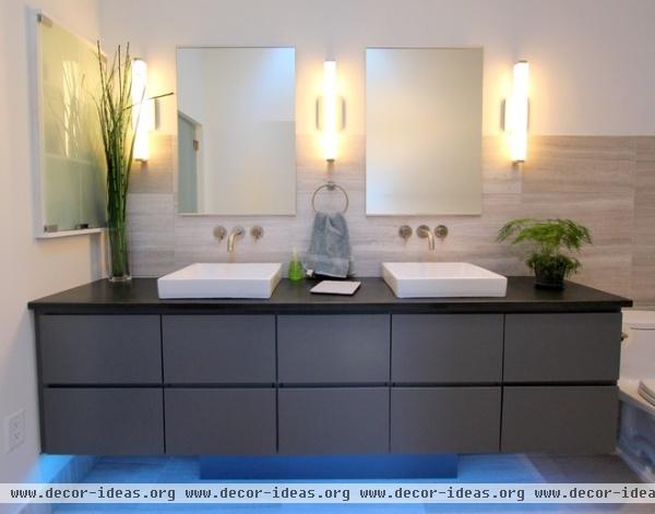
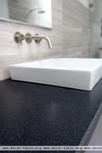
AFTER: The team custom designed and fabricated this floating vanity; it has drawers, doors and a pullout trash can while maintaining a clean front.
Though the bathroom relies on natural light as much as possible, motion-controlled undercabinet lights softly illuminate the bathroom when needed; Anderson can control the color manually. Extra-long wall sconces add more direct lighting.
Leather-finish Absolute Black granite counters top the vanity. Two semirecessed vessel sinks and the wall sconces reinforce the room’s clean lines.
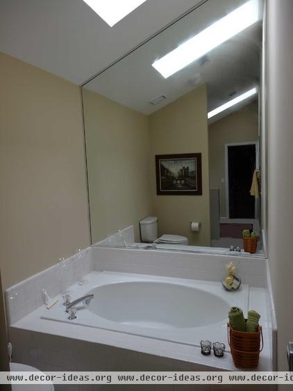
The original layout separated the shower from the tub and didn’t use the space as efficiently as possible.
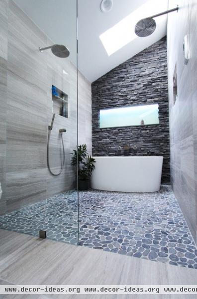
AFTER: Anderson tasked Gann with creating a mini wet room. Having lived in Japan for a while, he liked the bathtub-inside-the-shower setup he saw there.
Gann placed a Victoria + Albert freestanding tub inside the open wet room. Originally the team planned to enclose the shower area with a glass door, but they decided during construction to let the room flow uninterrupted all the way through. They replaced the mirrored rear wall with a stacked slate one. Gann added a backlit false window for more light, with the slate framing creating a convenient shelf for the tub.
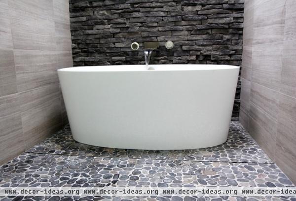
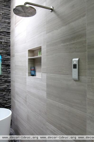
A linear floor drain hides between pebble tiles in front of the tub (previous photo). The pebbles are low and smooth, making them easier to clean and softer on the feet than some other pebble tiles. Limestone was used on the walls and floors of the rest of the bathroom. Brushed nickel fixtures keep the color scheme cool.
Other details enhance the bathroom’s usability and uncluttered appearance. Anderson can control a shower speaker in the ceiling with his iPhone. The shower is managed with one digital control, shown here. Though luxurious, these features were priorities for Anderson; he wanted a bathroom that would be as ergonomic and intuitive as possible.
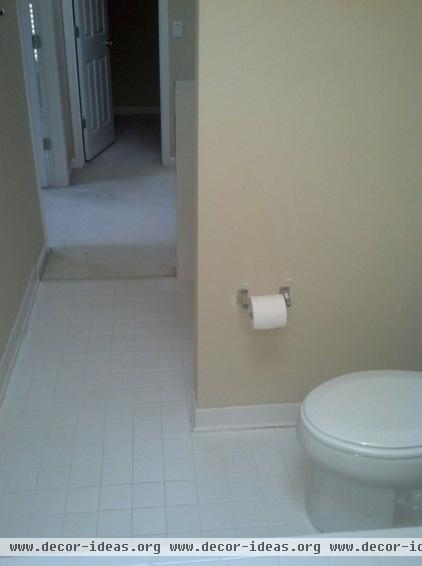
The bathroom before might as well have been a hallway with closets off the side. There was no opportunity to linger and enjoy the space.
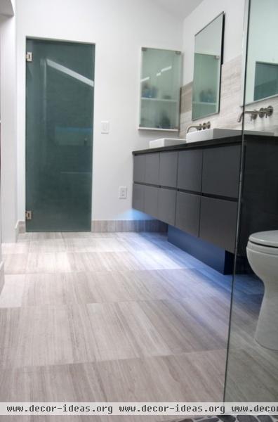
AFTER: The bathroom now exudes the swanky sophistication of a trendy hotel. A frosted glass door conceals bathroom storage.
Throughout the remodel’s entirety, Anderson was happy to see how excited the crew was about his project. It wasn’t just another bathroom for them, he says. Gann agrees. “Every [bathroom] is like our baby,” she says, and this one has left the nest. “[It was a] long, unusable space, and now it’s streamlined and functional.”
We love hearing about your success stories. Please share your before-and-after projects in the Comments!
How to Find a Designer or Architect Using Houzz Photos
More:
Find design professionals near you
See more guides to using Houzz to help with your home projects
Related Articles Recommended


