Cylinders — More Than Architects’ Pipe Dreams
In the kit of parts of modern architecture, one finds plenty of boxes (especially glass ones) as well as gables and the occasional curve. But what about cylinders? Hearing of that form in regard to buildings probably brings to mind art deco architecture, a short-lived style that was popular in the early 20th century; it used rounded corners and cylinders to give the appearance of streamlined movement. Going further back in time, cylinders recall the turrets of medieval buildings and the grain silos of vernacular industrial buildings in America.
Nevertheless, cylinders have a place in architectural form making; they’re rare in modern and contemporary architecture but quite a statement when done successfully. This ideabook presents some cylinders from the outside and the inside.
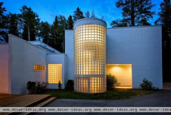
There are two main questions behind the reasons that cylinders are rarely used in buildings, much less houses. What goes inside them? And how do they relate to the rest of the house, both in expression and in plan? In the case of the former, most cylinders are stairs, which makes sense. In the latter case, we’ll see that cylinders can project in front of adjacent walls, like the glass-block one here, or be almost flush with them; sometimes they act like an elbow around which the rest of the house pivots.
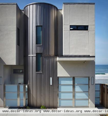
Shown here is 3 Palms, the house of actor Bryan Cranston; it aspires to achieve both LEED Platinum certification and Passive House standards. There’s a cylinder in the middle of the main elevation, signaling the entrance and breaking up the facade into smaller volumes.
What’s LEED All About, Anyway?
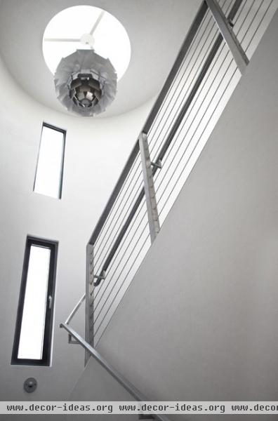
The cylinder houses a stair, which makes sense given its proximity to the entrance and its location in the middle of the house. Given that stairs are basically two-story spaces with some steps in them, they are great for bringing in lots of natural light, here via some slender windows and a skylight.
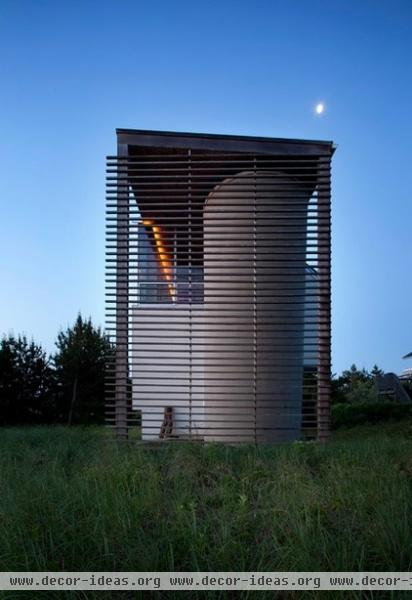
This Long Island, New York, house, designed by architect David Ling for himself, includes a cylinder that sits behind a slatted wood wall.
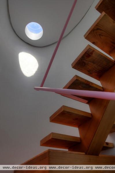
Again, the cylinder houses a stair that is capped by a skylight. This photo shows how it could be used like a sundial, especially considering the stair is open to the second-floor living space.
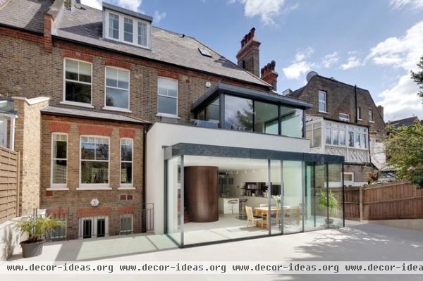
This London house addition is an example of how a cylinder can be an internal volume that shapes space and creates emphasis.
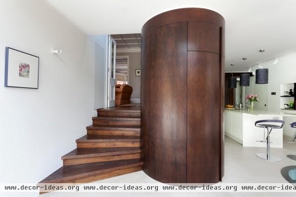
The cylinder caps the end of the kitchen, its curve continuing the flow from the old portion of the house up a few stairs. Not only does the form work well with the stairs and its movement, but it creates a hierarchy in the room while also hiding the pantry.
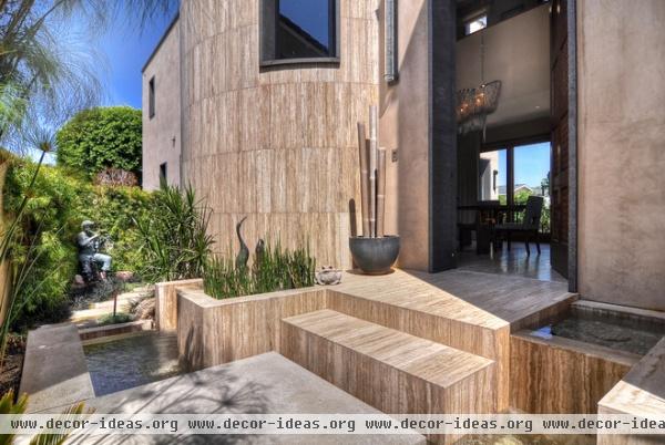
The scale of a cylinder is also worth considering. This one is large, on par with the whole house.
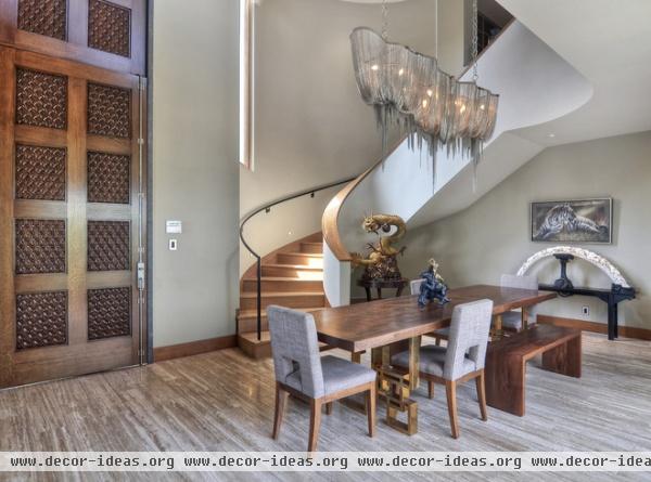
That scale equates with a spacious stair that recalls movie sets from the 1940s rather than even the largest great rooms today.
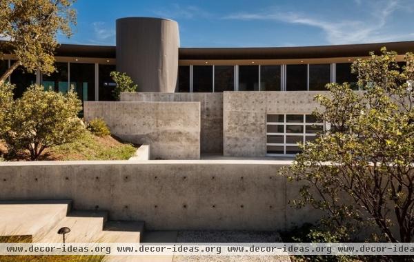
Cylinders can also give the eye somewhere to rest on an elevation. Imagine this facade of numerous horizontal layers without the vertical cylinder. Like a chimney, it anchors the composition.
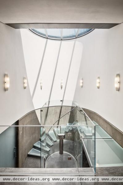
Of course it’s not a chimney, but a stair, with a glass roof that brings in plenty of natural light.
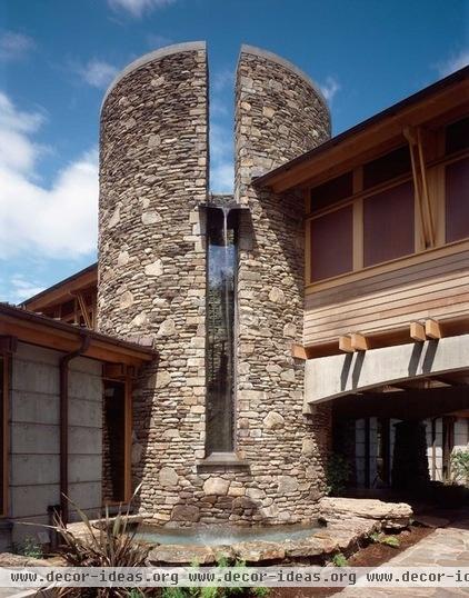
One of my favorite cylinders on Houzz is this stone stair that the rest of the house hinges upon (we can see three wings from here); it incorporates a fountain above a slender window.
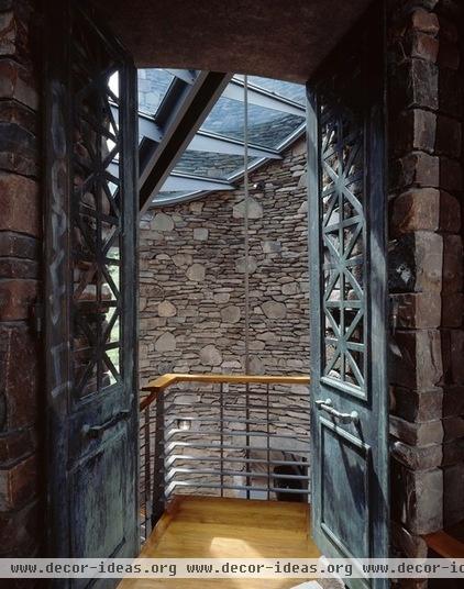
Best about the cylinder is the way the stone is found inside as well, making the space seem medieval yet modern through its glass roof and the design of the railings.
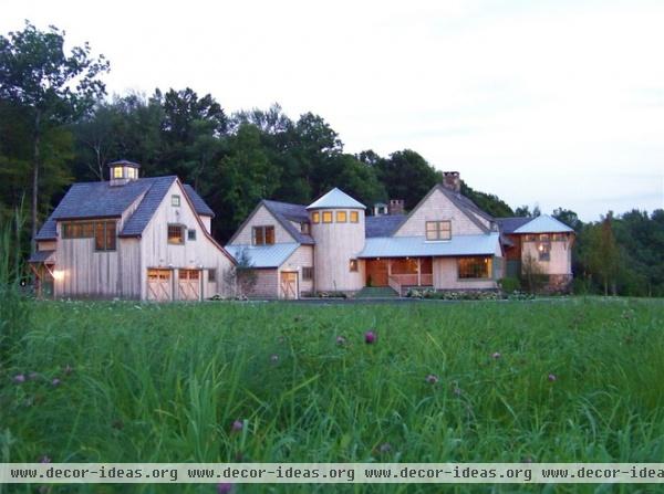
Here is another cylinder that acts like an elbow, being found where the “arms” of the building meet.
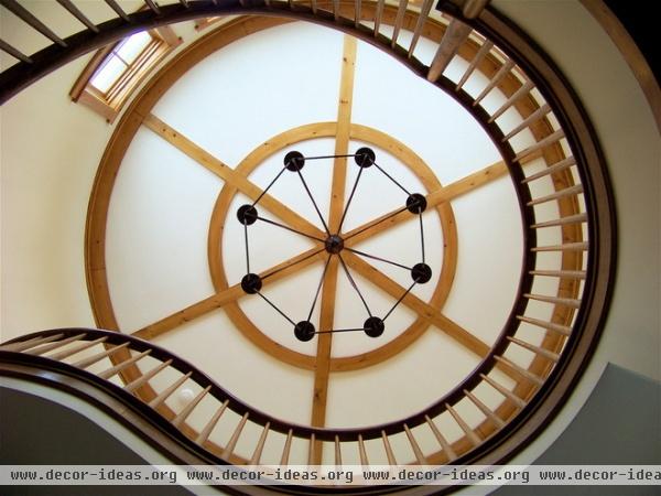
Not surprisingly, this is where we find the stair — and a fittingly grand one at that.
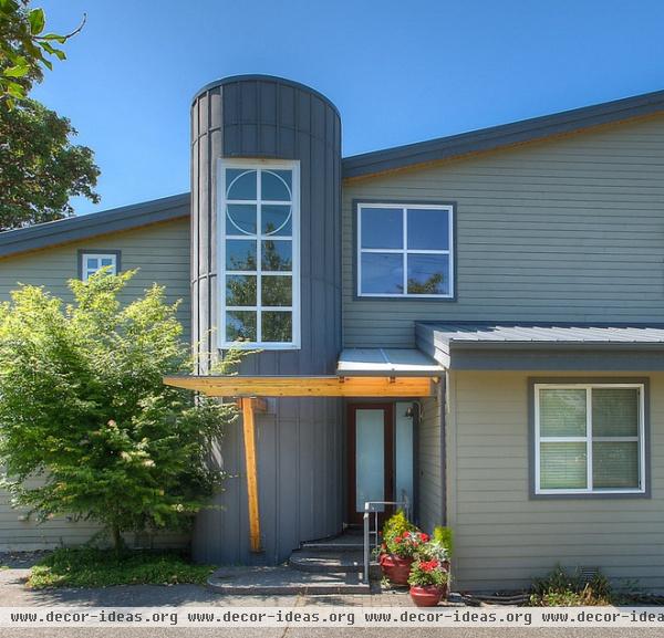
This last example is considerably more modest. Situated next to the entrance, the cylinder has an almost industrial agriculture appearance. It’s set off by the metal cladding as well as by how it projects from the adjacent wall.
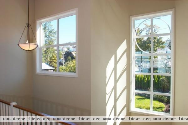
Again, we find a stairwell housed in the cylinder, allowing plenty of light into the house and adding some interest to this side of the house.


