Houzz Tour: Laid-Back Comfort in the New York Woods
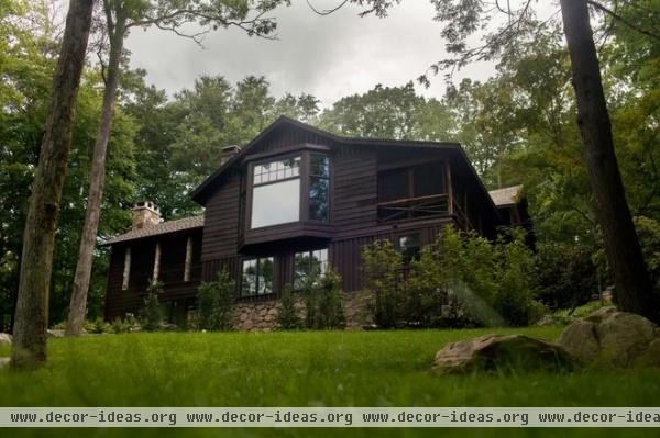
Thomas Riker, the codesigner of this house and a principal at design firm jamesthomas, calls the area of upstate New York state where it sits the “anti-Hamptons.” The Hamptons, a collection of villages on Long Island bordering the Atlantic, is known as a summer retreat for business titans and celebrity moguls, and the area contains some of the most expensive real estate in the United States. In contrast, “There’s a very Adirondack feeling to this part of upstate New York,” Riker says. “It’s almost like a throwback to a 1950s camp. It’s an area where the homes are quirky and unpretentious.”
This is where a friend whom Riker grew up with in Detroit decided to stake his claim for a weekend family retreat. “They purchased a little cabin that had a lot of charm, but not enough room for his family — which includes two adults and three teenagers,” Riker says. It also was in a major state of disrepair. Together he, business partner James Dolenc and architect Leonard Woods made the house comfortable for the family while retaining its rustic sensibility.
Houzz at a Glance
Who lives here: A couple and 3 teens
Location: Upstate New York
Size: Before the remodel: 2,500 square feet (232 square meters); after the remodel: 3,700 square feet (344 square meters); 5 bedrooms, 3½ baths
Year built: 1920s
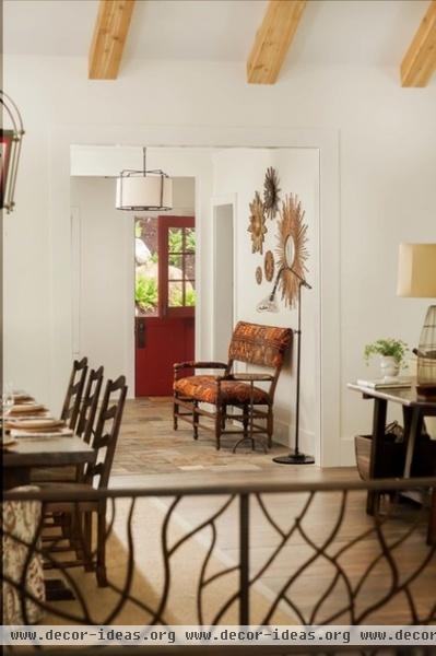
Although the exterior looks much the same, the interior rooms were refreshed and two additions were added. On the front of the house, a single-story addition contains a gracious entry, pictured here, a powder room and a mudroom. A new two-story structure was added on the back. “This structure made way for a screened-in porch on the upper level and a master bedroom suite on the lower level,” says Riker. “The porch is an informal living room in the summer.”
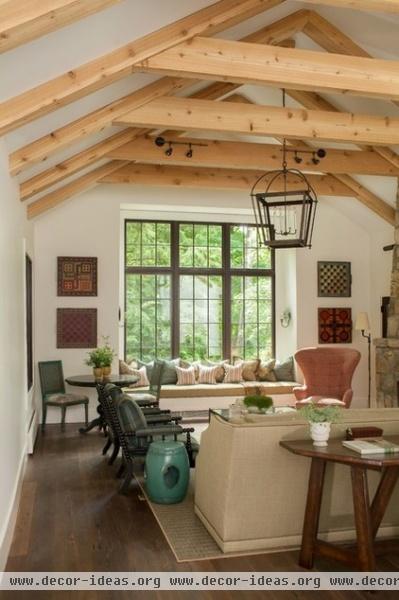
A big goal was to make the house feel rustic, but also fresh and modern. “We didn’t want to do the expected wool plaid,” says Riker.
Although the room had a peaked roofline, it didn’t have the Douglas fir beams. The addition of the wood on the high ceiling brings it down to human scale and adds an element of casual rusticity.
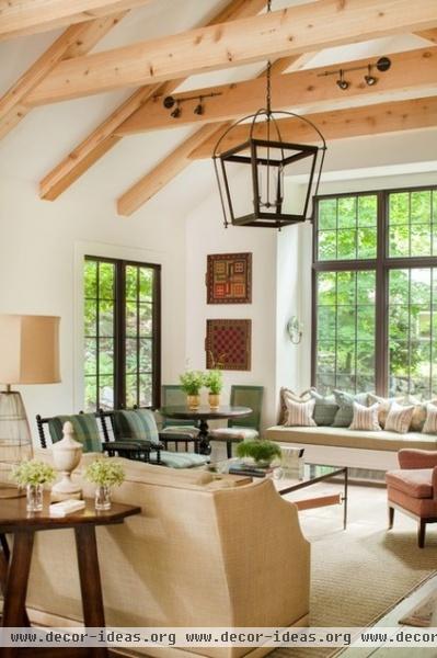
Two bobbin armchairs wear the only plaid upholstery in the home. “But we chose a plaid in a bright color,” says Riker. This is horse country, he adds, so a coffee table with equestrian leather straps feels like a natural choice.
The windows are original, but the window seat and sconces were added. “This is where the kids like to go and read,” says Riker. It’s also where they like to play games, so there’s a game table to the left of the window.
“My client found several trays that are made to look like vintage game boards,” says Riker. “She wasn’t sure what to do with them, but she thought they were cool. They look great hanging on the walls in this room.”
Armchairs: Spindle Chairs, Wisteria; coffee table: Equis, Casamidy
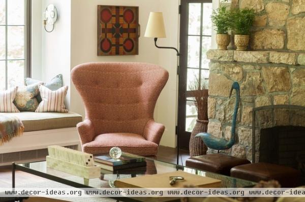
The adults have staked their claim to this modern take on a wing chair. This is their comfortable spot for relaxing and reading by the fire. The original stone fireplace was crumbling; a new stone surround mimics the original.
Armchair: Vanguard Furniture
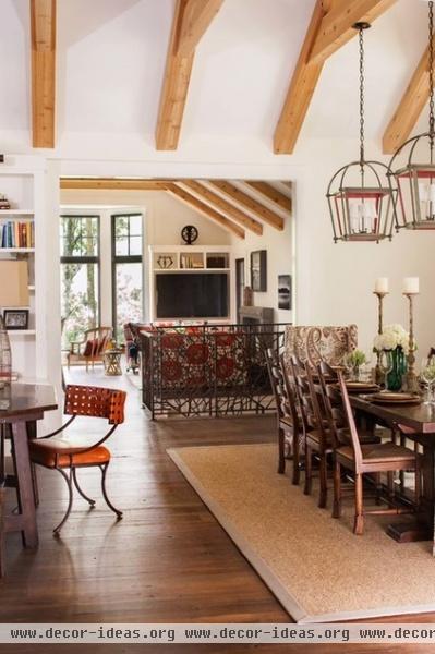
The console table behind the sofa acts as a divider and a desk. “It visually separates the living room from the dining room,” says Riker. “We put a chair there, so it can be used as a desk or just a place to check your laptop.”
Leather chair: Casamidy
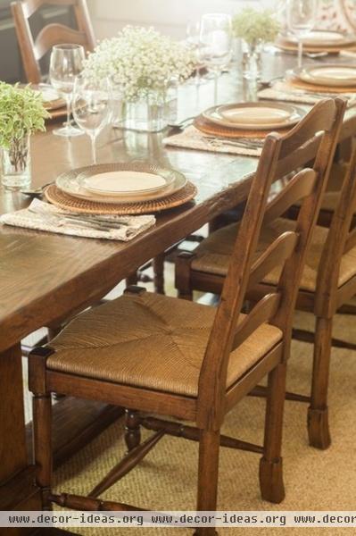
This is a family who likes to entertain, so the designer chose a trestle table that will seat 10 people.
Table, chairs: Old Plank Road
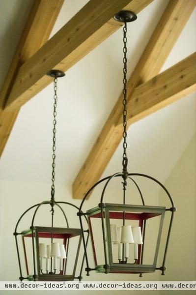
Lantern light fixtures are found throughout the house. “We liked them because they are both outdoorsy and rustic,” says Riker. In the dining room, the designers lined the lantern interiors with red for color contrast.
Lantern fixtures: Urban Electric
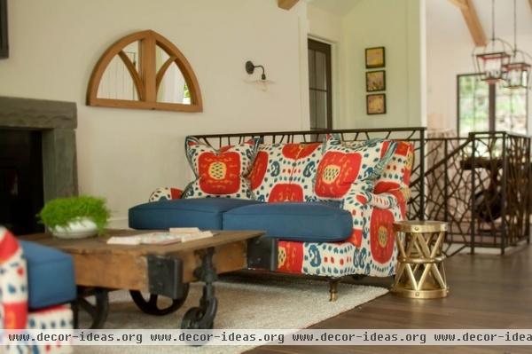
A new metal railing, designed to look like the branches of the surrounding trees, flanks stairs that lead to the lower level. Just beyond the rail is what the designer calls the family lounge. It’s a space off the kitchen that serves as a media room.
Patterned upholstery: Samarkand, Brunschwig & Fils; coffee table: Napa Style
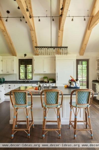
Fir beams in the new and larger kitchen echo the ones in the living room. “The owner wanted to add some fun touches and color,” says Riker. “She chose a light fixture that’s crafted with forks, and blue Parisian-style chairs.”
For more lighting the designers selected adjustable track lights. “They have a vintage, industrial look,” Riker says. “These days we are shying away from grids of can lights.”
Light fixture: Interiors New York
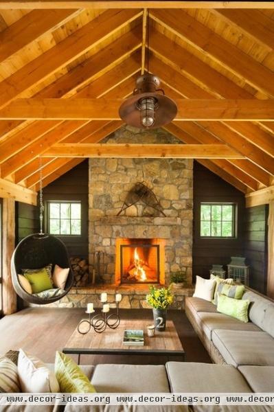
A new screened porch off the family lounge and the kitchen was painted a dark color to relate it to the home’s exterior. Here the fir beams wear a slightly darker stain than those found on the interior.
“We wanted to allow a lot of people to gather here, so we chose an outdoor sectional,” says Riker. The three teens and their friends use this space often, so a hanging chair was added for fun.
Sofa, hanging chair: Restoration Hardware
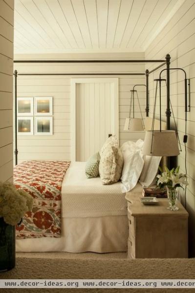
The lower level was a “warren of rooms” before the remodel, Riker says. The addition allowed them to add a master suite and reorganize the rest of the bedrooms. As a cost-saving move, the designers installed scored MDF instead of wood paneling in the master suite. “Once painted, it’s hard to tell the difference,” Riker says.
The home is now the family’s welcoming retreat. “In New York City, their lives are a bit frenetic. The couple is busy with their jobs; the kids are taking the subway to school,” Riker says. “This place is a total escape for them, where they can leave that all behind.”
Antonia Canopy Bed: Pottery Barn; light fixtures: Urban Electric


