21 Creative Ways With Load-Bearing Columns
The eternal struggle between design and engineering often leaves us with conundrums. It’s easy to glide through the home design process in almost a dreamlike trance, imagining a spacious open floor plan with big, sweeping views that flow from room to room, making the house feel bigger than it is.
Then comes the day when your architect or structural engineer wakes you up with, “Hey! You’re going to need a column to support that roof!” Renovation junkies experience the same jolt of reality when “Let’s just tear that wall down and open this space up” becomes complicated with pesky terminology like “load bearing.”
Indeed, columns are often unavoidable in open floor plans. I’ve been working on a renovation of a space with two such unavoidable columns conspicuously placed right in the center of my open floor plan. So for inspiration, I looked at some of the ways Houzzers have dealt with columns in their homes. Here are some of the great suggestions I’ve stumbled across.
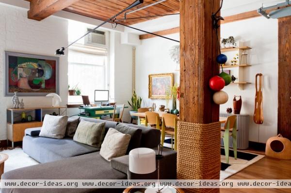
Make a central column tactile. If it’s going to be in the center of activity, then you might as well make it pleasant to touch. Rope was wrapped around this wooden column to accommodate the belief held by certain feline occupants of the home that a large scratching post had been placed in the middle of the room for them. However, the combination of the wood with the rope makes it equally tactile for humans to run their fingers across as they pass by.
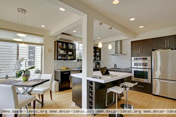
Use a column to anchor an island. Consider using your column as a pivot point to which your built-in furniture, like your kitchen island, can gravitate. Notice how the floor remains consistent, but the column, in combination with the similarly sized beams, marks the kitchen space.
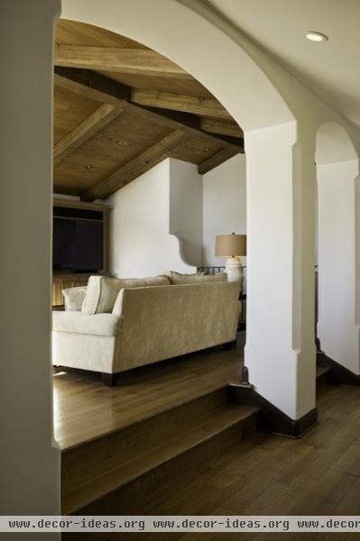
Use a row of columns to signal a level change. A row of columns is a perfect place to put one or two steps up to an elevated section of the floor plan. Plus, the row of vertical structures acts as a visual cue to watch your toes.
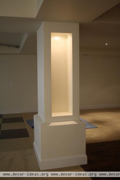
Light it up. Integrate downlighting, uplighting or a lit display box, like the one shown here, to showcase a sculpture or another piece of art.

Decorate your columns. Treat the column itself as a work of art and showcase an ornate pattern or carving.
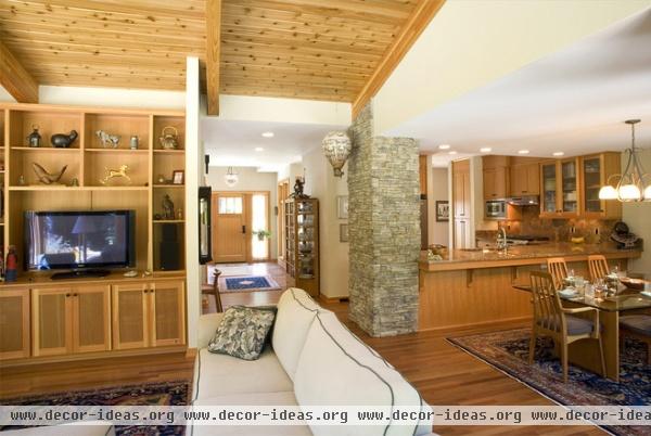
Clad a large column in stone. The imposing presence of the masonry column here reminds you of its purpose, while at the same time introducing a tactile material that contrasts with the rest of the soft interior. This could be a good idea for bringing some of the material from the home’s exterior inside.
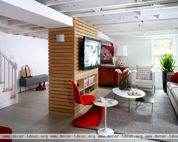
Turn it into a media center. Not sure where to place your TV in your big, beautiful open floor plan? Why not turn your structural column into a media center? Even if you don’t place the TV there right away, it could be smart planning to allow for electrical outlets near the column.
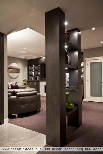
Make two columns into a bookcase. Use two columns that are close together to create shelving and lighting for display or storage space. You could even clad them to match other built-in furniture in the room, and no one would even know they’re structural.
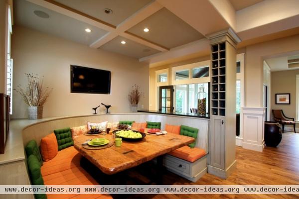
Make a wine rack. Encase the column and add some cubbies, and you have a perfect spot to store wines. You could do something similar for shoes, CDs or anything else that could fit into cubbies.
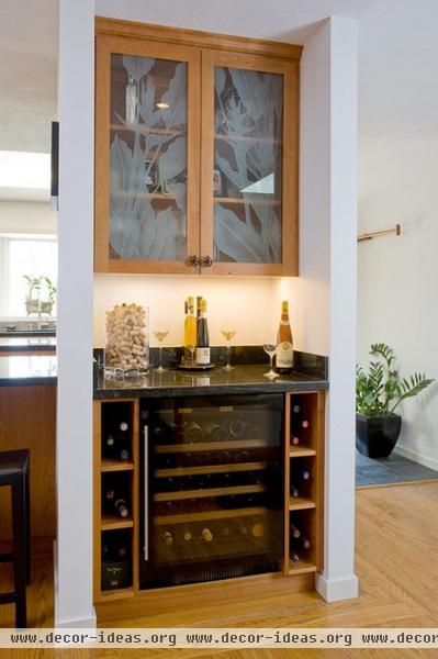
Create a spot for a minibar. Forget the wine rack! Use the column as an opportunity to create a minibar or an ice station.
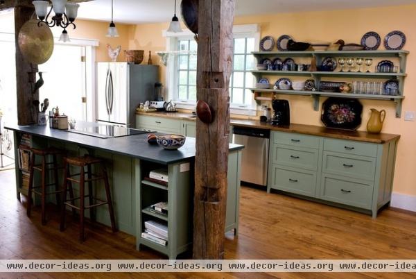
Let your column tell a story. Consider using a reclaimed structural element as your feature column (after clearing it with your structural engineer, of course).
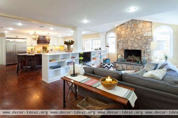
Make it a room divider. For a row of columns between two spaces with different functions, consider adding some low storage that can also act as a room divider.
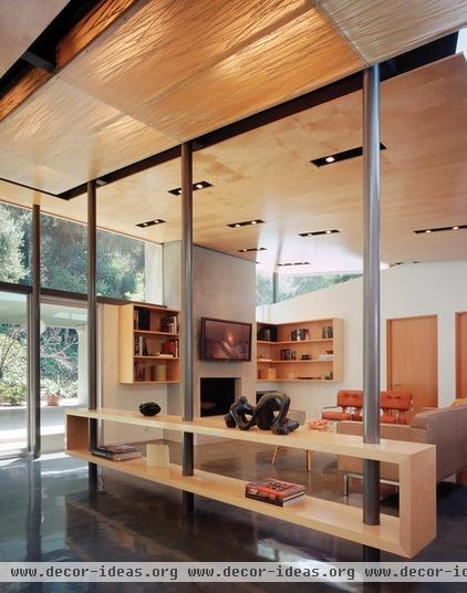
Here’s another example of storage between columns that are acting as a room divider. The open, floating shelf system here has a very different feel from the previous example but achieves a similar result.
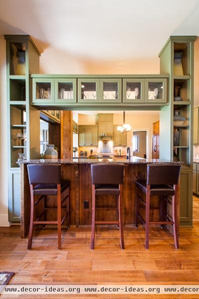
Create custom furniture. This bar stretches between two columns to nicely frame the kitchen while providing vertical and horizontal storage space.
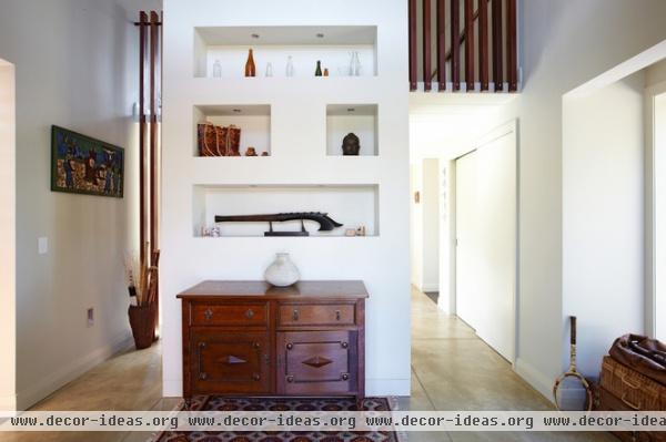
Use a column to signal private space. This column almost acts more like a screen. The front side is a display case with built-in shelves, but the structure marks the separation between a more public and a more private part of the house.

Display art on your columns. These large white columns are acting as blank canvases for floating typographic artwork. The downlights cast shadows on the columns, making the artwork even more noticeable.
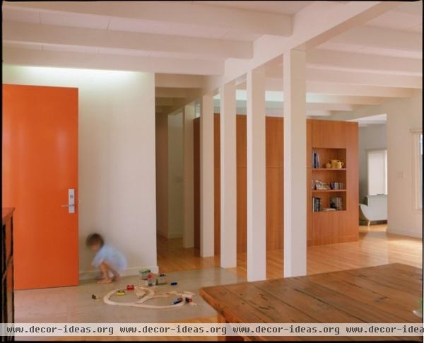
Use a row of columns to provide rhythm. The eye takes comfort in patterns. Use columns, and even beams, to create a sense of rhythm in an otherwise muted space.

Use the column material to bring nature in. Depending on where in the world you’re located, you may be able to find tree trunks that meet your structural requirements.
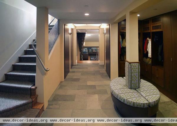
Create seating around the column base. Or even stretch a bench between two columns for an extra spot where people can take shoes off.
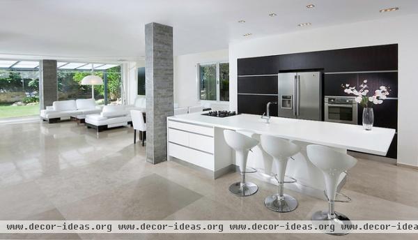
Create contrast between materials. Use the columns like you would a feature wall. Color them or clad them with a contrasting texture to add a splash in a room with minimalist decor.
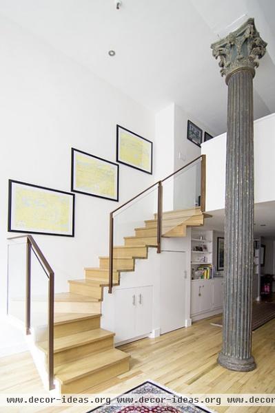
Create contrast between styles. Like with a classical column in a contemporary setting, as shown here.
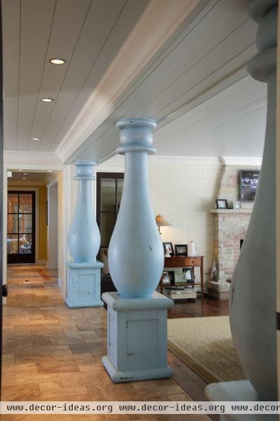
Get whimsical. Show your playful side, like with these Disney-inspired columns that resemble something from a cartoon.
Instead of trying to make structural columns disappear in your open floor plan, try to celebrate them. Because at the end of the day, the column stands alone!
More: What you can do to really open up a space


