Houzz Tour: Farmhouse Style That Feels Metro, Not Retro
These days they raise more cash than crops in Silicon Valley, but that didn’t stop a Menlo Park family from wanting their new home to feel like a farmhouse.
“It’s in the suburbs, but they wanted to incorporate some aspects of country life,” says interior designer Suzanne Glynne of Modern Organic Interiors in Oakland, California. Her clients — a couple with two school-age children — are nature lovers who enjoy growing their own food, so the agrarian association wasn’t much of a stretch. But they were emphatic that they didn’t want to build an imitation of an 1890s homestead.
“From the start the concept was modern farmhouse,” says Glynne, who collaborated on the project with architect Steve Simpson of SDG Architects and Milne Design and Build, both in Redwood City. “They wanted it to feel modern but like something you would find in the country.”
Houze at a Glance
Who lives here: A family of 4
Location: Menlo Park, California
Size: 6,052 square feet (562 square meters), including a full finished basement; 4 bedrooms, 6½ baths
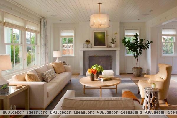
“It’s kind of an updated country look, but I don’t want to use the word ‘country,’” explains Glynne, who bathed the interiors in white paint (Benjamin Moore’s White Dove) and introduced an eclectic mix of contemporary, midcentury and craftsy pieces that prevent the interior from feeling too dogmatic.
Coffee table: custom; sofa: A. Rudin; wing chair: Ironies
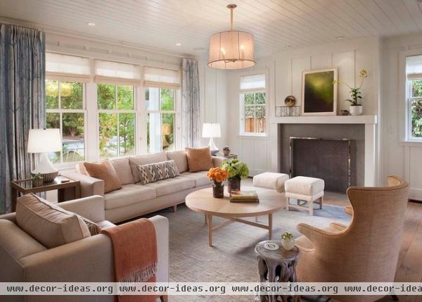
Glynne kept most of the furnishings neutral, which helped the styles work together, but she didn’t eschew color altogether. “All the rooms have some color,” she says, pointing out the pale blue Afghani rug and Lee Jofa curtains in the living room.
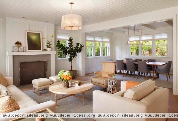
Organic touches — like the gnarled root table and the pendant stem wrapped in sisal — add a toothy naturalness that’s echoed in the white oak floors, which were finished with a lightly pigmented oil instead of polyurethane, for a matte surface.
“We’re not using any glossy finishes, except the polished-nickel fireplace screen, so the natural organic finishes make it feel less formal,” the designer says.
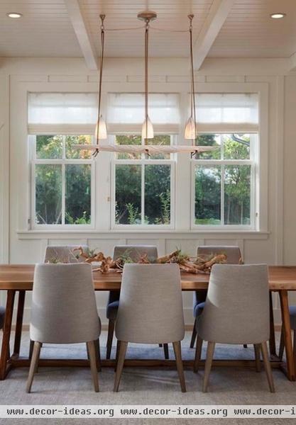
There’s a spare poetry to the dining room, which features Maxalto chairs customized with weathered legs, and a carved marble chandelier suspended from leather cording.
The owners didn’t want much exposed Sheetrock in the house, so Simpson applied board and batten paneling from floor to ceiling, but omitted crown molding, for a more contemporary look.
Table: custom, Luke Bartels
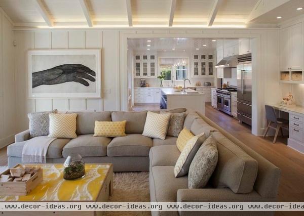
The family room, off the kitchen, is furnished with a generous sectional covered in durable wool bouclé. The coffee table is actually a child’s play set with integrated stools, which the owner suggested using. Glynne dressed it up by applying vinyl wall covering on top.
Art: “Phantom,” by Richard Dupont, sourced by Lauren Geremia
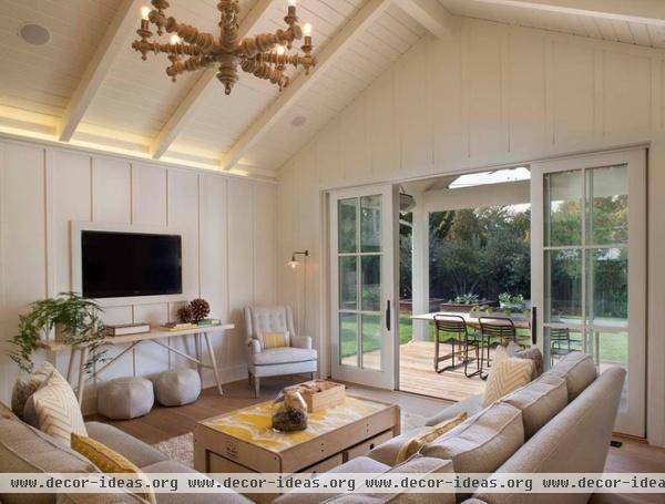
Industrial lighting helps temper some of the sweetness of the farmhouse aesthetic, as in the wall sconce and in the Edison bulbs in the traditional turned-wood chandelier.
The flat-panel TV feels far less intrusive than the usual sight, framed in white and hung above a skeletal console table with nary a wire or gadget in sight.
Chandelier: Noir Furniture; console: custom
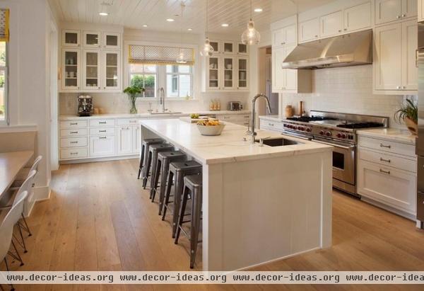
The owners grow their own vegetables and like to entertain, so cooking is pretty central to their lives (as evidenced by the 60-inch Wolf range). Honed Calacatta Oro marble graces the perimeter counters and the island. The Tolix stools have slots in their seats for easy moving.
Range: Wolf; pendants: &Tradition; stools: Tolix
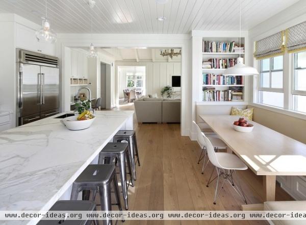
The kitchen’s flow-through floor plan minimizes congestion and makes it easier for others to help with the meals or simply watch. Cookbooks fill the shelves next to the breakfast bay, while a built-in desk (visible behind the island faucet) accommodates homework and household chores.
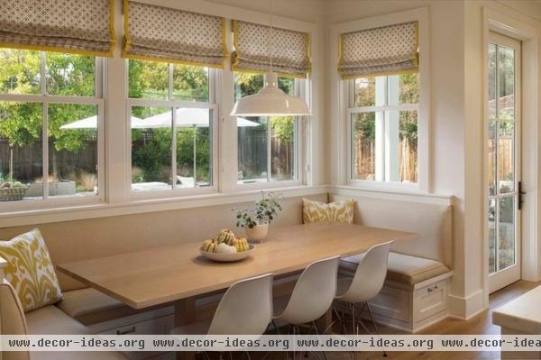
The owners asked for a breakfast table large enough to fit friends as well as the immediate family.
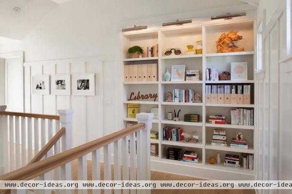
Illuminated shelves at the top of the stairs display family collections.
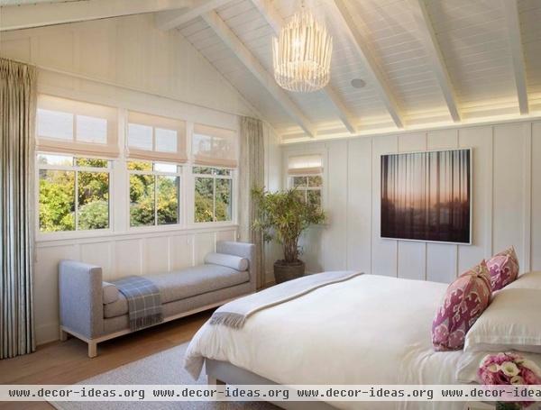
The master bedroom has a vaulted ceiling and treetop views. A shimmering chandelier from Arteriors adds a playful touch of glamour that tweaks the farmhouse aesthetic.
Bench: custom, A. Rudin; photograph on wall: Mona Kuhn, sourced by Lauren Geremia
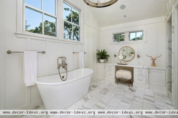
All white but definitely not clinical, the master bath boasts classic fixtures and finishes with some fun modern accents thrown in, like the fluffy Mongolian lamb’s wool stool and the carved trophy head.
Tub: Cheviot Products
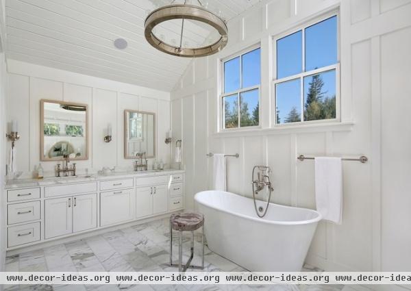
The floor is Calacatta marble, honed to prevent slipping. (The grout lines provide added traction.) The stool sports a petrified wood top.

If it weren’t for the ladder in the lightwell outside, you’d never guess this guest room was in the basement. An arboreal wallpaper helps banish any subterranean feel, as does the chandelier from Dennis & Leen. (How often to you see a chandelier in a basement?)
Bench: Williams-Sonoma Home; lamps: Restoration Hardware; headboard: custom
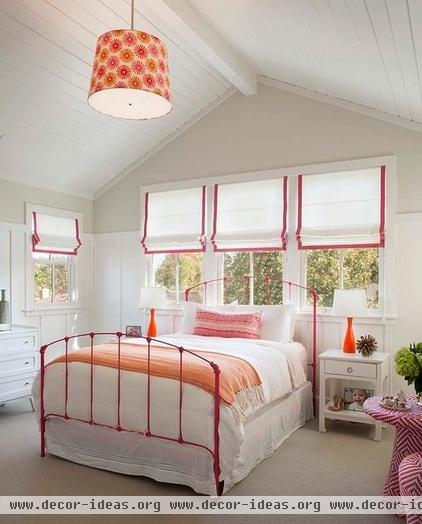
How do you create a pink bedroom for a little girl that will age along with her? By using the color sparingly. Here it trims the edges of the Roman shades, colors a bed from Charles P. Rogers and anchors a woven seating group. The final effect is sweet but not cloying.
Pendant light: custom, with Duralee fabric
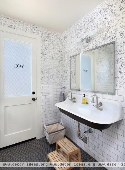
This bathroom off the pool was inspired by a restroom at New York’s Soho Grand Hotel. The new door was designed to look vintage, complete with “WC” lettering on the wire glass, while the Schumacher wallpaper is covered with doodles by Saul Steinberg.
Sink: Brockway, Kohler
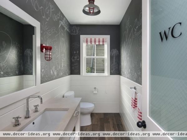
The homeowners wanted a playful look in this children’s bathroom. Custom-colored chalkboard paint covers the walls; the door is another period replica.
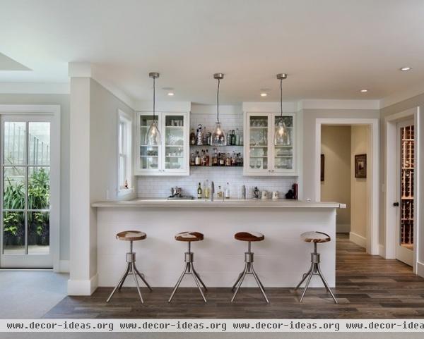
The basement rec room/media area includes a full bar and a wine cellar (visible at far right).
Pendant lights: Velocity Art and Design (now closed); stools: Big Daddy’s Antiques

“It’s not supermodern or traditional — it’s sort of in between,” says architect Simpson of the farmhouse design. The preweathered Galvalume roof is designed to look like zinc and will become even more matte over time.
The neighbors must have approved: Several copycat houses have already sprung up around the community.
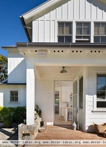
The back door opens right into the kitchen. In a departure from tradition, the base of the house is covered with horizontal lap siding; the second floor is board and batten. The mix adds interest and helps make the scale feel more modest — in true farmhouse tradition.
More: Houzz Tour: Reviving a Farmhouse in California’s Wine Country


