Room of the Day: Storage Becomes a Feature in a Brooklyn Apartment
The owners of this home in Brooklyn, New York, knew they wanted to renovate even before they moved in. “The main thing was that they wanted way more storage than one typically has anywhere in New York City,” says designer Henry Grosman. The clients, a software engineer and a stay-at-home mom, didn’t want any of their household items left out in the open. Two young daughters meant even more accumulated stuff to store.
”The client was very articulate about what their relationship to their stuff is,” says Grosman. When brainstorming ideas on how much additional closet space would be needed, the client said he wanted enough to potentially store everything he owns. Though the design didn’t go that far, it came pretty close.
Photography by Bjorg Magnea
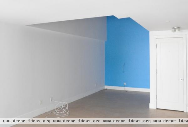
The home lacked storage for items like DVDS, luggage and toys. Though most of us might squeeze a suitcase under the bed or stash the toys in a basket, this couple saw things differently. Their previous apartment, which was smaller than this home, contained a dedicated storage room, keeping everyday things out of sight but accessible. With two children, they wanted at least the equivalent for this home.
A double-height alcove in the corner of the living room suited the project perfectly. Siting the new storage room in the recessed corner, next to the small closet, would streamline the angles of the living room and create concealed, usable storage space.
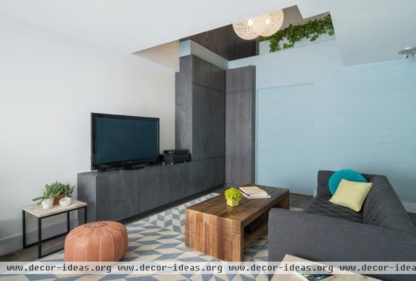
AFTER: The designers filled in about 90 square feet of the corner, building the storage room flush with the existing adjacent wall. (The new blue wall of the storage room spans from the wall of the small closet seen above to the end of the room, filling in the unused alcove.)
“Our big design move was to use the storage as a centerpiece, rather than trying to hide it,” says Grosman, who renovated the space with partner Babak Bryan. With an additional 10 linear feet of cabinetry, they built what amounts to a reasonable-sized storage unit inside the apartment.
Designer Abby Richardson of AbbyElle Style chose furniture whose shapes and lines reflected the architecture. The texture of the coffee table reinforces the rippled texture of the blue wall, and the low-profile sofa maintains an open view of the space. A plush rug creates a soft landing for the kids.
Area rug: Arial, The Rug Company; coffee table: Angora, Zin Home; side table: Box Frame Nesting Tables, West Elm; sofa: ABC Carpet & Home
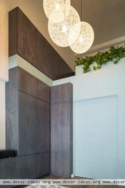
Grosman and Bryan, principals at Bang Studio, finished the two features of the storage unit differently as a way to reduce its visual impact. Half-round wood tambour, painted a light blue, covers the storage room. The plywood cabinetry is stained a light gray.
Cabinet stain: Slate, Minwax; paint: Soft Chinchilla, Benjamin Moore
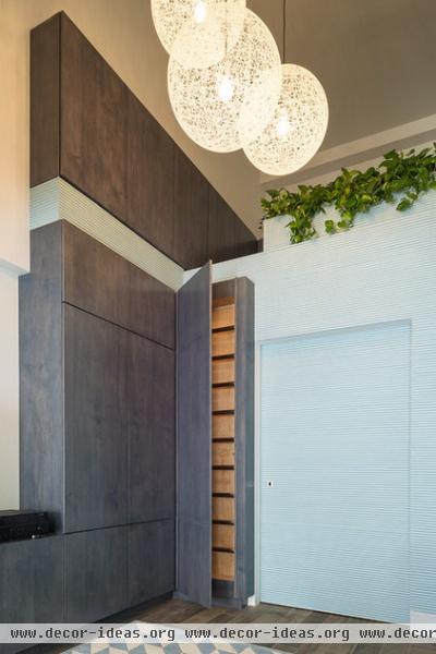
A hidden ladder leads to an additional 20 linear of feet of cabinetry in a loft space. Grosman and Bryan envisioned this area as a tree-house-like experience for the kids.
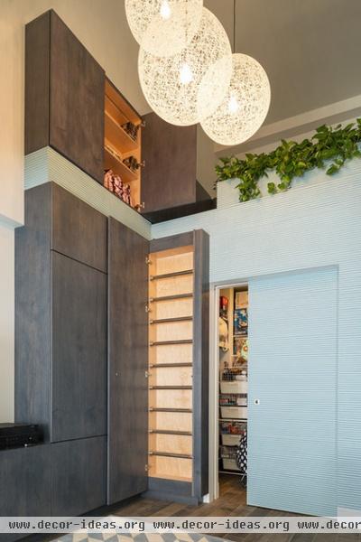
Hanger rods and open shelving fill the closet. Shallower shelving in the cabinetry allows for easy organization and display. (After Grosman saw these photos, he was happy to see there was still some open shelf space left.)
Grosman and Bryan also replaced the existing tile floor. Though they intended to match the hardwood floors upstairs, a downstairs water leak steered them toward selecting a porcelain tile with a wood look. It provides a similar aesthetic while being much more resistant to moisture.
Floor: Inessence Noce-Ossidata, Provenza
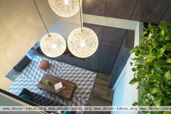
Looking down through the opening on the second floor, you can see how the storage room recedes into the wall, with the ladder closet projecting slightly. They didn’t interrupt the glass railing on the second floor, so the loft and cabinets above the storage room are only really accessible from below. An integrated planter guards the loft from the drop-off.
Though Bang Studio renovated other portions of the home, including adding additional storage space in the kitchen and dining area, it’s this storage area that’s the real standout. By saving money on other parts of the renovation, including refinishing the upstairs floors instead of replacing them and refacing the kitchen cabinets instead of tearing them out, the clients were able to build the storage system they wanted. The closet definitely reflects their personality, says Grosman, but he adds that it’s also really cool.
More: 3 Ingenious Ways With Wall Cabinets


