Houzz Tour: Dressed Up With a Bow Tie in Arkansas
Think “bow tie” and most likely pasta or a gentleman wearing a tux comes to mind, not a house. But Bowtie House is the monicker that Tim Maddox and Tim de Noble of Arkansas’ deMx architecture gave this house near Fayetteville, built for a couple whose grown children and grandchildren make frequent visits. The name refers to the way the roofline rises at either end of the house, reaching a low point in the middle near the house’s entrance. Inspired by the vernacular buildings in the Ozarks rather than Italian food or formal attire, the house’s form is a logical response to the client’s needs and the lay of the land.
Houzz at a Glance
Location: Near Fayetteville, Arkansas
Size: 2,750 square feet (255 square meters) interior conditioned space with 3 bedrooms and 2½ bathrooms; 4,175 square feet total (388 square meters) with garage, storage and covered porches
Photography by Tim Hursley
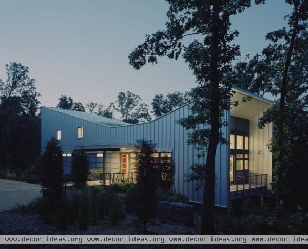
The bow tie shape of the house is clearly visible in this view, which shows the west, entry elevation. The plan of the house is a basic, long rectangle that runs from the southeast (the end on the right) to the northwest (the end on the left). In between is the entrance, marked by the low point in the roof and by a canopy projecting from the standing-seam metal enclosure.
The glow on the right is coming from the living room, which gets extra height from the roof’s bow tie shape.
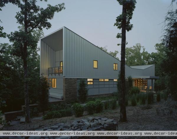
In this second view we’re looking at the other end of the house, which is where the master suite and guest bedrooms are. The master suite is on the same level as the living room for easy accessibility; the owner’s children and grandchildren get to trek to the second-floor bedrooms above the master suite. This stacking gives the bow tie form its subtle asymmetry. Below them, but out of sight beyond the stepping stone wall on the left, are the garage and driveway.
The extension of the standing-seam side walls and roof beyond the end wall creates a terrace for the guest bedrooms (much like the living room terrace on the other side). This extension also references the way haylofts extend from the walls of a barn for protection from the elements.
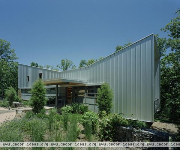
The west side of the house is the public face. Only a few small openings can be found on this side, which accentuates the openness of the covered entry.
The roof form has another benefit: It funnels rainwater to a cistern on the east side of the house, so the water can be collected for irrigation and other greywater uses.
See more about greywater systems
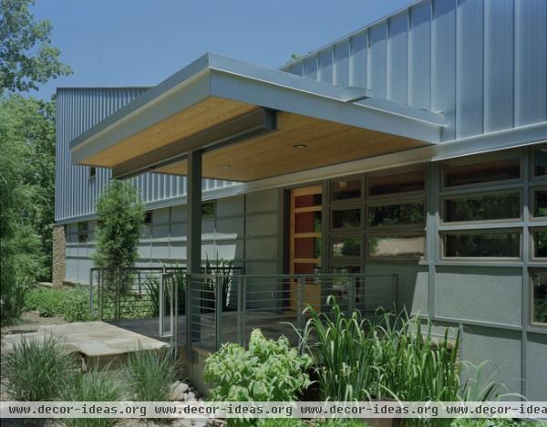
Just as the ends of the house provide shelter from the elements, the entry’s generous canopy does the same.
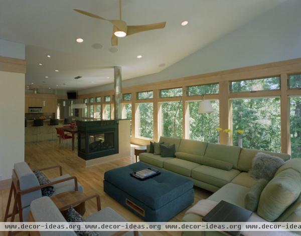
The closed-off nature of the house as experienced through the west-facing side gives way inside to an openness through an expanse of windows facing east. You sense the shape of the roof in the slope of the ceiling from the living room (behind us) to the low ceiling over the kitchen. This shape of the ceiling helps to define smaller areas within the large, open space, aided by the fireplace that straddles the living and dining areas.
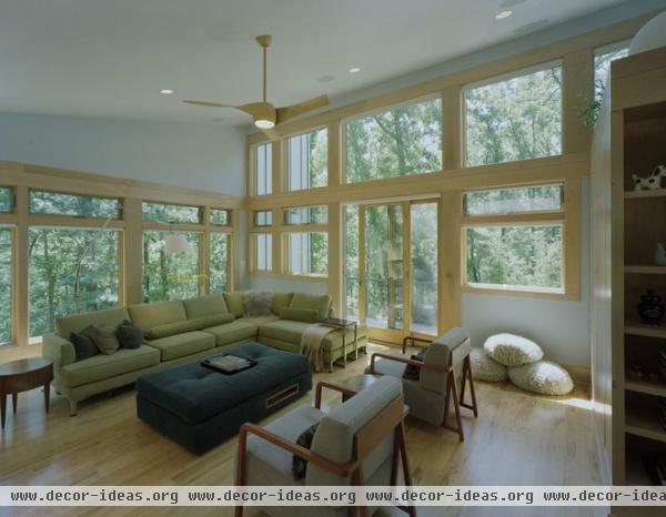
The windows facing south take advantage of the extra height (14 feet, as opposed to 10 feet at the kitchen), but keep in mind that the side wall and roof extension provide some much-needed shade from the high summer sun.
Note the many operable windows that are placed at the top of the long line of windows. Combined with operable windows throughout, the house is set up to take advantage of cooling breezes.
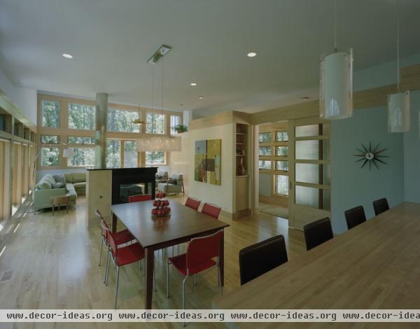
Looking from the kitchen to the wall at the southeast end of the house makes the openness of the level apparent, but we can also see the translucent door that separates this space from the entrance. This door serves as a layer of privacy between the windows next to the entry and the dining area. This shoji-like screen can also redirect guests to the living room during parties.
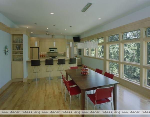
The long expanse of windows really highlights the surrounding trees and reinforces the movement of the house from southeast to northwest. Here the windows lead to the opening beyond the kitchen and the master suite beyond.
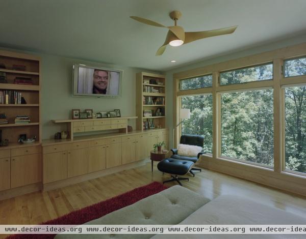
Maple is used throughout the house, for the window trim, the floors and the custom built-ins. The piece below the television in the master bedroom echoes the influence of Japanese design found in the sliding door near the entry.
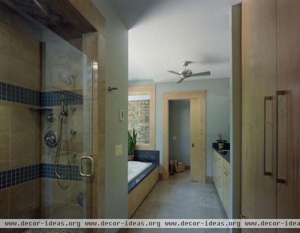
The master bedroom faces east, which saves the far northwest end of the house for the master bathroom. It’s a generous room, as can be seen here, with a shower, a tub, a separate toilet closet and plenty of natural light.


