More Storage and Light for a Seattle Kitchen
http://decor-ideas.org 05/04/2014 23:22 Decor Ideas
The owners of this 1920s home in Seattle’s Queen Anne neighborhood love its Tudor-style architecture, but they weren’t so enamored with the kitchen. Although it appeared to have been remodeled in the 1950s, its layout and lack of counter space and light made it less than desirable by today’s standards. Architect Anne Scott of Adapt Architecture was hired to bring the room out of the dark.
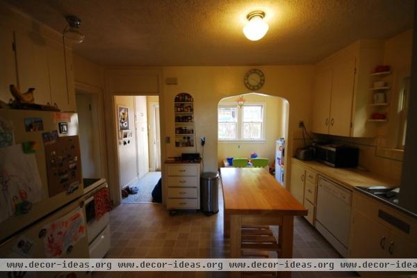
“The kitchen was cut off from daylight by a back entry hall and a small breakfast room,” says Scott. The breakfast room was used as a playspace by the owners’ two children.
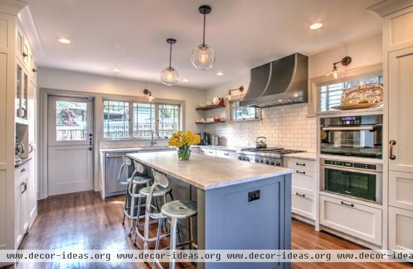
AFTER: Scott removed the walls defining the hall and the eating area, creating an extra 104 square feet and making way for countertops and lower cabinets that stretch down and around the room. With the walls out of the way, light can enter the space from a new bank of windows.
The previous island, a freestanding counter-height table, didn’t provide much storage. A new built-in island contains a wealth of drawers and cabinets and is a comfortable place for casual meals.
The sink has a new home under the row of windows, and the cooktop, once relegated to a space across the room with no vent or surrounding countertop, has been brought into a convenient space between the refrigerator and the sink. Perhaps the members of the original Tudor dynasty wouldn’t have known what to make of a modern range hood, but the vaguely medieval shape of this one might have pleased them.
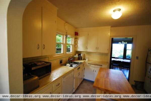
The original tile countertops were difficult to work on and clean; the upper cabinets were shallow, making it hard to store platters and large plates; the dining room was accessed by a small doorway; and a single overhead light shone down from a popcorn ceiling.
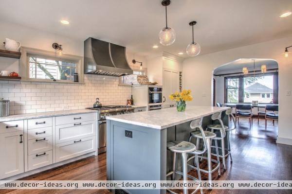
AFTER: The upper cabinets are gone, and the double windows have been replaced by two mullioned clerestory models. The new cabinetry includes a steam convection oven, a microwave drawer and a refrigerator fronted by paneling that matches the cabinets. The entryway to the dining room has been enlarged and, mirroring other passages in the house, topped with an arch.
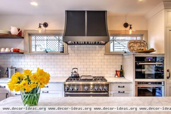
Can lights, wall sconces and pendant lights now illuminate the once-dim workspaces.
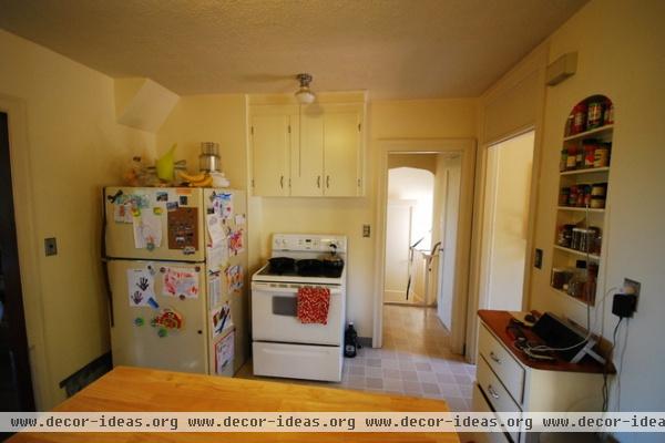
Anyone who has had the displeasure of cooking on a range with no place to lay a dripping spoon knows the definition of “dysfunctional style.” The fact that the owners had to cross the room to reach the sink, navigating the island along the way, didn’t make the experience any more enjoyable.
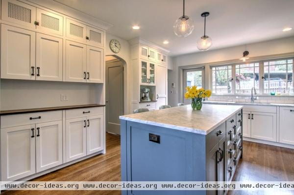
AFTER: Now this space has a storage wall that houses food and small appliances. The countertop is meant to hold cookbooks and serve as a place to perch a laptop. “We gave it a walnut top for warmth,” Scott says.
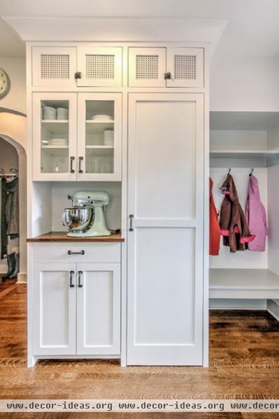
The cabinets on the other side of the doorway provide overflow storage and screen a small mud-area niche.
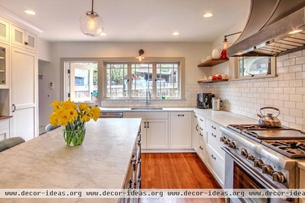
“The family wanted to have a space that felt timeless and functioned in a modern way,” says Scott. Consider it a contemporary, American take on Tudor style.
More: Does Your House Have Medieval Roots?
Related Articles Recommended


