The Key to Designer-Look Window Treatments
http://decor-ideas.org 05/02/2014 23:24 Decor Ideas
When I look at a window treatment and know in my gut that it’s wrong, it’s almost always an issue of proportion.
Proportion is simply about relationships; in this case how each component of a window treatment relates to the other components, to the other windows and to the room. Here are some tips to make sure your proportions are always appropriate.

Fullness. Even the simplest treatment needs the correct proportions. Panels like these would go from lovely to skimpy if their fullness were not right.
Most fabrics come in 54-inch widths. Once that fabric is hemmed and shirred or pleated, you end up with about 18 inches of width, which is just not enough fullness for any but the smallest window. Penny-pinching DIYers like myself would love to make one width of fabric work, but at least one and a half widths are necessary for the proportions to be right.
I know, I know, that means more sewing. But I am reminded of my dad, who always said, “If a thing is worth doing, it is worth doing well.” In other words, “Better no window treatment at all than a skimpy one.”
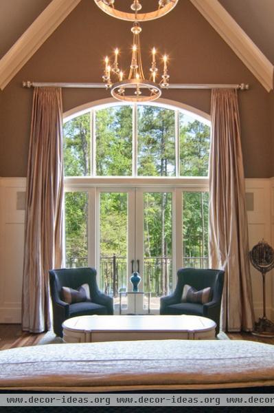
Length. And then there is panel length. If you want to see me instantly transmogrify from nice, polite, graceful Becky to a belligerent, raging maniac, put me in front of a window treatment where the panels are too short. Can you say, “High-water pants”?
Unless you are trying to show off a really trim little ankle, your pants will just graze your shoes, and the same is true of panels, which should just graze the floor. Stationary panels can be much longer, falling into a puddle. But remember, too much puddle can throw the treatment out of proportion.
Speaking of high-water pants, whatever you do, do not wash your curtains! Only the cheapest of ready-mades can be washed, and they won’t look good afterward. Most decorator fabrics are dry clean only, and even then you must be very careful, as the linings might disintegrate from sun exposure. Unless your home is inhabited by smokers, there is really no reason to clean your drapes. Frequent, careful vacuuming is all they need, unless you have pets or children that are allowed to gambol around them, in which case drapes are probably not a great idea.
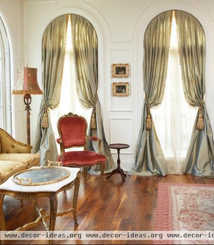
Tiebacks. Getting tieback placement right is also a matter of proportion, as is the size of the tieback itself. An oft-repeated rule is that the tieback should not be placed in the middle of the panel, because it cuts the panel in half. Rather, the tieback should be placed at either the one-third or two-third point on the panel (somewhat above or below center). But look at this stunning treatment with its tiebacks just about at the midpoint. You guessed it: The rules do not guarantee that proportion will be right; they are simply guidelines.

Marrying two elements. When you add a shade or a valance to panels, the relationship between those elements is also a matter of proportion. It would be so nice if there were a hard and fast rule, but there is not. The size of the window and where the panels are hung (at the ceiling, slightly above the window frame or inside the window) affect the length of the accompanying shade.
You also have to consider how much light you are willing to lose. Many fabricators consider the ideal proportion for a valance in a room with an 8-foot ceiling to be one-fifth the length of the panel. If the ceiling is low, the valance should be made to a measurement of one-sixth, while a taller ceiling will require a longer shade or valance. If the valance will be mounted at the ceiling, it will need to be longer still.
There you have it. This proportion thing can be complicated, tricky, even subjective. (Are you sweating yet?)

Long point, short point. There is also the issue of long points and short points. (Take a deep breath and stay with me.) Since many valances hang in a shape rather than straight across, you have both a short point and a long point to consider. It is of course basic that your short point should cover the header (pleats or shirring) of the drapery, the hardware and the frame of the window. Then I usually add about 6 inches for the long point. Of course (lest we make it too easy), the longer the valance is, the more variation you will need between your long and short points.
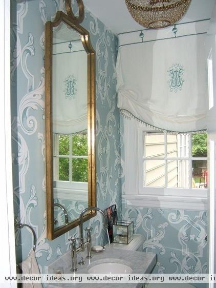
Your long and short points will also reflect your need for privacy and your need for light. My rule of thumb is this: If you are going to err, err on the side of too much length and too much variation between points, rather than too short and too little. Skimpiness in proportion is practically an unforgivable sin.
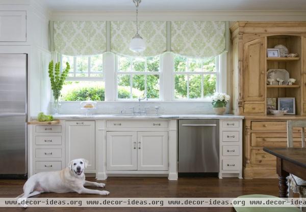
Here’s an idea that might help you. Build a temporary shade or valance out of butcher paper and tape or pin it onto your window. Keep adjusting its length — adding more or less — until the proportion is pleasing to you.
Keep in mind that most of us tend to go too short rather than too long, so if there is any doubt, go longer. You will also get a good read on how the valance or shade will affect your light. (Just a word of advice: Don’t ask the UPS man what he thinks; he will invariably be wrong.)

If you are pairing swags (loops of fabric at the top) with jabots (the cascading side pieces), you will also deal with proportion: the length and fullness of the jabot, and its relationship to the swag.
The length and width of your window will bear heavily on this decision, but I like to think in terms of the jabot’s being two-thirds the length of the window, and the swag being one-third to one-half the length of the jabot. Think lush.
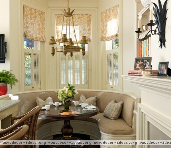
The weight and opacity of your chosen fabrics also have to be considered. Generally speaking, the sheerer the fabric, the more of the window you can cover.

Rod dimension. The size of of your rod and rings — if that is your hardware of choice — is yet another factor. The narrower or smaller your window, the thinner the rod can be. Larger and wider windows will require heftier rods.

Mounting. Proportion is affected by where your window treatment is mounted. Generally speaking, the longer your panel, the fuller it will need to be, so mounting your panel or valance at the ceiling will require more fullness than if you mount it inside the window or just above the frame.
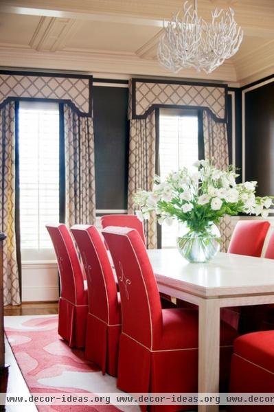
Return. Finally, you must decide how much return you will need. Return is the distance your drapery hangs away from the wall. Yup, this also affects the proportion. The standard return is 3½ inches. But larger or taller windows may require a deeper return to avoid looking squashed against the wall. Obviously, if you are adding a valance to panels, your valance return will need to be deep enough to adequately clear the panels.
So how can you make sure you get it right? If you are coughing up the money for custom treatments, expect your designer or workroom to present you with a scaled drawing of your treatment before fabric is ordered or fabrication has begun. Do not give the go-ahead until you have seen a rendering of the finished product and are happy with how it looks.
If you are buying ready made, be prepared for their proportions to be wrong. You may need to purchase two sets to make one good treatment.
If you are making your own curtains, work with butcher paper as I suggested, but also invest in some scaled paper and draw your windows and your treatment to scale. Remember, it’s always better to go too long, too lush or too full than to have window treatments that are skimpy and pinched.
More: Curtain Speech
Related Articles Recommended


