Kitchen of the Week: Keeping It Casual in a Modern Farmhouse
http://decor-ideas.org 05/02/2014 19:23 Decor Ideas
“My clients wanted things to be unfussy and casual, with touches of whimsy,” says interior designer Kress Jack of her approach to a San Francisco family’s second home in Santa Rosa, California. The home is in horse country and surrounded by vineyards, and Jack was inspired by the bucolic farm vibe. She started with a crisp white base, opened up the ceilings for a lofty barn feeling and mixed in primitive elements, creating an inviting space that suits the family’s relaxed lifestyle when they’re here.
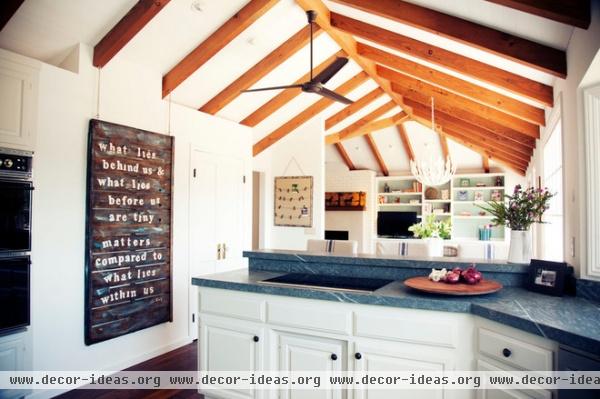
The first floor had oppressively low ceilings, shag carpeting, outdated tiles and closed-in rooms. The homeowners love to entertain extended family and friends and needed a more open plan. Blowing out the wall between the living room and the kitchen was one of the most important moves Jack made. “Now it’s very functional, open and spacious,” she says.
She also removed the low ceilings, going right up to the roofline. “We wanted to push things to be more modern but also keep the original rustic touches,” she says. New wood ceiling beams add warmth and a rustic barn-like feel, while all of the crisp white keeps things light and modern.
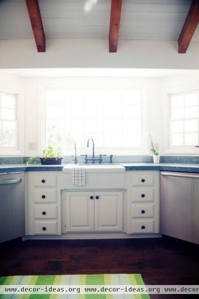
Jack was able to save the existing cabinets with a fresh coat of paint. The cabinets are sporting new hardware in oil-rubbed bronze. “They are hand forged and not perfect, which shows they have a hand to them and makes them feel older,” she describes.
While the new space has lots of clean, modern lines, overall it is not a hard space. For example, the countertops are Pietra Grigio marble. “The gray stone with its beautiful white veins really softens things up,” says Jack. She picked up their gray-blue tones by using other shades of blue throughout the first floor.
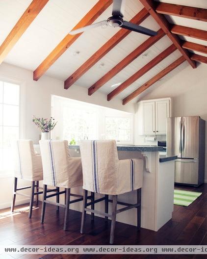
Like the beams, new hand-scraped walnut floors add to the warm, rustic barn feeling.
Space for gathering was of great importance to the family; comfortable bar stools add additional seating allow the cook to have some company. French-ticking slipcovers add touches of blue.
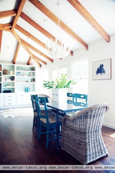
In the adjacent dining area, a chandelier and mix of chairs bring the whimsy. “The chandelier looks kind of of like upside-down sea kelp painted white,” Jack says. She added practical seating for the children and comfy curved wicker chairs for the adults.
Jack also infused the space with subtle European touches, like the blue chairs, which hint at Scandinavian style. She connected the living, dining and kitchen spaces with touches of blue, including painting the back of the living room shelves blue. “I never want to go with just one theme,” she says. “I wanted the eclectic mix to look well traveled and sophisticated.”
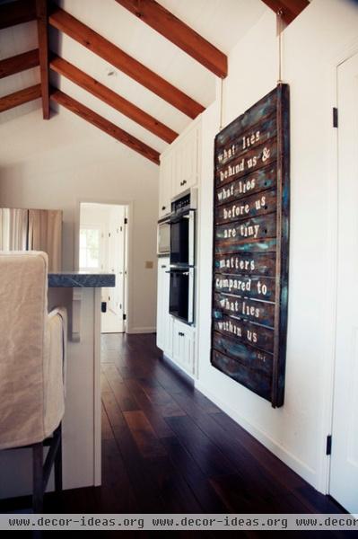
Artwork adds another extraordinary touch that mixes rustic and modern. Hand painting on reclaimed planks brings the rustic; contrasting white text brings the modern. “Scale is important,” Jack says. The piece stands up to the size of the range and refrigerator. The new kitchen is inviting, functional and flows into the rest of the new open plan.
See more Houzz Kitchens of the Week
Related Articles Recommended


