Design Workshop: Additions With Attitude
The very act of adding on to an existing structure prompts the design professional and homeowner to have opinions — about the neighborhood, the design, preferences, priorities and budget. It also passes judgment on the structure’s history, because it can be deferential to the existing architectural style or radically contrast with it.
I generally think of additions as falling into one of three categories: completely separate extensions, which include pavilions; outward or horizontal extensions; and upward or vertical extensions. There are, of course, other unique strategies, but by and large the most common additions are separate, out and up.
Additions are complex by nature, and there’s no single approach that lends itself to a better outcome than another. Designers of the most successful additions look to understand the nature of an existing structure and use that as design inspiration.
Separate Extensions
We’ll begin with the most genuinely modernist approach — the distinct pavilion. The physical separation of a pavilion outwardly implies a disconnect from the past and a break from its rules and conventions. It also frees the shape of the building to exist as an object on its own, because there are no rooflines to connect or meet, or door styles or trim to match.
In some parts of the world, this strategy is actually a requirement when adding to historical structures. Clearly delineating the age of each addition — creating architecture of its time — reminds me of something Frank Gehry once said: “Architecture should speak of its time and place, but yearn for timelessness.” I think Gehry would approve of the addition seen here.
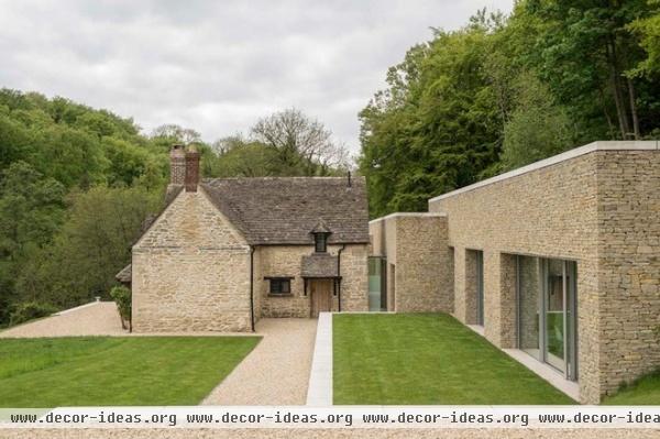
Separation in this project, in England’s Cotswolds, was done with a sensitive hand, one that respected the existing 18th-century stone cottage, seen to the left, while establishing a new order in the modernized living quarters to the right.
Borrowing from the existing stone exterior, the addition is a partner in the composition. Adopting an existing material palette is a common means of assimilating an addition, even one as modern as this. Similar effects can be achieved tonally by matching color as well.
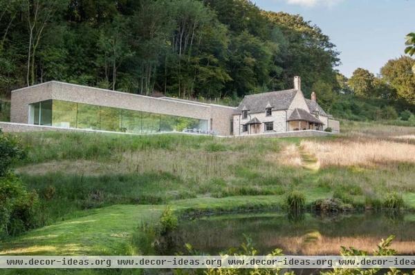
By digging the extension into the existing landform and using a similar stone on the exterior, the architect has created a backdrop for the historic structure to be viewed against. The glass wall reflects the site and the cottage, and it reduces the apparent weight of the addition.
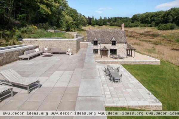
While the extension has a larger footprint than the cottage, it is deferential. It mimics an archaeological find — an old foundation. I appreciate the narrative, which mixes old and new and blurs the two.
The flat-roof terrace is a brilliant architectural move that minimizes the impact of the addition while clearly distinguishing it as a modern backdrop. In this view from the roof terrace, one can clearly sense these priorities at work. The cottage, despite its scale, is a dominant force in the composition, because its distinctive roof, porches and dormers contrast the monolithic addition.
See more of this house
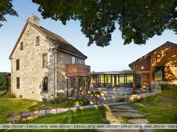
Here we see another pavilion-like addition. The architect of this project took even greater steps to differentiate it from the existing stone structure than in the previous one.
The use of a connecting link in separate extensions is quite common. Links can be long or short, solid or quite open, as seen here. Here the glazed hallway connects old and new. Using an addition pavilion is particularly effective in situations where the preservation of existing structures is important.
It’s difficult to add on to an existing stone farmhouse without disturbing the structural integrity of the exterior walls or changing the building’s proportions. The link allows a functional interior connection but ensures that it is delicate and doesn’t interfere with the integrity of the existing building.
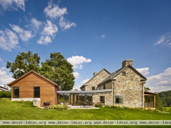
From another view, the new addition on the left shares a proportional relationship with the original stone structures as well as the roof slope, but it’s not trying to imitate or re-create it. The architect has rendered it less important in the composition because is has less detail and larger, less refined openings.
The exterior material palette of the addition is humble compared with the striking stone facades. However, it is connected — the color references the browns of the stone and the window frames.
The synergy of contrasts is perhaps one of the most appealing reasons to consider a separate extension. When different styles are next to each other, we can better appreciate the similarities and differences between old and new.
Outward Extensions
When land is available and setbacks aren’t an issue, a horizontal addition is often the first and most obvious choice. Horizontal additions often take their cues from the existing architecture. This usually makes decisions regarding rooflines, proportions and materials fairly straightforward. But merely duplicating the existing building shouldn’t be the goal. After all, we’re seeking an architecture that’s of its time, right?
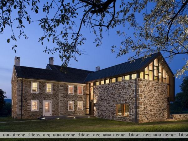
This addition to an 18th-century farmhouse is clad in stone and copper. This elevation hints at what lies inside; the stone base has been treated as a thin wrapper on the addition that has been peeled back for the new entry. The clerestory windows enhance this effect by disrupting the connection of the stone base to the roof, which in the original stone house is a load-bearing wall. The addition is undeniably rooted in the present. It uses interior steel columns to support the roof and leaves the exterior wall to float, expressing both solid and void as appropriate.
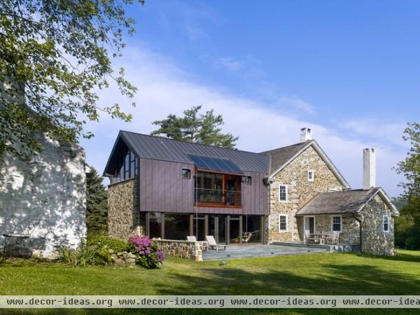
On the opposite side, the roof wraps down onto the wall plane (again a thin wrapper).
Stretching outward, the proportion reads as a barn, housing the new master suite and living room, but the architects have pushed the definition of what a barn can look like. They’ve indicated the historical reference to a barn in the cutout deck by imitating a barn’s forebay on the second floor, but these are subtle devices. Proportion is the key player in this addition.
Lateral additions have the benefit of providing a new perspective on the site; reorienting and opening up the living spaces to views and light is often the primary goal of this type of addition. It’s important to also consider the exterior spaces this type of addition creates. Consider using the architecture to shield winds, gather sunlight and reinforce interior-exterior connections. Barns have always been positioned to do this on farmsteads.
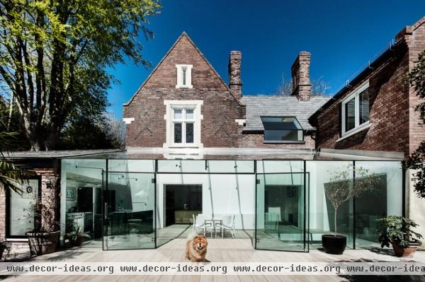
This project is all about contrast — between light and dark and old and new. Formerly housing servants on a large estate, this masonry structure harbored an extremely dark interior. The conversion is marked by a thin glass shell that encloses a new living space.
The traditional facade conceals a minimalist interior. Shared rooflines between old and new on the rear facade are where the similarities end. This is a good example of an addition positioned to continue an existing structure’s exterior gestures or shapes while still being of its time. The glazed roof and wall continue the gesture of the old roof and wall to the left, claiming the new space as an interior-exterior solarium and living space. The addition almost appears to complete the thought of the original structure.
Upward Extensions
Homeowners in urban areas, which often have space constraints, are usually forced to embrace the vertical addition. Assuming a relatively simple structural system, the vertical addition makes excellent economic sense, as it makes use of existing systems to gain space without additional foundation and infrastructure costs.
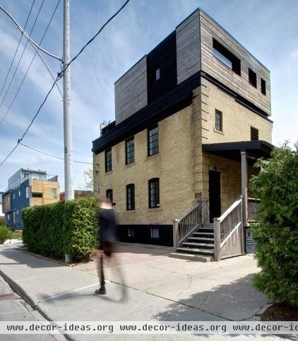
This project is a third-story addition and renovation on an urban lot in Toronto. The addition borrows from the horizontal coursing of the original masonry building below, but the wood cladding lends a lightness to it. The window proportions were borrowed and reoriented, and a wonderful pattern has emerged between solid and void on the facades. Alternating between black and buff, the patterning breaks up the mass while relating the two volumes.
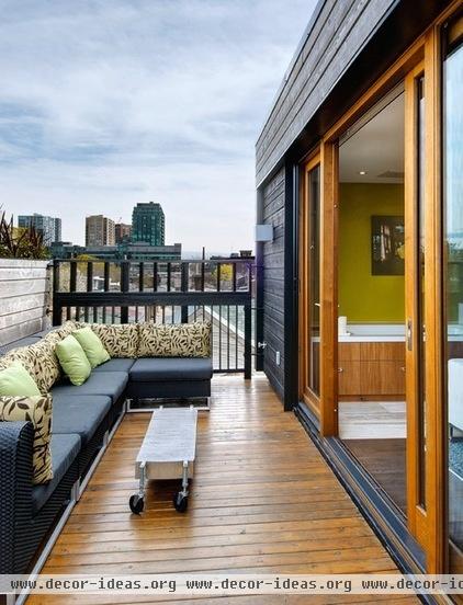
By offsetting the walls of the upper level back from the building perimeter, the architect has co-opted the exterior space for the interior. Urban sites often have neighboring structures that make the introduction of natural light difficult, if not impossible. Vertical additions often allow the introduction of light and air into a structure’s interior. At a basic level, one of the most common vertical additions, the dormer (shed or doghouse) seeks to increase headroom, usable floor area and, of course, light.
The other key advantage of vertical additions is an increased access to views. If you’re near the water, an upwards addition may more than pay for itself in a higher home value.
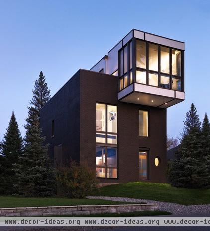
Competing design priorities led to an ingenious solution in this upward extension. The interior of the original Victorian structure was heavily partitioned and dark. The client requested that the architect create a space that was loft-like in feel but retained much of the privacy and separation of the original structure.
The solution was to vertically reorient the home. Opening the first floor and basement via a stair and gutting the remaining interior left a soaring interior (loft-like) space. To meet the client’s objectives, the architect cleverly subdivided the vertical space by suspending floor zones within the newly created open space. These retain the visual separation and privacy from the other spaces but create the open loft-like feel requested by the client.
Enhanced views, more light, openness, connection, privacy and an updated interior — what’s not to like? The vertical addition can be truly transformative when everything is in play.
More: Adding On: 10 Ways to Expand Your House Out and Up


