Houzz Tour: A Colorful Victorian Gets a Through Line
http://decor-ideas.org 05/01/2014 02:42 Decor Ideas
Victorian architects didn’t build open-plan great rooms. Instead, they enclosed spaces and added hallways. In this Victorian, in San Francisco’s Noe Valley neighborhood, interior designer Susan Diana Harris still managed to link the rooms; using color, repetition and a really long rug, she fluidly created a through line that ebbs and flows through the house.
The homeowner is a sailor, and though the house sits in the middle of San Francisco, Harris redesigned the space to reflect where he feels most at home — on the water. Without resorting to nautical clichés, she created a space that subtly references the spirit of the ocean.
Photography by Scott Hargis Photo
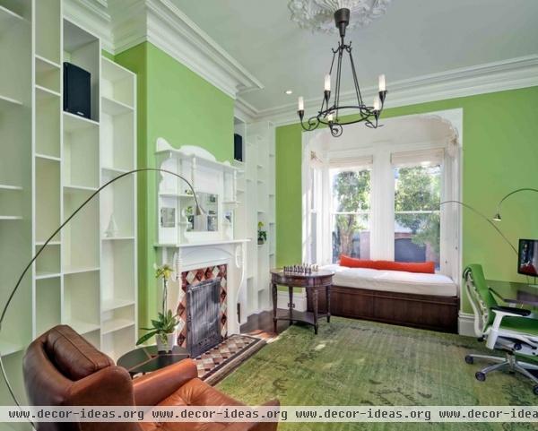
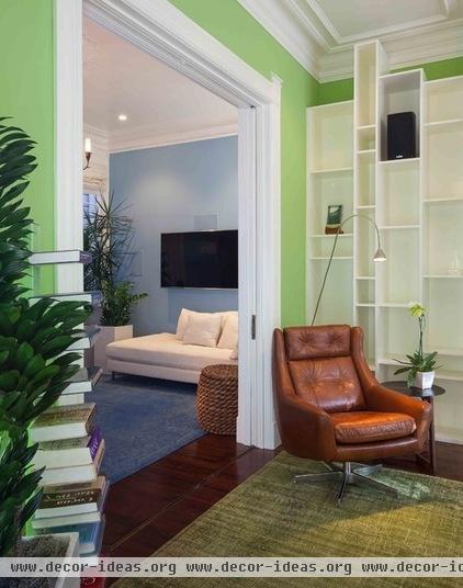
Harris, of Susan Diana Harris Interior Design, relocated the home office to the front room, the brightest and largest in the house. The homeowner often works long hours and late nights. Morning light pours through this front window, in case any of those late nights turn into early mornings.
The client wanted to retain the contrast of the traditional crown molding and trim, so Harris painted it soft cream. As a contrast to the traditional detailing, she added a contemporary wall unit. The top shelves intentionally break the line of the crown molding in places, introducing the two architectural time periods to each other.
The light trim punctuates the room’s green expanse, while other details recede. (Though not visible in these photos, Harris even powder coated the desk legs to match the walls.) Rope, leather and other nautical details appear throughout, as in a rope stool in the adjacent room.
Wall paint: Stem Green, Benjamin Moore; trim and ceiling paint: Bavarian Cream, Benjamin Moore; Turkish Oushak overdyed rug: The Rug Finder; wall unit, window seat: custom, built by Matt Siddens of Capstone Cabinets
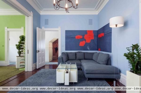
A wash of blue overtakes you as you move from the green office to the adjacent family room. When rooms are combined in an open and stacked layout like this, the bold colors emphasize depth, Harris says. She and her client browsed through many books of color swatches to develop the palette. It was important to see which colors caused him to react, and how, she says.
A zoomed-in photograph of a ship’s hull on the San Francisco Bay by Klaus Lange adds a contemporary nautical detail. The custom coffee table echoes the design of the bookcase next door.
The hallway in the background runs the length of the house, starting at the front door and ending in the dining room. A custom rug runner — 52 feet long — spans the entire length and is visible from every room, connecting them and creating “a continuous anchor to run through the home,” says Harris. Here the rug also creates a sense of mystery as to where the hallway leads.
A small niche painted a dark brown picks up the hues of the original wood floors.
Wall paint: Tahoe Blue, Behr; trim, ceiling and coffee table paint: Bavarian Cream, Benjamin Moore; Hayes Two-Piece Sectional: Room & Board
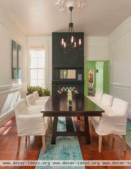
Here we see where the runner ends in the dining room. A second rug takes over, running parallel to the first and into the adjacent kitchen.
For this second original fireplace in the house, Harris painted the mantel and wall a matte charcoal. She says you can go both ways with trim painting: matching the trim to the wall color adds subtle texture to the room, blending surfaces together, while the unified color accentuates the room’s height. Alternatively, traditional contrasting trim creates more movement and visual breaks.
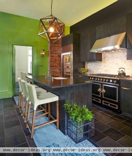
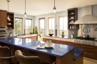
The second rug continues through the kitchen. Harris improved upon updates that had already been made to the kitchen. “We used what was good,” she says. The La Cornue range, which the client loved, came with the house. The backsplash had been hexagonal marble tiles, which they swapped out for subway tiles of the same material.
The countertops, sink and faucet are from earlier updates. The client had expressed interest in dark cabinets, so they matched the smoke stain of the maple veneer to the existing countertops. For the lower cabinets and drawers, Harris added brass hardware as a nod to the hardware of the range. She repeated these metal finishes in other details throughout the house. The upper cabinets were left bare, but a simple tab on the small cabinet above the hood makes it easy to open.
The kitchen’s details break from the rest of the house: There’s no crown molding, and the walls are finished differently, making Harris think it had been added on at some point. The homeowner was more experimental in this room, maybe due to the lack of Victorian detail. The original brick chimney, however, ties the kitchen in with the rest of the house and gives it some history and visual height.
Wall paint: Fresh Grass, Benjamin Moore; ceiling paint: Pale Vista, Benjamin Moore; Steel Polyhedron Pendant: Restoration Hardware
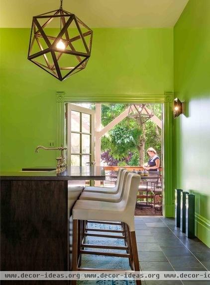
The client was open to color throughout the project, but the bright green walls and trim in the kitchen took some convincing. Harris says they looked at more swatches and painted a lot of samples on the wall, but that ultimately it took a trip to Ireland for the client to realize he wanted a green kitchen. He sent Harris a photo of a green inn he saw there, and that’s the color they painted the walls.
The kitchen opens up to a deck and a lush, green backyard. Harris wanted to bring the view into the kitchen as much as possible. Painting the trim the same green color as the walls brought the backyard into focus in the kitchen. The paint picks up colors in the foliage, and the garden advances inside.
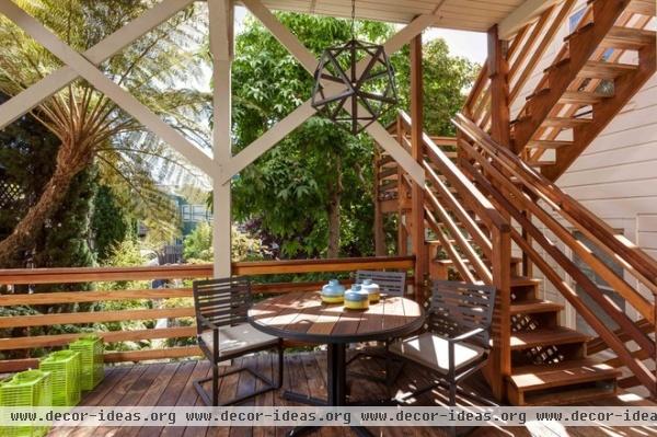
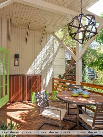
The deck’s chandelier matches the one in the kitchen, creating a visual connection between the two spaces. Harris painted the French door the same green as the kitchen walls, reducing color distractions. From outside you also get a hint of the color inside.
Harris enjoys the color story line and rhythm of this house — there’s always something around the corner to immerse yourself in. It reminds her of Mount Vernon, George Washington’s home, where color is responsible for “the steady, welcoming nature of each next bold room,” she says.
Steel Polyhedron Pendant: Restoration Hardware; dining table: Montego, Room & Board
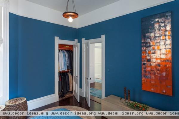
The bedroom sits at the back of the house, off the dining room. Harris painted all the closets in the house a bright orange, contrasted here by the dark blue walls. A colorful painting by Beth Bloom Designs ties both colors together.
Wall paint: Van Deusen Blue, Benjamin Moore
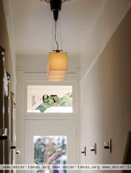
The front door has its original trim. Though it didn’t quite fit around the transom, Harris decided to leave it as a quirky reminder of the home’s Victorian heritage. “The asymmetry is so human,” she says.
General contractor: Jason Stearns, Kunstbau+Kids
Browse more homes by style:
Small Homes | Colorful Homes | Eclectic Homes | Modern Homes | Contemporary Homes | Midcentury Homes | Ranch Homes | Traditional Homes | Barn Homes | Townhouses |Apartments | Lofts | Vacation Homes
Related Articles Recommended

