Room of the Day: Firing Up a California Dining Room
http://decor-ideas.org 04/30/2014 22:22 Decor Ideas
The owners of this home went from residing in an apartment on the edge of Manhattan’s Central Park to a house in Hillsborough, California, in a park-like setting. “It was a big change for them,” says Christy Allen, the designer of their Golden State residence. “In New York their apartment had a more conservative style done in blue and beige. They wanted to try something different with more color.”
Photography by Michele Lee Willson

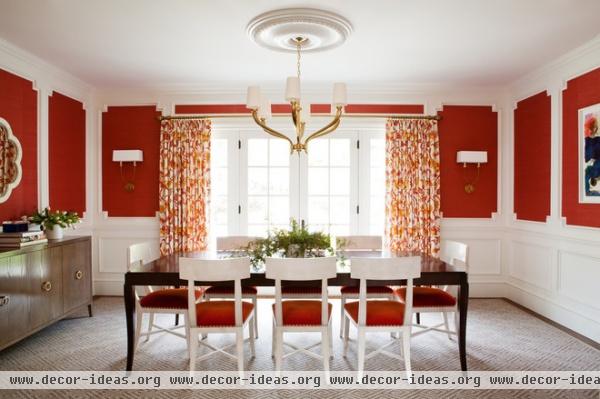
Allen set the stage for the family’s fresh start with vibrant pomegranate-colored walls, curtains done in shades of fire and an eclectic grouping of furniture with traditional lines and a modern attitude.
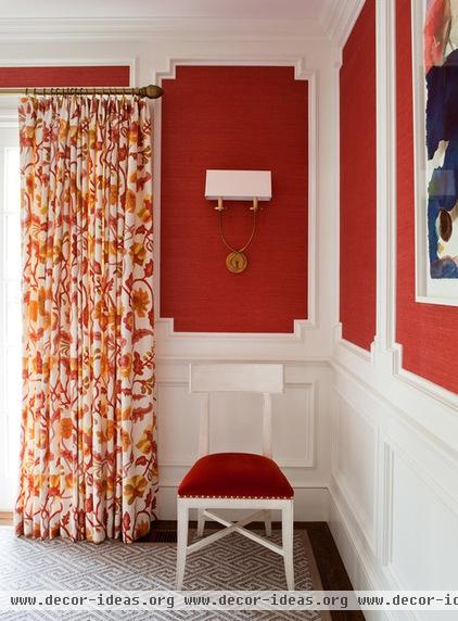
The classical-style molding was already there, but the new wall covering strips it of its formality by adding depth and texture. “It’s woven, so there are lighter and darker colors in it,” Allen says. “It’s much more interesting than just paint.”
The dark dining room table is surrounded by white Klismos chairs. The unorthodox pairing of traditional shapes in contrasting colors gives the whole look a contemporary flavor. “I thought it was fresh, less serious but still elegant,” says the designer. “It’s what the client was looking for.”
Wall covering: Phillip Jeffries; chairs: Diana Side Chair, Oly; light fixtures: Circa Lighting

“The impetus for the whole scheme was the curtain fabric,” Allen says. “I loved the pops of color and the organic lines.” They are matched by orange velvet chair seats accented with brass nailhead trim. “The trim makes it,” says Allen.
Curtain fabric: Potalla, Alan Campbell, Quadrille; chair upholstery: Donghia; art: Eva Lundsager

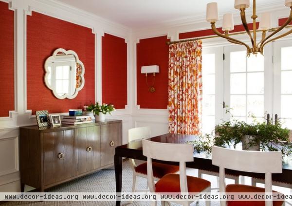
A console, another interesting piece that breaks the matching-set mold, holds linens and servingware. It’s topped by a mirror that bounces light around the room. Although the mirror is a new piece, its bone-white finish gives it the feeling of a vintage item.
Mirror: Plantation

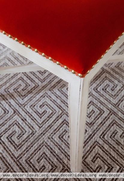
From a distance the carpet appears to be a light color, but a close look shows it’s a more forgiving mix of white, beige and brown. A close look at the chairs also reveals a more nuanced look with a slightly rubbed finish. “It made the mix seem right,” says Allen.
Working with bold color is fun for most designers, but for Allen the icing on the cake was the clients’ attitude. “They went outside of their boundaries,” she says. “It was so fun to see people just go for it.”
Previous Room of the Day
Related Articles Recommended


