Trend Spotting in Milan
Milan, Italy, is always a great place to be for great design. April is a particularly hot month, though. The city hosts one of the biggest design events in the world then: Salone Internazionale del Mobile (International Furnishing Accessories Exhibition), as well as a citywide celebration called Fuorisalone, which translates to “outside the expo.” Most people just call this time Design Week.
It’s a time when new products debut, when the latest materials, furnishings and accessories get paraded around for all to see. In the neighborhood called Brera, home to the Brera Academy of Fine Arts and known to many as Milan’s Design District, there’s a fantastic kickoff to the new season in interior and industrial design. I had one day in Milan, so I decided to skip the vast sea of stands at the official expo grounds and head straight for Brera.
Most of the shops in this area show off the best Italian home furniture and accessories year-round, but Design Week had quite a few bonuses. Now that the mayhem has past and I’ve had a couple of weeks to process all the great things I saw, I’m ready to share some of my favorites with you.
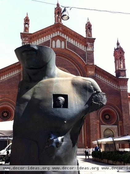
While the event started as a trade fair in 1961 for home furnishings and industrial design, in more recent years it has spread outside the boundaries of the Milan Rho fairgrounds to include microevents throughout the entire city.
One could dedicate the entire week to scouring the official expo and the city of Milan and still not come anywhere close to seeing all that the city has to offer during Design Week. Aside from the temporary installations covering almost every corner of the Centro Storico (the historical city center), there is also Zona Tortona, a neighborhood known for its young, student vibe, as well as Ventura Lambrate, a relatively new hub of Fuorisalone events that was quite popular this year.
Several shops in Brera (the Design District) are known for showing off the best of the best in home furniture and accessories on a year-round basis. Design Week is their opportunity to debut new products and get people talking.
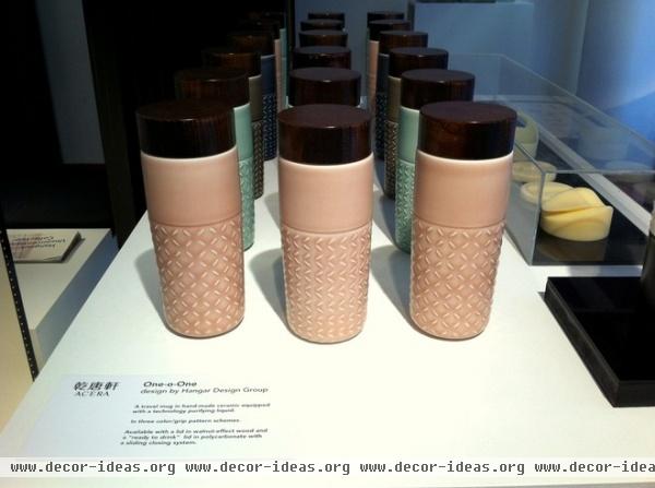
One of the first designs that caught my eye was this ceramic and wood travel mug, designed by the Italy-based Hangar Design Group for Acera, a Taiwanese ceramics company.
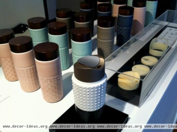
The One-o-One mug is named after Taipei 101, the tallest LEED-certified building in the world (certified Platinum, the highest level). For many years it was also the tallest building in the world, representing the evolution of Asian technology and tradition hand in hand.
It seems only fitting that this modern take on the traditional Chinese tea mug does the same, bridging a gap between traditional Asian craft and a newer demand for travel accessories. Acera calls it an “item for a new global lifestyle.”
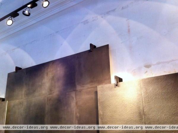
Another company with a showroom that is open year-round is Brix, which makes architectural surfaces.
The ceramic industry here in Italy is a very competitive one, with many options. However, I keep coming back to the subtle textures of the Brix samples as favorites.
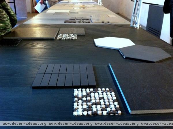
The photograph here shows a portion of the examples from the company’s Progetto Totale (Total Project) system, which groups various surface options to help designers or homeowners maintain a consistent color and material palette.
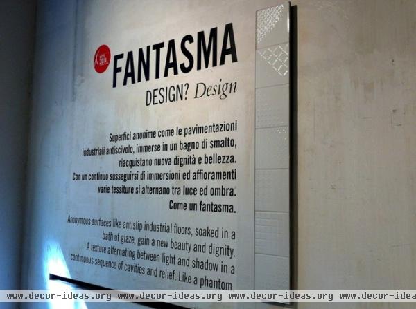
The subtle texture changes in Brix tiles makes them difficult to photograph but tempting to touch. This Fantasma series is beautiful as well, with the pattern gradually fading on a diagonal.
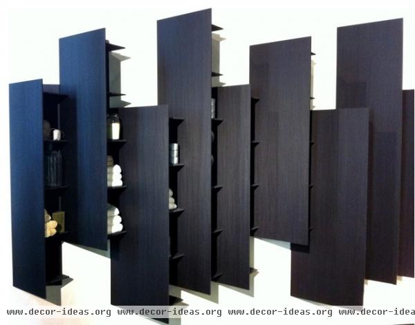
Moving on to one of the bigger showrooms, Boffi Solferino’s array of kitchen, bathroom and wardrobe furniture was quite impressive.
These diagonal shelving units, designed by Victor Vasilev, allow for open storage that reveals its contents only to one end of the room, minimizing the visual impact from the other end. The product is called CTline and is available in white solid surface as well. The fact that it is modular allows you to cover any length of wall, including corridors.
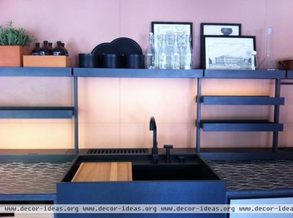
Continuing with the theme of open shelving, this Boffi kitchen is shown with the Brompton shelving system, designed by Piero Lissoni. The vertical aluminum supports can accommodate shelves and drawers of two different depths (35 or 55 centimeters), making it flexible for use in several different rooms.
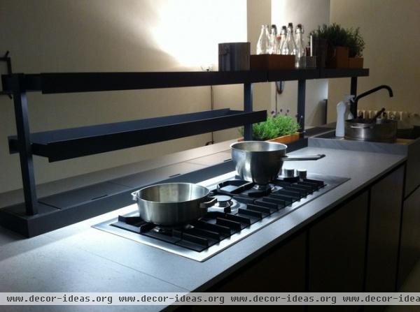
The aluminum uprights can also act as conductors for low-voltage LED strips, eliminating any visible cables and providing a really beautiful recessed lighting source under each shelf.
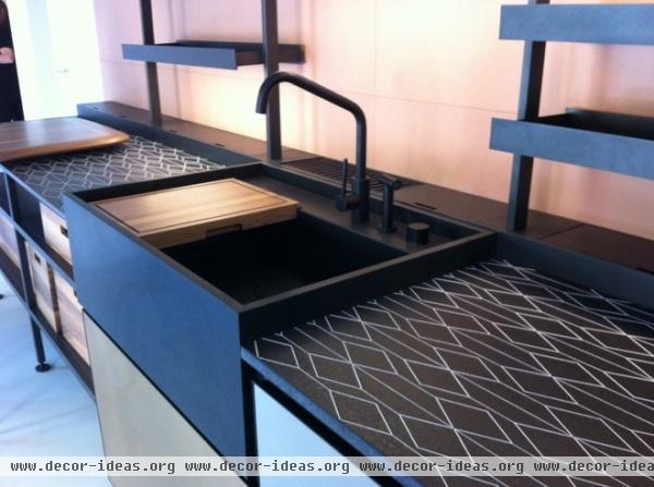
This Boffi kitchen is shown with the Brompton shelving above a patterned countertop and a huge farmhouse-style sink that has an inlaid wooden cutting board.
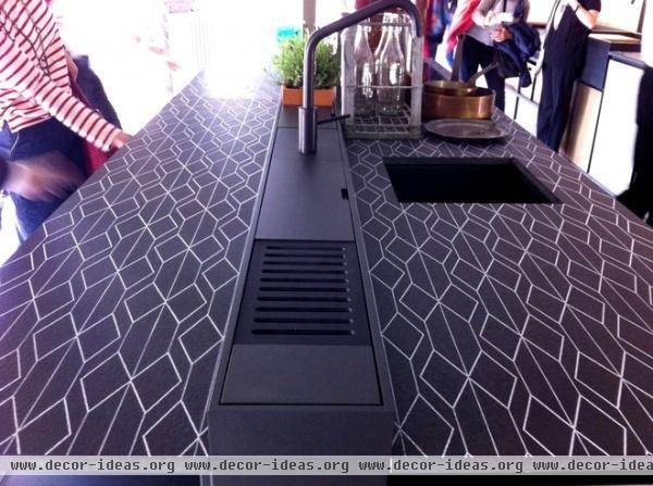
It’s interesting that the countertop itself is patterned — perhaps an extension of popular patterned tiles at last year’s CERSAIE expo.
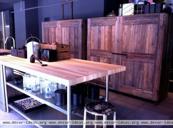
One of the most popular displays in the Boffi showroom was this rustic-looking cupboard set, clad in weathered wood and closed with a metal latch. I actually overheard several Italian women exclaiming how much they loved it because it reminded them of their nonna’s (grandmother’s) pantry, where all good things come from in Italy!
When the unit is open, however, it is anything but rustic, with integrated lighting and modern, black organizational shelving.
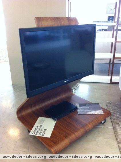
Just up the road, a local retailer was showing off some Horm Italy products. Horm is another company that consistently creates beautiful work. This Cobra TV stand was designed by Mario Bellini.
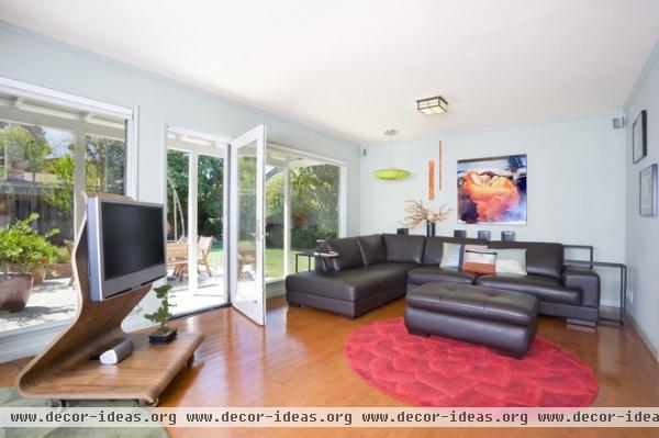
Made of curved plywood and polished by hand, the TV stand discreetly hides cables beneath its structure and even has lighting that emits from underneath to set the mood for movie night.
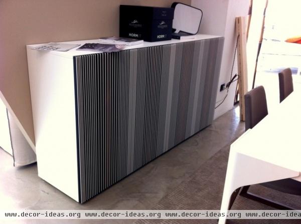
The retailer also had a new product on display: this cabinet, named Carlos, after the Venezuelan optical artist Carlos Cruz-Diez. The pattern of vertical lines jutting out of the wooden pane references Cruz-Diez’s works and invites you to run your fingers along the front to find the opening.
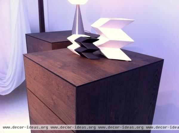
One of the last stops I was able to make was to the temporary installation by Gruppo Santarossa, a series of workshops and showrooms called “Essentially Wood,” paying tribute to a classic material being used in contemporary ways.
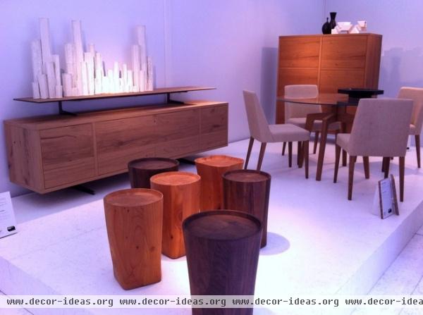
Inspired by the Italian rationalist movement of the 1920s and ’30s, these pieces (part of the “Ratio30” series) give a new twist to a classic look. For example, the credenza (at left) has a shelf floating above it that is actually glass with a wooden texture over it.
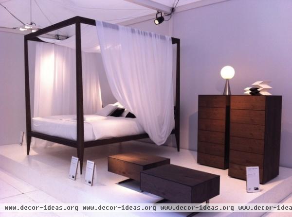
Many of the pieces in this series have simplified forms with warm wooden textures.
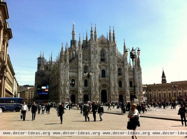
As always, Milan delivers when it comes to design. This was just a small sampling from one day in the Design District. You can just imagine what the rest of the city has to offer!
See more photos from a day of trend spotting around Milan


