Kitchen of the Week: Modern Comforts in an Old-Time Home
http://decor-ideas.org 04/26/2014 01:22 Decor Ideas
Looking at the kitchen in her San Francisco clients’ Victorian home, Eliza Hart of Hart Wright Architects thought it couldn’t have been much different from when it was constructed in that era. “By today’s standards, it really wasn’t a kitchen,” she says. “There was a 4-foot-long run of cabinetry, a sink and a hot plate. There was once a range, but the woman they’d purchased it from had taken it with her.” Since her clients loved modern style and had no fear of using it in their antique home, Hart gave them a kitchen that embraced the new.
“After” photography by David Duncan Livingston
Kitchen at a Glance
Location: San Francisco
Size: 238 square feet (22 square meters)
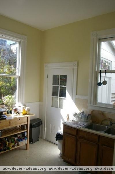
The small space originally had a single row of cabinets, with a countertop occupied mostly by the sink.
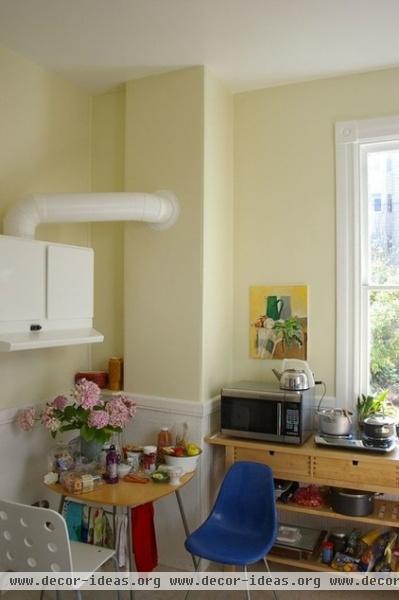
A worktable held a microwave and cooking implements. A small dining table sat under a useless ventilation hood.
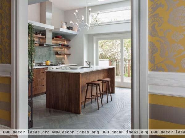
AFTER: Hart widened the entry between the dining room and the kitchen. “This is the line between the old and the new,” she says. “You can see the Victorian detailing and how it transitions into something more modern and clean lined.”
Materials such as walnut, herringbone tile (on the floor) and marble (on the countertops) have their roots in the time when the house was built, but here they were used in a very contemporary way.
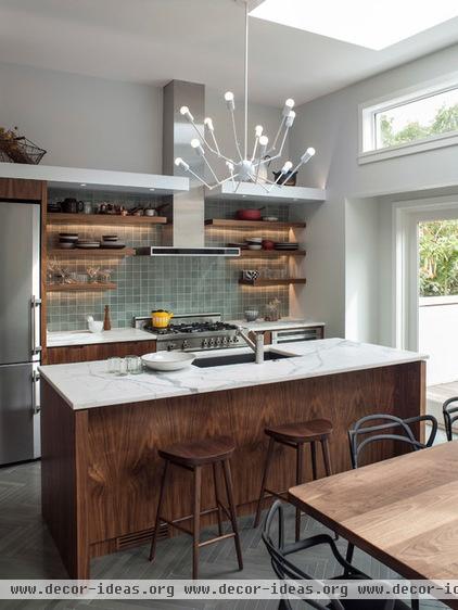
Hart outfitted the walls with open shelves, keeping the cabinets below the countertop. “They love to collect things, and they have their collections displayed throughout the house,” she says. “Here the things they use every day are just another collection and give the room character.”
A soffit has lights that point up to the ceiling and down to the countertop. The uplights bounce off the ceiling for an overall glow, while the downlights illuminate cooking tasks. “The soffit also helps define the kitchen,” says Hart. “The workspace is more intimate; the eating area is more voluminous.”
The chandelier is a large statement piece that would crowd most kitchens, but the high ceilings here give it breathing room. A new, large skylight means that it will almost never need to be turned on during the day.
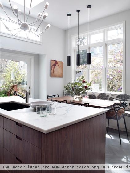
Having an eat-in kitchen was very important to this couple, as they love to entertain and prefer to have plenty of options. By adding 5 feet to the width of the room, the architect was able to make it happen, but just barely. “In order to make it fit, we had to make a window seat that doubles as a bench seat,” she says.
The new table and wider doors mean the clients finally have a connection to the backyard and a place where they can sit and enjoy it from the inside.
More:
Micro-Additions: When You Just Want a Little More Room
Other Kitchens of the Week
Related Articles Recommended


