Breezy and Bug-Free Modern Porches
http://decor-ideas.org 04/25/2014 01:24 Decor Ideas
The brutal winter of 2014 has finally given way to spring and warmer temperatures. So now it’s time to start thinking about what comes with those higher temperatures: bugs. As great as it is to be outside in the spring, summer and fall, it’s even better to have a place where one can enjoy the mild temperatures without worrying about bugs.
Enter screened-in porches. These examples how the diversity of designs as well as how they relate to the rest of their respective houses. Given that screened-in porches are ideal as additions, this latter aspect is particularly important, both architecturally and in terms of how the spaces flow from inside to screened-in exterior.
Washington State
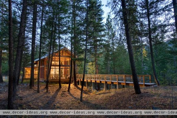
This house in Mazama, Washington, is accessed by a footbridge just visible at left. Balance Associates Architects placed indoor-outdoor spaces at either end of the house; you can see one in the foreground adjacent to a catwalk that heads into the woods.
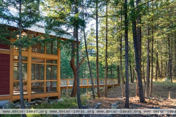
Another view shows the screened-in porch on the left and the catwalk beyond.
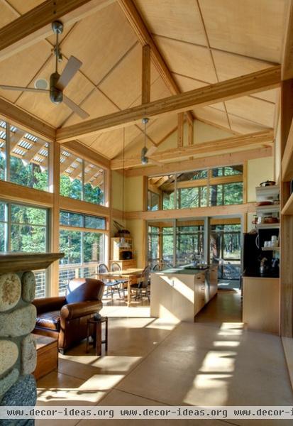
Inside, the living space is a generous height that extends to the porch. Note the translucent roofing that extends beyond the glass wall at left; this hints at what the porch has to offer.
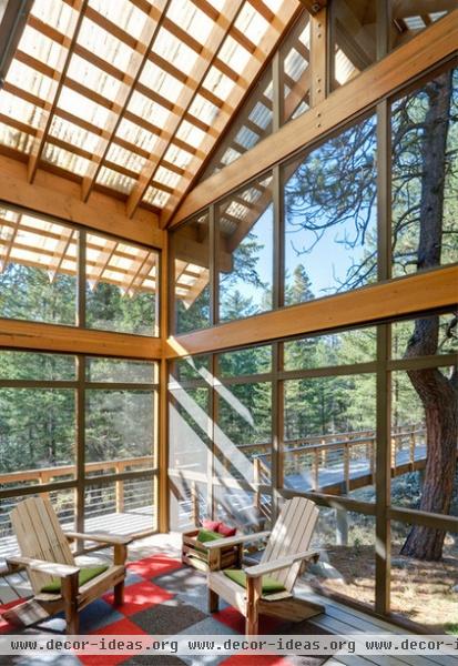
Yes, the roof above the porch is translucent corrugated plastic, bringing in plenty of filtered sunlight to the tall space.
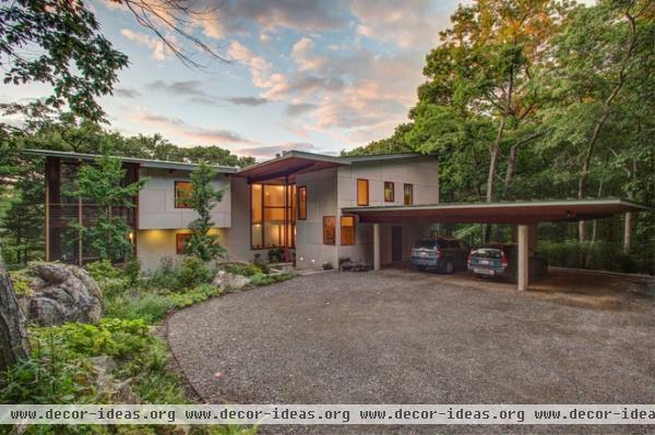
Near Boston
The screened-in porch is on the left here, removed from the more public front and driveway.
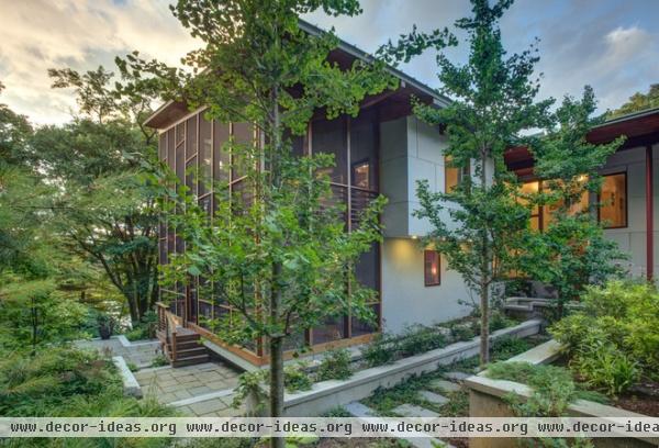
The porch overlooks a beautiful garden designed by Julie Moir Messervy Design Studio. The house balances traditional and modern, with its (slightly) pitched roofs and flat surfaces.
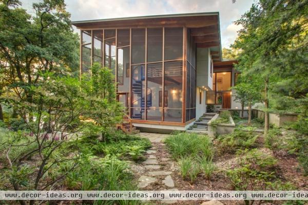
The porch is located to take advantage of the garden. It is also tall enough to act as a link between the two floors of the house via a spiral staircase.
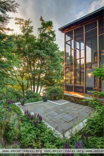
We can also see how the porch takes advantage of distant water views through the trees.
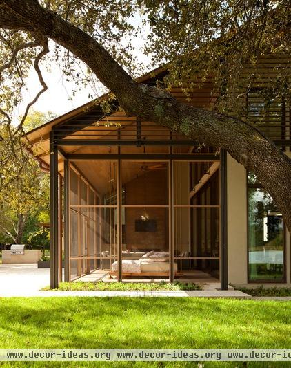
Austin, Texas
The previous two designs could be seen as additive, meaning each porch is an extension of the rest of the house’s form. In this house, by Furman + Keil Architects, the screened-in porch is subtractive, since it sits under the roof it shares with the living spaces to the right and beyond.
To see it as subtractive, think of the plan as a rectangle and the porch as occupying one quadrant of it, instead of projecting beyond it on the end.
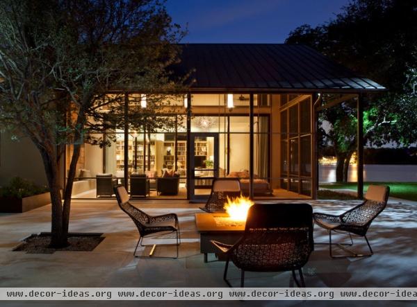
Here is a view from the side at night, accentuating the transparency of the screens and giving us a view into the living space.
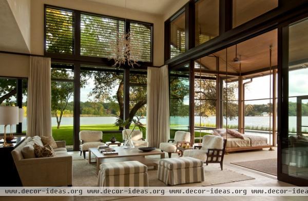
The large glass walls between the living room on the left and the porch on the right can be opened, allowing the house to be naturally ventilated without worry of bugs, and without screens obstructing views on some of the windows in the living space.
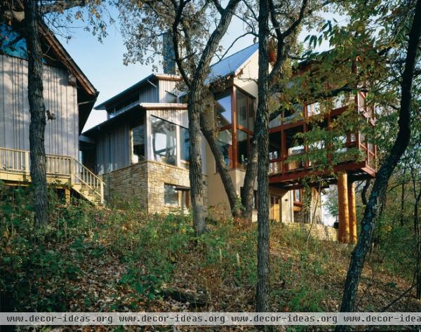
Minneapolis
This house in Minnesota, designed by Yunker Associates Architecture, has one of the more daring screened-in porches. It projects from the main house and is propped up on stilts — what looks like two tree trunks.
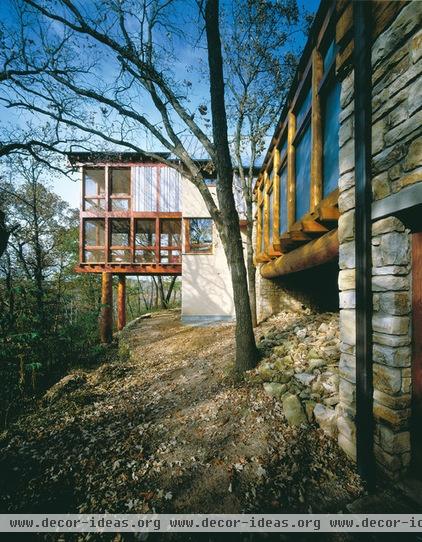
The porch looks like it could have been added on after the house was built.
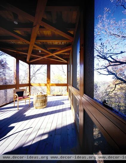
Whatever the case, the reasons for its jutting out the way it does are clear, given the distant views and having air and views on threes sides.
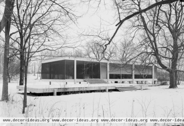
Farnsworth House, Illinois
What about strictly modern houses? Can screened-in porches work with them? Well, the front porch of Mies van der Rohe’s Farnsworth House was screened in at one point. While Mies did not originally want the screens, they were built per his design, so they work well with the steel and glass house.
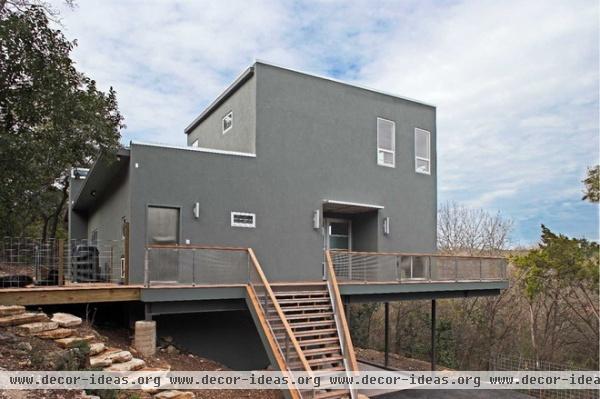
Austin, Texas
This house, by Steinbomer, Bramwell & Vrazel Architects, isn’t as orthodox in its modernity as the Farnsworth House, but it does beg the question of how to create a porch with such flat surfaces.
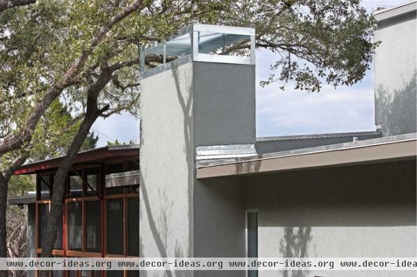
The architects inserted it into the middle of the plan, bumping out the space in the floor plan and moving up vertically to make it a volume of sorts.
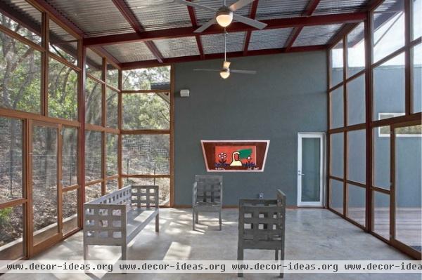
Here we can see the flat surface of the house extending inside (visible looking the other way in another photo), as well as the bump-out on the left, which gives the porch a corner for more expansive views and more air.
Chicago
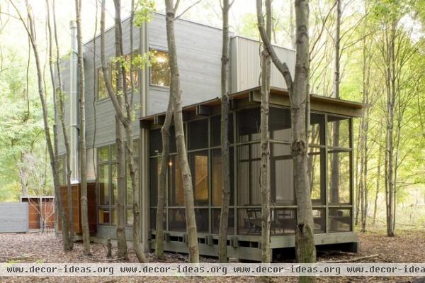
But in many cases the best way to design a screened-in porch for a modern box is to design it as a box itself. Such is the case with this ecofriendly vacation home in Illinois.
Austin, Texas
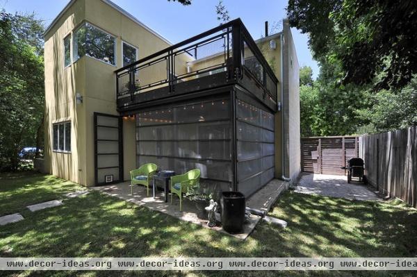
Here is a porch and rooftop deck addition. Hatch + Ulland Owen Architects departed from the yellow stucco with dark painted wood and a strongly horizontal design.
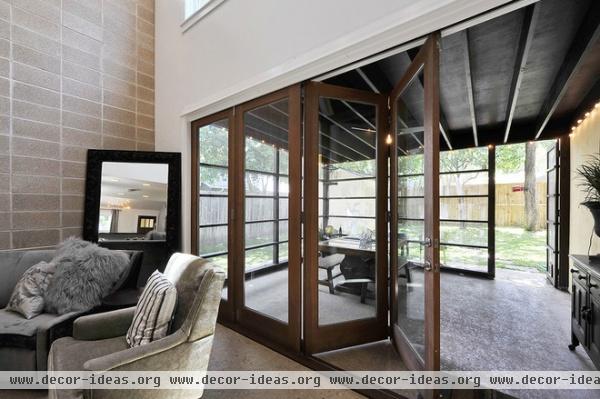
A hinged glass wall connects the living room and porch to allow the living space that much more room without the issue of bugs in the house.

Minneapolis
Of course, given the land and the desire, a separate screened-in building may even be in order. Sala Architects designed this structure, called the Loon’s Nest, for a family who wanted a refuge from the rain and bugs in addition to their nearby cabin.
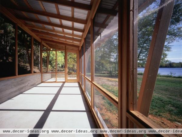
Even though this is a standalone structure, the design shares many aspects with the other examples; namely, lightweight (wood) construction, corrugated (or similarly lightweight) roofing, roof overhangs and large screens that allow views and plenty of air, but not bugs!
Related Articles Recommended


