Houzz Tour: Upping the Sophistication in a Charming Tudor
Few homeowners would willingly sacrifice a bedroom, but since the woman who owns this Tudor cottage in Palo Alto, California, a) lives by herself and b) has future plans for a second-story master bedroom suite, she took the plunge. Architect Kathleen Bost implemented the first phase of the remodel, replacing a bedroom with a living and entertaining area that opens to the backyard and the kitchen.
“From a real estate perspective, moving from a three-bedroom to a two-bedroom home might seem like a mistake,” says Bost. “But my client sees this as her long-term home and has no intention of selling the house anytime soon. Plus, we plan to build the master suite, so it will be a three-bedroom again someday.” With that in mind, the architect set out to give her client, the founder of a successful investment management company, a home that suits her in the here and now.
Houzz at a Glance
Location: Palo Alto, California
Size: 1,535 square feet (143 square meters); 2 bedrooms, 2 bathrooms
Year built: Around 1920
Photography by Matthew Millman Photography

The exterior was not changed during the remodel. “One of the main goals was to preserve the charm of this home,” says Bost.
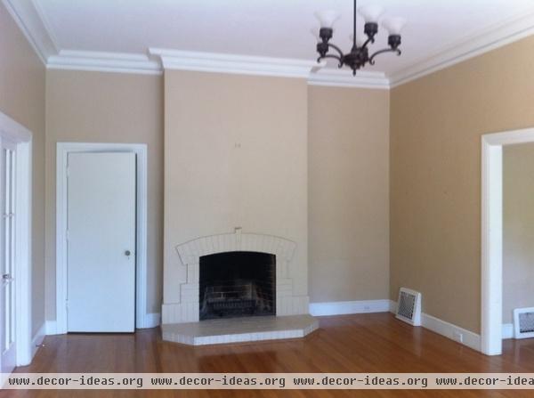
The home originally was divided into small rooms that felt dark. A narrow corridor and a bedroom were behind this wall.
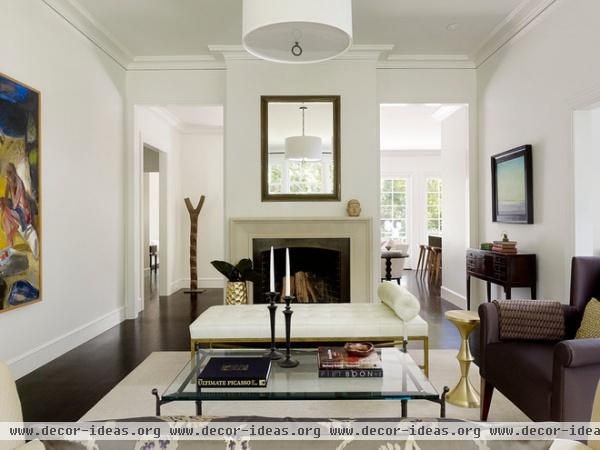
AFTER: The walls that blocked views of a lovely backyard from the living room were removed, and the hall and bedroom were combined to create a family room (you can glimpse it here behind the fireplace). Now the living room has much more natural light.
“We chose dark floors and light-colored walls for drama,” says Bost. A bench doesn’t obstruct views of the fireplace but does provide seating for guests. This is where the owner entertains.
Jonathan Lounge Bench: Oly; Meurice Pendant: Jonathan Adler, Robert Abbey; Spun Metal Side Table in brass: Lawsen Fenning
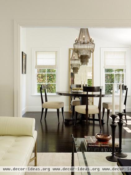
Entertaining here makes sense, since the living room is adjacent to the dining room. You can imagine guests moving from the round dining table to continue conversation around the fireplace in the living room.
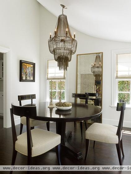
Before the remodel this room had an ordinary flat ceiling. “It’s a small room, so we decided to open it up by allowing the ceiling to follow the swooping lines of the roof,” says Bost. With that bold architectural move and the simple addition of a large mirror behind the table, the once-diminutive space now lives large.
Molly Dining Table: Oly; chairs: Zelia by Reagan Hayes, David Sutherland; Maxim Iron Beaded Chandelier: Arteriors
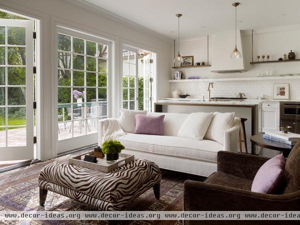
Behind the fireplace is the new family room that replaced one of the bedrooms. “This is where my client likes to relax,” says Bost. The architect says this is a true kick-back room, a place where her client can grab a cup of coffee or tea from the now-open kitchen and sit down with her feet up while working on her laptop.
Because of the new wall of windows and glass doors, the homeowner can look at the garden between emails. Note the fixed section of mullioned glass in the middle. It marks the spot for an outdoor table and chairs on the patio (where no door will swing into them). “I also like the quirkiness of [the mullioned glass],” says the architect. “It’s an unexpected twist on a classic cottage look.”
A creamy white color palette throughout unifies the now-wide-open spaces. Here, though, an area rug the client owned inspired touches of purple — the owner’s favorite color.
Sofa: Jayson Home with Bellusco upholstery, Designers Guild; chair: Swivel Chair, Lee Industries, with Shuffle/Slide upholstery, Fabricut
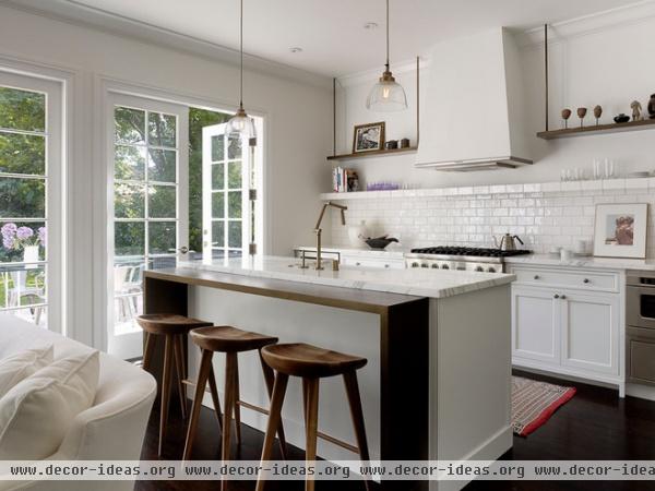
The beginning of the kitchen is marked by a casual eating section on one side of the island. Its surface is covered in a metallic bronze paint, echoing the finish on the kitchen hardware.
Kami Counter Stools: Neuvo Living; Daughtry Pendants: Arteriors
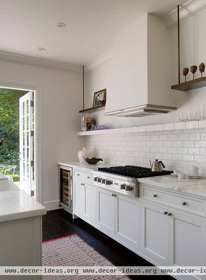
“This client didn’t want to have any upper cabinets,” says Bost. The look is sleek and clean, and blends perfectly with the family room.
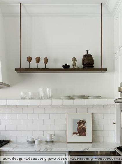
A tile shelf that tops the backsplash conveniently holds everyday glasses and plates. A pair of walnut shelves hangs from ceiling-mounted metal rods on either side of the cooktop’s hood. “My client loves art, and this gives her a place to display smaller pieces,” says Bost. Those pieces include some figures and bowl brought back from China right after it had opened to visitors in the 1980s, and a brown vessel picked up on a trip to Santa Fe, New Mexico.
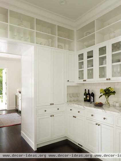
The butler’s pantry, conveniently located between the kitchen and the dining room, more than makes up for the lack of upper kitchen cabinets.
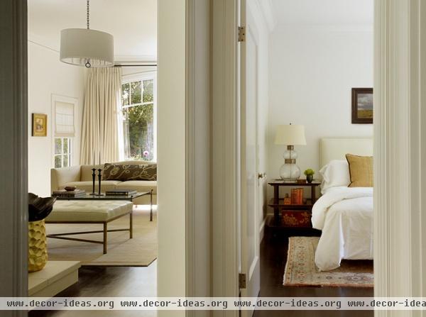
The two bedrooms are next to the living room and family room. “She has a grown daughter and a niece who like to visit, so keeping a guest room was important,” says Bost.
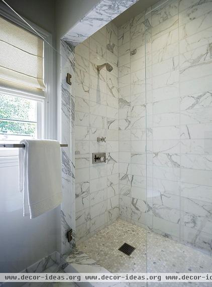
In the master bathroom, the whites give way to pale grays, such as in the marble-tiled shower.
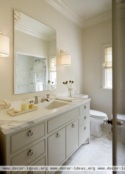
Oversize hexagonal tiles cover the bathroom floor. They reference the classic small hex tile that might have covered the floors when the home was built, but their larger shape makes them modern.
French Cuff Sconces: Circa
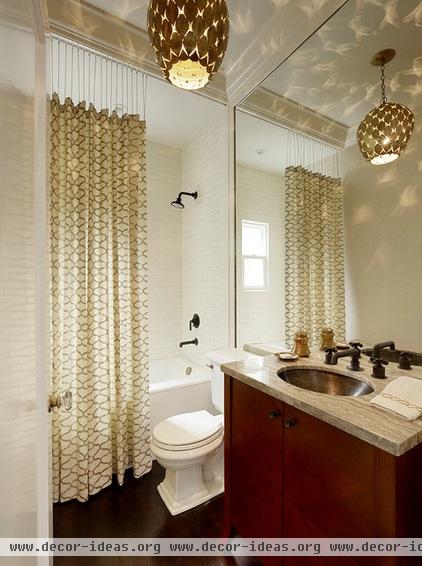
Another bath serves as a powder room and the guest bathroom. A shower curtain adds pattern. “We dropped it from a curtain rail with chains to let natural light into the room,” says Bost.
Shower curtain, grommets, hooks, chains: custom; curtain fabric: Kerry Joyce Textiles; Osgood Pendant: Arteriors


