Imagination Rules at the 2014 San Francisco Decorator Showcase
http://decor-ideas.org 04/24/2014 09:02 Decor Ideas
A lot has been written about the innovative spirit of San Francisco and its environs this past year. Judging from the 2014 Decorator Showcase, a benefit for University High School in which Bay Area designers decorate rooms in a local house, the “think different” mentality that spread throughout the region like a trembler has affected the design community as well. From a master bedroom inspired by Portugal to an entry whose genesis can be found in the realm of high fashion and popular music, this is a true house of ideas.
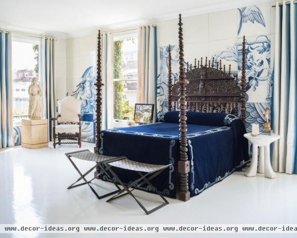
One of the most striking rooms in the 1908 classical revival home is the blue and white bedroom designed by Antonio Martins. An old saying has it that good design is personal, and this room looked to the designer’s heritage for inspiration. The exotic rosewood bed was crafted for Martins’ Portuguese family in the 18th century and incorporates the family crest. Martins says he has wanted to possess the piece since boyhood, and it was passed on to him by an elderly cousin only recently. The original navy blue bed covering has been diligently preserved by his family for hundreds of years, and Martins had it faithfully re-created for the bed’s North American debut.
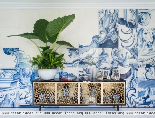
The designer continues the celebration of his home country on the walls of the bedroom. He asked another cousin to photograph the 4- by 4-inch blue and white tiles that people associate with the region. He enlarged those images, and master decorative painters Linda Horning and Katherine Jacobus re-created them over a series of 24- by 24-inch Masonite tiles, giving them a crackle glaze that fools the eyes into believing they are looking at an ancient ceramic surface.
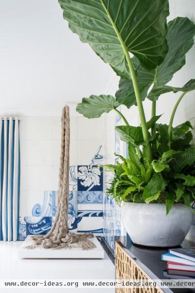
Martins wanted to give the room a modern feeling, so he shuffled the squares before applying them to the wall. “It makes it look like modern art,” he says.
Rope is also often associated with Portuguese history. The designer braided long lengths of it to create the floor-to-ceiling contemporary piece that hangs in the corner of the room. So much bold art calls for an appropriate backdrop, so Martins had the floor painted white for a gallery-like feel.
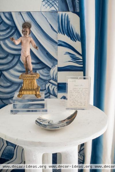
The nightstand, created by the late San Francisco design legend John Dickinson, holds a santo (religious statue) given to Martins by another relative and a framed note his mother penned to him when he left Portugal for Switzerland. It doesn’t get more personal than that.

For inspiration for the living room, designer Heather Hilliard looked through the window to the landscape. The walls are covered with striations of Venetian plaster (designed by Hilliard and executed by Willem Racke) that resemble the earth’s strata. The sofas, by Jiun Ho, have curvaceous lines that seem to mirror the rolling hills of the Marin headlands (visible from the seats).
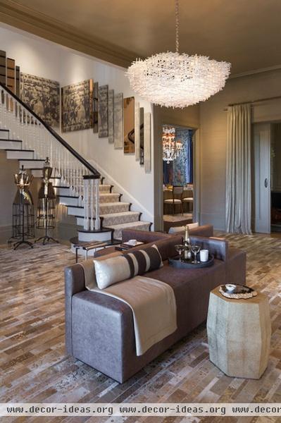
The entryway is large enough to house a dramatic design statement. Interior designer Jonathan Rachman drew on two pop icons: fashion model Kate Moss and singer-songwriter Lorde’s song Royals. Noting that Moss is associated with heroin chic and Lorde’s latest album is titled Pure Heroine, Rachman says that his intention is to glorify the chic “heroinE” (spelling is his).
The room is done in neutral materials embellished with gold. The hide rug, crafted by rug design powerhouse Vaheed Taheri, appears to be splashed and splattered by a paintbrush laden with glittery paint; the wall covering is woven with metallic threads; and the edges of the stair runner are dotted with quarter-size brass nailheads.
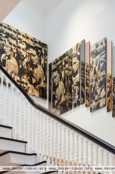
A piece by Caroline Lizarraga from Rachman’s own art collection inspired the wraparound installation on the stairs. The artwork is a collage of Kate Moss images. The designer took it several steps farther, slicing images from the art and layering them with panels of champagne and smoke-colored mirrors.

Surrounded by dark-paneled shelves, the library would seem to be forever set as a very formal, traditional room. In the hands of designer Geoffrey De Sousa, it became lighter and modern. The designer pictured the residents of this room as young, contemporary people who happened to inhabit a home built in the 19th century. Their relaxed attitude is conveyed in the linen and suede upholstery on the Padrino Club Chair by Studio Van Den Akker. The linen, by De le Cuona, is so thick and soft, it reminds one of a very broken-in pair of jeans. The light fixture, a thick glass cone by Mattaliano, strikes another modern note.

“Cosmopolitan” and “kitchen” are two words not often used together. But the idea of an upscale black and white space guided Steven Miller’s design of the room and its adjacent breakfast area. In Miller’s hands, the space became a family lounge. “The view is so wonderful, I thought they should have a place to relax and enjoy it,” he says. In true California style, he did give them a nearby space for informal meals — on the deck outside.
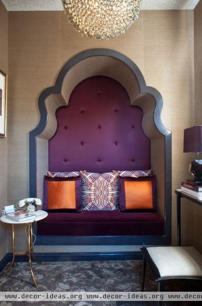
This year’s house has a number of small spaces, and the designers used big doses of creativity to make them special. For instance, Kristi Will made the most of a tiny sitting area off her powder room by refashioning a shallow closet as an alcove that’s backed by purple satin and surrounded by an art deco arch.
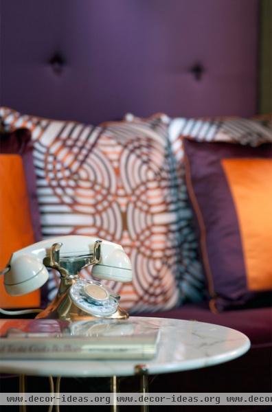
While working on the closet, Will discovered a hidden telephone cabinet filled with old wires. Since the home’s first resident, prominent attorney Alfred Sutro, worked for Western Electric, the designer added one of the company’s gold-plated telephones to a nearby table. (This one just happened to belong to Charlie Chaplin.)

The third floor houses a trio of wonderful children’s rooms. One, done by designer Shelley Cahan, has blue-patterned wallpaper as a starting point. It had been installed by a previous designer (both Michael Taylor and Suzanne Tucker had turns here), and the current owner asked that it be preserved. Drawing furniture and accessories from Restoration Hardware and RH Baby & Child, Cahan installed bunk beds and a dresser that resembles a steamer trunk.

An open closet has a portion of the fictional resident’s nickname — Little Boy Blu — written in lights.
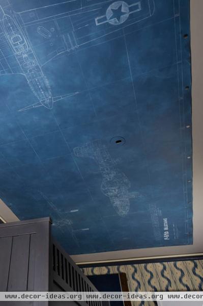
Blue chalkboard paint decorates the ceiling, and painter Shannon Geiss spent hours lying on her back on a scaffolding sketching out blueprints for a fighter plane in chalk.

For her girls’ room, designer Tineke Triggs tapped into her childhood passions for art and dance. Her imagined client is an artistic teenager who just happens to love both subjects. Representing the girl’s artistic ambitions, paint is splattered, Jackson Pollack–style, across the ceiling and down the walls.
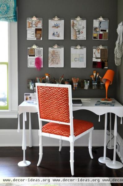
Dripping paint was the inspiration for this stunning desk, which Triggs designed and had crafted by a local baseball bat artisan.

Another little boy’s room was inspired by the designer’s own children. Regan Baker has a 4-year-old who loves to build forts. This led her to create a denim tent that, when hidden ropes are tethered to a cleat on the opposite wall, can stretch completely across this room to make the ultimate playhouse.
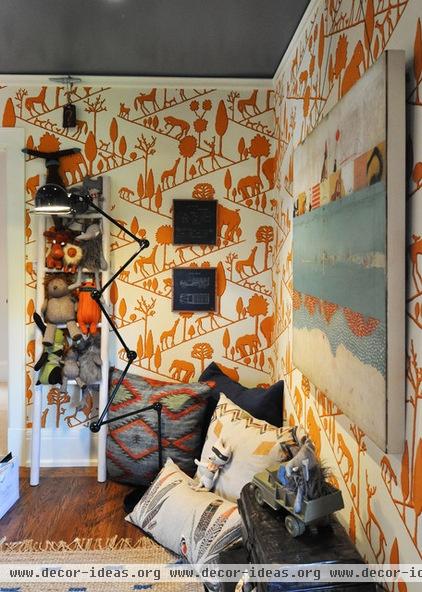
She says the tent is reinforced by the existing wallpaper, which the homeowner requested she keep. “The animals seem to be coming and going,” Baker says, explaining the nomadic association. The print looks almost tribal, which led her to accessorize with a number of ethnic print pillows.
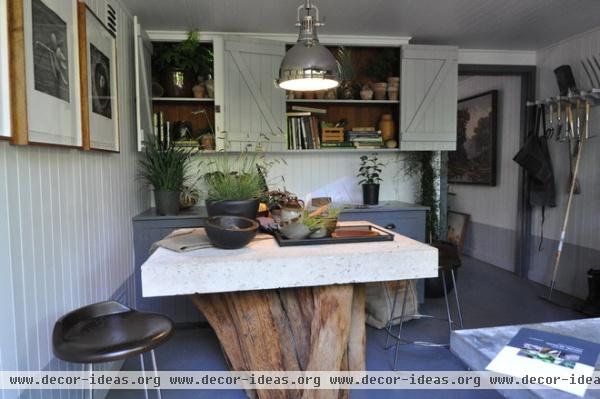
Randy McDannell’s potting shed is a workspace and a retreat. Created for an imaginary groundskeeper who happens to be well traveled and well read, this room allows the occupant to pursue studies and interests beyond plants. And that ties right in with what showcases do best: inspire dreams while piquing our interest.
Info: The 2014 San Francisco Decorator Showcase runs from April 26 through May 26.
Related Articles Recommended


