A Quirky Ontario Cabin Gets a Lighter Touch
http://decor-ideas.org 04/23/2014 23:22 Decor Ideas
Eccentricity is what gives a space personality, while its history gives it a soul. Although the rooms in this Tiny Beaches, Ontario, log cabin were dark and a bit peculiar when interior decorator Enza Ricco took on their makeover, she treated the home’s spirit and eccentricities with reverence. “My client really appreciated that I loved the house for all of its personality,” she says. Here’s a look at how Ricco lightened up the space, keeping the rustic spirit alive while adding crisp, more contemporary touches and function.
Photography by Stephani Buchman Photography
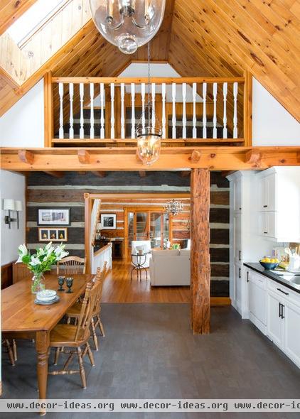
The kitchen is in an addition built in 1986. “The work was done by a local gentleman who added lots of interesting quirks that presented some challenges,” Ricco says.
For instance, a structural post holding up a balcony in the middle of the kitchen is a big appliance door-blocker and dictated some of the layout. However, Ricco and the homeowner didn’t demolish this and certain other elements, as they are such a part of the home’s personality.
The homeowner already owned the table and chairs, and they’re a great fit for the eat-in space.
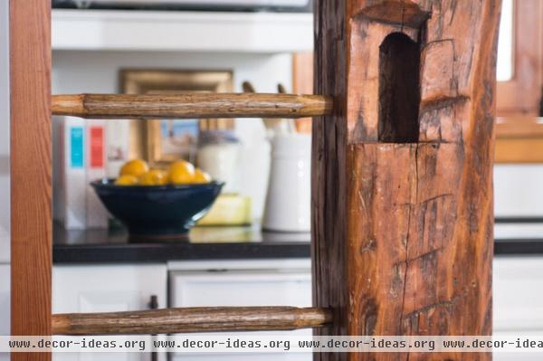
The other side of the reclaimed-beam structural post has an attached ladder leading to a trapdoor in the small balcony. The balcony is not used for much, but it’s one of the home’s beloved idiosyncrasies. Also beloved are the original remodeler’s initials carved into another section of the beam.
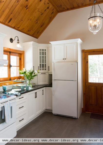
“Lighting was challenge No. 1,” says Ricco. “All she had were some track lights along the ceiling, and it was very dark in here.” To remedy the situation, Ricco added two Hundi Lanterns, task lighting and sconces.
The owner plans to live here for the rest of her life, so she wanted something soft underfoot. Ricco chose a cork floor in a warm, gray-brown hue.
The black Caesarstone countertops have flecks of brown, and the hardware is oil-rubbed bronze. White cabinets offer a crisp contrast.
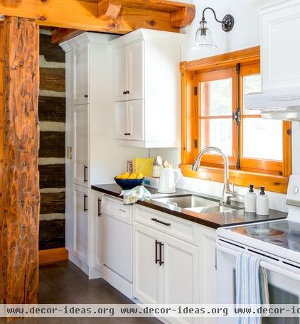
Another priority was providing the homeowner with ample storage and organization in the kitchen. The tall cabinet to the left is the pantry, with pullout drawers. The lower cabinets have pullouts for pots and pans, which make them much easier to use. The doors open and close with one touch, thanks to Blum Hardware.
Ricco believes part of keeping the spirit of the house alive includes hiring local talent, and found a great collaborator in Perkinsfield Kitchen and Bath, which crafted all of the cabinetry.
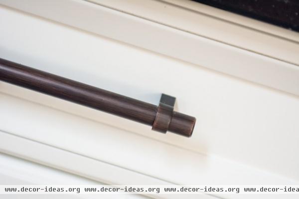
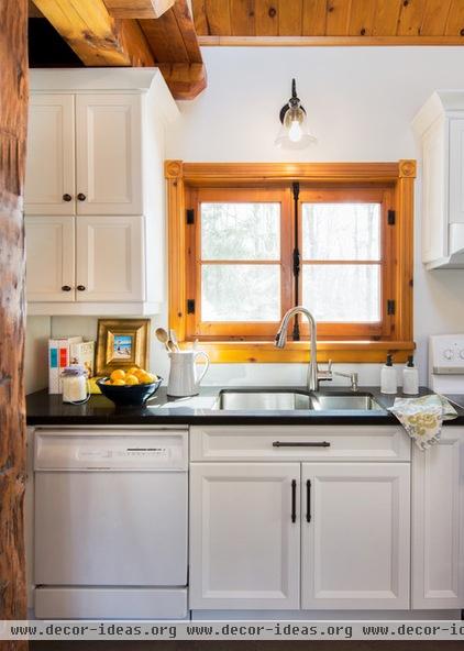
The original hardware on the windows inspired the choices for the cabinet hardware and other metal pieces, like the sconce over the kitchen sink and the lanterns. “They aren’t an exact match, but they all complement one another,” Ricco describes. Small details like this make the room cohesive.
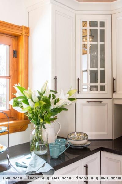
This countertop cabinet door rises with one touch, and the space inside serves as a catchall. When the homeowner wants to neaten up for company, she can simply stash everything in there and out of sight. The glass cabinet door reflects the light.
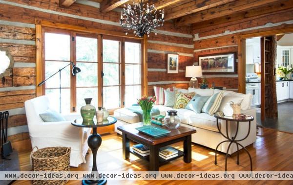
Next we move into the living room. “This room is a square box with a lot of wood,” says Ricco. She’s not kidding; logs cover the walls, heavy beams line the ceiling, and the flooring is hardwood. The goal was to maintain the rustic log cabin look but give it fresh and airy appeal.
The original room was dark, with only a few small lamps and extension cords running everywhere. Ricco did have a wonderful large set of windows to work with — they look out to a path to a beach, which is less than a minute’s walk away. She took full advantage of them, bringing in glass and mirrors to reflect the light. The side tabletops are smoked mirror, there is a quatrefoil mirror on the wall, and two table lamps of seeded and mercury glass add understated shimmer.
Just out of view on the left is a woodstove, which makes the armchair a toasty spot.
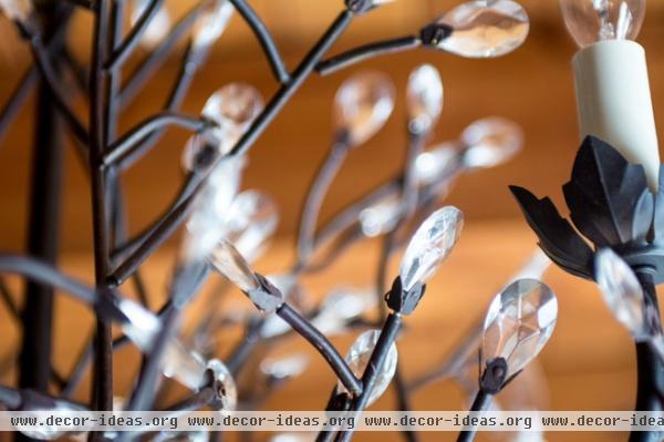
Ricco’s first move was finding this chandelier, which balances rustic with some bling. “It has a bronze look with little glass crystals; it has a natural feel, but it’s also pretty and sparkly,” she says.
Camilla 6-Arm Chandelier: Pottery Barn
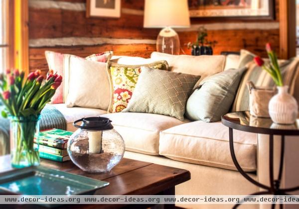
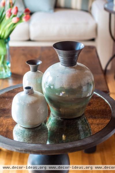
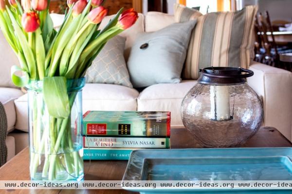
The oatmeal-colored linen makes the sofa a large, light-colored piece in the center of the room. It’s an inviting spot for reading, visiting and watching TV. (Tip: To complement wood, stick with hues found in nature.) Ricco added some brighter colors and patterns via throw pillows, but kept to hues you’d find in fields, the sea and the sky. She also stuck with natural materials like linen and cotton.
This redecoration did not involve chucking everything and starting with a blank slate. “It’s wonderful to be able to use a client’s existing pieces,” Ricco says. The coffee table, the console table beneath the seeded glass lamp and the armchair all belonged to the homeowner. Ricco brought in the sofa, lamps, side tables and accessories. These pieces help tie everything together; both side tables pick up on the bronze look used throughout the home and have smoked glass tops.

Ricco added reflective pieces wherever she could, via accessories and surfaces. The seeded glass lamp brings a beachy material into the wood-encased room. More seeded glass graces the coffee table in the form of a hurricane.
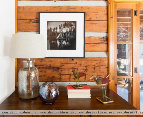
Across from the sofa, a cabinet conceals the TV; a mercury glass table lamp reflects more light. To the right is the foyer, which Ricco also gave a refresh. Sand, sky, earth and plants helped inspire the palette, which brings out the best in the rustic log cabin.
“I just talked to the homeowner this week, and she told me that the changes we’ve made have really changed her life,” she says. There’s not any more a client could ask for.
Related Articles Recommended


