Just Passing Through: How to Make Passageways an Experience
http://decor-ideas.org 04/22/2014 05:22 Decor Ideas
Circulation pathways take up a lot of square footage in a home, so make every inch count when you’re getting from here to there — even if you’re just walking between rooms.
Passageways can be more interesting if the wall is thicker. Once an opening is around 18 to 24 inches thick, you can dress it up with recesses, shelving, molding and other elements that will maximize the space and make the passageway feel not only functional, but like an authentic transition between realms.
If your archways aren’t that deep now, consider adding built-ins to one or both sides of the wall, to enhance the journey and make sure you are getting every last inch of impact.
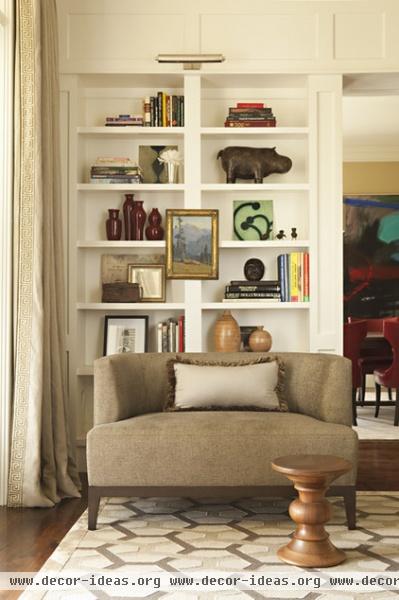
Improve your living space. This passageway between the dining room and the living room (to the right of the bookcase) is a typical framed opening, but its depth allows for bookcases on the living room side. Even if you aren’t building a new home, you can build out your walls and drastically change the atmosphere of a space and how you use it, just as these bookcases turn a plain living room wall into an elegant library.
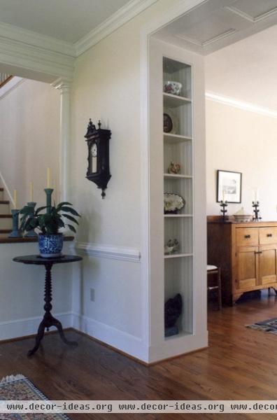
Don’t miss even a thin opportunity. Sometimes walls are thicker between rooms to allow for heating, cooling or plumbing elements — but not by much. Carve out some of that dead space that isn’t deep enough for a full closet and use the inside for open shelves. The added visual depth will turn a plain wall into something more eye catching. Make it as functional as needed with baskets, books, a charging station and hooks for keys. Just make sure the opening is at least 12 inches wide, so something actually fits in the space and dusting is easier. A good depth for the open space is about 10 to 12 inches.
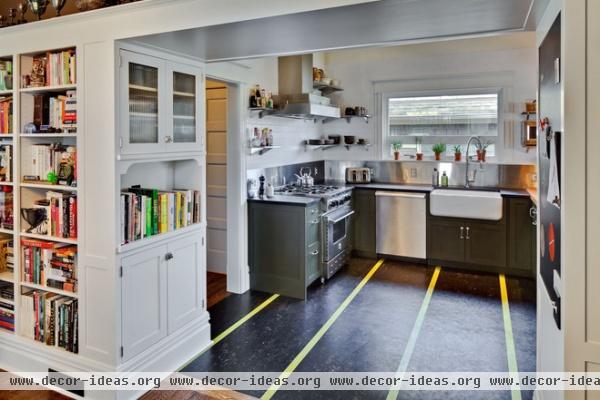
Use a passageway as a purposeful link between spaces. This kitchen passageway, defined by the overhead soffit, serves as a mini command center with pinup space on one side and cookbook storage and upper and lower cabinets on the other side. The ceiling height aligns with the bookcases on the adjacent wall, the base trim wraps about the corner seamlessly, and the same white paint ensures that the opening feels like it’s part of both of the rooms it connects.
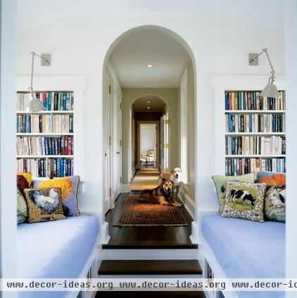
Add a passageway as part of a hall. If you have a very long hallway, consider breaking it up into bays. Here the passageway is nearly a room unto itself, as it houses a reading nook and a window seat with storage cubbies near the floor. Make sure you leave at least 36 inches of floor space for circulation.
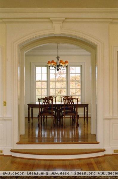
Dress it up. The passageway between these two rooms doesn’t use any tricks; it simply allows you to get from point A to point B. What is elegant about this passageway, however, is the curved step guiding you up to the archway and framing the view from the lower room.
The opening is wide, arched and decorated with multiple layers of molding. The ceiling inside, between the rooms, is a bit higher than the opening, so you don’t feel as though you are in a tunnel. This slight change in ceiling height makes the passageway its own space between the rooms — a brief moment of transition.
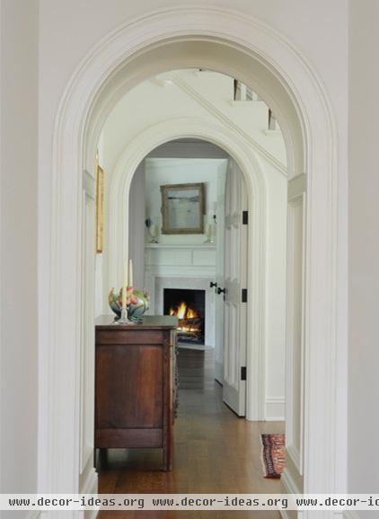
Line up arches. In a very similar manner, molding details and, in this case, a narrow arched opening, define this passageway. They are simple elements that make it successful.
If you have all square openings in your home, turning a few into arches — especially in a row, as in this example — is another way to add architectural interest.
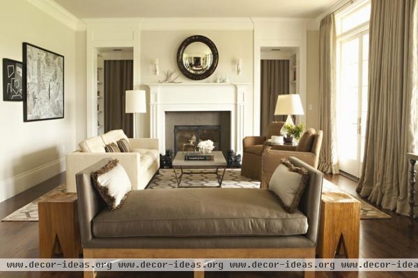
Make it symmetrical. You might think it would be overkill to have two passageways between rooms, but it’s usually an excellent way to improve circulation — and symmetry is a classic way to make a room feel balanced, even if you have to make one of the passageways fake (you can fill it with bookshelves). If this sounds odd, imagine this room without the opening on the right side, for instance. You wouldn’t know where to look first. In a balanced room, you have a clear focal point. In this room it is the fireplace, flanked by the symmetrical passageways.
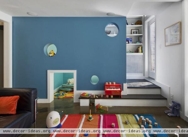
Use every surface. Instead of there simply being a plain wall here, the cutout openings, longer bottom step and change in ceiling height combine to create a unique open yet clearly defined passageway, with space for a child’s playroom.
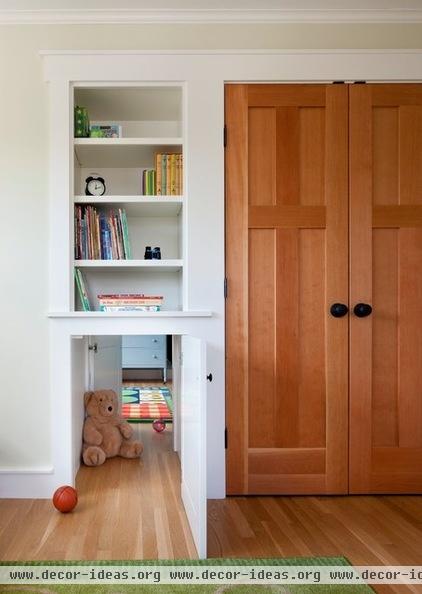
Make a secret passageway, with a twist. The closet on the right provides the depth for the opening on the left. Though a floor-to-ceiling bookcase is beneficial in a kid’s room, it’s also nice to know you can keep some special things out of little hands and let the kids focus on hide-and-seek.
Related Articles Recommended


