My Houzz: Finding Beauty in the Everyday
Peter Andrew’s approach to photography isn’t much different from his approach to renovating and decorating. “Photography for me is the process of turning ordinary or overlooked things into something that causes you to pause and examine and make your eyes explode because it’s so incredibly beautiful,” he says.
His “Highways” photography series captures freeway interchanges from above in locations all over the world, revealing complicated geometry, elegant clovers and confounding lines and loops that produce a stunning composition while keeping traffic moving.
Similarly, everyday objects are elevated to artistic status in Andrew’s semidetached house in Toronto’s West End. Everywhere you look, the hand of the artist is visible, along with a respect for the age of the home (and its stories) and a clever approach to storage.
Houzz at a Glance
Who lives here: Peter Andrew and a housemate
Location: Junction Triangle neighborhood in Toronto’s West End
Size: 1,100 square feet (102 square meters); 2 bedrooms, 1½ bathrooms
Year built: 1910; renovated in 2011
Photography by Peter Andrew
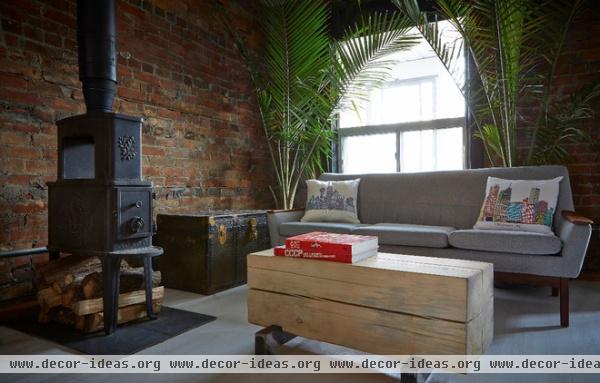
When Andrew got the keys to his home in 2011, the first thing he did was strip away the old plaster on two walls to reveal the original brick, giving the space a more industrial, loft-like appeal. Every piece he’s brought into the home since completing the renovation has a story and a human element: The coffee table, for example — which he nicknamed “The Crawler” — was made by friend Adam Wheller out of kiln-dried spruce and finished with lye bleach. Another friend found the World War II army trunk in the walls of a neighborhood home.
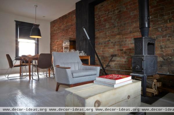
Exposed brick runs the length of the living and dining rooms, interrupted by ductwork that the homeowner clad in rough-cut planks and painted black.
Andrew chose to paint the original hardwood floors white, despite warnings from friends that white floors would be really hard to maintain. “That’s part of the beauty to me,” he says. “When they’re scuffed up and dirty, it reminds me of being an apprentice in photography studios when I was just learning the craft.”
Floor light: Castor
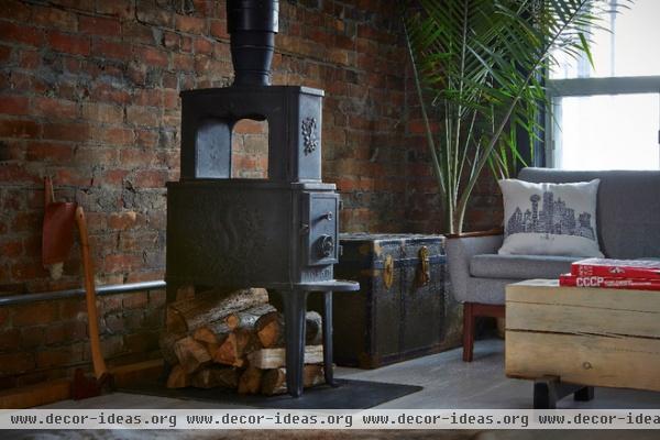
Andrew traveled to Milford, Pennsylvania, to scoop up this antique woodstove. It’s a wonderful alternative to a traditional fireplace that speaks to the home’s stripped-down aesthetic. The exposed chimney runs through the second floor, allowing heat to radiate through the whole house.
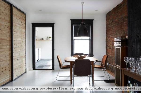
The dining area is simple and perfectly composed. Andrew sourced the chairs from an old Sears break room, and loves the idea of workers over decades before him sitting down for their lunch.
Light: Carvaggio P3, Mjölk
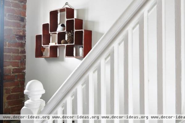
“This piece actually informed the entire renovation,” says Andrew. “When I saw this, I knew I wanted it in my entranceway, which meant that I wanted to keep the original staircase — which lead to a whole series of other decisions coming to a head.”
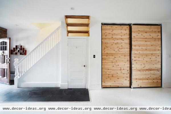
The homeowner extended the entry flooring to the closet to visually guide his guests there. Once he decided to keep the original staircase, he had to rethink space priorities with respect to basement access. So he turned the original access into an entry closet and installed a trapdoor for when he needed to get into the basement.
Andrew opened up the stairs above the landing to visually connect parts of the house. “I like being able to see the living room when I’m going up to the second floor,” he says. The sliding doors to the right cleverly conceal the washer, dryer and refrigerator.
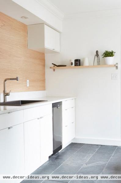
You read correctly: His fridge isn’t in the kitchen. But it’s not far, and for how he lives, and given the size of the kitchen, he would prefer to have an eating area (currently in the works) in the kitchen rather than a large refrigerator taking up floor space.
Andrew scored the quartz countertop from the as-is section at Ikea for an incredible $300. Exterior tile and oak-veneered plywood complete the rustic, minimalist aesthetic.
Cabinets: Ikea
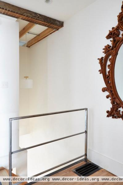
Andrew and his contractor opened up the second floor, revealing original beams and joists. Wheller built the stairs from the landing to the second floor with oak treads and cold-rolled steel supports. He also created the railing and the floor grate for the cold-air return.
Light: Castor; mirror: Craigslist
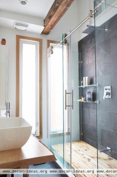
The bathroom is where Andrew really unleashed his creative energy. He created an “aquarium” (three-walled) glass shower that required some clever combinations of different shower systems. The vanity was crafted from a live-edge red elm plank.
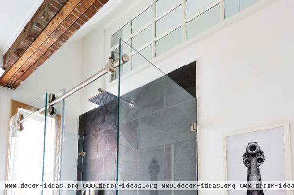
He also vaulted the ceiling and installed an interior window between the bath and the neighboring bedroom to let in more light. The horizontal window was originally a French door that connected the living and dining rooms on the main floor.
This is the only room in the house in which Andrew displays his own work. This print, from his “Point Blank” series, sits above the toilet — a daunting view for some!
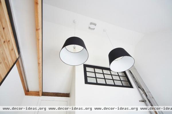
Here’s that interior window again, shown from the bedroom side; here it’s painted black and paired with oversized pendants. The chimney from the woodstove runs up through this room as well.
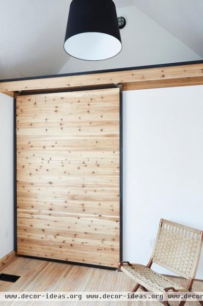
In the same bedroom, Andrew created a loft space over the closet that peeks over the stairwell. “I really wanted to use every inch of space and to create strange openings that unite the home,” he says.
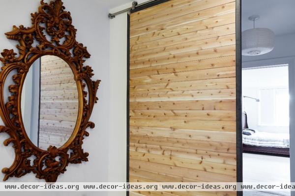
A walk-through closet on the other side of the landing leads to Andrew’s bedroom. The sliding doors throughout the home were made by Wheller from welded angle iron and tongue and groove cedar board.
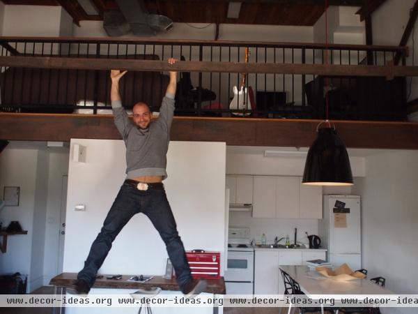
Andrew swings from a beam in his envy-inducing photography studio and creative incubator in Toronto’s West End, a couple of blocks from his home.
Show us your creative home!
Browse more homes by style:
Small Homes | Colorful Homes | Eclectic Homes | Modern Homes | Contemporary Homes | Midcentury Homes | Ranch Homes | Traditional Homes | Barn Homes | Townhouses | Apartments | Lofts | Vacation Homes
More: My Houzz: Polished Urban Sanctuary in Toronto


