Kitchen of the Week: Warm and Industrial in New Hampshire
http://decor-ideas.org 04/19/2014 02:23 Decor Ideas
Kitchen designer Karen Swanson of New England Design Works and the owner of this New Hampshire kitchen found each other on Houzz. “She liked some of the ideabooks I’d put together,” says Swanson. “She contacted me to help her redesign her kitchen. It was the first time I got a client that way.” Swanson quickly found that she and her new client were style soul mates. “Her taste is impeccable,” she says. “It made the job a lot of fun.” When they established a common visual vocabulary, the pair set out to re-create the kitchen.
Kitchen at a Glance
Location: New Hampshire
Size: 230 square feet (21 square meters)
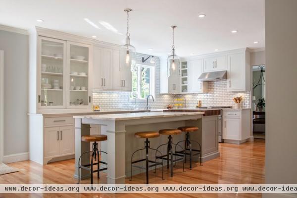
“To keep the costs down, we left the appliances where they were,” says Swanson. “That gave us room in the budget for the custom island.”
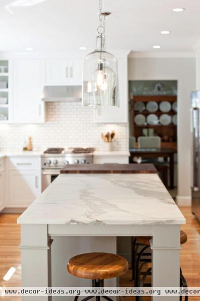
Although the owner would have preferred to use Calacatta marble throughout, it cost too much; she splurged by topping only the eat-in island with the natural stone. “It was cheaper to use it on the smaller counter of the island, and we put it in the center of the room where it would make the most impact,” says Swanson. The rest of the countertops are made of Caesarstone.
The cabinets that line the room are a soft white, but Swanson advocated that the island be gray with a pale green undertone. She had the color custom mixed, and the cabinetmakers liked it so much, they added it to their general collection. “They let me name it,” the designer says. “I chose the name Marguerite, for my grandmother. I was at the beginning of my career, and a number of jobs just fell into my lap. I felt that if anyone up there was watching out for me, it was my grandmother.”
Cabinetry: Pennville Custom Cabinets
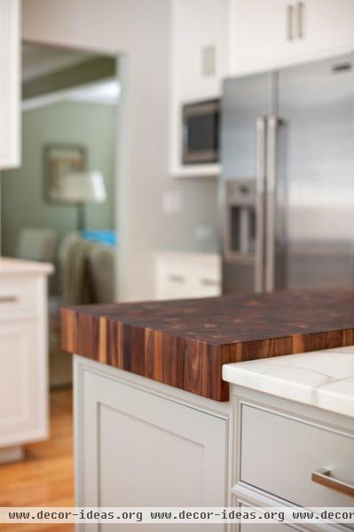
On one end of the island is a walnut butcher block. “She actually uses this to prep food; it’s not just decorative,” says Swanson. “It’s an end cut, which is the toughest butcher block you can buy.”
Butcher block: Grothouse Lumber Company
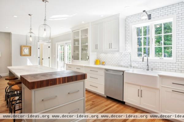
Two deep drawers at the end of the island are a home for pots and pans conveniently near the cooktop.
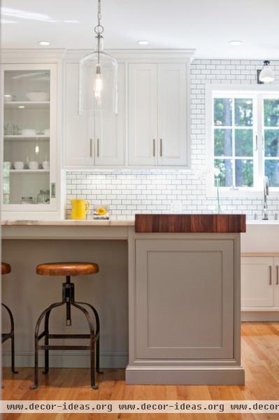
“We were going for an industrial look,” says Swanson. The white subway tile runs from counter to ceiling and has a narrow band of gray around the edges that’s enhanced by the gray grout. A single factory-style light fixture illuminates the sink, and the two pendants over the island look as if they could be its slightly-more-dignified city cousins. The stools — which, like piano stools, have a top that adjusts with a spin — also have an urban-by-way-of-yesteryear edge.
Light fixture over sink: Metro, The Urban Electric Company
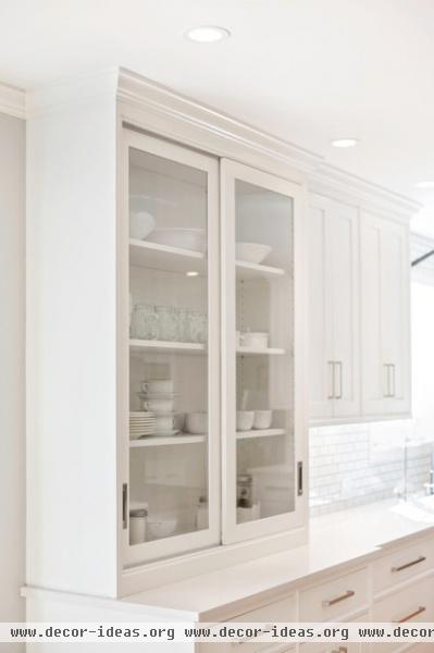
The inspiration for an apothecary-style cabinet came from Houzz. “She had seen several examples on the site and saved them into her personal ideabooks,” says Swanson. “It made sense, because she has a lovely collection of servingware and likes to display it. It also was a fit because she is, in fact, a pharmacist.”
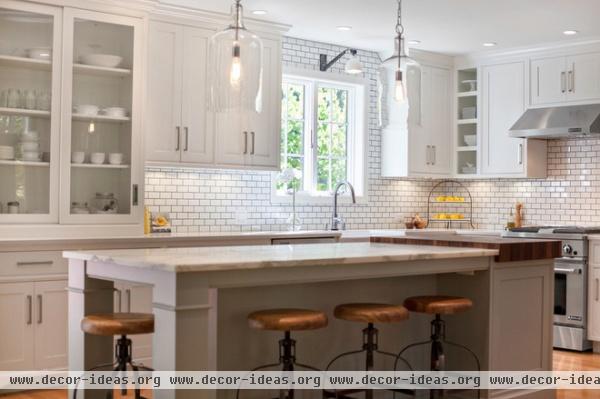
In the end both women were happy working long-distance (Swanson lives in Massachusetts) and with the completed kitchen. It was a prescription for success.
More:
Find Houzz pros near you
How to find a designer through photos on Houzz
How to contact a home professional and start your project
Related Articles Recommended


