Inside Houzz: Setting a Midcentury Mood in Portland
Eight years ago Robert and Amanda Nathan added 900 square feet to their 1950s home in Portland, Oregon, reorienting the living room and adding a couple of bedrooms and a bathroom. “We generated ideas old-school, from magazines and books, and simply clipped them out,” says Robert. It was hard collecting ideas that way, he notes, and not easy to share them once they did.
When the couple began brainstorming for their kitchen remodel last year, a neighbor introduced them to Houzz. “Originally we signed up just to collect ideas in preparation for the remodel,” says Robert, not realizing you could also find professionals on Houzz. “We checked with the local AIA website and then started doing more broad searches, and that is when we saw Risa’s work on Houzz,” he says. “We were looking for an architect that was easy to work with, had good ideas and appreciated midcentury architecture.”
The Nathans liked Portland architect Risa Boyer’s portfolio and valued the positive reviews past clients had left on her profile. “The fact that her own house had some midcentury furniture was a great sign as well,” says Robert. “Once we made the decision to go for it, [it] took about one month to decide Risa was the best fit for us.”
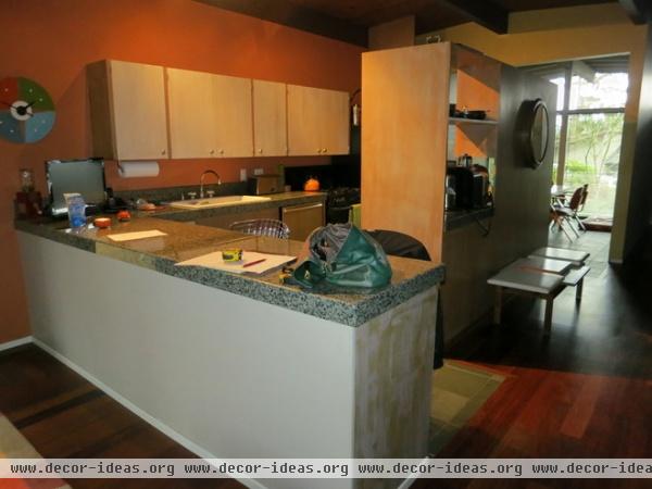
“The kitchen was the biggest change,” says Robert. “It was dark, we had no disposal or ice maker, and the appliances were all pretty challenging if you like to cook.” Amanda and Robert wanted a kitchen that fit their home’s context, but they desperately needed modern functionality.
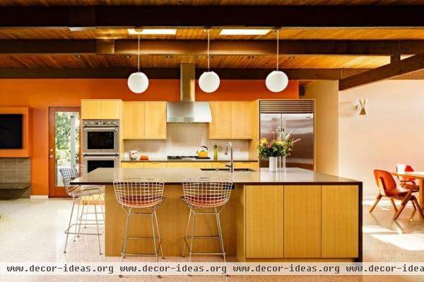
AFTER: Boyer removed some partitions and built-ins, simplifying the connections between the kitchen, dining area and living area. The great room is a contemporary concept, she says, but it reflects how people inhabit their homes. “How people live has changed,” she adds.
“We definitely did not want to damage the midcentury post-and-beam aesthetic,” says Robert. “However, we’re not into the retro for retro’s sake for things like kitchens and bathrooms.” Boyer used vertical grain fir, a common material found in midcentury homes, for the kitchen cabinets. New quartz countertops respect the midcentury aesthetic but hold up better than the plastic laminates common in midcentury homes. “We think the style should fit the house, but not that you have to have everything vintage or original,” he says.
Island lighting: Galaxy Pendant, Illuminating Experiences; wall paint: Chrysanthemum, Sherwin-Williams
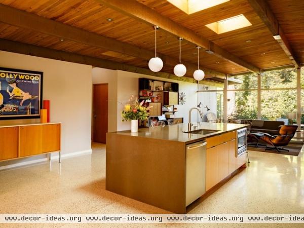
New skylights bring more natural light to the home’s core. Overall the house was in good shape, notes Boyer. “There were funky details but good bones.” The home’s original owner was a woman with a fondness of pink who split her time between Portland and Palm Springs. Though the color scheme has since changed, Robert says the pink lives on in the landscape.
Originally the Nathans planned to update only the kitchen, but they ended up adding a wet bar, renovating the deck area and laundry room, and adding an entry screen. During the previous remodel, the couple installed dark hardwood floors, but they just didn’t feel right in the space. New poured-in-place terrazzo floors lighten up the home and handle the wear and tear of the family’s two 100-pound dogs better.
“While it doesn’t show, a big chunk of budget went to replacing HVAC, electrical and adding a tankless water heater,” says Robert. New windows are dual glazed, and Boyer stuffed insulation anywhere there was room. New structural and energy codes mean you can’t build to the same midcentury standards, she explains, but they updated using modern conveniences that stayed true to the post-and-beam style.
Everyone working on the project added photos to ideabooks to share ideas and inspiration. “The fireplace — inside and out — and screen portions of the projects in particular had lots of back-and-forth between Risa and us as we finalized the design,” Robert says. “We shared our ideabooks with Risa, and I think it helped her understand the look and feel we really wanted to have.”
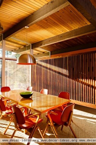
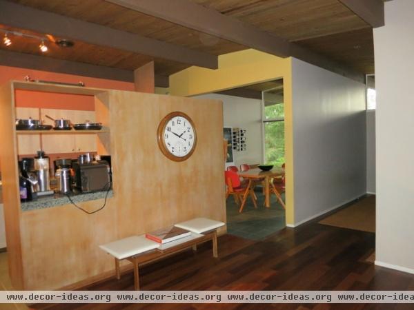
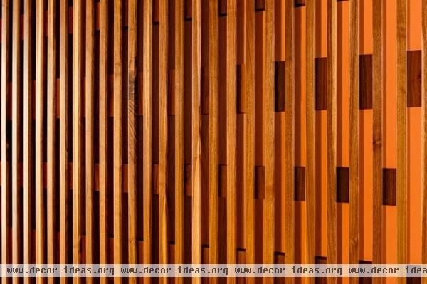
AFTER: Boyer wanted to maintain the entry’s sense of space without overpowering it or the adjacent dining room. She tore down the solid wall dividing the two rooms and added a custom wood screen. After studying and analyzing period details, Boyer designed a piece that the Nathans’ neighbor, the owner of Aura cabinetry, fabricated from solid walnut. Fir was used throughout the project, but in this case Boyer decided a change of tone was needed.
The dining table is a vintage Brown Saltman, designed by Van Keppel-Green. The dining chairs are vintage Thonet by Joe Atkinson, collected by the couple over several years. Though the chairs were refinished, their upholstery is original. “To come up with eight complete chairs, we’ve probably bought nearly twice that many, all on eBay,” says Robert. “We really like them, and they are quite comfortable.”
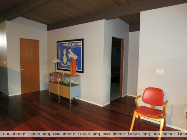
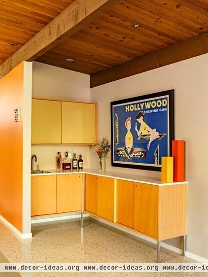
AFTER: Boyer referenced George Nelson in the cabinetry she designed for the built-in wet bar. With its plastic laminate counter and fir construction, the new unit coordinates with the midcentury furniture used throughout the rest of the house.
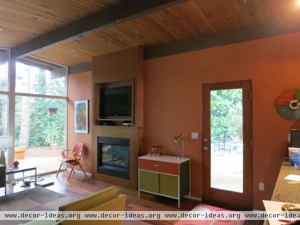
The homeowners installed a fireplace during the previous remodel but didn’t like how it fit in the house. Because of the home’s construction, Boyer was unsure how an open-hearth masonry fireplace would be feasible.
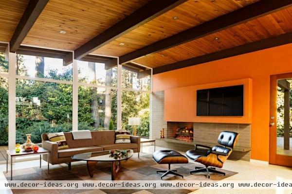
AFTER: She found a modular fireplace made of lightweight pumice from Scandinavia that they clad in brick. It gives the appearance of a full masonry fireplace, without all the weight, and is supported by the wood-framed floor and deck. Mason David Rael built it.
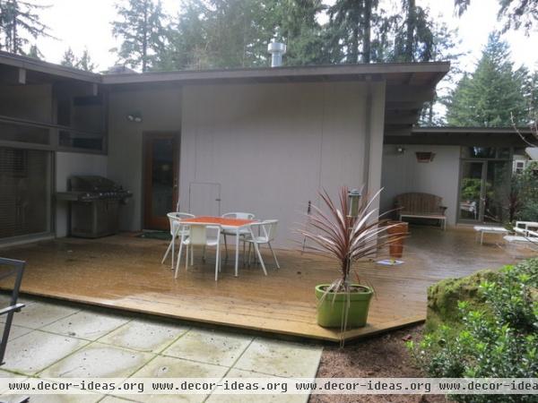
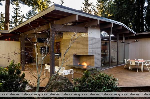
AFTER: They extended the roof over an existing deck, adding an outdoor component to the fireplace as well as a built-in grill. Where new details and joints connected with original components, Boyer’s team went to great lengths to ensure the transitions were seamless. No drawings or architectural records accompanied the house, so she reasearched prominent architects of the time, particularly Richard Neutra, for authentic details, including the corner fireplace. Whereas an original would have been wood burning, this one runs on gas. “We have sat out there in every weather condition since we finished in January,” says Robert.
Boyer has wrapped up another set of drawings for the couple as they decide if they want to pursue remodel number three. Her advice to other architects: “Photography is worth the investment,” because when you’re done with a project, that’s all you have left. “Who knows if they would have found me otherwise,” she says.
More:
Find design professionals near you on Houzz
See more guides to using Houzz to help with your home projects


