Chic New Interiors Take a Ranch House Beyond Typical
http://decor-ideas.org 04/15/2014 23:23 Decor Ideas
Before-and-afters like this one have launched a million projects, snagged thousands of jobs for clever designers and ignited countless dreams. Nothing illustrates possibility like a dramatic interior transformation — especially when that potential lies just beneath a coat of paint, dated wallpaper or a tired mantel.
With this typical ranch-style home in Alamo, California, interior designer Kriste Michelini was able to look past what existed and imagine it with a new, chic attitude. With a few tweaks and well-chosen finishes and furnishings, she’s made that vision a reality — and thus, the cycle begins again.
Photography by Wayne Miller

The house belongs to a young family: two active and athletic adults and two young children. The interior didn’t reflect their spirit.

AFTER: “They wanted something that was calming, relaxed, warm and modern,” Michelini says. “They wanted their home to be more like a sanctuary.” The new living room is done in soothing neutrals with pops of color and lots of texture for interest. A new furniture arrangement opens up the room and makes it feel larger.
The mottled brick on the fireplace has been painted white, and the cabinets beside it have new, simpler hardware to bring it into this century. An area rug with an abstract pattern is forgiving (remember, two young kids live here) and classy. The ceiling-piercing cans are gone, replaced by an elegant spherical light fixture.
What you need to know before painting brick
When she wasn’t able to find a bench in the right dimensions, the designer purchased a metal coffee table from Crate & Barrel, had the legs cut down and then added a cushioned top.
Sofa: Ironies, Kneedler/Fauchere; chairs: Lawson-Fenning; bench: Crate&Barrel; rug: Bellbridge Carpets; light fixture: Restoration Hardware
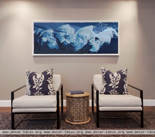
The armchairs are under a painting by James Nares, an artist known for creating entire works with a single, wave-like brushstroke. “We used accents of navy blue and plum colors in this room,” says Michelini. “My client loved this painting because it looks like a wave or clouds.”
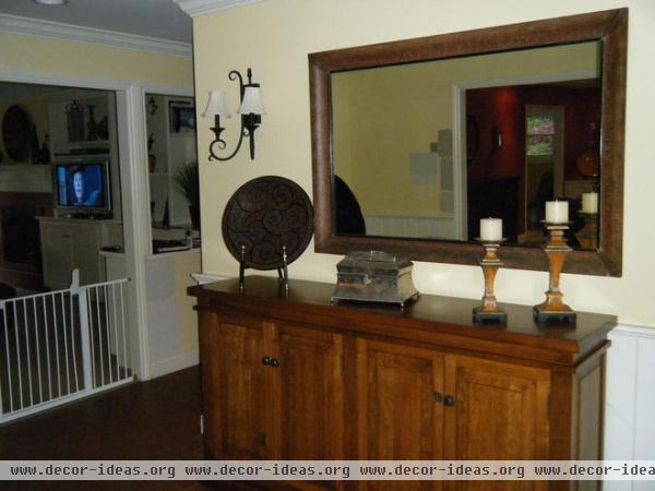
BEFORE: Despite being cloaked in yellow, the adjacent entry seemed dark. “One of the words the clients used to describe what they wanted from their home was ‘welcoming,’” says Michelini.
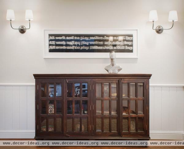
AFTER: The new entry is dressed in lighter colors and modern sconces for a lighter, brighter look. The designer paired a console the family already owned with a modern artwork (an abstracted rendering of the phrase “all work and no play makes Jack a dull boy") for a look she calls classical modern. “These people run Ironman triathlons, and they ski — but they work hard too,” she says. “Because of that, this artwork resonates.”
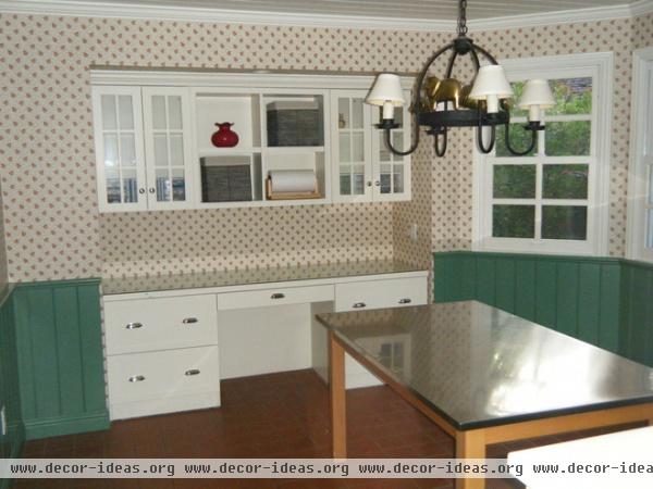
Country-style wallpaper, a farm-animal-adorned light fixture and green trim made the breakfast room more cute than classy.
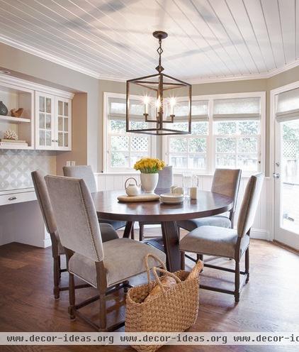
AFTER: A tongue and groove ceiling adds quiet texture. Classic chairs covered in velvet outdoor fabric make the room elegant, although the fabric is tough enough to stand up to kids. The new chandelier is a modern take on a traditional lantern fixture. The built-in desk remains the same, but has been painted and backed by a modern wallpaper. “It’s nice to have a desk near the kitchen, but not in the kitchen,” says Michelini. “It’s away from the work area but close to the action, making it the perfect place for kids to do homework and other projects.”
Chairs: Restoration Hardware; light fixture: Visual Comfort
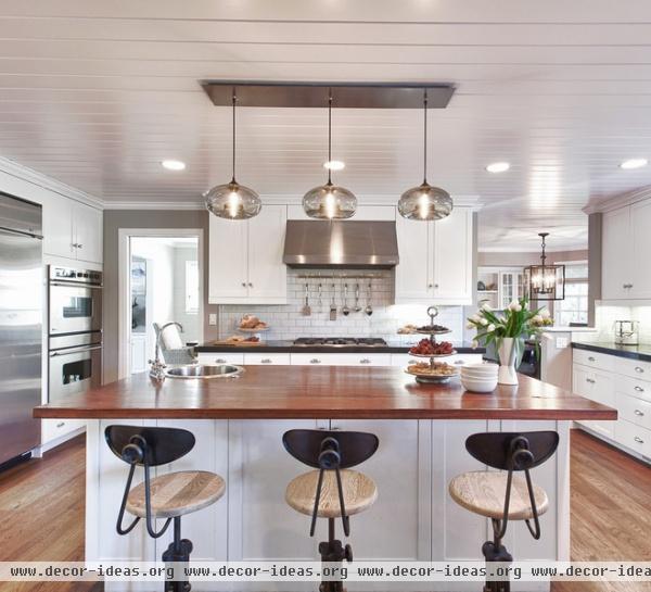
The tongue and groove ceiling continues into the new kitchen, where an island is topped with a warm walnut wood. “These clients wanted to use wood, because they love the warming element of it,” says Michelini. “It’s not for everybody, because it requires some maintenance and care. You have to seal it once a year, and you can’t put hot items on it.” The other countertops are Absolute Black granite.
The light fixture and bar stools strike a modern industrial note.
Light fixture: Niche Modern; bar stools: HD Buttercup
Wonderful Wood Countertops for Kitchen and Bath

In the family room, a dated, overscale and awkwardly placed fireplace once loomed large.

AFTER: A new sectional allows family members to enjoy the fireplace or the television set.
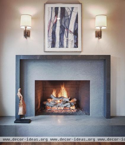
The new fireplace is smaller, creating more separation between it and the built-in cabinetry and shelves. Its new, sleek lines are much more modern than before.
Fireplace surround: Caesarstone
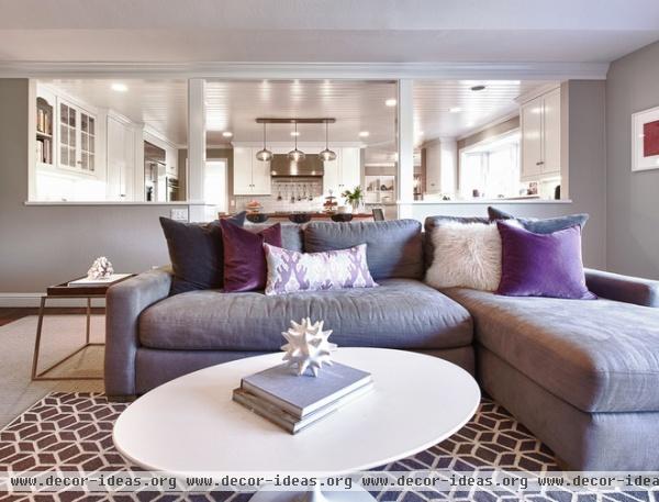
A graphic rug and colorful pillows give the room a punch of color and texture.
Sofa: Restoration Hardware; coffee table: Design Within Reach
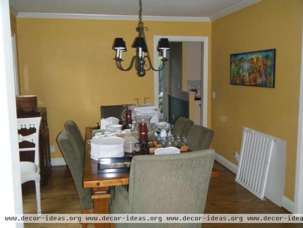
The dining room was formerly small and plain.
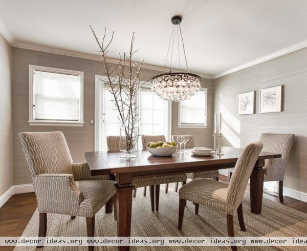
AFTER: The walls of the new dining room are covered with grass cloth for texture. The previous table and chairs remain, but the chairs have new upholstery. The bubble-like light fixture adds a dose of glam without weighing down the small room. “It brings in some shimmer,” says Michelini.
Light fixture: Ochre
See more ranch house remodels
We love a happy ending! Please share your home transformations with us in the Comments section below.
Related Articles Recommended


