Houzz Tour: Stacking Up to a Modern Master in Kansas
Inspiration for the design of a new house can come from many places, such as a client’s interests and wishes, a place’s context or another building. The latter, referred to as a precedent in design circles, was one major influence on Matthew Hufft’s design of this modern house in the well-to-do Mission Hills neighborhood of Kansas, near Kansas City. Specifically, the precedent was Marcel Breuer’s 1954 Snower Residence, which sits on a corner lot just a few doors down from the new house Hufft designed for two physicians and their children.
Like Mies van der Rohe, Richard Neutra, Walter Gropius and other early modern architects, Breuer emigrated to the United States from Europe before the outbreak of World War II. He lived in Cambridge, Massachusetts, then later New York City. He is known for his furniture, large concrete public and commercial buildings, and many modern dwellings. The latter are primarily found on the East Coast, so the Snower Residence is a rarity, lying west of the Mississippi.
Hufft said he drew inspiration from the wood-clad house’s “clean lines and modern planes and volumes.” Instead of copying the elements of Breuer’s design, however, Hufft “expanded upon them in ways that fit our site and our specific program,” he says. Let’s take a tour of the house and see how it compares with its predecessor.
Houzz at a Glance
Who lives here: 2 physicians and their 2 kids
Location: Mission Hills, Kansas
Size: 6,400 square feet (595 square meters); 3 bedrooms; 4½ bathrooms
Photography by Andrew Fabin
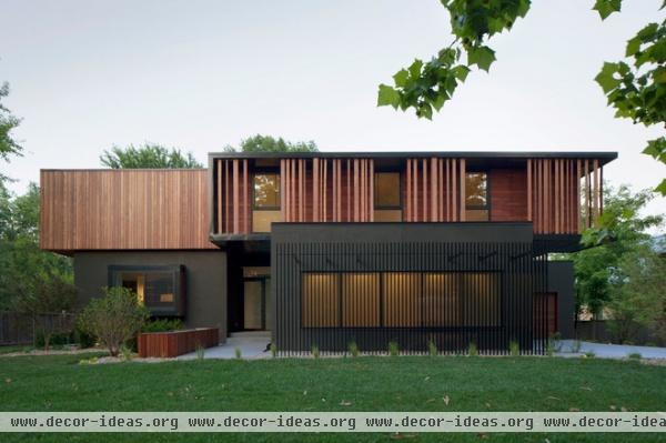
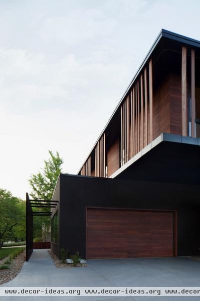
The new, two-story house designed by Hufft and company is composed of layers: a wood-clad upper volume sits above and cantilevers beyond a dark stuccoed ground floor. Vertical slats screen both the bedrooms on the top floor and the windows of the garage below; those above filter the sunlight on this west-facing elevation, while those below could act as an armature for plants to creep up them.
Here’s a close-up of the garage and the dramatic layering of the materials upstairs. The screen below acts like a trellis over the path to the front door beyond.
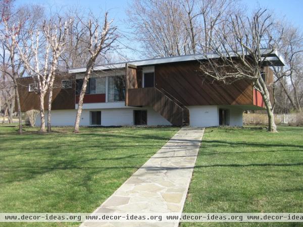
Here’s Breuer’s house, built 60 years ago; it lies on a corner lot just a few doors to the north. The similarities and differences between the old and new houses are clear: The second story here is also wood-covered, but its siding is diagonal. And while the upper floor cantilevers beyond the footprint of the lower level, here we can see that the upper floor is devoted to living spaces, unlike in Hufft’s house.
Further, Breuer addressed the corner by turning the simple linear box at a nearly 45-degree angle. Therefore only one side faces the intersection (as opposed to two facing each street). This siting guarantees it will have a distinct presence as long as it survives, even though the house is smaller than usual for this affluent area.
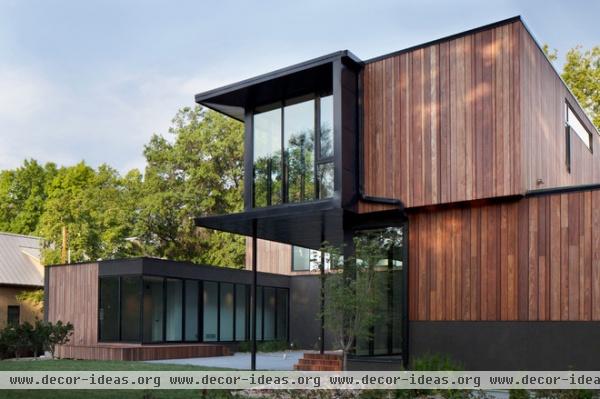
Now we’re back to Hufft’s house. The back of this new house is much more complex than Breuer’s, which is a simple rectangle. This U-shaped plan creates a courtyard between the wings: in the foreground are the living spaces on the ground floor and the master suite above, while in the background is the one-story cabana that will serve a future pool.
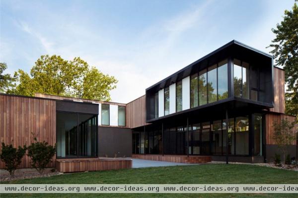
The wood covering the exterior is vertical shiplap siding milled from FSC-certified machiche, a tropical hardwood. Hufft says this wood was chosen “for its density, durability and warmth against the dark metal of the exterior.” The painted stucco on the ground floor sits between the wood and the dark metal and dark aluminum window frames upstairs. White is introduced in a few areas to break up the primarily dark palette, something that also happens inside.
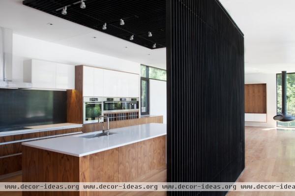
Unlike many of the photos on Houzz, these shots of the interior were taken before the family moved in, before they populated the spaces with their furniture, belongings and other elements that will turn the modern house into their home. You’ll need to use your imagination to envisioning the spaces as being lived in, then, but the photos do help to illustrate the built-in furnishings the architects designed throughout the house.
In the kitchen they designed a blackened steel screen that echoes the one in front of the garage. Like the one outside, the screen wraps overhead to create a plane that contrasts with the white ceiling, and to support the track lights. We can also see a blackened steel backsplash behind the stove. Like the exterior, wood and dark metal are broken up by white surfaces here, though the white predominates inside.
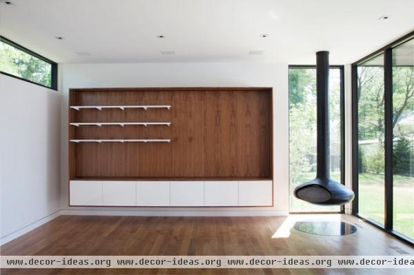
“In the kitchen, bathrooms and living spaces, we fabricated the clear-stained walnut casework and shelving, mixing in high-gloss white laminate panels for a clean, bright appearance,” Hufft describes. Note how the top of the wood casework aligns with the bottom of the window on the left, something any architect would be proud of.
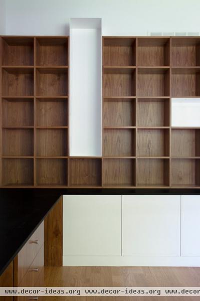
As with the Breuer house, architectural elements are perpendicular but asymmetrical here. Rectangular volumes overlap and extend past one another, for example. Here a grid of wood shelves is broken up by white boxes that allow for art and other objects to be displayed prominently.
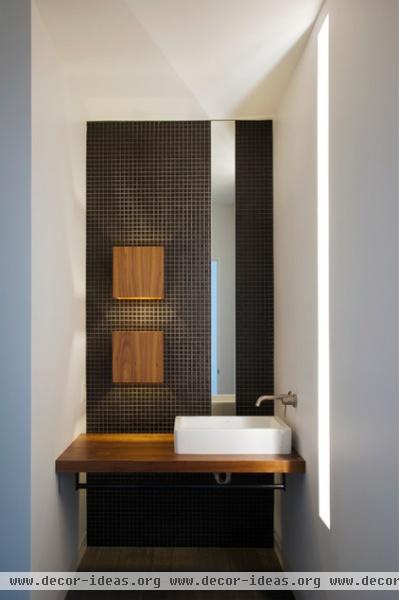
A powder room on the first floor illustrates the care and the level of custom design from Hufft Projects. The palette of dark colors, wood and white continues, but in an execution appropriate to the space. The dark tiles are particularly nice, as are the vertically oriented mirror and the slot of light cut into the wall.
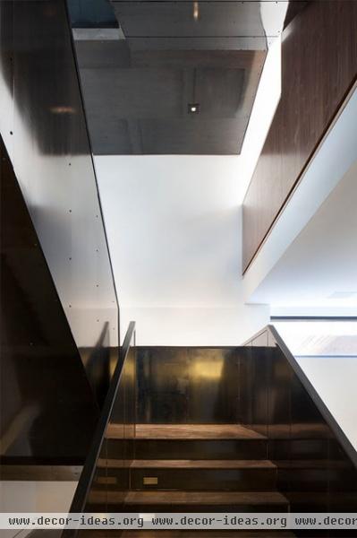
Blackened steel was also used for the stair guardrails. Combined with the wood, the materials are an intentional contrast of dark and light.
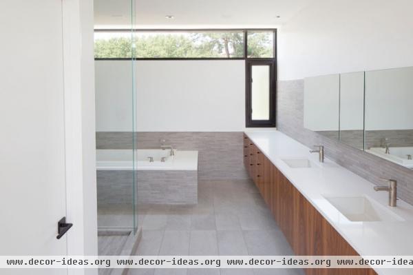
Given the size of the master bathrooms, the dark colors were toned down to a gray, while the wood and white are still present. The different materials work together to create stacked bands, much like the house itself is two stacked floors that are expressed individually.
More: 10 Must-Know Modern Homes | Modern vs. Contemporary: What’s the Difference?


