My Houzz: Family Efforts Pay Off for a 1915 Home
Kathy and Joe Szabo spent 12 years renovating their previous home and were itching to get their hands dirty again. It took them three years of searching, but they found a new house that was worthy of their attention. “We were looking for a house that wasn’t touched very much,” says Joe, a cardiologist. “This one had enough character and a lot of work to be done.”
Their “new” house was built in 1915, and not much had been updated since then. Kathy, who runs Katherine Szabo for Cinderella Design and Events, took charge of all the planning, design and permits. Then the pair did all the rough work, including changing all the wiring and plumbing, and demolishing walls. Once that was done, they hired professional help for the finishing touches.
Houzz at a Glance
Who lives here: Joe and Kathy Szabo, and their children, Amelia (age 10) and Sophia (7)
Location: Westmount area of Montreal
Size: 4,500 square feet (418 square meters); 3 bedrooms, 5 bathrooms, plus a basement
Year built: 1915
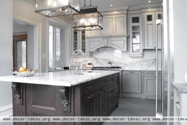
Kathy drew out her kitchen plans and worked with Armoires CKB to have the cabinetry made.
Her father had worked in many of the old houses around the city and would take home old moldings, paneling or stairwells that people were throwing away. He gave her some beautiful wooden corbels, which the cabinetmaker incorporated into the island.
Paint on walls, ceiling and top cabinets: Aged Beige, Behr

It was taking a long time to receive the marble the couple ordered from Italy. Then, by chance, someone else bought three pieces of Calacatta marble and canceled the order. Mont-Royal Marble and Granite called the Szabos in to see it.
Their original plans called for 1¾-inch-thick marble, but they improvised with the new ¾-inch piece. “We’re much happier with the result,” says Joe. They used a second piece of marble for the backsplash, instead of subway tiles.
Appliances: Almar; fruit bowl: Stockholm, Ikea
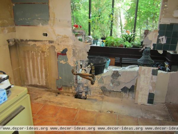
The house had been built with a kitchen window facing a small greenhouse. The couple tore down the wall and extended the kitchen, giving them a much brighter space.
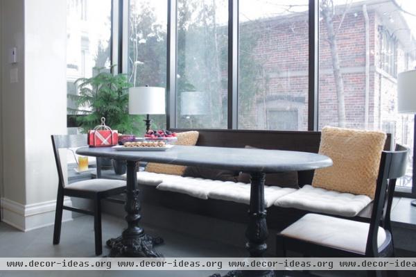
AFTER: The Szabos used the extra space to create a breakfast nook in the kitchen.
Joe and his father made the table from a piece of plywood and two bistro table bases. Impressed by the durability of soapstone, they adhered a slab of it to the top of the table.

The previous owners had painted the living room bright orange. Kathy repainted it pale tan and filled it with furniture from family and Craigslist, along with some custom pieces.
Blue couch: custom by Dimitri Furniture; wall paint: Canvas Tan, Behr
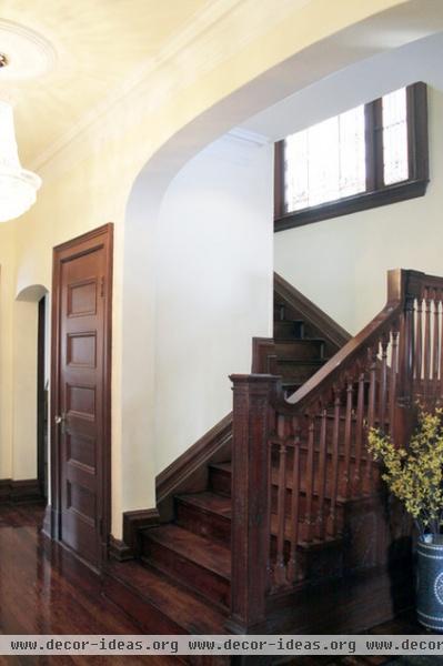
The woodwork was originally very mismatched. The moldings were mahogany, the stairs were maple, and the floors were quartersawn oak, all in varying tones.
The owners hired Plancher A.P. to refinish their floors and match the moldings as closely as possible, but they soon found out the floor was on its last sanding. “The floors were one of the things we loved about the house, and we didn’t want to have to replace them,” says Kathy. Plancher A.P. applied a durable floor product and varnish to increase the wood’s longevity and match the color of the moldings.
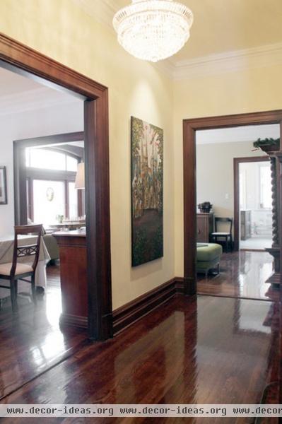
The main hallway on the first floor leads to the formal living room, dining room and family room, with more openings that lead to the kitchen.
“This is a house of doors,” says Kathy. “There aren’t many walls for art.” Despite this she managed to find space for a few of her favorites, including a painting of the Sagrada Família basilica.
Wall and ceiling paint: Polished Pearl, Behr
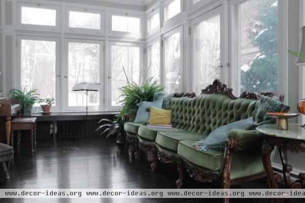
When Kathy sits in the light-filled conservatory on Joe’s grandfather’s couch, it feels like all the manual labor has paid off. “This is probably my favorite room to relax in,” she says.
The piano was a gift to the couple’s daughters from Joe’s father, who saw it on the curb, walked it up his block, had it restored and delivered it in time for Christmas.
Wall paint: Coliseum Marble, Behr
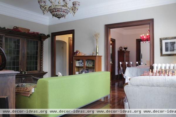
The family room is centrally located between the dining room and the kitchen. Kathy chose a low-profile couch from Ikea, which is perfect for entertaining. Guests can sit on the back of it or on the arms while chatting. The family enjoys playing games in this room.
The red dining room chandelier hails from Venice, Italy.
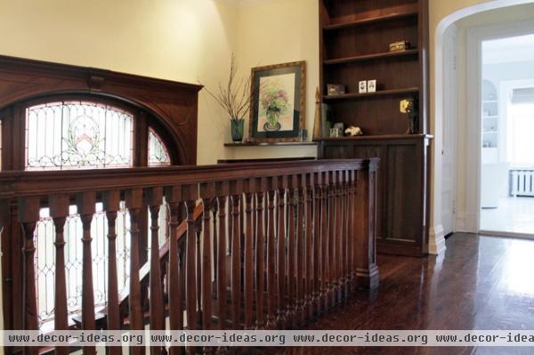
This large stained glass window is original to the home. The couple plans to close off the small hallway leading to their bathroom and bedroom, and turn the space into a self-contained master suite.
Painting: Andrei Zadorozny

The couple converted a bedroom into their master bathroom. They installed a heated flooring system and used the third piece of Calacatta marble, left over from the kitchen, for the shower.
Tiles, tub: Ciot; mirrors, glass: Vitrerie A. Lavoie
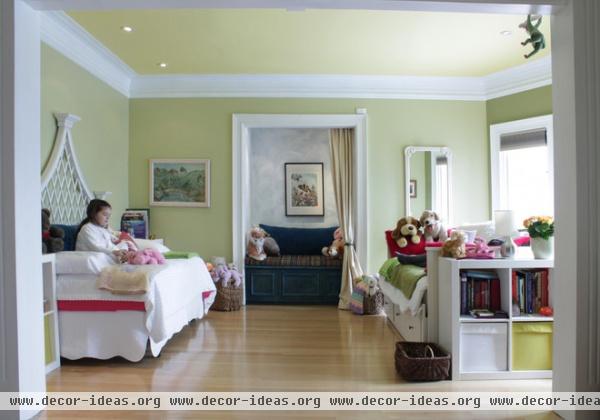
“We noticed among our friends that those who had shared a room with a sibling were very close,” says Kathy. With that in mind, they turned what had once been the master bedroom into a shared space for daughters Amelia and Sophia.
“My favorite part is the nook,” says Amelia about the closet-turned-reading-area.
Ceiling paint: Banana Fibre, Sico
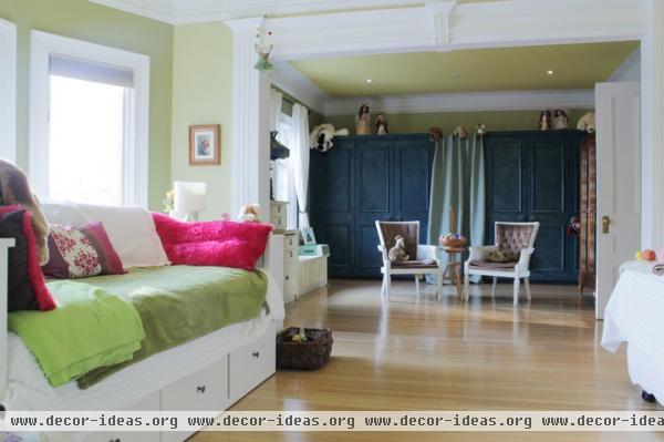
The floors in every room were originally different colors. The Szabos matched them all except for the one in the girls’ room, which they just buffed.
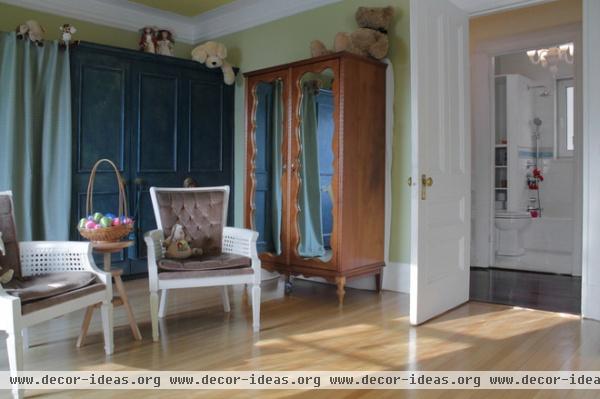
The second part of the bedroom is where Amelia and Sophia’s clothes and toys are stored. Across the hallway is a bathroom designed by the girls; Sophia picked the upper tiles and Amelia the lower ones.

Updating the house was a family project. Everyone got involved.
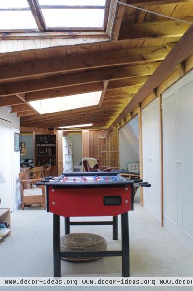
The sun-filled attic is generally a hub of activity. It houses the girls’ playroom and two office spaces.
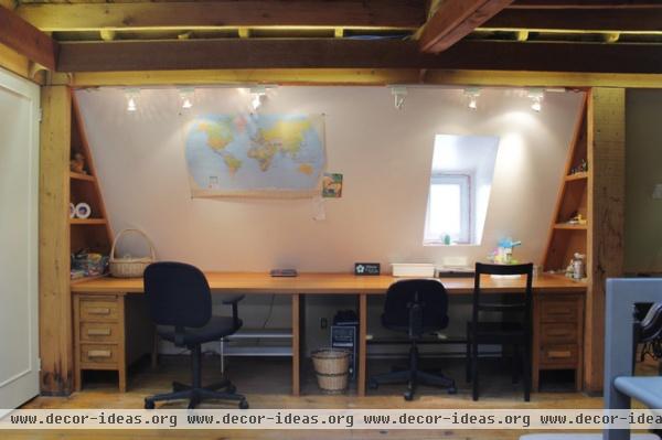
This attic wall was designated as a homework area for the girls.
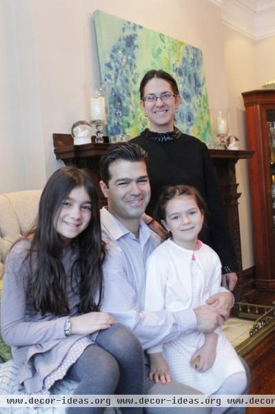
Joe and Kathy relax with daughters Amelia (left) and Sophia in their living room. The painting on top of the fireplace is by a family friend, Yolande Tumiuk.
See more photos of this home | Show us your home
Browse more homes by style:
Small Homes | Colorful Homes | Eclectic Homes | Modern Homes | Contemporary Homes | Midcentury Homes | Ranch Homes | Traditional Homes | Barn Homes | Townhouses | Apartments | Lofts | Vacation Homes
More: My Houzz: Goodwill and Good Taste in a Grand Colonial


