Houzz Tour: Farmhouse Meets Victorian in Los Angeles
Interior designer Alison Kandler’s farmhouse fantasy began with tile. “I fell in love with this chicken-wire tile, and the whole house grew out of that,” she says. Kandler had worked on many house projects with architect Joan Swartz, and together the two infused the designer’s Los Angeles house with an eclectic vintage farmhouse look. Kandler shopped flea markets with that style in mind, picking up unique signs, mixing in Victorian furnishings, adding to her midcentury pottery collection and selecting artwork that spoke to her. She even picked up scrolled wrought iron planters from a mortuary to use as sculpture. The results have a unique style and a playful energy.
Houzz at a Glance
Who lives here: Alison and Brian Kandler and their daughter
Location: Los Angeles
Size: 5,000 square feet (465 meters); 5 bedrooms, 4 full bathrooms and 2 half bathrooms
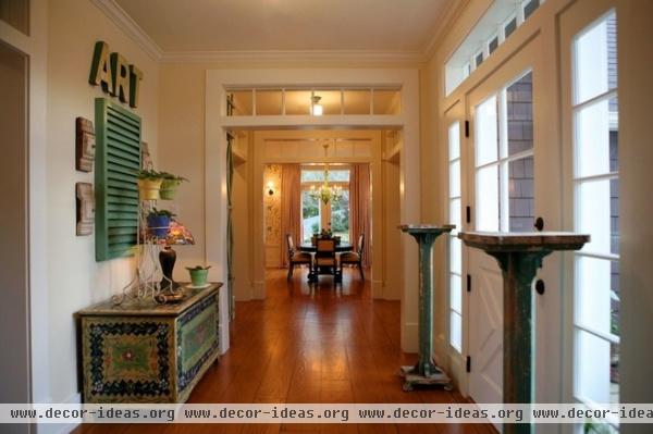
The entrance offers many clues as to what awaits in the rest of the house. “I like to create some confusion between indoors and out,” Kandler says. Hence the Dutch door, large sidelights and transom. Vintage rolling plant pedestals provide architectural interest.
She’s also a big fan of vintage signs and letters, which you’ll notice all around the house. The original hand-painted trunk here was a lucky flea market find and one she’s unlikely to ever sell.
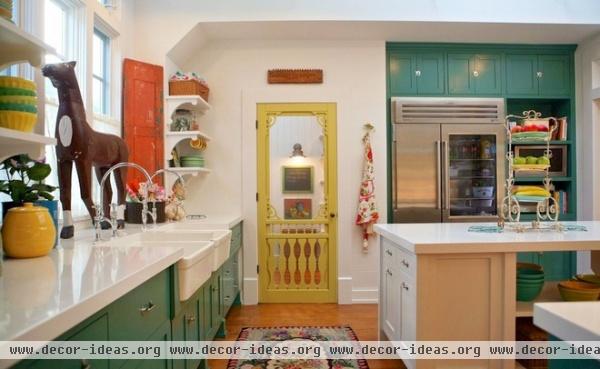
In the kitchen a cheerful screen door marks the entrance to the pantry. This is a quirky move Kandler likes to make on a lot of her projects.
While considering a very large famhouse sink, she decided she preferred the scale of using two side by side. It’s a great way to create a divided sink, and the two faucets work well beneath the large window.
Similar-color door paint: Citrus Spice, Dunn Edwards; similar-color cabinet paint: Green Gables, Benjamin Moore; counters: Qortstone; refrigerator: Sub-Zero
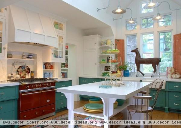
Also working hard in front of the window is a vintage horse, which probably came from an old ranch sign. “I shopped the flea markets with a farmhouse in mind,” Kandler says. When she sells a house, she likes to sell most of her finds so she can spend the money on new treasures.
The island has open shelving on one side and cabinets that contain the trash and recycling bins on the other. “I wanted it to look like a piece of furniture,” Kandler says. She also likes to use a range as the focal point in a kitchen and considers it “the hearth of the room.” A deep red Lacanche model adds European flair and a classic look. If you look closely, you can see the chicken wire–imprinted tile in the backsplash behind the range.
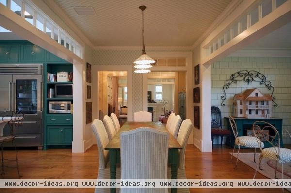
More deliberate confusion between indoors and out is apparent off the breakfast nook. The sitting room on the left is shingled to give the look that it was once a porch. Transoms and wide openings connect the rooms, and providing a transition between the sitting room and the kitchen is a breakfast nook covered in a lattice wallpaper.
The light fixture is Italian; it’s composed of painted ceramic and unlacquered brass. Note the scrolled ironwork over the dollhouse. Such pieces are architectural elements that Kandler loves to use as sculpture all around the house.
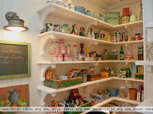
“I’m really into pantries and laundry rooms, and making them pleasant destinations,” Kandler says. She treats them like any other room. For instance, she custom designed the shelf brackets and hung a vintage still life on the wall for her own pantry.
The pantry is full of fun vintage touches, from old boxes and jars to a vintage sconce and chalkboard. The room also has a skylight, and if you look closely, you’ll see that the ceiling is wallpapered in a sweet floral print. Just out of view is some open counter space, great for small appliances.
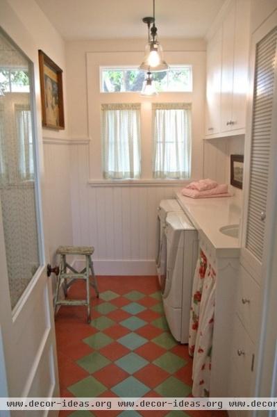
The laundry room gets the same treatment as the pantry in a Kandler home. The floor is colorful encaustic tile; the beadboard adds a charming touch. The glass door reads “Laundry.” The skirt under the sink was sewn from a vintage tablecloth. Kandler has a deep stash of vintage tablecloths she uses for seat cushions, throw pillows, skirts and other fabric needs. “When you use a vintage tablecloth, you wind up spending $15 instead of $400 on fabric,” she says.
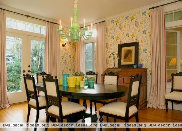
The dining room sprang from the bright botanical Osbourne & Little wallpaper. “It just said farm to me,” Kandler says. A green Depression-glass chandelier by Martha Stewart continues the pastels overhead, while the designer’s favorite Bauer ceramic pieces add color to the dark table. Transoms and French doors fill the room with light.
The chairs are French Eastlake-style reproductions; Kandler re-covered them in a burlap-like linen.
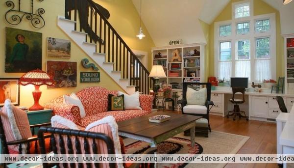
In the family room, you can just catch a glimpse of Fred Astaire dancing up the staircase. He came from the Kennedy Center Honors show that aired in 1978. Kandler loves to pick art that speaks to her, whether it’s a vintage portrait, still life or sign.
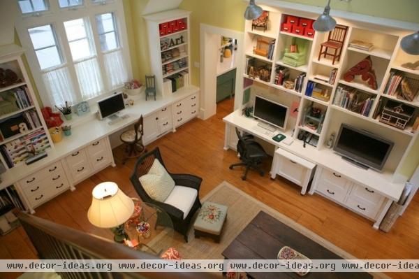
“I find that wherever I am, the whole family follows,” she says. Hence she set up her office right in the family room, but outfitted the TV with headphones to keep from being disturbed. The station to the left is her daughter’s work and craft station.
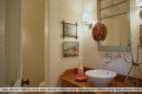
In this sweet powder room, a small botanical-print wallpaper adorns the walls and an old pine table serves as a vanity. The mirror frame adds the look of a window to the room, as does the window on the door.
Wallpaper: Farrow & Ball
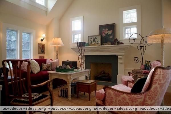
This cozy living room shows some Victorian influences. Kandler created a set out of two different chairs by upholstering them in matching fabric by Mimi London. The sofa was a floor sample from Grange Furniture that she had reupholstered. The high coffee table is an old oak Victorian table. The scrolled ironwork pieces are plant stands. “I drag home a lot of iron; it’s inexpensive art that adds instant charm,” she says.
The fireplace is surrounded with slate. Most of the rooms that are not wallpapered have tongue and groove planks, evoking a farmhouse feeling.
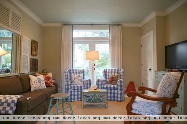
This first-floor room is meant to be an extra bedroom if needed, but the Kandlers use it as a den too. (The Mitchell Gold sofa folds out.) A pair of large-print gingham chairs are about the only matched set of anything in the eclectic house, aside from the chairs in the living room. The mirror surrounded by shutters mimics a window and reflects the light.
Kandler scooped up another darling hand-painted trunk at the Rose Bowl flea market, which now serves as a coffee table.
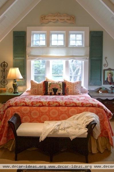
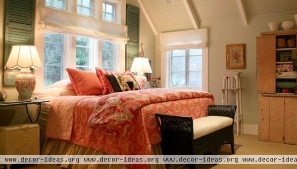
More vintage shutters serve the master bedroom. “Most people say putting a bed in front of a window is a no-no, but I think they make great headboards,” she says.
A piece of tramp art serves as an architectural piece above the windows. More little iron scrolls serve as sculpture over the nightstands.
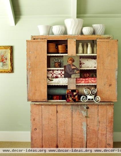
A large primitive armoire provides storage for linens. Kandler displays her white Bauer pottery collection on top of it.
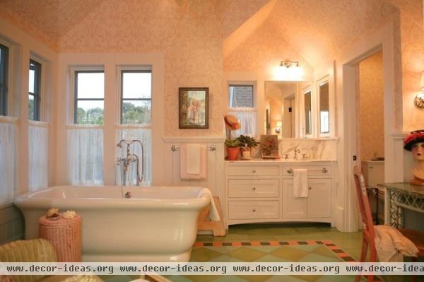
More colorful encaustic tile enlivens the master bathroom floor. Tiny bits of glass tile surround the border. Kandler loves a great mannequin head; one adds personality to her wicker dressing table.
Bathtub: Waterworks
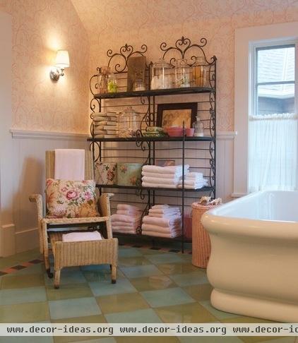
More iron scrolls adorn these baker’s racks used for linens, and a vintage Heywood-Wakefield wicker chair from a ship serves as spot for reading or keeping a soaker company. The Nina Campbell Wallpaper seems to takes its cues from the iron scrolls.
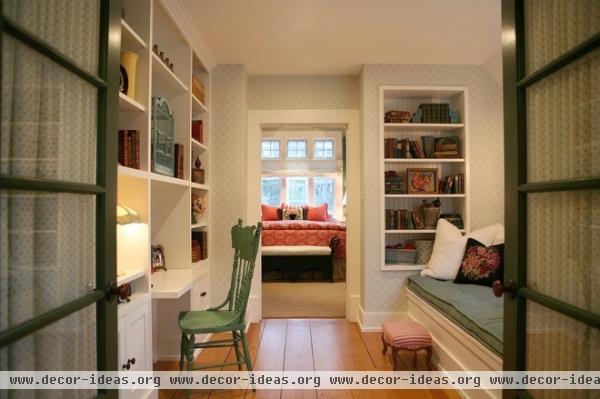
Kandler rarely lets a hallway be just a hallway. Off the master bedroom, this hallway serves as her husband’s workspace, and the deep window seat is mattress size. It has enough room underneath for the family to store all of their luggage.
Wallpaper: Barbara Barry
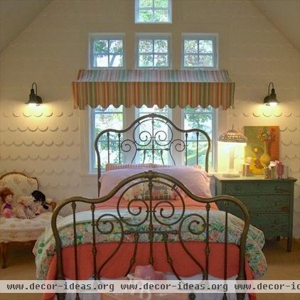
“I wanted my daughter’s room to feel like a living dollhouse,” Kandler says. The scalloped shingles, gooseneck barn lights and awning over the headboard also dance along the indoor-outdoor line. The scrolls on the brass bed are similar to the scrolls used throughout the rest of the house.
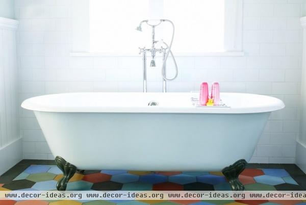
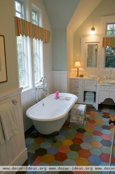
In her daughter’s bath, colorful 8-inch encaustic tiles play with scale and create a cheerful pattern underfoot. Kandler had the outside of the claw-foot tub painted baby blue to match the flower-shaped vessel sink.
Tile: Redondo; bathtub: Sunrise


