Houzz Tour: Vintage and New Make a Groovy Mix in Houston
http://decor-ideas.org 04/14/2014 03:22 Decor Ideas
Interior designer Sally Wheat and her husband, Mark, built this Houston house in 2006, but looking at the interior, it would be hard to tell when it was constructed. That’s because she’s filled it with an eclectic mix of old and new pieces for a look that’s as unique as it is timeless.
Houzz at a Glance
Who lives here: Sally and Mark Wheat and their 2 children
Location: Houston
Size: 4,000 square feet (372 square meters); 4 bedrooms, 4½ bathrooms
Year built: 2006
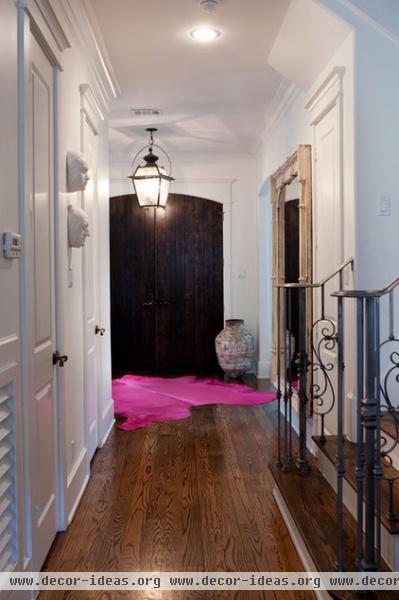
The old-and-new mix starts at the front door, with a classic lantern fixture hanging over a hot-pink cowhide rug.
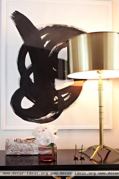
Also in the entry, a bold modernist work by Houston artist Amanda Fulk hangs over a beloved Espana Chest by design icon Dorothy Draper.
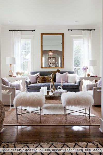
The living room is done in soft tones. The genesis of the look was the pink table lamp on the left. “I found it at a vintage shop, and it inspired the entire space,” says Wheat. “I knew I’d never find another one, so I paired it with a clear glass lamp on the other side. It’s just as well, as you don’t want to have too many sets of things in one room.”
Fluffy ottomans, a white cowhide and filmy white curtains add an ethereal softness to the room. As for the barely there window treatment: “We don’t use the front rooms at night,” Wheat says.
Pig bank: Harry Allen; benches: Mongolian Fur X Bench, Sally Wheat Interiors
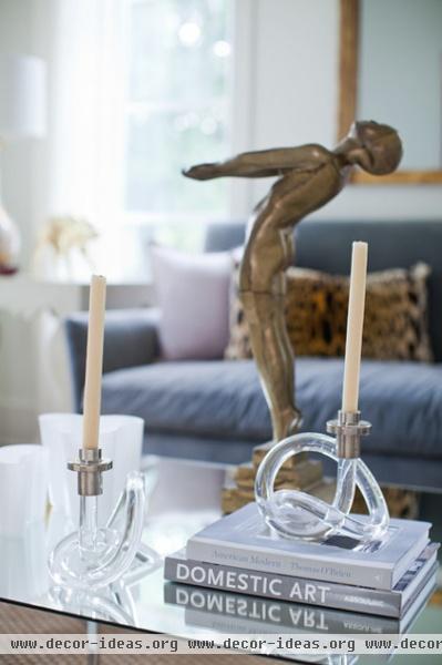
Wheat likes to put memorable pieces in her rooms. In this case it’s a large brass figure leaning backward over the glass coffee table. The figure’s glowing surface is picked up in gold-tone accessories around the room.
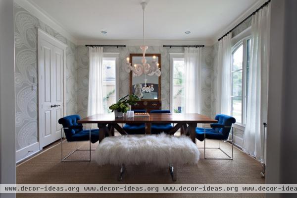
Across the hall, the dining room is done in shades of blue. Wheat first chose the watery-toned wallpaper, and when she saw these Milo Baughman chairs in an antiques store, she snatched them up and re-covered them in cobalt velvet — even though there were only four, and the table is large. Although she’s since found two more, she used a bench to make up the extra seating at the time this photo was taken.
Wallpaper: Rajapur, Cole & Son
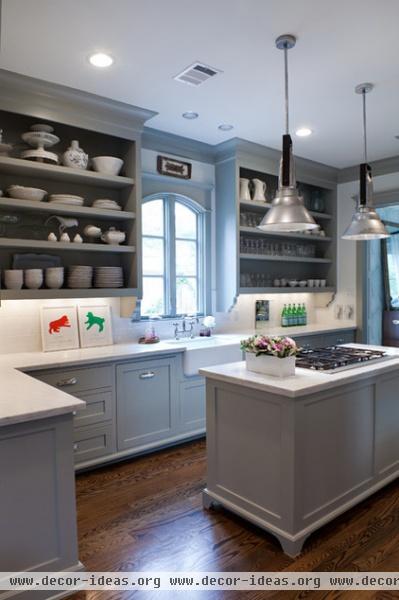
Wheat used light gray for the kitchen cabinets. “I chose open shelving, because I saw it used in a decorator showcase and loved it,” she says. “I’ve heard people say that it’s a maintenance issue, and that things get dusty. I mostly put things I use all the time on them, and it hasn’t been an issue,” she says.
Cabinet paint: Fieldstone, Benjamin Moore
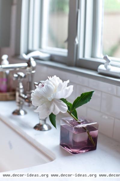
A peony decorates the space beneath the kitchen’s arched window.
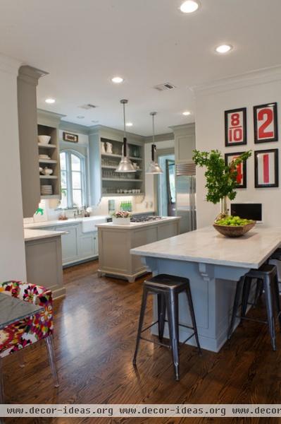
Wheat displays a collection of framed vintage numbers over the peninsula. “They were once used in a gas station,” she says.
Counter stools: Marais, Design Within Reach
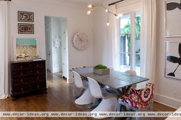
Near the kitchen is a breakfast area. It has an antique, character-rich zinc-topped table and a collection of modern chairs.
Fabric chair: Mademoiselle, Kartell; white chair: Panton
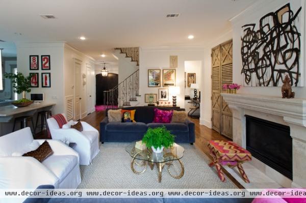
For the family room, Wheat selected two sofas and two armchairs for maximum seating (because where you have kids, there you have their friends). The television is hidden behind one set of the old French shutters that flank the fireplace. A brass ram’s-head coffee table — popular in the 1960s and highly collectible today — anchors the room.
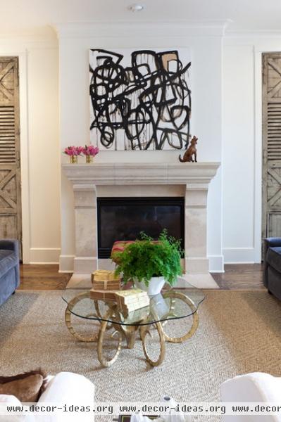
The classic fireplace went edgy with the addition of a graffiti-like painting. “I love graphic art,” says Wheat. “The bolder, the better.”
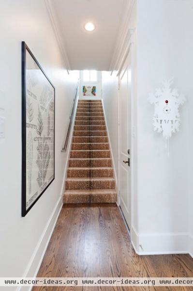
A flight of stairs is covered with an antelope-print rug. “Animal prints are always in style,” says Wheat. “I like this one for the way it looks and because it’s very forgiving. This carpet looks exactly as it did when we installed it in 2006.” The colorful print from Ikea of a woman with a finger to her lips might be issuing a silent message to the Wheat children.
Cuckoo clock: Pascal Tarabay
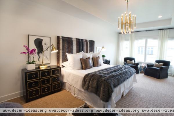
Espana chests make another appearance beside the bed in the master bedroom. With the gold Jonathan Adler light fixture, an almost tribal headboard, snakeskin-print pillows and the brindled faux-fur throw, the effect is almost 1970s. “I can’t help it,” says Wheat. “I love that era.”
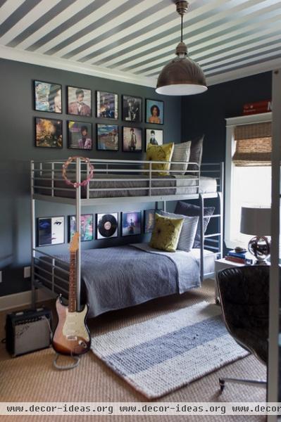
Things get even groovier in her boy’s room with framed album covers, a striped ceiling and an electric guitar.
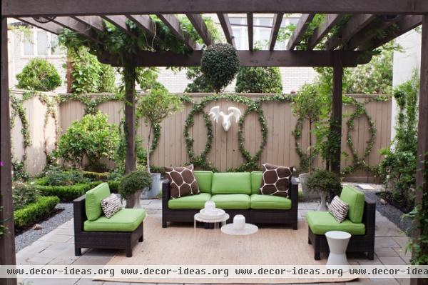
Wheat enlisted her husband to help her do something different in the backyard. “It seemed like everyone was training vines in X patterns,” she says. When her husband suggested O shapes, she readily agreed. He used nails to create the form and stretched wire over them. Jasmine vines now make fragrant circles around the patio. “I don’t like to do what everyone else is doing,” Wheat explains.
Browse more homes by style:
Small Homes | Colorful Homes | Eclectic Homes | Modern Homes | Contemporary Homes | Midcentury Homes | Ranch Homes | Traditional Homes | Barn Homes | Townhouses | Apartments | Lofts | Vacation Homes
Related Articles Recommended


