Kitchen of the Week: Captain Courageous Style in Massachusetts
http://decor-ideas.org 04/11/2014 23:22 Decor Ideas
Karen Swanson’s historic Manchester, Massachusetts, home was built in 1850 by a prosperous local sea captain named John Carter, and although most of the house has the architectural detail of that period, the kitchen was a relic of the 1950s (or thereabouts). Swanson, owner of New England Design Works and an award-winning kitchen designer whose personal tastes are more modern, made a kitchen that straddles the line between traditional and contemporary, with a small nod to the home’s original owner.
Kitchen at a Glance
Location: Manchester, Massachusetts
Size: 280 square feet (26 square meters)
Photography by Evan White

The old kitchen had fixtures and finishes that had given up the ghost. The room stood in front of a large utility room.
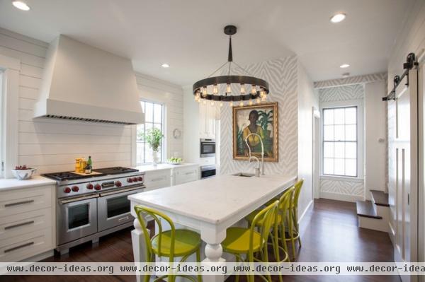
AFTER: Swanson took over the utility room, gaining workspace and allowing more natural light to enter the kitchen through two exterior windows. A no-longer-working brick chimney lies behind the oil painting. The bricks could not be removed, so Swanson stuccoed over them and tucked a small laundry room behind the old structure.
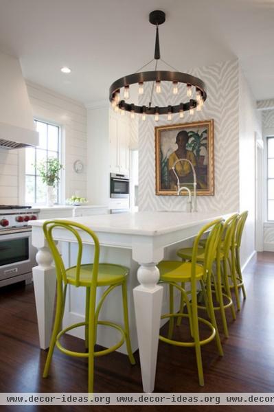
The zebra-hide wallpaper immediately sets this kitchen apart. “I’ve always loved wallpaper,” says Swanson. “I feel like you can go a little wild with it, because it’s easy to change. I tend to stick with neutral cabinets and countertops, because they are much harder and more expensive to change. You can do a very of-the-moment kitchen that looks smashing today, but you might get tired of it in a few years.”
The peninsula is designed as a prep area and a place where the family can eat. “I never have liked chairs all in a row,” says Swanson. “It makes it really hard to talk. I always try to wrap the eating area around a bit.”
Oil paintings in kitchens are nearly as rare as, well, zebra prints. This one is by Leon Kroll, a painter who lived in Massachusetts and whom Life magazine dubbed the “dean of U.S. nude painters.” This is a portrait of his children’s governess, and although her clothes are on, it has an exotic look to it. “It’s the most valuable piece we own,” says Swanson. “But I didn’t really worry about putting it in the kitchen. I made sure to hang it above where the water comes out of the faucet. A lot of people get really concerned about things like this — but really, that sort of sucks all the fun out of everything.”
Wallpaper: Zebbie; chairs: Crate & Barrel
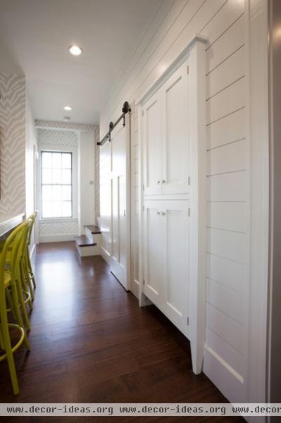
The peninsula separates the pantry and a storage area from the kitchen.

Instead of the expected tile backsplash, Swanson installed wood shiplap paneling as a homage to the home’s heritage. She painted it with Benjamin Moore’s Satin Impervo — an oil-based paint meant for interior trim. “It definitely made it easy to wipe down,” she says. “Using a wood backsplash might not be for everyone, but I cook a lot, and it has never been a problem.”
To make a wider passage, the designer reduced the depth of the cabinets near the wall surrounding the chimney and laundry room.
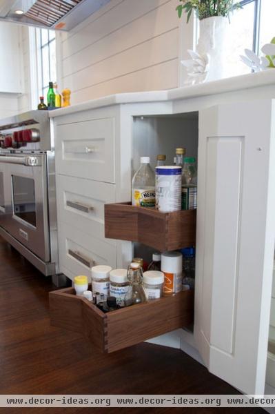
Custom cabinetry allowed for angled-front pullouts to make what could have been an awkward space make sense.
Cabinets: Pennville Custom Cabinetry

Swanson used walnut as the finish for inside the drawers. “I used wood floors in the kitchen, and I thought they matched nicely,” she says. One of the options offered by Pennville Custom Cabinetry is a knife block complete with a set of Wustoff knives.
“The hardware is by Du Verre,” says the designer. “I had seen it once long ago, and I made the decision to use it someday. Plain bar pulls are ubiquitous these days; these add sparkle and a modern touch.”
Hardware: Du Verre
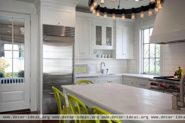
As anyone who follows design knows, Carrara marble has been popular in kitchens for the past few years. Swanson chose a white marble that was much less expensive — $75 per square foot. “That’s cheaper than granite,” she says. The designer notes that marble comes with maintenance. “But as you may have guessed, I’m not that fussy about things,” she says.
She sealed the marble with a DuPont sealer that has a 15-year guarantee. “I tested it by purposely spilling red wine on it. I left it for a few hours, and it wiped right up,” she says. Indian food that had seeped through a takeout container left a lasting but faint stain, and lemonade making by her kids also left marks. “Lemons and marble just don’t mix,” she says.
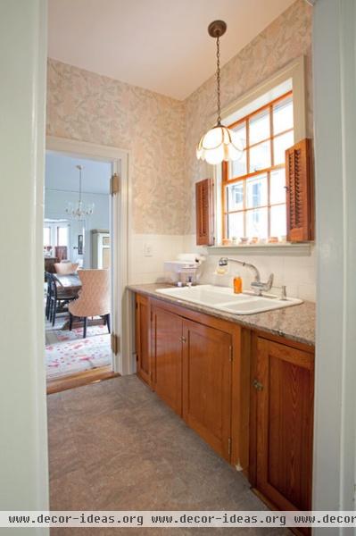
Here’s the old version of the butler’s pantry that connects the kitchen to the formal dining room.
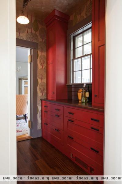
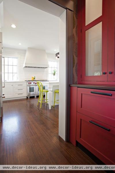
AFTER: Reimagined by Swanson, the butler’s pantry is now a brilliantly hued passageway with amped-up storage. “Red is one of my favorite colors,” says the designer. “In my mind it’s a neutral — it goes with virtually every other color.”
Cabinets: Revolutionary Red, Pennville Custom Cabinetry
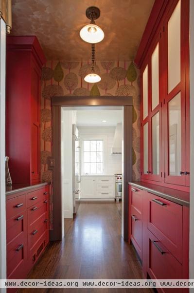
“I applied the same reasoning here that some people use when decorating a powder room. I feel like it’s a controlled space, so you can go a little wild,” Swanson says. “I always love passing through the darker butler’s pantry into the light, bright kitchen.”
“This is one of the well-known historic homes in town,” says Swanson. “I wanted to give the kitchen an updated feel and panache, but I didn’t want to entirely ignore tradition.” As Captain Carter might have said, these are rough waters well navigated.
More:
Key Measurements to Help You Design Your Kitchen
See more Kitchens of the Week
Related Articles Recommended


