Room of the Day: More Function for a Boston Condo
http://decor-ideas.org 04/11/2014 19:24 Decor Ideas
As a seasoned traveler who owns three homes, designer Gary McBournie knows a lot about packing.
So when the interior designer decorated his Boston apartment, he had no trouble squeezing plenty of function into a compact space. The 12- by 23-foot living room in his Beacon Hill condominium serves as a seating area, a dining room and a library, yet doesn’t feel the least bit cramped.
Circulation, McBournie says, is the key. Before he gives any thought to finishes or colors or patterns, he thinks about the way bodies move through a space. Once he establishes that, everything else just follows.
“Sometimes you have to listen to what the room tells you,” he says.
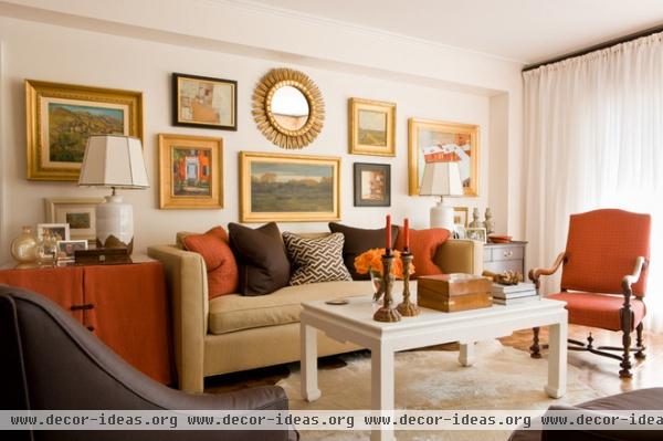
The place didn’t look nearly so cheery the first time McBournie visited it with his husband, Bill Richards, the chief marketing officer at their interior design company, Gary McBournie Inc. “It was very dreary, very tired,” the designer recalls. “There was almost nothing to like about the space itself, except it had a beautiful view and a beautiful location.”
Despite its 19th-century surroundings, the building dated from 1952. Although the living room had good proportions, its few other charms were hidden under layers of “improvements.” McBournie stripped these away, then added new baseboards, parquet flooring and designer radiator covers, to give the space the character of a prewar apartment. The walls were refreshed with a skim coat of plaster to smooth out the surface and hide decades of patching.
Sofa: custom; coffee table: Icon Group
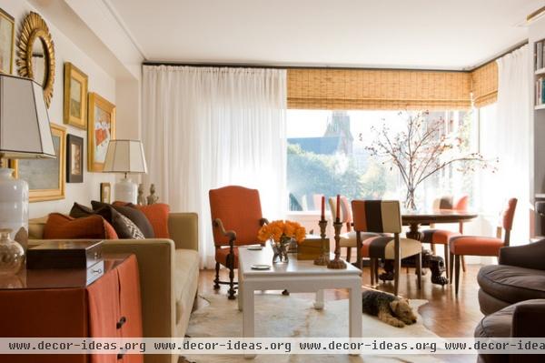
The aluminum window frames were painted white to blend them into the surroundings, then McBournie dressed them with white drapes and bamboo blinds that stretch from floor to ceiling and wall to wall. The window treatment makes the room look taller and wider, and hides a support beam above the glass.
The designer put a cowhide rug on the floor instead of a rectangular carpet, to disguise the fact that the room is trapezoidal. (Plus, it seems to suit the couple’s Welsh terrier, Winston.) Then he dappled the room with generous splashes of orange. “I like orange,” he says. “It seems like a happy color to me.”
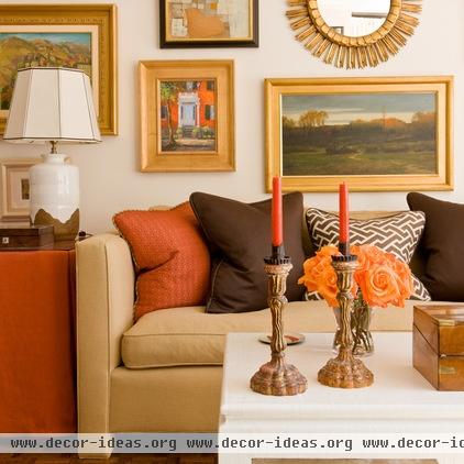
A big painting over the sofa would have been boring, McBournie says. He wanted to make that wall important, so he covered it with a collection of framed art and a mirror to draw attention to the surface, and to also help disguise the fact that the room was asymmetrical. (The arrangement’s lack of symmetry distracts your eye so you’re not even aware the room itself is off-kilter.) Plus, he admits, he had a lot of paintings in storage and had to put them somewhere.
When space is tight, you have to hide storage anywhere you can. The skirted side table conceals serving pieces and silverware; a chest of drawers on the other end of the sofa stores linens and candles.
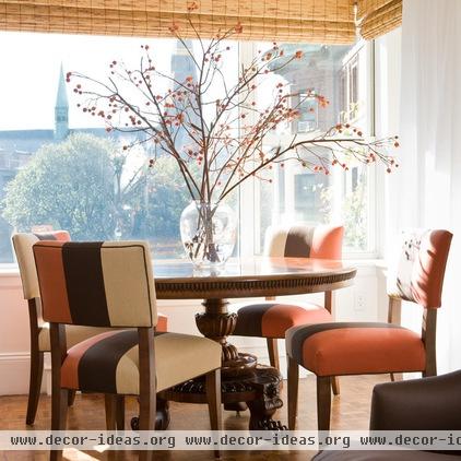
An antique breakfast table from the first half of the 19th century is paired with dining chairs from Crate & Barrel. “When I don’t feel like spending $3,000 a chair, I go to Crate & Barrel, then send it to my upholsterer and have them restuff it,” McBournie says.
The grouping overlooks the Church of the Advent, a Gothic revival landmark dating from the late 19th century.
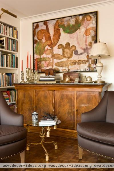
Opposite the front window, McBournie set a 19th-century buffet, which he purchased in Paris. The piece is both pretty and an ample source of storage. A painting by Kevin Paulsen hangs above; the custom chairs are covered in a Holly Hunt polished wool. The 1950s Italian side table was found at an antiques store in Palm Beach, California.
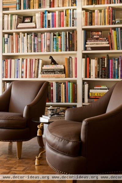
“Walking to that brown chair, I’m suddenly in ‘the library,’” says McBournie. The designer added the expansive built-in bookcase because he and Richards own a large collection of books, and because it seemed like a feature that belonged in an apartment like this. (The couple’s own book, Living Color: A Designer Works Magic with Traditional Interiors, was just published last fall.)
“I always like multiple seating areas,” says McBournie. “It looks very static if there’s just a sofa and two chairs — its kind of boring. I like to move around a space.”
Even when he’s at home, apparently, the man likes to travel.
More Rooms of the Day
Related Articles Recommended


