A Kitchen Opens Up for a D.C. Show House
http://decor-ideas.org 04/11/2014 07:22 Decor Ideas
One of the biggest challenges in remodeling a kitchen is improving the layout — as well as the flow into the adjoining rooms — to better meet the demands of today’s lifestyle. At this year’s DC Design House, Nadia Subaran of Aidan Design faced that exact predicament and literally found herself up against a stone wall.
“Our recommended design solution involved the removal of an 18-inch-thick fieldstone wall, which was no small feat in the compressed timeline of a show house,” she says. “We quickly enlisted the assistance of a structural engineer and a talented contractor — and with the homeowner’s approval were able to make it happen.”

One of the key features Subaran reinstated is a window that had been boarded up and now serves as a focal point with a traditional farmhouse sink and suspended open shelving.
The veining pattern on the large porcelain tile (60 by 120 inches) in a Calacatta marble pattern continues from one slab to the next, allowing for continuity throughout the space.
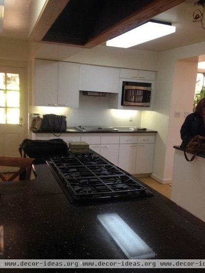
Before the makeover, cabinets hid the window.

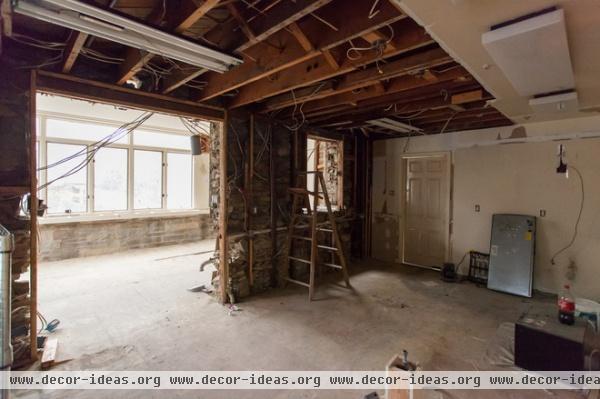
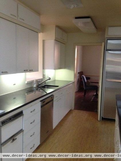
During demolition the fieldstone wall was exposed and then removed to provide a more natural flow into the family room.
The wall was behind these cabinets.
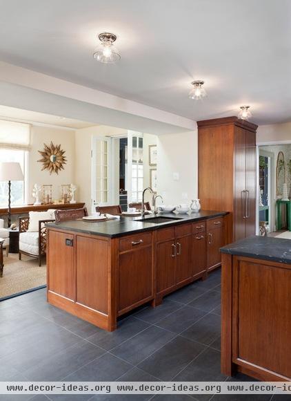
AFTER: This area is now completely open to the family room, which allows exterior light to flood the kitchen. The doorway at the rear leads into the dining room.

Hood insert: custom 54-inch, Thermador; range: 48-Inch Professional Series Pro Grand steam range, Thermador


Subaran, shown here, took inspiration for the colors and tones used in the kitchen from the fieldstone wall that was removed during construction.
Not everything on the board is exact. For example, the metal grille is there to represent a radiator grille, and the fieldstone is also representative and not a piece of the actual wall. “The colors and tones in the stone walls can be seen in the burnished cherry cabinets, slate gray floors and soapstone countertops,” Subaran says.

In the butler’s pantry, adjacent to the dining room, Subaran was challenged by a space that had no alignment between the doors and windows, as well as awkward bulkheads and chase walls.
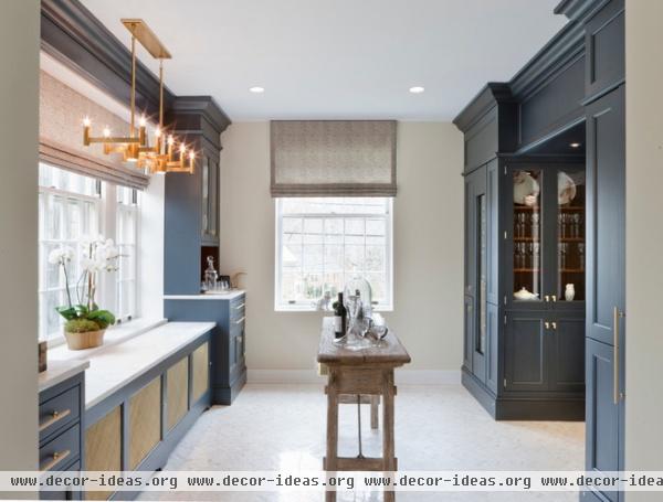
AFTER: Her design solution was to build out cabinetry to conceal the awkward jogs and streamline the space. “We wanted the butler’s pantry to function as an extension of the kitchen and serve as a central place for all entertaining needs,” says Subaran. She saw it as an ideal wine-tasting room. It has two Thermador wine columns, which hold a total of 140 bottles of wine, and custom cabinetry designed for ample storage of stemware.
Appliances: Thermador; cabinet hardware: Lewis Dolin Bar series; countertops: R. Bratti Associates; floor tile: Architectural Ceramics; furnishings, fabrics, accessories: Victoria at Home; Delany Linear Chandelier: Robert Abbey; paint by C2: walls: Noodle (flat), trim: Sheer (semigloss), ceiling: Kind of Blue (flat)
2014 DC Design House info: April 13 to May 11, 2014; Saturdays and Sundays, noon to 5 p.m.; Tuesday through Friday, 10 a.m. to 3 p.m.; closed Mondays; 4600 Linnean Ave., in Northwest Washington, D.C.; $25 general admission. More info
More: See other spaces in this year’s show house
Related Articles Recommended


