Bath of the Week: A Lovely Update for a Victorian Tub
http://decor-ideas.org 04/10/2014 22:22 Decor Ideas
The owners of this barely touched Victorian home were clear about two things: They wanted a proper shower, and they wanted a modern bathroom. Eliza Hart of Hart Wright Architects fully understood. “They had a claw-foot tub with a shower attachment and a curtain,” she says. “Anyone who has tried it knows that claw-foot tubs are nice for bathing, but it’s hard to shower comfortably in them.” The tiny floor plan seemed to make fulfilling those wishes mission impossible, but where there’s a will and a clever architect, there’s a way.
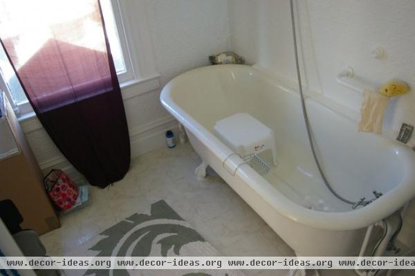
The claw-foot tub’s weak attachment and narrow, curved floor made taking a shower an unpleasant balancing act.
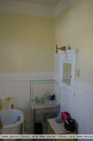
The original sink and countertop were made for the people of yesteryear. Like any classic Victorian home, this house had a bathroom with a tub and a sink, and a toilet was in a separate room next door, commonly called the water closet (or WC).
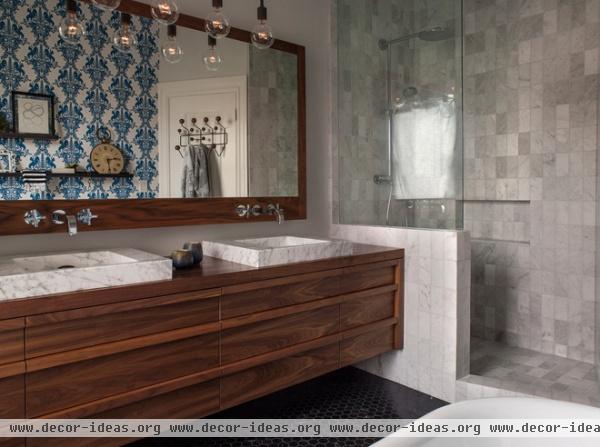
AFTER: The architect took over the water closet for the walk-in shower and used an adjacent linen closet for the new WC. “There wasn’t room or a budget to create another bathroom on the second level,” Hart says. “There’s also an original marble sink in the guest room. So preserving a water closet means guests can use the bathroom while the owners are showering or bathing.”
The architect used classic materials that might be found in a Victorian home — walnut, marble and hexagonal floor tile — but applied them in a modern way. The walnut wood is used in custom floating cabinets designed with ledges that act as handles. The sinks and modern shower are crafted from marble. The floor tiles are in a hex shape, but in a larger scale than Victorians favored.
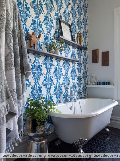
The tub was reglazed, outfitted with new chrome feet and moved across the room. Now that the tub is used for bathing only, it has become a source of pleasure instead of aggravation. The homeowners chose display ledges and what could almost pass as period wallpaper.
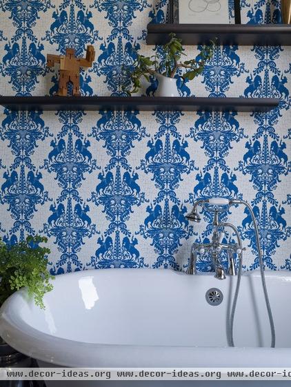
But when you look more closely, you see that the wallpaper pattern is composed of gushing oil wells flanked by gunslinging cowboys atop rearing horses. Queen Victoria never saw the like.
Because the couple has no kids, splashing isn’t a problem. “I love their choices,” says Hart. “I always feel that the bathroom, generally a smaller room separated from the rest of the house, is where you can go bold — and these people have bold design tastes.”
As for the shelves: “They love to travel and collect things, and they display them all over the house,” says Hart. “Some architects use stylists to bring in props to make a house look great for photos. We did not have that problem here.”
Get ideas from more bathroom makeovers
Related Articles Recommended


