Houzz Tour: A Cubist Confection Oriented Toward Nature
http://decor-ideas.org 04/10/2014 06:23 Decor Ideas
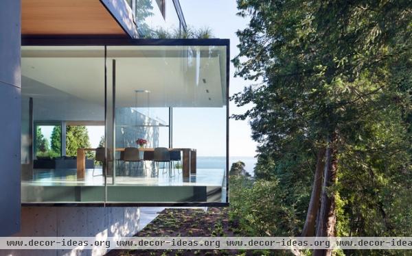
When a Vancouver couple decided to give up their downtown condo for something closer to nature, they never realized just how close nature would get.
The cubist confection they built in West Vancouver embraces ocean and forest with unparalleled gusto, capturing views from every angle and allowing air to flow so fluidly through the building that the house cools itself.
Overlooking English Bay to the south and a steep, wooded creekside bluff to the west, the house makes the most of a limited footprint through a stacked floor plan and dramatic cantilevers.
Houzz at a Glance
Who lives here: The owner of an electrical wholesale business, a psychotherapist and their daughters, ages 2 and 6
Location: West Vancouver, British Columbia
Size: 4,600 square feet (427 square meters); 5 bedrooms, 5 bathrooms
Photography by Ivan Hunter
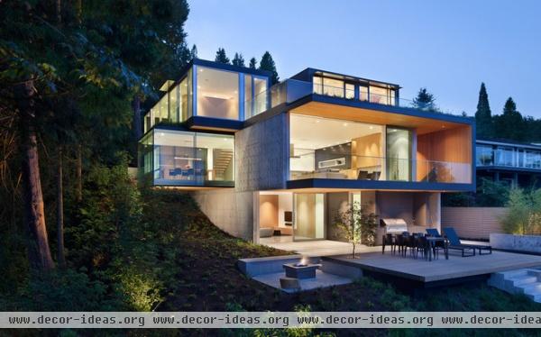
The owners asked Vancouver designer Nigel Parish of Splyce Design to create a family-oriented house that would work well for communal gatherings and entertaining.
“The site informed a lot of the design,” says Parish, who teamed up with Powers Construction on the house. Much of it was recessed into the hillside and fitted with walls of glass to make the most of the views. He’d worked with the couple on their condominium and understood their tastes so thoroughly, not much discussion was required. “It was seamless and effortless,” he says, “because we saw eye to eye on most things.”
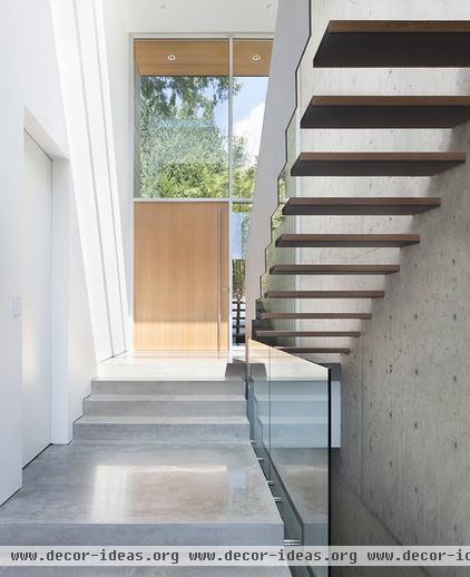
The front door opens into a split-level entry dominated by a dramatic staircase. The white oak treads project from the concrete wall at right but are not supported on the other end, defying gravity and adding drama to the ascent.
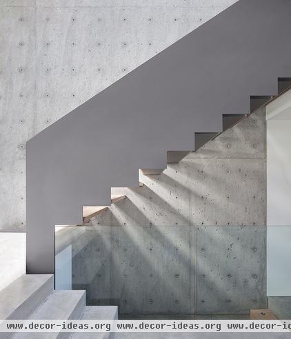
The aluminum balustrade looks like it was cut with pinking shears. The treads stop 3 inches short of the railing, emphasizing their cantilevered look.
The towering wall of raw concrete anchors the interior, offering a craggy counterpoint to the sleek finishes surrounding it.
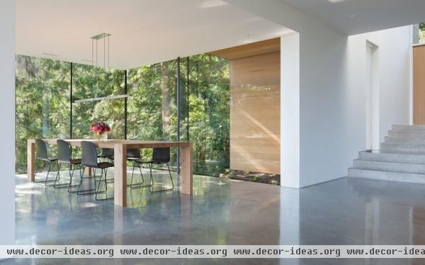
The floors throughout most of the house are polished concrete. As the slurry set, it was agitated with power trowels to give the surface a mottled patina.
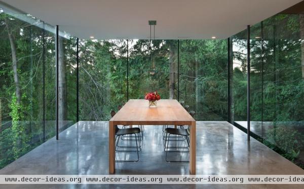
“We wanted the walls to dissolve into the forest,” says Parish. He joined the dining room windows with black silicone in lieu of frames to minimize the structure. Stepping into the space, you can see the woods straight ahead or turn to the left to view the bay.
Not surprisingly, the room is a magnet for visitors. “People immediately go in there,” Parish observes.
Table: The London Table by e15, Livingspace; chairs: Muuto
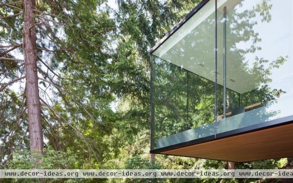
The dining room cantilevers 15 feet from the foundation. The glass walls extend below the floor plane and above the ceiling plane, minimizing divisions between the interior and exterior.
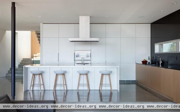
“We wanted everything to be simple and timeless and to not distract from the outdoors,” says Parish. The custom cabinets are finished in white oak and Formica’s ColorCore laminate, which the designer considers a more durable alternative to lacquer. The perimeter counters and backsplash are black honed granite; the island is topped with Caesarstone.
Appliances, vent: Gaggenau; stools: Hay
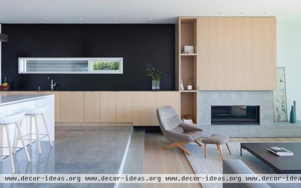
The living room furnishings are just as understated as the kitchen, in deference to the view.
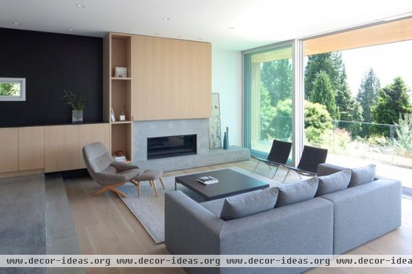
Parish warmed the room with white oak floors and cabinetry. B&B Italia’s low-profile Charles coffee table is echoed in the Panavision proportions of the gas fireplace, which emits a ribbon of flames.
Sofa: Spencer Interiors; Danish chair: family heirloom
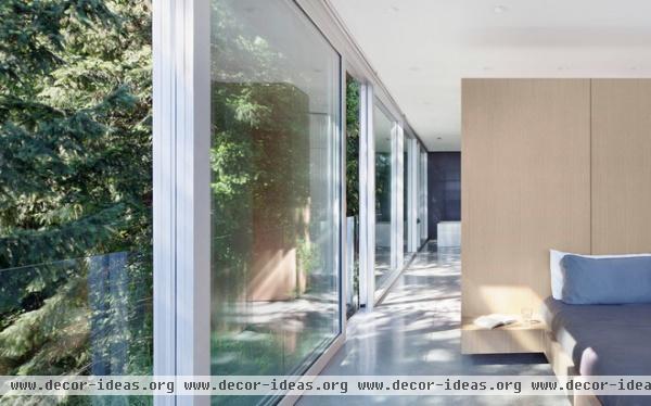
In the master bedroom, a custom bed backs up against a white oak wall that divides the space from the dressing area behind it. Walls of glass overlook the adjacent forest, assuring privacy and an ever-changing panorama of flora and fauna. A portion of the master bathroom is visible at the back.
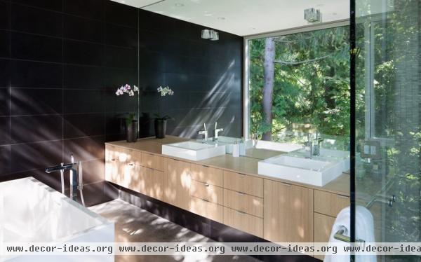
A mirrored wall behind the vanity reflects the neighboring woods, making the narrow master bath appear much larger. “You can sit in the tub and feel like you’re sitting in the trees,” says Parish.
The tub is also oriented to take in views of the water, visible at the end of the long hallway shown in the previous photo.
Sinks: Wetstyle; tub: Wetstyle; faucets: Hansgrohe
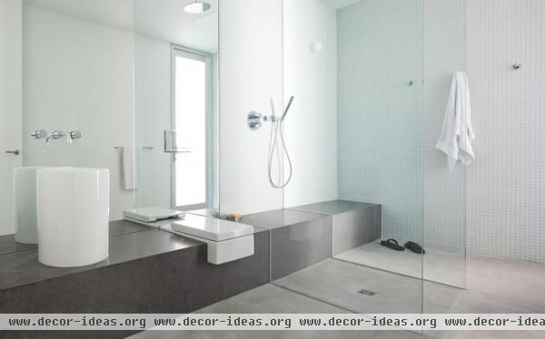
In a house with so many remarkable design elements, one that provokes a fair share of comments is this guest bathroom off the pool. A single stone bench extends from the shower to the cylindrical sink, with a Duravit toilet discreetly mounted between the two — atop what is, essentially, the vanity.
Parish insists he came up with the plan simply to save space, but admits it’s become a conversation piece at parties. (A wall-mounted shelf — not visible in this photo — is available in case guests feel squeamish about leaving their toiletries on the counter.)
Sink: Duravit
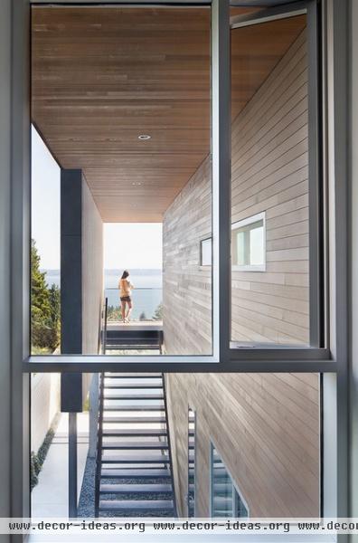
A stairway on the east side of the house provides access between the living room deck and the yard and pool below. The adjoining wall screens bathers as they dart between the two.
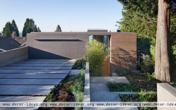
Because much of the home’s volume is recessed into the hillside, the front facade appears deceptively understated. “It’s not a ‘Hey, look at me!’ house,” Parish says.
A discreet overhang is all that distinguishes the garage, which is covered with Swisspearl, a cementitious panel with integrated color that requires no painting. (The same material is repeated on the barbecue pit out back.) The rest of the facade is covered in western red cedar — a nod to the towering evergreen that dominates the front yard.
More: Houzz Tour: Dream Views Wow on Seattle’s Lake Washington
Related Articles Recommended


