Design Workshop: The Art of Joining Materials
I remember the first time I set foot on a bustling construction site as an intern architect fresh out of school. It was the first time I connected the abstract vision I had been drawing on paper to the reality — and chaos — of construction. It all stood, literally and figuratively, in stark contrast to the design process. Hammers flying, tons of concrete being cast, beams being welded to soaring steel columns — it was hard to make sense of it all. This is when the true education of an architect begins, the moment when one realizes that the lines on paper represent the meeting points of materials, what we call joints.
Like most architects, I’m consumed with the process of making and the art of joining materials. What these joints say about a structure and how carefully they’ve been designed and crafted are hallmarks of good architecture. Let’s look at two projects that differ in their execution and style but share similarly striking results, due in large part to a skilled joining of materials.
Passive in Portland
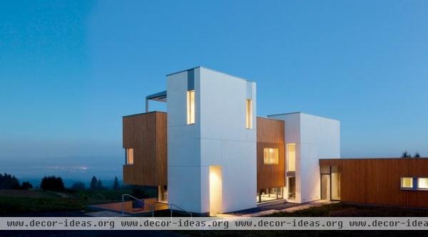
This high-performance passive house is sited on a south-facing mountainside in Portland, Oregon. Capitalizing on the solar exposure, the house has a strong visual presence. Anchored by two vertical tower elements, which house the stairs and double-height spaces, the design is a complex composition of slipped volumes and geometry. To achieve this look while maintaining the strict energy performance goals was no small feat.
Articulation. Revealing the individual parts of an architectural composition and its place in the larger whole is called articulation. Architects use this term frequently, because it’s one of the ways we establish order in design. We express the different building blocks of architecture — the walls, floors, roof and ground planes — to achieve certain effects. Put simply, articulation is expression.
Viewed from afar, the volumes clad in white plaster and wood are articulated or expressed as distinct elements. The white is more vertically oriented and anchors the wood and glass volumes, which appear more horizontal. This is done using reveal joints.
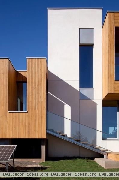
Function. The pattern of joints is even more finely grained and expressive close up. The plaster-clad volumes have a Mondrian-like rectilinear pattern, emphasizing the sheet-like nature of the plaster. Plaster moves and cracks, so proper care must be used to control the way it cracks. We call these control joints.
Instead of overlaying a strict, uniform grid, the architect has chosen alignments and proportions that relate to the window openings and the sizes of the volumes. Edges and corners of openings are areas that are subject to higher cracking stresses, so that also makes good functional sense.
Orientation. The tongue and groove cedar skin follows a similar set of rules. Vertical strips add a fine layer of detail and reinforce the vertical faces, while the floor and roof planes received a horizontal treatment. They’re slight textural differences but expressive of each one’s orientation — vertical walls, horizontal floor and roof planes.
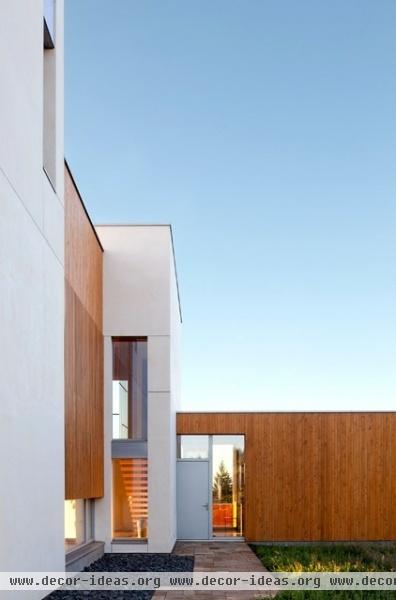
Sealing. The joints on this house, both visible and concealed, are an integral part of the entire design strategy. Passive houses seek to capture and retain as much of the sun’s energy as possible to passively heat them. To do this, the designer strives to eliminate air leakage altogether. This requires an aggressive approach to joint detailing and sealing.
Much of the contractor’s diligence and care is hidden from view behind the wall plane. The joints where the wood and plaster volumes meet is an extremely tight ½-inch reveal. This preserves the separation and reinforces the sense that one volume is slipping past the other, articulating movement and volume. The care that has gone into making these buildings meet at a single ½-inch joint is hard to overstate. It takes a builder who cares as much as the architect to realize a building like this.
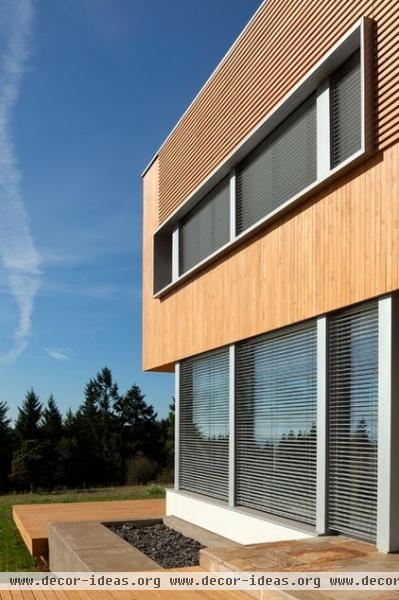
Breathable joints. Separating the interior conditioned space from the exterior is a critical exercise in joint sealing; by contrast, the exterior siding is designed to be open and allow air movement.
The evolution of building science in recent years has taught us that it’s critical to ventilate siding when we’re constructing new homes. This is referred to as rain screen detailing. Instead of nailing siding directly to the exterior sheathing, the siding is set on spacers that keep the back of the siding away from the sheathing by a small margin. This creates a ventilation and drainage plane. By maintaining an airspace behind the siding, we allow air to circulate and carry away any moisture that gets behind the siding joints.
The architects have carefully integrated it into the wall assembly here, expressed as a small joint visible at both the windowsill and the top of the wall as a thin shadow line.
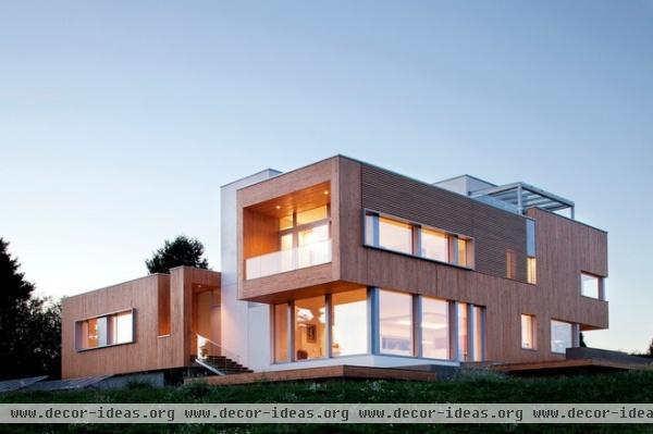
Compositional. The wood cladding predominates the walls that face the view and sun. The joints oscillate between open and lattice-like to tightly fitted. This breaks up the mass of the wall plane and adds architectural interest.
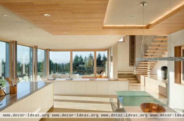
Defining space. Moving to the interior, we see the same care and attention to detail as on the exterior. The palette is similar: white and natural wood tones used in slipping planes.
No surface has gone unconsidered; note the wood infill of the steel columns near the glazed wall, the thin wood surface on the white cabinetry and the cutaway ceiling subtly defining the dining area.
Each of these meeting points is a series of joints and a series of design decisions made according to a certain grammar. In this case it’s a language of wrapping planar skins, cutting away and revealing. The space feels unified and considered because it’s speaking with one voice.
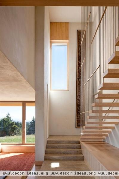
In the vertical element, the concrete floor rises as a simple plinth, inviting one to move up through the home. The light helps to draw one upward as well. The treads and guard are open and lattice-like, allowing the light (and heat) from the high window to move even deeper into the space. These arose from meaningful decisions about how to treat the joining of materials.
From this vantage point, one can also sense the thickness of the exterior walls as they extend inside. I can appreciate the care it must have taken to arrive at the ½-inch joint reveal where the distinct building volumes meet on the exterior (shown in a previous photo).
Charisma in Charlotte
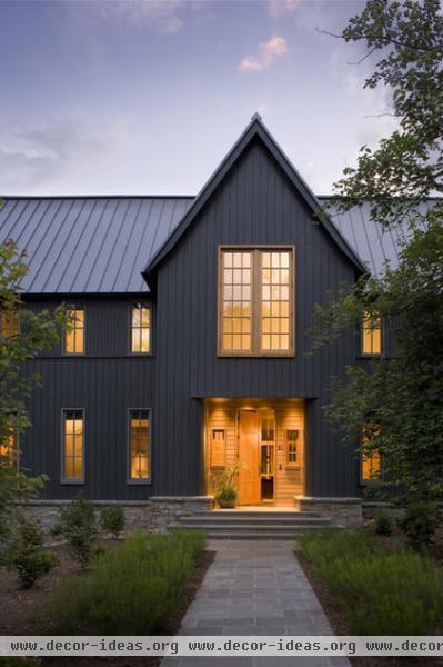
Arriving at a very different result, but using many of the same techniques as in the previous project, this home in Charlotte, North Carolina, proudly exhibits the means of its making. Again the fine details, the joints, play a prominent role in unifying the distinct components of the building.
Set in a neighborhood with an aesthetic code for design that was at odds with the client’s directive for a structure that was light, open and airy, the architect devised an ingenious solution. He oriented the restrained and familiar gable volume toward the street, grounding it on a heavy stone base, and developed a more unrestrained and open pavilion to house the public living areas and the porch toward the rear.
Articulation. At the entry facade, the base middle and top have each been articulated to reduce the scale and accentuate the first and second stories. The reverse board and batten siding is further broken by a belt line of trim at the second-floor windowsills rather than at the second-floor line. This reduces the apparent scale of the two-story volume facing the street, making it feel like one and a half stories. It’s a visual trick accomplished via a simple shadow joint that’s particularly effective on tall walls.
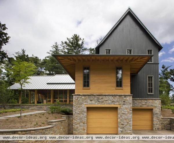
Pattern and form. Intersecting materials in this project are highlighted by a change in both plane and color. The heavy stone water table acts as the durable base upon which the light wood elements are positioned. The joints of the stone, while more irregular, have an overall effect similar to that of the joints of the wood siding. They’re clipped and shaped to emphasize volume.
Note how the joints become finer as your eye moves upward. The wider boards at the base of the gabled volume give way to the tighter spacing of the second floor. This is another visual trick that works to reduce the apparent scale of the upper story. The massive stone gives way to the lighter horizontal wall skin and ultimately to the rafter sticking and wafer-thin roof plane.
Even small joints, such as at the wood lintel over the garage door opening, were treated with care. Small stacked stones wouldn’t have been able to span an opening this large, so it made functional and aesthetic sense to deploy the wood lintel. It just feels right.
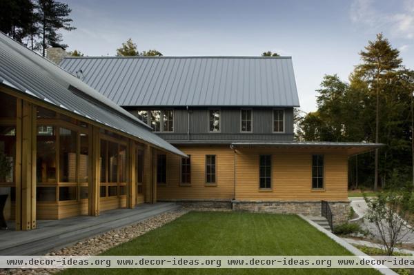
The joinery of the various siding areas breaks up the mass of the home. It also borrows from tradition while remaining firmly planted in the contemporary, as revealed in the treatment of the reverse board and batten siding, with the battens acting as reveals and shadow lines. The darker siding is a powerful gesture, but the joinery is less pronounced because shadows on dark surfaces lack the contrast of lighter surfaces. It follows the restrained-but-refined theme.
The joints in the horizontal clear finished wood siding emphasize the horizontality of the lower volume and mark the transition to the more open pavilion to the left. The roof planes supported by the thin wood sticking support this idea and reach farther out to the landscape. The tight skin of the metal roof also works well, as the corduroy seams recall the vertical batten pattern.
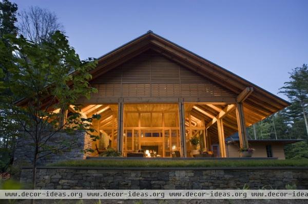
Exposed construction. Viewed from the end of the pavilion and porch, one can clearly see how the structure dissolves as it meets the exterior. The horizontal joints of the siding give way to open slats that shield the sun but let in breezes and ambient light.
The columns and beams have been subdivided into smaller components, reducing their overall mass. The thinner members joined together contribute to the lightness of the structure, even given the fairly wide footprint.
The stone base mediates the grade and becomes a terrace, defining informal places in the landscape but without the rigor of the street side.
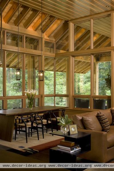
Inside the pavilion the joinery is just as expressive. The double rafters support a massive, deeply overhanging roof. The supporting wood girders display the hardware used to connect the smaller elements used to construct them. It fits within an attitude of honestly displaying how things are put together. The stick-like details and revealed joints combined with the treatment of the wood structural members make this space a refined abstraction of the wooded site beyond.
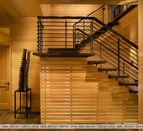
The stairway borrows details from other parts of the home, notably the airy pavilion, to achieve similar results. Rather than a solid wall, a slatted motif has been employed, with open joints allowing light to pass through. This has the added effect of reducing the visual weight of the stairs. When combined with treads that are tapered and cantilevered, the slats establish a sculpturally dominant element that has a weightlessness.
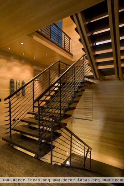
Note the stringers supporting the stairs. These borrow from the rafters in the pavilion too. Tight joints make up the walls that define the room extents, while open joints comprise the floating stair element. There’s a richness of thought evident here that I really appreciate.
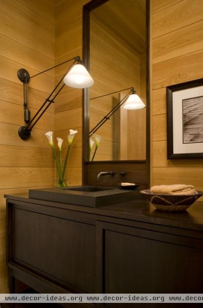
Details. This lavatory exhibits the exacting detail and thought that was put into the rest of the project. The cypress feels refined, laid with a slim reveal joint. Repeating design motifs in a project reinforce an overall theme and strengthen the project. But knowing when to defy the set of rules in place helps keep it from becoming monotonous. The planar quality of the tongue and groove wood walls is broken by the insertion of the mirror and cabinetry element. The wall plane breaks back, and it appears as an incision, revealing an inner layer of darker and even more refined wood.
More: Design Workshop: Reasons to Love Narrow Homes


