Room of the Day: Contrasts Catch the Eye in a Beachy Family Room
http://decor-ideas.org 04/09/2014 22:22 Decor Ideas
When this couple and their two young children moved from California to Oregon, they carried north a love of relaxed California midcentury modern style. “This was a true collaboration with our clients, Paula and Mike, who had a very specific design aesthetic,” says interior designer Jenny Baines. Together, Baines, her colleague Lara White and the homeowners mixed comfortable new pieces with eclectic retro ones, laid soft textures atop rough and paired dark wood with white to create a room that’s light, comfy, beachy and infused with bursts of bold color and midcentury energy.

The room had great bones, but they were bare. “I think Mike and Paula had probably picked up this furniture after graduating from college,” Baines says.
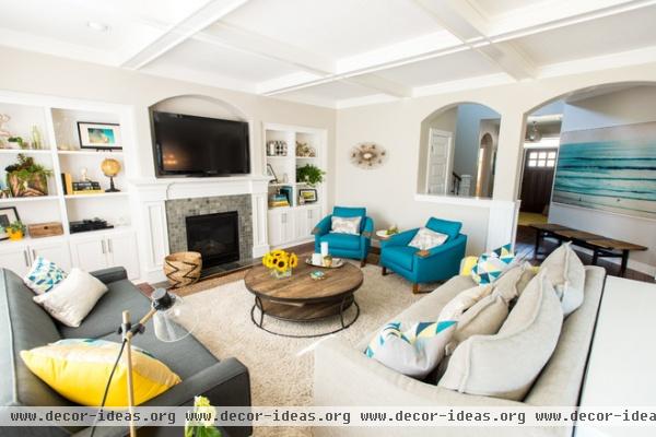
AFTER: Baines and White set out to make things light, starting with neutral-colored base pieces like the rug and the sofas. Then they layered in textures and bolder colors. “You have to have contrast,” Baines says. “In order to see something as light, you need to see dark.”
For instance, the one piece the owners wanted to keep from their old room was the shag rug, so their two young children would have something soft and cushy covering the floor. Baines added a rough jute rug underneath to add a textural and color contrast. “It’s this kind of subtle layering that makes a big impact,” she says.
The round coffee table is made of reclaimed wood. Its circular shape keeps the kids from bumping into any sharp edges, and the lower shelf provides a space for baskets of toys and games. In fact, the room may look picked up, but there are toys within the reach of little hands all around. The lower cabinets are convenient storage spots, and the closet you can see through the arch is the “Harry Potter closet.”
Coffee table: Four Hands; sofas: Moss; triangle throw pillows: West Elm
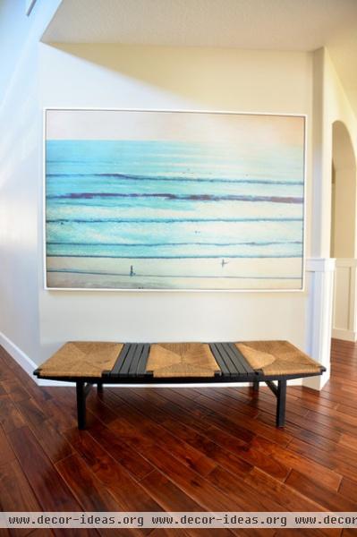
This unique midcentury modern bench in the hall just outside the room is a vintage find; its rattan adds another beachy texture. “The photograph has a huge impact on the rest of the space,” Baines says.
Photograph: Via Wendover Art Group
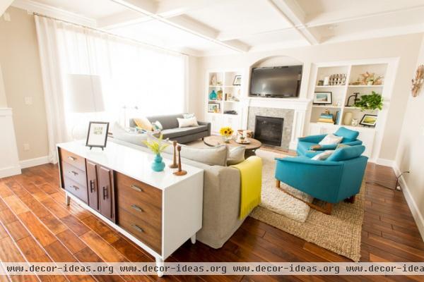
The designers brought more natural textures like driftwood and glass to the bookshelves. A starburst piece on the wall serves as a retro exclamation mark.
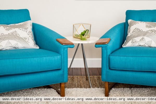
“Portland has the best off-the-wall places to buy vintage,” Baines says. These chairs were local finds, and the upholstery adds a shock of bright blue to the room.
(All of the upholstery in here is fiber sealed to stand up to stains.)

“Paula found this piece on Craigslist,” Baines says. “She is a Craigslist and Etsy fanatic.” Baines had the outside painted with automotive paint and kept the original walnut on the front. It’s another great study in contrast.
Related Articles Recommended


