Houzz Tour: Modern Style With Wood, Stone and Color
Think “modern house” and most likely one with glass walls comes to mind, such as Mies van der Rohe’s Farnsworth House. Even though that iconic building, completed over 50 years ago, has had a lasting impact on modern home designs and people’s impressions of modern residential architecture, a lot has changed in the intervening years. Glass technology has improved, to make the use of so many glass walls more tolerable, and architects have a plurality of influences, not just one figurehead. Therefore, while “modern” may mean straight lines and more glass than punched windows, it also means wood, stone, color and building green.
This house, designed by Thomas Roszak for a couple with three kids from their previous marriages, is a good example of modern architecture’s going beyond preconceptions, and being created for the unique situation of the client.
Houzz at a Glance
Who lives here: A couple with 3 kids
Location: A suburb north of Chicago
Size: 5 bedrooms; 6½ bathrooms on 2 stories
Photography by Scott McDonald at Hedrich Blessing
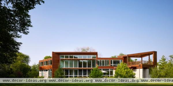
That this home is primarily wood and stone with splashes of color and a deep commitment to green building (it has been dubbed 7RR-Ecohome) is all the more surprising considering that Roszak teaches at the deeply modern Illinois Institute of Technology (started with Mies as the Armour Institute of Technology in 1938) and that he designed this house’s neighbor with all-glass walls.
This is not a case of wood is good and glass is bad, but a recognition that modern design can be more varied than people consider. There are shades of gray, and as we’ll see in this case, shades of green.
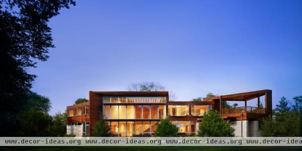
Roszak describes the house as “an experiment in transparency and solid form.” The transparency is evident in the south elevation, shown here, which faces the backyard.
That transparency is accentuated in the evening, when lights inside the home make the double-height living space glow. Here we can also see the angled wall inside, reflecting the way the house’s two wings — the children’s bedrooms on the left and the garage on the right — are set at angles to the living area in the middle. Or, as Roszak puts it: “The angular form of the house is a result of the family’s program, the zoning rules, the lot’s attributes and the sun’s path.”
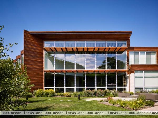
But with so much glass, heat gain is an issue. In response, sizable wood louvers project from the glass wall in two horizontal bands. They serve a functional purpose — filtering the high summer sun while allowing in the low winter sun — but they also extend the wood palette (ipe wood is used throughout) from other parts of the house over the glass.
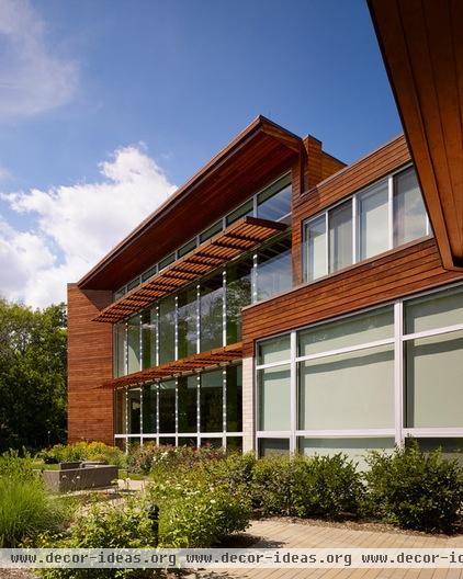
Here we can grasp how much the sunshades project from the surface of the glass.
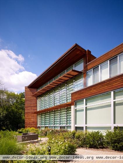
For more control there are operable shades inside, which keep out the sun entirely. Here we can see from the shadows hitting the interior shades just how the louvers work, letting some sunlight through the gaps between the wood.
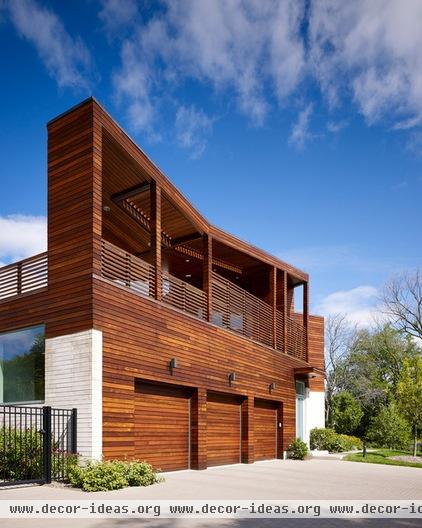
Let’s move around the house to take in its other sides. The three-car garage faces east. This means the sizable terrace atop it also faces east. Located adjacent to the master bedroom on the second floor, this outdoor space is a perfect place for welcoming the morning.
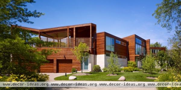
The terrace is also a modern interpretation of the traditional front porch. Namely, it straddles the public and private realms, facing both the backyard and the street.
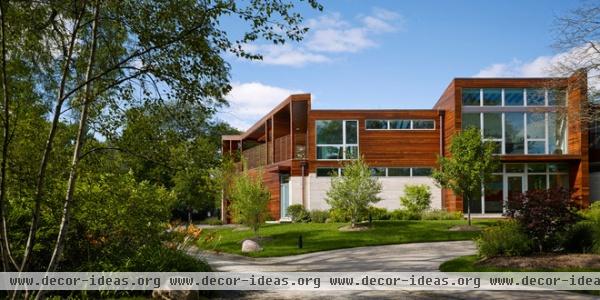
Continuing our counterclockwise movement around the house, we come to the northeast-facing elevation. The garage is on the left, and the kitchen (behind the stone wall) and the master bedroom (upstairs) are to the right, followed by the main entrance, at the base of the large glass walls. As we’ll see, what appears highly transparent is not so revealing on the inside.
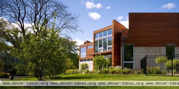
Here we see the entrance in the middle and the bedroom wing on the right, which faces true north. This side is primarily closed, so the windows primarily face south and west toward the backyard. The first-floor windows serve a guest bedroom, which has its own entrance around the corner.
On the left we can see the architect’s design for the neighbors’ Glass House, mentioned earlier.
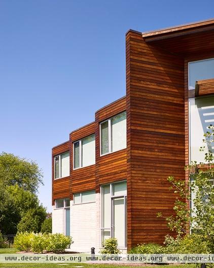
Our last look at the exterior brings us back to the south-facing, private side of the house. Here we have a close-up of the serrated plan of the bedroom wing.
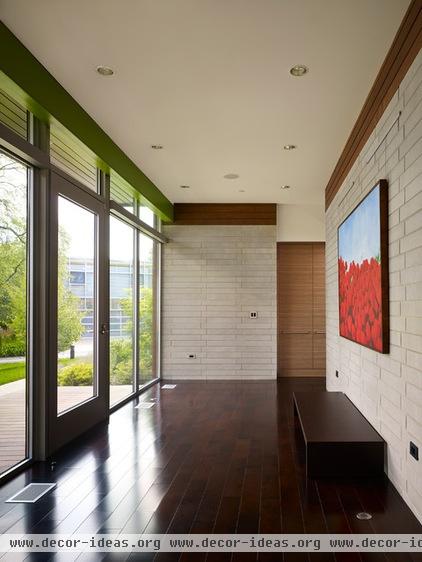
As mentioned earlier, the entrance is through a large glass wall that echoes the living room’s double-height wall facing the backyard. But immediately inside the foyer is a stone wall that cuts down on any view into the interior.
The transition between outside and inside is aided by the FSC-certified walnut wood floors, which provide some warmth.
(Note the Glass House, visible through the glass wall at left.)
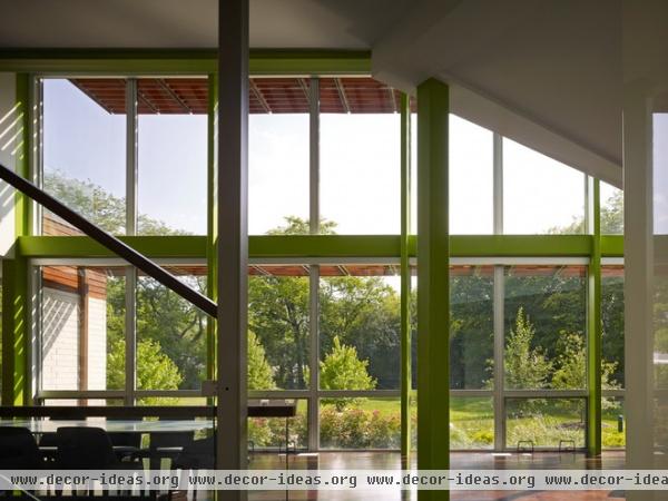
When we walk around either side of the stone wall, we get a view to the backyard through the large space. We can also see the way the architect has embraced color, painting the steel columns and beams an almost lime green that fits well with the view. Roszak says the house was designed “with a nod to Japanese wood construction in the method in which the siding is installed and the exposed interior beams are placed in the double-height space.“
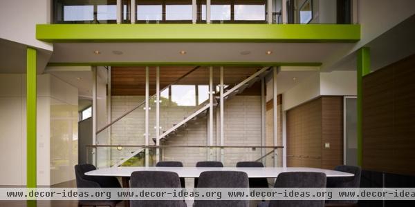
Taking a few steps forward and then turning around, we see the same stone wall. It is also used for one side of the stair connecting this level to the basement and a bridge upstairs that traverses the double-height space.
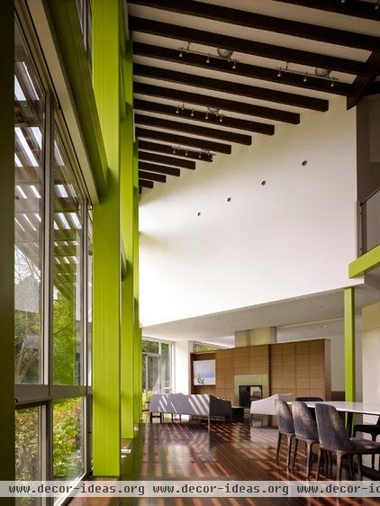
By angling parts of the plan, Roszak has created a dynamic living space that is hardly as conservative as what usually comes to mind when one considers modern design and glass boxes. This is of course aided by the structure’s green color but also by the exposed roof members overhead that orient our view to the backyard and the trees beyond.
Here we are looking past the dining area to the living area. Beyond the casework with fireplace is a more intimate family room, and beyond it still is the guest suite. This space, as Rosznak describes, “allows for aging in place, with a guest suite that can become the master suite, with no need to move as family members mature.“
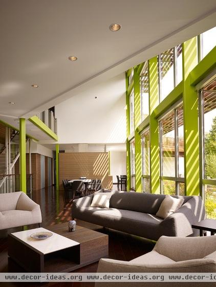
Here we see the double-height space from the living area, looking toward the dining area and kitchen beyond the wood wall. The role of the wood louvers is evident in the shadows cast inside.
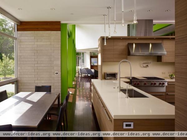
Unlike in many open plans, modern or not, this kitchen is only partially open to the living space. The wood casework and flue echo the same of the family room beyond, helping to define two sides of the living space.
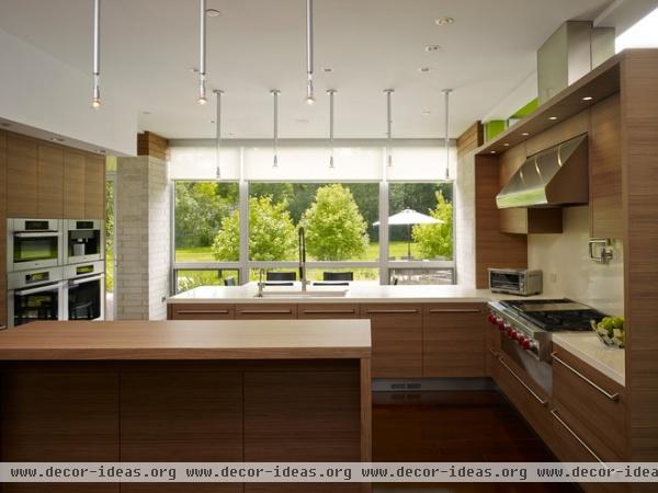
The kitchen benefits from a large window overlooking the backyard. A seating area adjacent to the kitchen allows for informal meals.
Here we can see the shades pulled down slightly below the ceiling. Fully automated and programmable systems for the house allow the shades to be controlled (along with the air conditioning, radiant heating, lighting, A/V, communications and so forth) at the push of a button — or the swipe of a finger, to be literal.
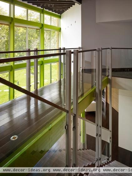
Let’s head upstairs. As mentioned earlier the stairs ascend to a bridge traversing the double-height space. From here we can walk behind us to the children’s bedrooms or straight to the master suite. The architecture is a direct response to the family’s needs: The parents and the children have their own spaces, and the living area connects the spaces and brings the family together.
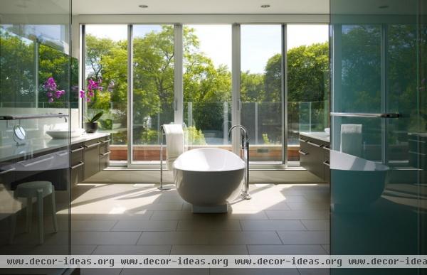
Befitting this rather large house is a sizable master bath that overlooks the trees to the south. Sliding glass doors can bring in some fresh air or provide access to the terrace above the garage.
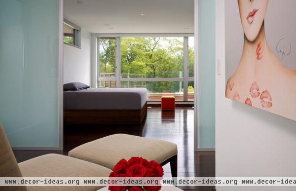
Beyond the master bath is the master bedroom. A seating area (foreground) overlooks the street on the north, while the view beyond is to the south, just like in the master bath.
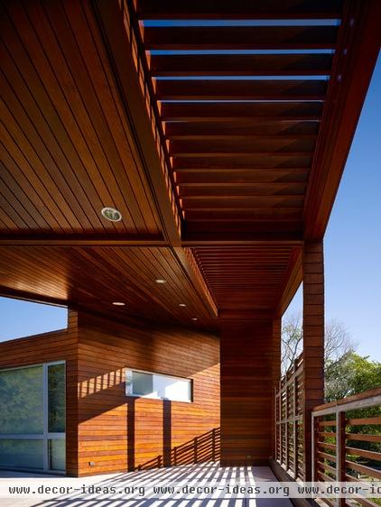
As nice as the master suite is, it’s got nothing on the terrace, which has the same ipe wood louvers used as both railings and sunshade overhead.
While considerably large (the size of a three-car garage), the terrace has a certain amount of intimacy that comes from the way the wood wraps around it. In a way, this space brings to mind the front porch of Mies’ Farnsworth House, though it shows how form and materials can change the character and experience of a modern home.
More: 10 Must-Know Modern Homes


