Houzz Tour: Modernism the Family-Friendly Way
http://decor-ideas.org 04/08/2014 22:22 Decor Ideas
Sascha and Denise Zarins care a lot about details. Both are accomplished mechanical engineers whose inventions have earned a multitude of patents.
When it came time to create a custom home for their family, they knew exactly what they wanted: a modern space with generous amounts of wood, glass and stone, one that was cozy and safe for their two young sons. What they started with, however, was anything but that.
Houzz at a Glance
Who lives here: Sascha and Denise Zarins, and sons Zach (age 5) and Sven (4)
Location: Saratoga, California
Size: 3,266 square feet (303 square meters); 4 bedrooms, 2½ baths
Year remodeled: 2012
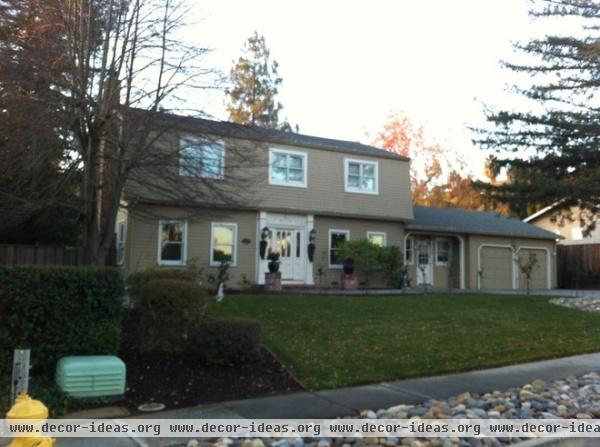
Built in 1969, the house had been remodeled 15 years before the Zarinses bought it, but was still too dated for the couple’s modernist tastes.
But it was livable, and they fell in love with the large, flat lot and established neighborhood, knowing it would be a great place to raise their boys. “I flip homes,” Sascha says, “so I look at every house with a vision of what it could be.”
The couple didn’t want to be in the middle of a major renovation with two infants at home, so they lived in the house for four years before starting the remodel. The remodeled home was designed by Sascha’s friend since college, architect Matt Hutchins of Cast Architecture.
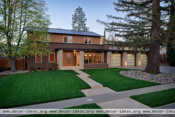
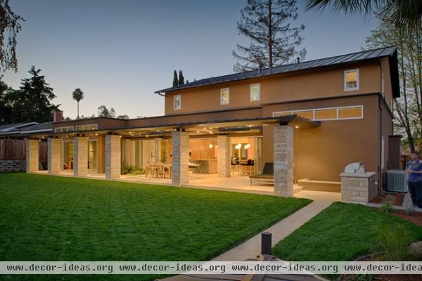
AFTER: Hutchins is based in Seattle, and Sascha and Denise live in Northern California. But with lots of communication and more than a few plane flights, they were able to take what Hutchins considered a tear-down and create a family-friendly, thoroughly modern home.
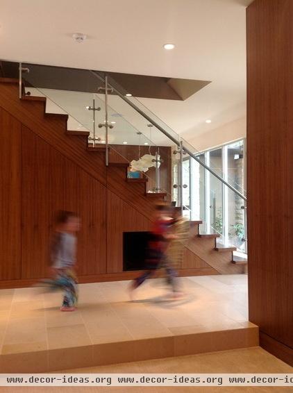
Many parents fear that modern is not family friendly. The Zarinses disagree. “We love modern styling. We also know that kids can adapt to anything — so why not a modern house?” Sascha says. “We made the space and style modern but didn’t go overboard on high-end things we’d have to worry about the kids destroying, like superexpensive light fixtures or furniture.”
He continues: “It’s a house, and we want it lived in, so we understand that things are going to get dinged and worn out. Oh, well.”
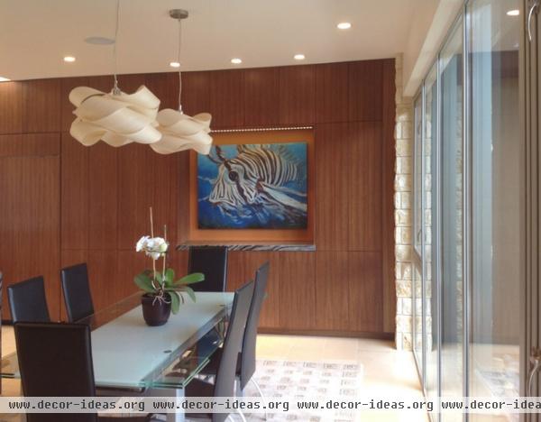
A wall of windows in the dining room faces the street and offers glimpses of the kitchen beyond. Neighbors still knock on the door regularly and ask for a look inside.
Dining set: Scandinavian Designs; pendant lights: Y Lighting
De Mattei Construction in San Jose, California, handled the remodel; the family moved out for the duration. The project was extremely challenging, as nearly all the internal walls on the lower level were removed, the garage height was raised and the square footage had to be maximized in creative ways to comply with the city’s tough building codes.
“I created space wherever I could, but it wasn’t easy,” says Hutchins. “After extending the porch and changing the exterior of the home, I was within inches of what the city would allow.”
AFTER: Sascha was onsite every day during the one-year remodel, which was especially helpful with Hutchins located out of state. Not afraid to get his hands dirty, the homeowner pitched in to work on the garage and bathrooms and took on some finish work as a personal challenge. At one point he was even mistaken for one of the crew and was assigned work to do, which he didn’t mind at all.
“I have a photographic memory and obsess about the superminor details,” Sascha says. “But I want it done right the first time, so I try to help solve the problem before anything is a problem. I tried to anticipate what the contractor and subs were doing, to make sure they were going to end up with what we wanted instead of having to do it over.”
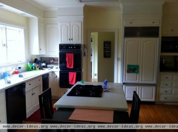
In the previous design, the kitchen was one of many closed-off rooms on the lower level with windows facing the back yard.
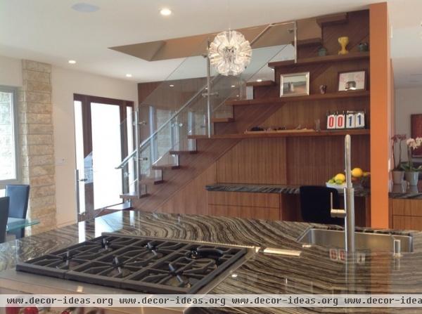
AFTER: A staircase divides the new kitchen from the family room and living room. The entry door (opposite the stairs) and dining area face the street.
Pendant lights: Interior Deluxe
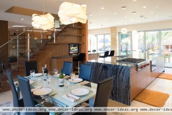
The open-plan kitchen and dining space includes an island outfitted with a wine fridge, dishwasher and cooktop, and adorned with a waterfall marble top.
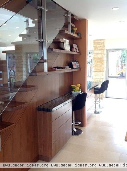
Hutchins incorporated a workspace beneath the stairs. Sliding walnut panels disguise the area when it’s not in use. Built-in shelving displays the kids’ art and other objects.
Bar stools: Scandinavian Designs
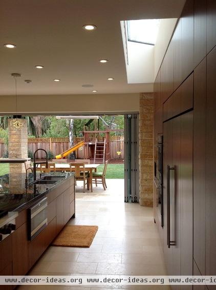
A bank of bifold doors opens onto the back patio. A play structure is situated so that it can be seen from every angle of the downstairs space. The limestone floor continues from the inside of the house to the outside, unifying the spaces.
“The house is very usable for daily living, and the kids love it because they can run around freely,” says Denise. “The best part is the connection to the backyard. It’s like a part of the interior space, which makes it also the perfect house for indoor-outdoor entertaining.”
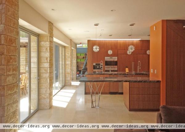
The breakfast bar doubles as buffet space when the couple entertains. The custom stainless steel counter base was an idea that Hutchins came up with to tweak the linear nature of the design. The bifold doors facing the garden connect the kitchen and the eating space on the back patio.
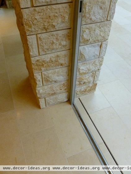
A linear drain runs along the track for the bifold doors, helping keep water off the stone patio. The drain empties into a shade garden under the back patio.
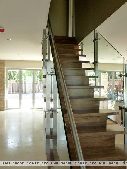
The glass, steel and walnut staircase acts as the single “wall” on the left side of the home.
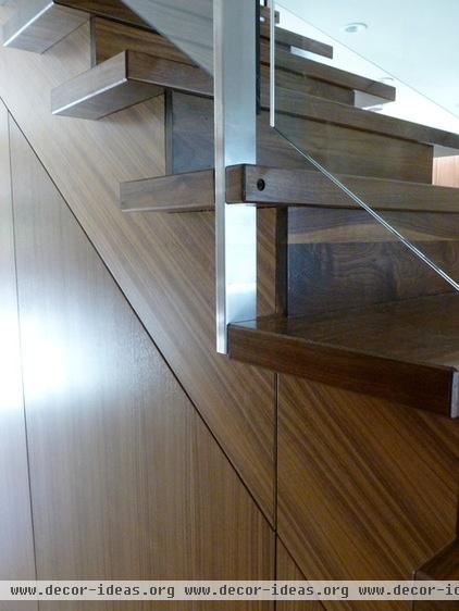
The Zarinses collaborated with Hutchins to plan a staircase that would be both safe and practical. Closed treads and high-tempered-glass panels were designed with child safety in mind. The gap between sheets of glass is wide enough to prevent little fingers from getting trapped between them.
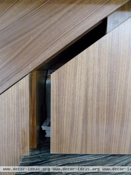
Cupboards built into both sides of the staircase provide ample room to hold toys and art supplies.
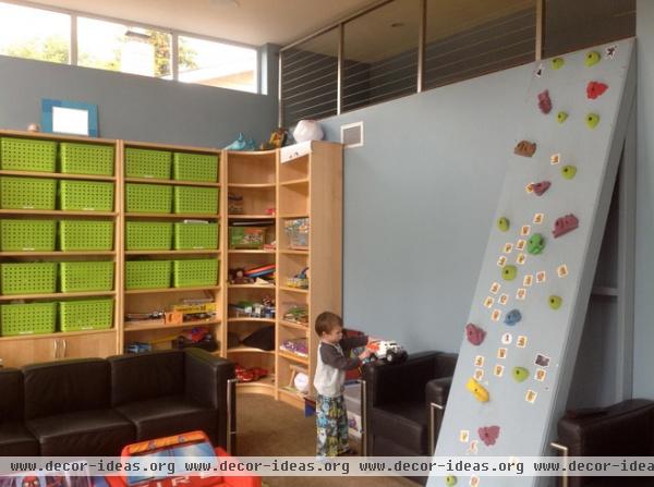
A carpeted playroom adjacent to the kitchen has child-size furnishings, a climbing wall that leads to a reading loft, and a separate door to the backyard play area. The loft’s steel railing meets the ceiling as a safety precaution.
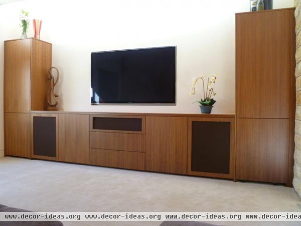
The family room includes built-in walnut cabinets to hold the audiovideo equipment.
Sascha describes himself as a neat freak and likes all the minutiae to be out of sight. Speakers are hidden behind the black fabric panels, and the home’s complex computer system is hidden inside the taller cabinets.
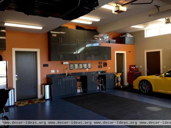
The double-height garage was designed as much more than a place in which to park cars. Sascha loves to work on projects — radio-controlled cars, models, puzzles — and wanted ample space so the boys could do those with him.
The long counter is made from a leftover slab of the marble (Silver Wave) that was used in the kitchen. It’s uncommon to see such a luxurious finish in such a utilitarian space, but Sascha loves garages and plans to spend a lot of time with his boys there.
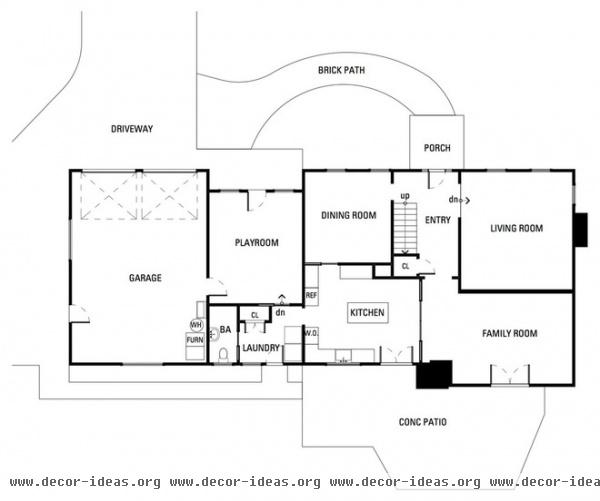
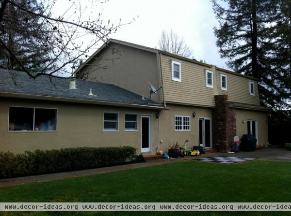
Originally the rooms were closed off to natural light and one another. The backyard space was an untapped resource that figured heavily into the new plan.
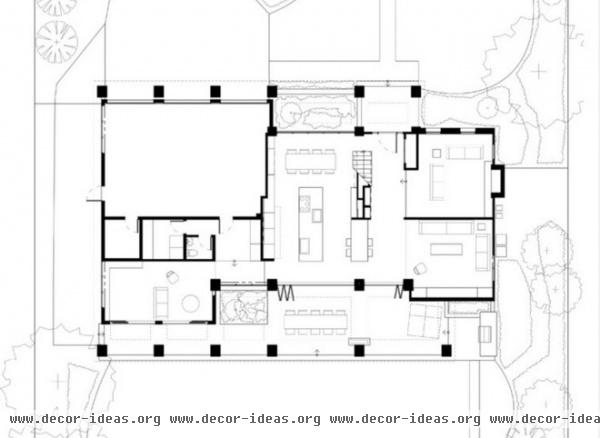
AFTER: The home was reconfigured to take advantage of natural light and open space; most of the interior walls were removed, and the garage was moved forward. An expansive covered patio was added in back, creating an indoor-outdoor living space that flows into the kitchen and dining areas.
More: Open and Modern Seattle Remodel
Related Articles Recommended


