Houzz Tour: Lovingly Resurrecting a Historic Queen Anne
Interior designer Carl Mattison and his husband and business partner Rob Smith have lived in the historic downtown Atlanta neighborhood of Grant Park for about 13 years. It’s walking distance to the famed Atlanta Zoo, the city’s oldest park and more than a dozen restaurants. They love the area and its charming early-1900s bungalows so much they’ve made it their personal mission to rehabilitate some of the old homes, one at a time, whenever they can, and find homeowners who will take care of them.
Their latest is a 1905 bungalow that had sat neglected for decades. The bathroom was unusable. The kitchen didn’t have any working appliances. The original hardwood floors had been painted over or covered with linoleum, and 1970s wood paneling covered the original plaster and lath walls.
Mattison and Smith thought it deserved better. After scooping up the home for $175,000, they shelled out another $205,000 to beautifully restore it, transforming a neighborhood eyesore into one of the jewels of the street.
Houzz at a Glance
Location: Grant Park neighborhood of Atlanta
Size: 2,650 square feet (246 square meters); 4 bedrooms, 3 bathrooms
Photography by Josh Vick
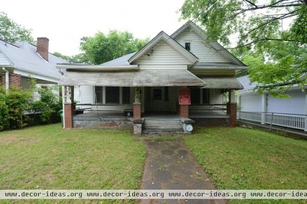
The couple discovered the house while driving around the Grant Park neighborhood one day, pointing at rundown houses they wanted to learn more about and possibly restore, when they saw this neglected Queen Anne with big awnings. “I thought, those awnings were probably put up in the 1930s. If they have been there that long, then probably much hasn’t been done to the inside,” Mattison says.
He had heard stories about the home’s only resident, a blind and deaf man who never left the house, who had taped over all the windows. “It was locked up like a little fortress,” Mattison says. “Someone would check on him, a relative or someone, but other than that he lived there for decades alone.”
The pair found the tax records for the house and called the owner, who turned out to be the nephew of the home’s resident. Sadly, the owner said his uncle had just died, but that he would be at the house that weekend cleaning it out if Mattison and Smith wanted to stop by.
They met the owner and his wife at the home. Mattison walked right into the front room, saw the 11-foot ceilings, generous room size and original fireplace mantels, tile and hardwood floors. He and Smith, a real estate agent, immediately took out paperwork and made an offer on the house. After two days of considering, the owner agreed.
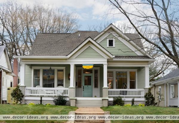
AFTER: Mattison’s careful renovation, aided by Round Here Renovations, returned the home to its charming heritage. Though he was limited with what he could do to the facade, he used soft paint colors, installed a new wood railing and restored the original wood siding to earn the home newfound street cred.
He added three dormers to the unused attic space — one on either side and one in the back — to add 980 square feet for two bedrooms, a family playroom and a large bathroom, bringing the house from a two-bedroom, one-bathroom to a four-bedroom, three-bathroom.
Exterior paint: Willow Tree, Sherwin-Williams
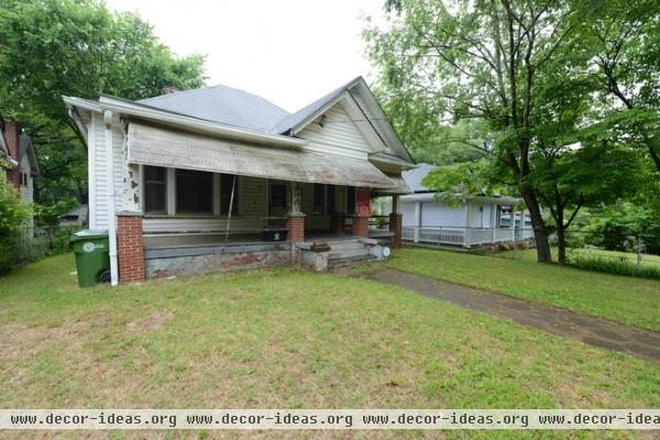
The front porch was in very bad shape and had been patched over the years because of water damage. “Pieces were all over the place,” Mattison says. The metal railings were likely from the 1920s. The columns were in good shape, as were the windows. And the stained glass was original. “As many times as we can say, ‘Original to the home’ — that’s what we’re looking for,” Mattison says.
The awning, likely put on in the 1930s to keep the heat down, had been painted over again and again. It needed to come off. “With central heat and air now, there’s no need for an awning like that,” he says.
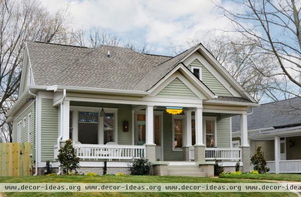
AFTER: Mattison added wood railings that reflect the style of the rest of the homes in the neighborhood, and opened up the front porch so it’s friendlier. “It’s now a place where you talk to neighbors, visit and wave,” he says.
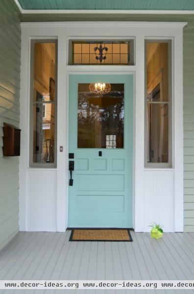
The front door was found at a salvage yard. Mattison paid $150 to patch and paint it.
Door paint: Hazel, Sherwin-Williams
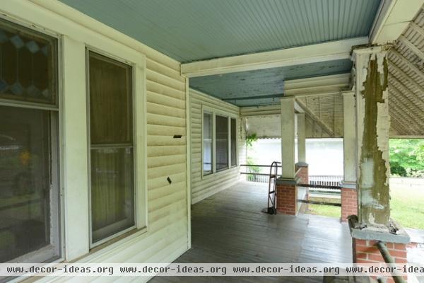
Previous owners had put beadboard over beadboard in the porch ceilings, which had dropped them down to the top of the windows. When Mattison first saw vinyl siding cladding the entire home, he knew it was probably put on in the 1980s, and had likely protected the original all-wood clapboard siding underneath.
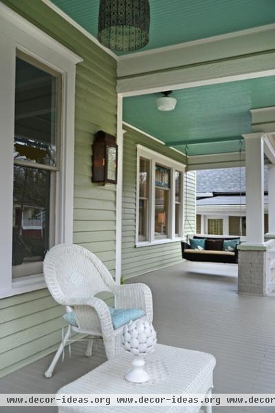
AFTER: He was right, and he was able to patch and paint all the original wood siding. He then pushed the ceiling back up to its original height and kept all the original beadboard.

When Mattison walked into the entryway (shown here at the end of the hallway), a false wall greeted him. (You can see the framing around the ceiling in the middle of the hallway.) This forced people to walk either to the right into the living room or left into the bedroom. The wall was constructed in the 1970s or ’80s from fiber-wood paneling.
“I said, ‘I have to see through this hallway. It’s 7 feet wide,’” Mattison says. “So one night we just started kicking it down.” Also sometime in the ’70s, Mattison says, someone rolled linoleum right over the original heart-of-pine flooring. Meanwhile, wood paneling had been nailed over the plaster and lath. Mattison and Smith pulled it off in a matter of seconds.
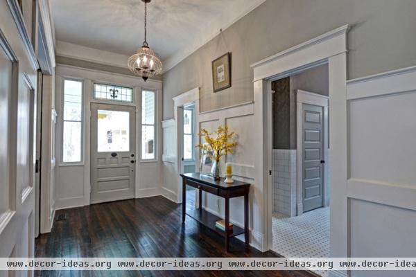
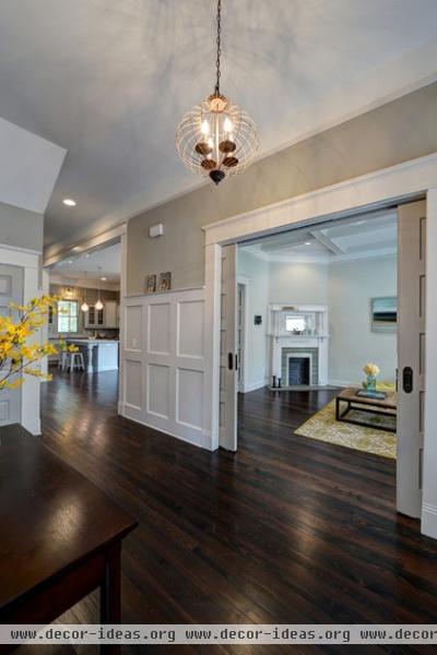
AFTER: Mattison felt the entry deserved something special. He had a millworker create the wainscoting with judges paneling and refinished the original wood floors.
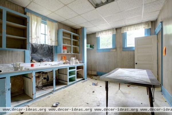
The kitchen was completely closed off from the rest of the house. Mattison sold the kitchen cabinet doors at an estate sale, along with a lot of other belongings left behind. “There was so much stuff in the kitchen,” Mattison says. “No less than five blenders, eight mixers, 30 of the same plate — everywhere, stacks of it.”
There was also a Formica countertop with a metal edge. “And someone decided baby blue was a nice color, so they painted the moldings, trim and cabinets that color. Then they added the same wood paneling from the hallway,” he says.
Also, office-style panels dropped the ceiling down. “If you threw a sharp pencil up there, it would stick,” he says.

Mattison took down a wall to open the kitchen to the dining room. Pocket doors to the living room create a better modern living flow.
As for the look of the kitchen, Mattison had one design goal: gray, and lots of it. “It was really all I wanted,” he said. “I hadn’t used gray cabinets before, and I finally found the right color with the right company. So I did gray on gray on gray.”
He then added all-new appliances and an open island topped with Vermont marble. “I’m from Vermont — my family and ancestors have lived there for hundreds of years — so I really wanted to use that marble. It has a lot of lines and movement; it’s a much more vintage feel,” he says.
The Vermont marble island top cost $2,000.
Cabinets: Keystone Millworks

Mattison chose an arabesque porcelain tile pattern as a twist on classic subway tile. “It’s simple and clean, with a similar look that’s a little more evolved,” he says.
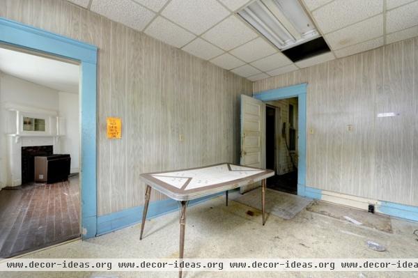
During the estate sale, Mattison flipped on a light in the kitchen. About 30 minutes later someone mentioned that they smelled smoke. Sure enough, there was a small fire in the attic from the faulty electrical wiring tied to the lighting. “We almost burned the house down before we even started work,” he says. A bright orange sign was placed over the switch so it wouldn’t happen again.
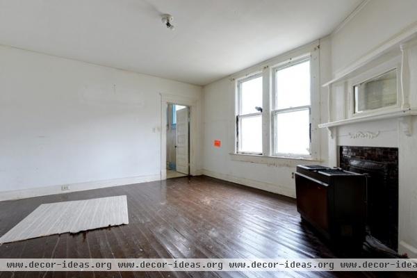
The far wall had separated the kitchen from a large dining room. The original fireplaces once burned coal, an extremely dirty system that caused many homeowners to place hulking gas-burning furnaces directly in front.
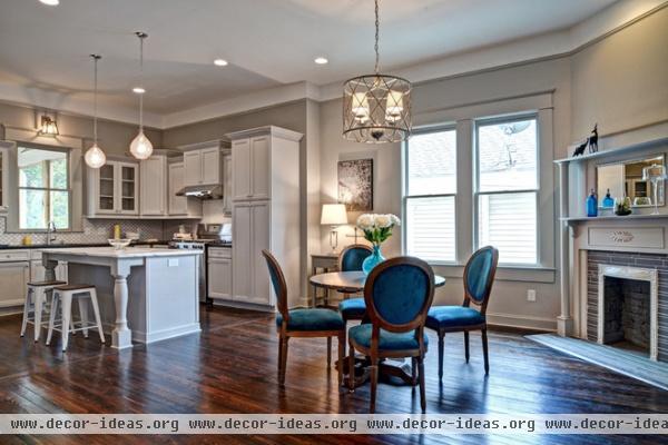
AFTER: The kitchen now opens to the dining area. Mattison restored all the fireplaces but converted them to gas-burning ones.
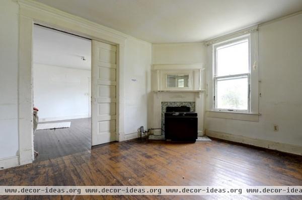
In the living room, the ceilings had been dropped down to the window, probably as a way to conserve heat, Mattison guesses. Previous inhabitants had painted over the original hardwood floors. “We have no idea what they were doing,” he says.
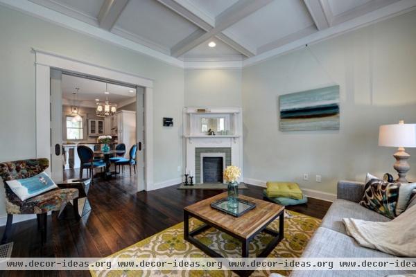
AFTER: Mattison wanted to dress up the living room and make it special, so he added coffered ceilings for more detail and charm. “It’s not the biggest living room, so I wanted to make it jewel-like or dollhouse-like; with the cute fireplace, it becomes its own little enclave,” he says.
He took out the window, because there was nowhere else to put the TV. (It’s hidden behind the painting.) “The window was just looking at the neighbor’s house anyway,” he says.
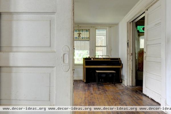
The pocket doors connecting the living room were in relatively good shape — completely painted over, but the original hardware was still there.
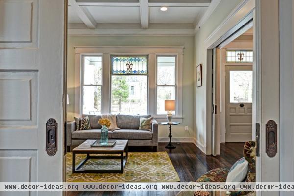
AFTER: Mattison refinished the doors and put them back on the original tracks. He cleaned the hardware himself by boiling the pieces for an hour in a pot until the paint started falling off, then used a wire brush on a drill to remove the rest.
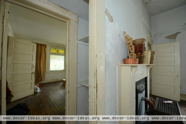
A weird pass-through had existed between the front bedroom and another room. Someone had put up shelves in the space. Since he already had two other fireplaces, Mattison removed this one and the in-between space to make way for a new guest en suite bathroom.
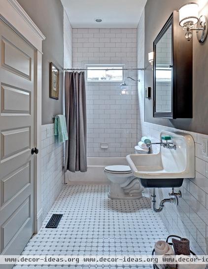
AFTER: Mattison’s design goal in the new guest bathroom was to create something neutral with a twist. The twist comes from the sink, which Mattison recovered from the original kitchen. For $300, he reglazed it and painted the bottom to match the large medicine cabinet from Restoration Hardware.
“Most people would put in a vanity,” he says. “I wanted to start with a bit of whimsy. And most people wouldn’t put tile all the way to the ceiling, or use it as wainscoting.”
Sink paint: Peppercorn; door paint: Mindful Gray; wall paint: Pewter Cast, all from Sherwin-Williams
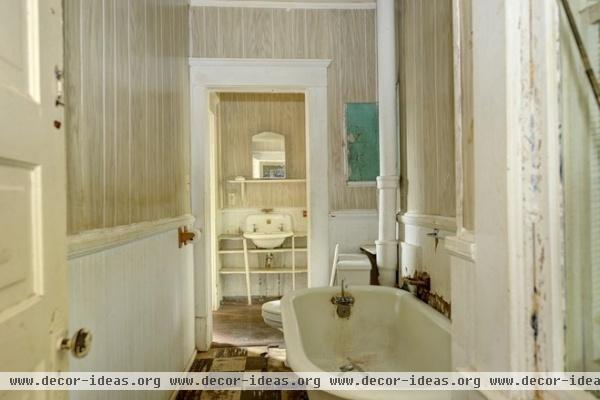
The toilet and an inoperable bathtub were in a strange room all their own, connected to a makeshift sink area that opened to the master bedroom.

AFTER: The new master bathroom “wasn’t the largest space, but I decided to jam everything in it that I could,” Mattison says. “I wanted it to be the full en suite bathroom that you didn’t want to leave.” He kept it as open as possible, with a full glass shower surround and a claw-foot tub original to his own 1905 house. He paid $300 to have it refinished and have the bottom painted black for a classic look. The chandelier gives the space a modern twist. Vermont marble tops the vanity.
Capiz Orb Pendant: West Elm; mirrors: Restoration Hardware

Mattison didn’t know what to do with this small sink space at first.
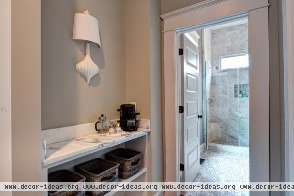
AFTER: He used leftover Vermont marble for a counter and built shelves to create a neat little coffee station that connects to the new master bathroom.
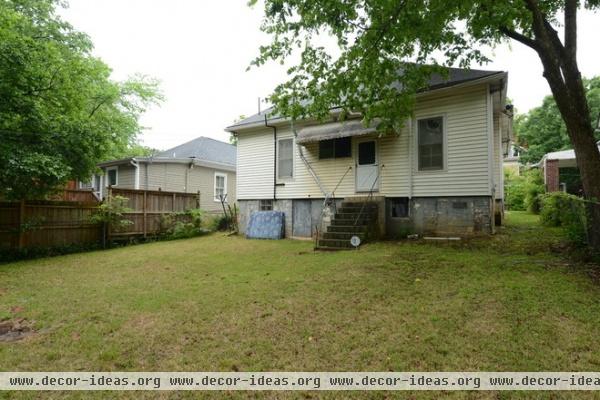
The backyard was open right to the rear alleyway and parking area.
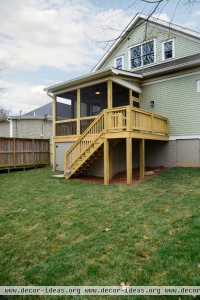
AFTER: There are mosquitoes and bugs in Atlanta, so a screened-in porch made sense. A new fence now blocks access to the alleyway.
See more photos of this home


