Houzz Tour: Curves Ahoy! See a Unique Floating Home
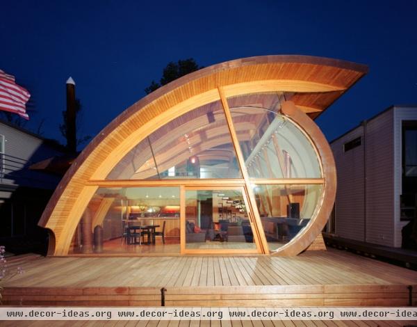
While I was watching Portlandia last week, the unique floating house where the sleazy character of Bacon (played by Fred Armisen) met with Marty, the celery guy (played by Steve Buscemi) made my eyes pop out of my head. When I happened upon it on Houzz the next day, I couldn’t believe my luck and immediately contacted architect Robert Oshatz to learn more about what inspired its unique organic forms. Built in 2006, the stunning floating home has curves that take their cues from the contours and movement of the Willamette River. A five-minute boat ride from downtown Portland, the home has a design that sprouted from how the clients wanted to live in it, and its organic form followed function.
Houzz at a Glance
Who lives here: This is the summer home of a couple who divides their time between Portland and the Far East.
Location: Portland, Oregon
Size: 2,300 square feet (214 square meters); 2 bedrooms, 2 bathrooms

As the celery guy, Steve Buscemi channels Jack Lemmon in Glengarry Glen Ross in this phone booth scene, in which he calls his wife before heading to Bacon’s mysterious house. The homeowners are fans of the show and let them shoot the sinister scenes in their home.
See the episode “Celery”
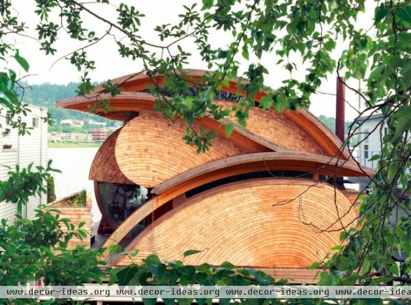
“Each site has its own sense of poetry to it,” Oshatz says. On this slip along the Willamette River, he was influenced by the rhythm of the water and its rippling effect. Clad in western red cedar shingles, the facade also resembles the cross section of a large log, like the ones the house is floating atop.
However, the exterior is the last part Oshatz designs. He begins with how the clients want to live and designs the inside in plan and section concurrently, then the exterior follows, taking its cues from the interior’s design. “I see how a person wants to be in and use their house … a house should adapt to the way they want to live; they should not have to adapt they way they want to live to the house,” he says.
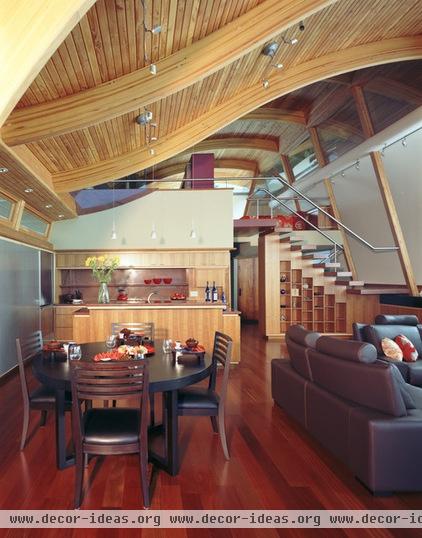
“These clients were interested in loft-style living; they are avid readers; and they also wanted space for a study and a guest room,” Oshatz says. They wanted to take advantage of summer outdoor living on the water and were not interested in minimalist white box-style architecture.
Oshatz’s talents for designing organic architecture appealed to them; they found him after admiring another one of his projects. From there he learned they liked soft, flowing lines, wood textures and warm colors. The floors are Brazilian cherry; every other piece of wood is local.
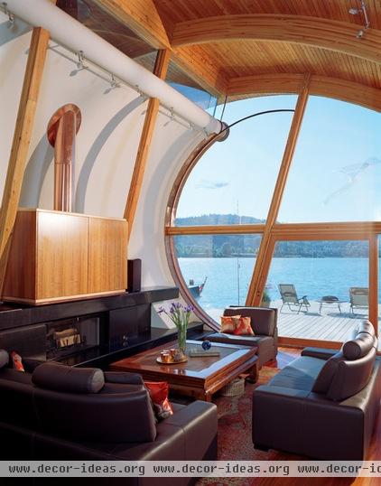
The large opening facing the water offers expansive views of the river and the sunsets. The trapezoid-shaped sliding door plays off the curved geometry. Oshatz made sure each separate piece of glass could fit into a local tempering furnace, cutting down on costs and the carbon footprint of having glass shipped in from far away.
The owners love copper, and Oshatz brought it inside via the fireplace flue. The wall behind it is drywall and reflects the sunlight bouncing off the rippling water that inspired the design.
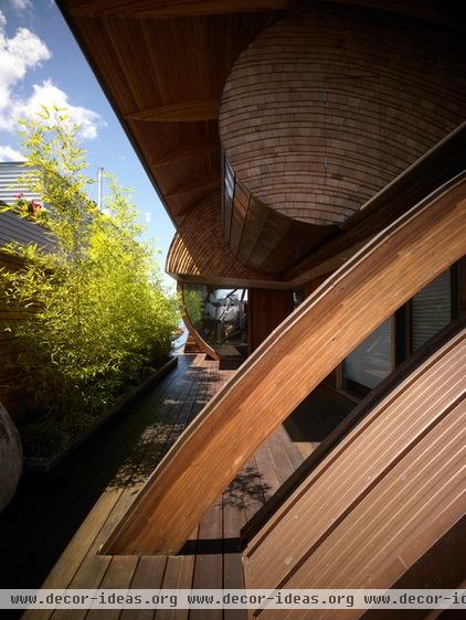
Privacy is an issue, as most floating homes are in slips very close to adjacent neighbors. Openings that let in light but maintain privacy are needed. Also, fire regulations require that one has to be able to walk all the way around the outside of the house. Oshatz addressed both of these issues with the outer wall and trees, which create privacy from the very close neighbors while still providing views out and letting light in.
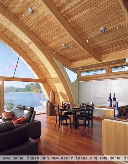
The curved beams are glulam, an engineered wood. The pieces are custom made in long metal molds. Here’s the catch: Every time the radius changes in the specifications, a fee is charged. Thus, every piece here has the same radius, even though you see different curves and S-curves on different beams. This not only cuts costs, but lent itself to a more pleasing geometry.
The clerestory windows to the right let in the light while maintaining privacy. Beneath the windows are large cabinets with perforated metal doors. The clients wanted to hang up lots of art, which is made easy by the small holes in the metal — they can hang framed pieces securely into it without having to pierce drywall or wood.
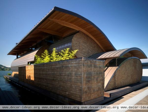
The shingles are standard, but Oshatz had them cut at a 45-degree angle. “This means they lay up more softly and don’t cast as strong of a shadow line,” he says. The pattern of the shingles picks up on the curves of the home and the sense of the flow of the water.
The straight wall along this side of the house contrasts with all the curves. The spacing of the rows of shingles is random, with the shingle exposure ranging from 1 inch to 6 inches.
The roof is copper, as is part of this side’s facade. The copper will weather and develop a patina over time
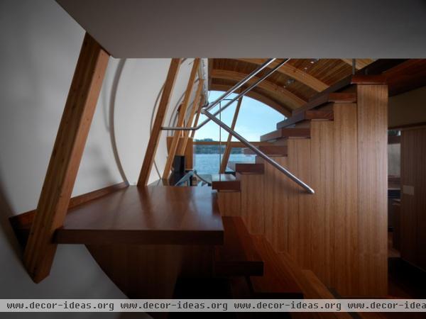
The staircase allows views through to the water.
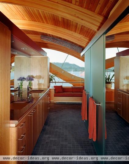
Upstairs is a master suite complete with a bedroom that looks down on the main living space and out to the river. The doors here cover a toilet and a shower, and there is a spa tub beyond them, next to the built-in sofa.
“Every house has its own spirit, which comes from the site and the personalities of the clients,” Oshatz says.


