Room of the Day: A Bland Bath Goes Bold
http://decor-ideas.org 04/03/2014 22:24 Decor Ideas
The DC Design House (the foremost decorator showcase home in Washington D.C.) is set to open on April 13. Before the latest rooms are revealed, we take a look back at one of our favorite spaces from years past. In 2012, Christopher Patrick was assigned a small, out-of-the-way bathroom in that year’s home, but after the remodel, it was among the most memorable. In the absence of an actual client, Patrick made the bathroom as he would like it. “I imagined that I lived in the house,” he says. “I added the things I would put in myself.”
Photography: Stacy Zarin-Goldberg
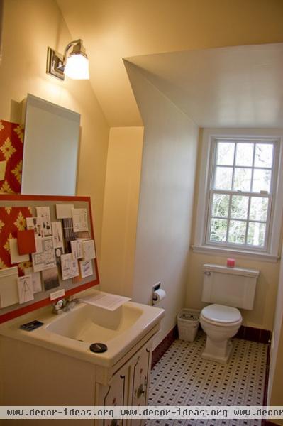
The small room had been remodeled in the 1950s. Storage was next to nil, and the appliances and fixtures were dated.
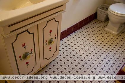
The rose-bedecked vanity and burgundy and white tile floor made the room seem like a time capsule.
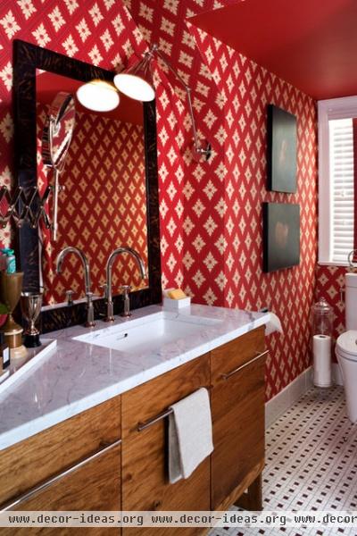
AFTER: Patrick added Ranelagh, a vibrant Farrow & Ball wallpaper with a re-created neoclassical design, in a brilliant red. A new vanity, done in a midcentury style, adds storage and a modernist note. “In this bathroom I blended the old and the new,” says Patrick. “I wanted to keep the charm of the period but to bring it up to date.”
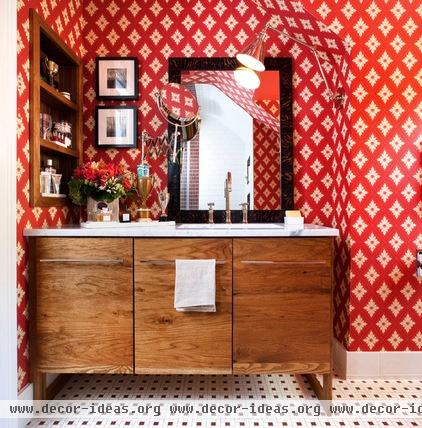
To avoid moving plumbing pipes and to give the sink area a larger uninterrupted countertop, Patrick made the vanity asymmetrical, with the sink and mirror shifted to the right. Anyone who has struggled to get ready for work while juggling a sea of toiletries, hair dryer attachments and flat irons can immediately see the benefit of a countertop surface that’s not divided into small portions by a sink.
The wall-mounted sconce — whose jointed neck follows the unusual ceiling plane — gives the person using the mirrors the ability to adjust the light. But it has a style purpose as well. “We’ve seen a million bathroom designs,” says Patrick. “I wanted to do something different and something that would make it look more like a living room than a bathroom.”
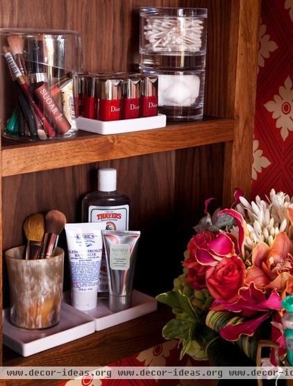
Creating the antibathroom was on Patrick’s mind when he designed this open medicine cabinet. ("I wanted it to feel like shelves,” he explains.) The fixture keeps items that are used every day close at hand.
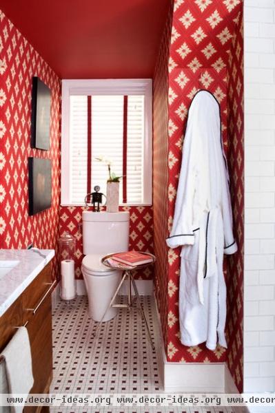
The burgundy and white floor stayed for budget reasons. But with the red wallpaper, its plummy tones read more brown. “I thought it would be fun to embrace that floor and turn it into a design element,” Patrick says. “A lot of homes in this area have floors just like this, and I thought it would be interesting for people to see what you can do with it.”
Patrick’s choice of a toilet paper holder (a tall apothecary jar from Pottery Barn) had visitors talking. “Everyone noticed it and commented on it,” he says. “I saw the idea online and liked the way it looked.”
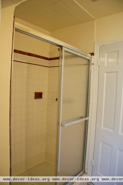
The old aluminum-framed, rippled-glass shower doors were ready for an overhaul.
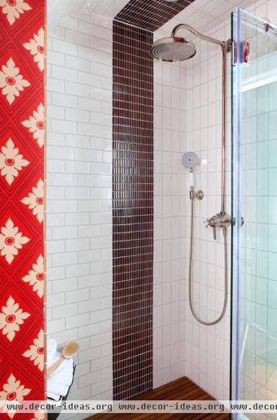
AFTER: Patrick remade the shower by using a period material (subway tile) in a novel installation that mixes in modern materials. The subway tile runs both horizontally and vertically, divided by a channel of accent tile. The original floor is there, but screened by teak planks.
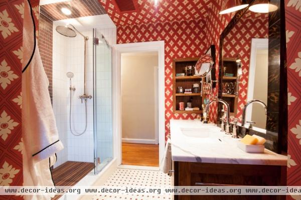
Patricks says he had no hesitation about installing the spirited wallpaper in such a small room. “I’m not sure if that is a testament to skill or ignorance,” he says. “In my mind it’s more fun to be bold and daring. It makes a petite space feel more like a jewel box.”
See more Rooms of the Day
Related Articles Recommended


