Houzz Tour: A Do-Over Addition Brings in Light, Air and Views
The street-facing exterior of this 1920s bungalow exuded charm. Unfortunately, a rear addition added by a previous owner had created small, dark rooms with low ceilings that disrupted the flow of the house and blocked sunshine, airflow and views to the wooded backyard.
So homeowners Jeff Dorn and Airi Maeno — he’s a government employee; she’s a potter and jewelry designer — hired architect Wakako Tokunaga, who ripped off the old addition and started over with a double-height glass wall that gave them light, air and views. “It’s a very simple idea but solves all of the problems the clients came to me with,” Tokunaga says.
Houzz at a Glance
Who lives here: Jeff Dorn, Airi Maeno and their son, Asa
Location: Takoma Park neighborhood of Washington, D.C.
Size: About 2,500 square feet (232 square meters); 3 bedrooms; 2½ bathrooms
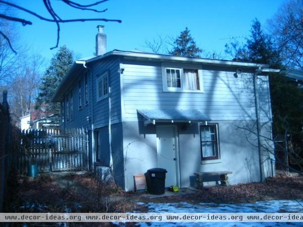
The bottom portion of the addition was an unfinished basement, while the top held bedrooms. None of the spaces had much natural light or views of the wooded lot. Tokunaga and the current homeowners immediately agreed this addition had to come down. “It wasn’t even structurally sound,” Tokunaga says.
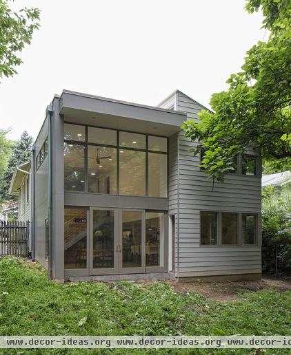
AFTER: A double-height glass wall and abundant windows fill the new addition with light and fresh air, and finally connect the interiors visually and physically to the lush landscape.
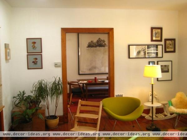
Because of the sloped property, the entry to the home is on the second level, which contributed to the disruption of flow and the disconnect with the leafy backyard. You’d enter in the living room and then wind through a series of small, very dark rooms, says Tokunaga. Through the door and to the left were the tiny kitchen and a steep, narrow “dark, dark, dark staircase to the basement,” she describes.
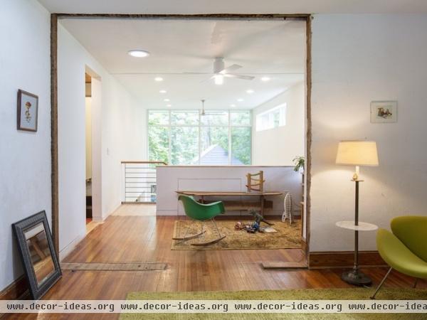
AFTER: Tokunaga removed the walls to give a clear view to the double-height wall of windows on the new rear addition, instantly connecting the homeowners and guests with the backyard.
After tearing down the wall, Tokunaga loved how the chipped edges and unfinished floor looked. They created a raw connection to the home’s old-and-new dichotomy, so they left them. “I thought it was in line with the original character of the home,” she says. “I like the contrast between imperfect lines in the old part of the house, then as you go down the staircase into the new addition, it’s very crisp. It was a good accident.”
What was once the dining room is now a sitting area and small playspace where the homeowners love to watch storms through the back windows.
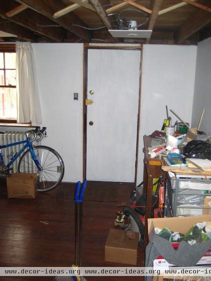
The basement area was unfinished, structurally unsound and rarely visited.
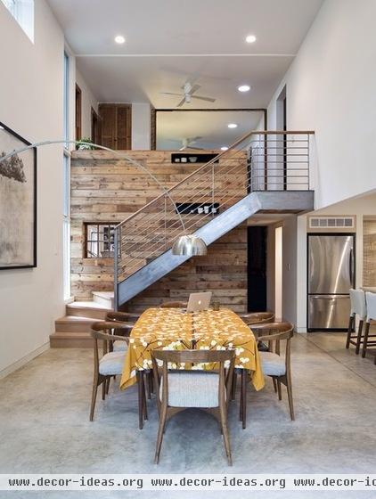
AFTER: The addition contains the dining room, Maeno’s art studio (beyond the reclaimed wall), a kitchen to the right and bedrooms above that.
Tokunaga reused wood left over from the demolition of the former addition throughout the house. “It’s Douglas fir that’s darkened over the years,” she says. “It’s pretty beautiful.”
“I believe in the expression through layers of time,” Tokunaga says. “I didn’t want the new addition to look like the original, but I needed something to tie the layers together. So the warm wood makes that cohesive connection.”
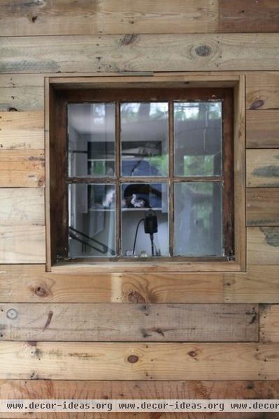
Dorn put this wall together himself to stay within the family’s strict budget. “It took him a couple of months, but he did a wonderful job,” Tokunaga says.
A window, also reused from the old addition, connects Maeno’s art studio to the dining space and backyard so she can keep an eye on the kids while she’s working.
Dorn and Maeno were both students at the Rhode Island School of Design (RISD), and their art backgrounds added to the project’s success, Tokunaga says. “A lot of projects I do, I come in with strong ideas, but clients have other ideas they want to incorporate, which is great, but sometimes the conceptual clarity gets a little muggy,” she says. “These clients had complete trust and understood my conceptual ideas and wanted to support that. They also understood drawings and models and thought spatially.”
When Tokunaga proposed covering the stairway wall in reclaimed wood, the couple liked that immediately. “They understood the play of materials,” she says. “Their art training was, for me, a delicious experience.”
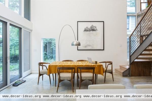
The couple found the midcentury modern dining table and chairs online. Most of the art pieces were done by the couple’s friends from RISD.
The vertical windows separate old and new and provide southern sunshine. A wall blocks views to the neighboring house. The picture window to the left has the same effect. It also allows the homeowners to peek out and see who has pulled up in the driveway. To help with airflow, all the windows except for the picture window open.
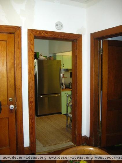
Too many doors in the house meant that the rooms got closed off to light and airflow. “It didn’t feel musty or moldy; there just wasn’t a breeze. The air and light were completely choked,” Tokunaga says.
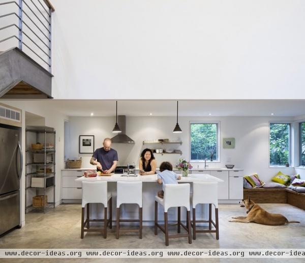
AFTER: A new open concept keeps things airy. The kitchen was the first thing Maeno and Tokunaga worked on together. “Maeno kept saying ‘central,’” Tokunaga says. “So I imagined everyone gathering at a big open island where the kids can sit and eat and do homework and where all their friends would gather during parties.” Here’s the family using the kitchen just as she envisioned.
Purekitchen in Brooklyn helped with the kitchen design.
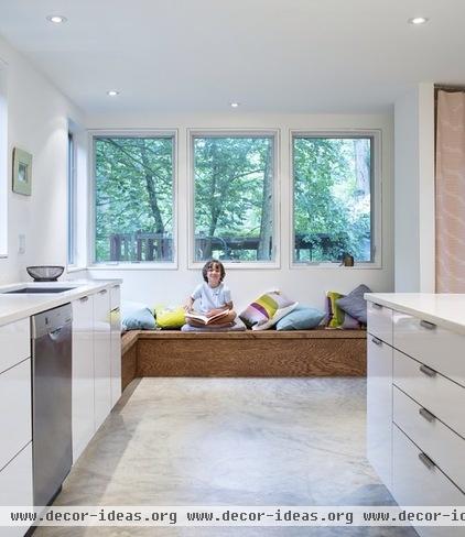
While Maeno was adamant about having a clean and minimalist space, Tokunaga pushed her for a bench in the kitchen. Otherwise there wouldn’t have been a casual living room space for sitting down on the bottom level. “It gets great morning light and views of the backyard,” the architect says. “This is the sit-down-coffee-and-newspaper space.”
Dorn built the bench with more leftover reclaimed wood from the demolition. (He’s since added a sloped back.)
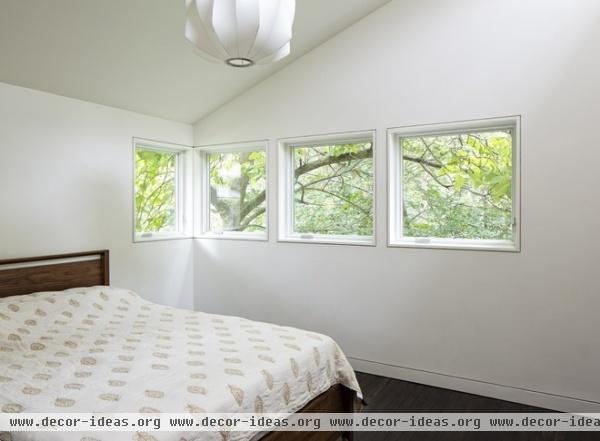
In the new master bedroom, above the kitchen, picture windows (something the previous bedroom didn’t have) face the backyard. “There are trees everywhere; it was a shame before not to have views of that,” Tokunaga says.
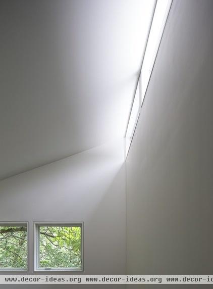
The floors are reclaimed oak left over from the demolition and stained dark. A sloped roof elevates this side of the house above the dining room ceiling so clerestory windows that bring in southern light could be added.
More: 10 Ways to Expand Your House Out and Up


