Houzz Tour: High Contrast Shakes Up a Townhouse
When Emily Ellis and Jemy Massie named their fledgling design firm Studio Revolution, they had nothing less than interior overthrows in mind. Their approach to the design of this Mountain View, California, townhouse was certainly revolutionary. They had to work quickly and on a tight budget, which meant turning to off-the-shelf products. Some professionals might have a problem with that concept, but this duo accepts good design where they find it, be it on a newly discovered website or among the towering warehouse shelves of Ikea. Using imagination, good taste and DIY skill, they made this simple space more interesting.
Houzz at a Glance
Who lives here: A young couple
Location: Mountain View, California
Size: 2,000 square feet (186 square meters); 3 bedrooms, 2 bathrooms
Photography by Thomas Kuoh

The townhouse was a tract building with no notable architectural detail. The couple had something else in mind and hired Massie and Ellis to make it happen. “The clients — especially the woman — loved sleek, ultramodern style,” says Massie. “She wanted everything to be white.” However, the couple showed the designers inspiration photos of spaces that were warmer and cozier, and spoke of a love for Europe, Scandinavian design and Islamic patterns. It might seem like an impossible-to-bridge dichotomy, but these designers looked at the house as an opportunity to mix things up.
The living room is painted in the whitest white they could source, but is furnished with a nubby off-white sofa and a Scandinavian-style chair. A crane-like light fixture (a plug-in, since the budget didn’t allow electrical work) adds a dramatic architectural element. The 6- by 7-foot artwork is wallpaper applied to a plywood panel; not only does it add graphic interest to the room, but it hides an unused, unsightly television niche over the fireplace.
Sofa: CB2; light fixture: Restoration Hardware; wallpaper: Wall & Deco; rug: West Elm; paint: Super White, Benjamin Moore
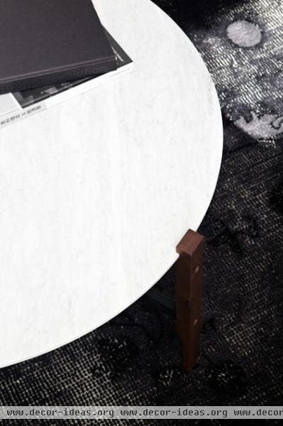
The deep black and bright white colors are the key. “We love high contrast, because it’s very sophisticated,” says Massie. “But we didn’t want it to be overpowering, so we chose a rug with a distressed look.”
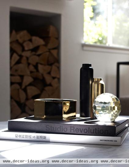
Accessories give the space dimension. Black, gold and crystal pieces add a touch of glamour. The vases are from CB2, and the prism and paperweight are from Target. “We shop everywhere,” says Ellis. “You never know about Target — sometimes they throw you a bone.”
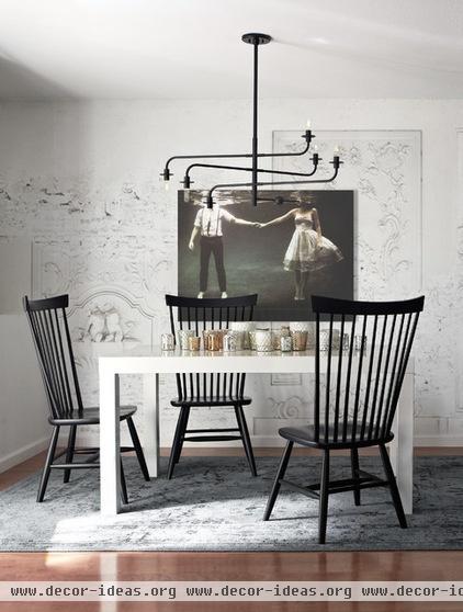
Massie and Ellis say that the key to choosing big-box items is to not go too trendy, as pieces that are of the moment can quickly become things of the past. Here the classic Windsor chairs and simple Parsons table have no expiration date.
To add visual architecture, the designers again installed a sculptural light and lined the back wall with wallpaper depicting crumbling bas relief details. The art was obtained from Society6, an affordable online gallery. “We thought it added an ethereal drama to the space,” says Ellis. “And since it shows a couple, and they are a young couple, we thought it was romantic.”
Light: Atelier pendant light, YLighting; chairs: Marlow side chair, Crate & Barrel; table: Parsons dining table, West Elm; votives: Target; art: Society6; wallpaper: Wall & Deco
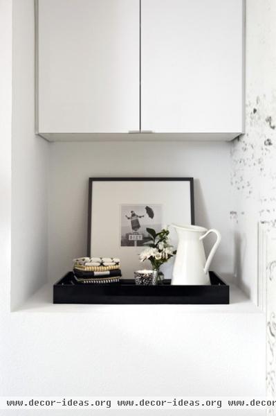
A niche next to the dining room is outfitted as a tea and coffee bar. A small framed artwork from Ikea gives it a special touch.
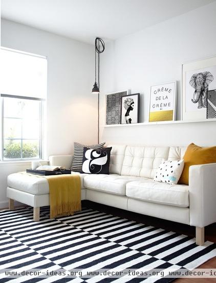
In the combined media room and office, Massie and Ellis were asked to keep the floor as open as possible. Instead of coffee tables or side tables, they made an impact with a statement rug and an art wall. The ledge allows the couple to display small works of art and gives them the flexibility to change things up as their collection grows. The graphic rug brings life and texture to the room.
Sofa, rug: Ikea
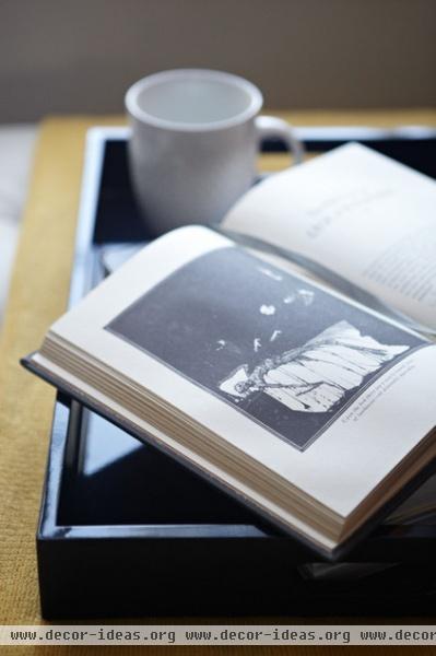
Since there is no coffee table, a large tray gives the owners a place to put down a coffee cup or tea mug while reading.
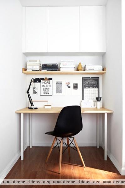
Across from the sofa, there was a large, empty niche. “This was likely supposed to be a closet, but it never got finished,” says Massie. “We used Ikea hacks to make it into an office.” The designers had Ikea butcher block cut to size, and then used one plank as an open shelf and the other as a desktop (the desk legs are also from Ikea). Cabinets overhead provide storage.
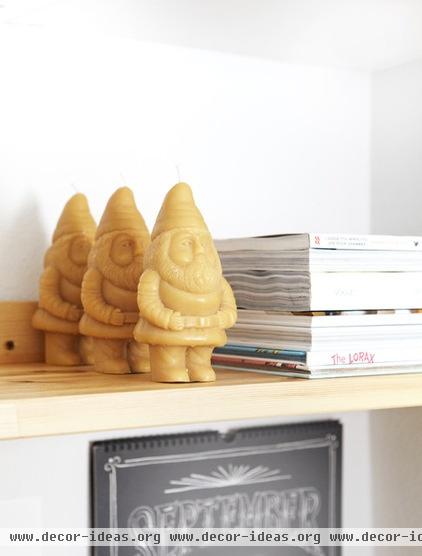
Looking like three of Snow White’s seven dwarves, little beeswax candles stand guard on the office shelf. “We wanted to add some fun,” says Ellis. “No room should be too serious.”
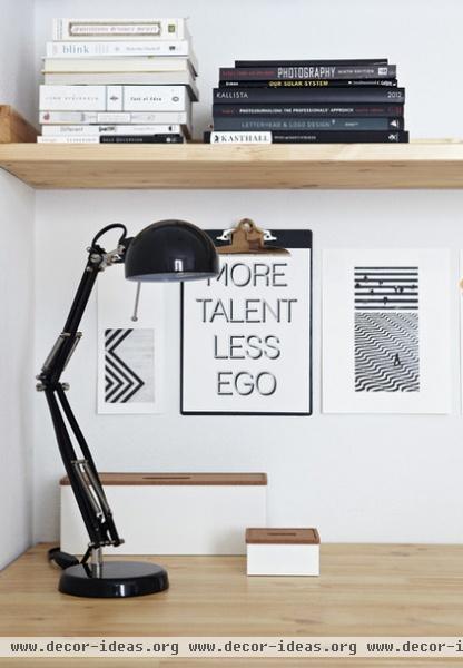
A clipboard displays an inspiring quote. It’s one the couple likes, and Massie and Ellis say it is also one of their credos. “It’s a good reminder to keep yourself a bit humble,” says Massie.
Good advice, but the new look of the townhouse is something to brag about.


