Design Workshop: Reasons to Love Narrow Homes
http://decor-ideas.org 03/26/2014 03:22 Decor Ideas
The simplicity, directness and beauty of a narrow floor plan makes it suitable for many building sites, and not only those on tight lots. Homeowners with narrow sites who feel constrained by tightness can embrace the narrow building plan, which offers advantages over stouter ones. Here’s a look at the most meaningful advantages of narrow structures.
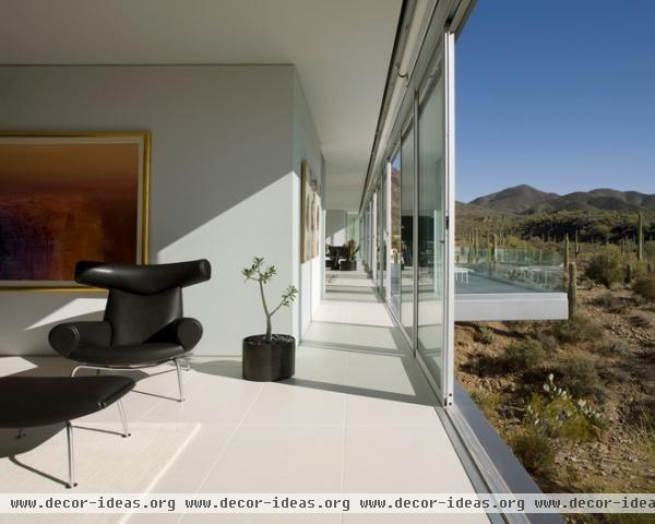
Light. Quite possibly the biggest advantage of a narrow building footprint is access to natural light. Narrow layouts permit daylight to enter the full depth of a space. Floor plans that are one room wide gather and distribute light very efficiently.
A width of 18 to 20 feet (give or take) is ideal, as it preserves a narrow proportion and allows for roughly 3 feet for walking space; 2 feet for built-in cabinetry, closets or shelving; and 13 to 15 feet for living space. Narrow plans ensure you’ll always be within a few feet of a window, natural light and fresh air.
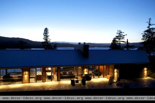
Warmth. Pair natural sunlight with a thermal mass on the interior, like a concrete floor, and a solar array on the roof, and you’ve established a way to collect both active and passive solar heat for use in your home.
Long, narrow homes can leverage their flanks to act as efficient collectors of solar energy. The local climate will dictate how you’ll want to position your windows. Where I practice in New England, the north-facing walls typically utilize smaller window apertures, while the south-facing walls are more open. In the desert Southwest, the south- and west-facing walls are subject to overheating and require a different treatment.
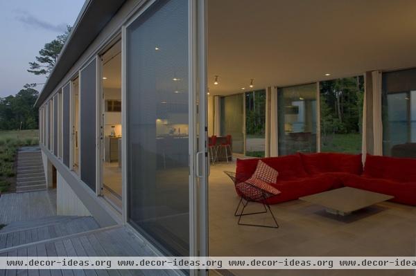
Ventilation. Narrow layouts offer plenty of natural ventilation opportunities. The architects have used sliding doors to maximize ventilation in the riverfront-site home shown here. Openings opposite one another take advantage of the physics of natural convection, drawing cooler air into warmer spaces, and the slender room dimension means the space is ventilated quickly.
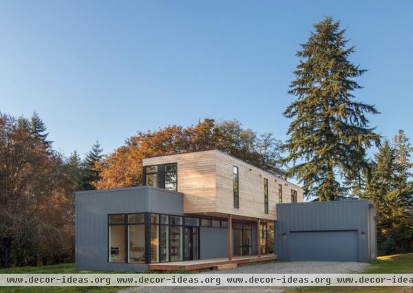
Efficiency. A narrow footprint opens up the possibility for prefabrication in construction. Factory construction allows site-driven issues such as weather, waste and quality concerns to be managed in a controlled environment. While the overall cost of prefab construction may not be lower than that of a structure built onsite, you’ll save time, as the structure and site work can occur simultaneously.
This prefabricated home, by Method Homes, boasts a waste stream — meaning the amount of waste that leaves the construction site — of less than 10 percent. Because prefabrication ultimately requires shipping via roadway, the modules are inherently narrow. As seen in this project, they can be shifted and stacked to create interesting and complex spatial arrangements that respond to views and light. As you can see, narrow doesn’t equal dull.
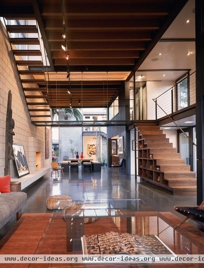
Flexibility. The width of narrow-plan layouts (18 to 20 feet) usually means that interior load-bearing walls or columns can be omitted, opening up the interior arrangement to many different possibilities. The roof can be spanned with trusses, and the floors supported by simple structural members to distribute the structural loads to the exterior walls, which act as load-bearing walls.
With the side walls carrying all of the structural weight of the building, any interior partitions can be placed wherever desired. This also promotes future flexibility, as moving partition walls is a much simpler task than redesigning or working around interior structural elements.
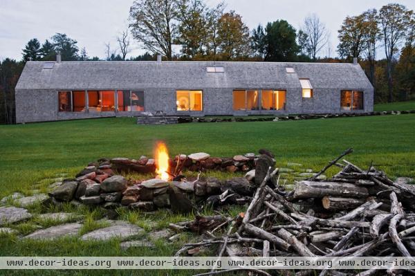
Expandability. It can be difficult to incorporate everything we want and need into a first pass at a custom home. Even when we are able to, our ever-changing lives demand that our homes adapt with us. Planning for expansion at the outset of a project is another benefit to a narrow building plan.
Adding rooms to either end of a slender configuration is perfectly viable. The structural bay can be repeated in both the floor and roof system. Consider the simple module employed here; adding to it would simply be a matter of extruding the form to increase the length.
Building upward, while more complex, can also be part of a phased addition. Added floors, load-bearing walls, the foundation and the roof framing can all be designed to accommodate the addition of future floors.
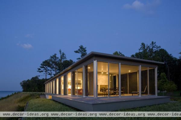
Escape. This building addresses three distinct site features: the forest, wetlands and river. Its length perfectly enables the inhabitants to experience each part of the site from a different vantage point, and offers private refuges at the extreme ends within the larger building. Extending the layout along a single axis preserved the simplicity of the structure while providing these necessary places of escape.
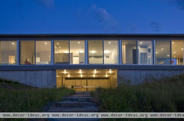
Vertical separation. Separating functions vertically in a narrow plan introduces complexity and can ably respond to site conditions. By drawing out the spaces of this home on a long axis, the architects have created a building shape that abstracts the river as well as a long wall against which to transition the grade from upper to lower level.
Here we see a carefully revealed boat storage area positioned on the lower level, close to the water’s edge. I particularly appreciate the subtle grade change the architects have enforced, transitioning from the upper to the lower level. Unlike the typical walk-out basement, this area feels married to the land at the water’s edge.
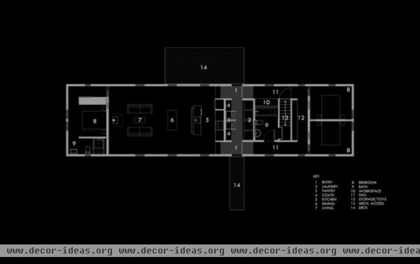
Horizontal separation. Narrow buildings can mean the interior space feels more compressed, which can be a concern for those looking for privacy. However, when properly designed, a narrow plan can offer this privacy.
A thoughtful zoning layout allocates private spaces farther away from public spaces in the plan shown here. Transition zones, such as the denser core in the center, are visual tricks that increase the sense of disconnection and privacy. Even very minimal transition zones act to reframe space and tell us that we’re entering a different place. In this case they delineate the public and private realms.
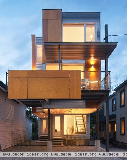
Savings. Stacking narrow plans vertically adds volume without increasing the footprint. This helps to minimize site costs, which can often be substantial.
![modern exterior by thirdstone inc. [^]](http://www.decor-ideas.org/upload/cases/2014-03-25/photos/middle/23100-2014032512220813957753284974.jpg)
Doing more with less square footage means you can choose to invest more money in the things that really matter to you. If your priorities are to maintain a connection to the surrounding context and neighborhood, a narrow plan can free up money to spend on glass walls that allow for those connections.
The owners of this project did just that. Establishing strong interior and exterior connections was important to them. Not only did they want to be able to view their children playing outside, but they wanted to engage their neighborhood. The glazed walls have the added benefit of allowing the interior spaces to be bound by the larger outdoor context and scale, not the interior footprint.
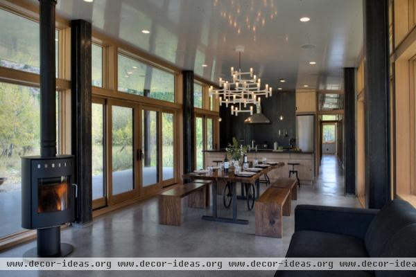
Sense of exploration. Supporting previously mentioned ideas about privacy and separation, hallways are necessary in narrow buildings. They can heighten our sense of disconnection from adjacent spaces. They’re like short trips with a clear beginning, middle and end.
In this way we understand that the spaces are physically separate even if only by a few feet. Single-loaded hallways — hallways accessed from only one side — make good sense in a narrow plan. But consider also ringed hallways, such as in the previous plan, in which the hall rings a central internal core, to increase a sense of exploration and mystery in a confined space.
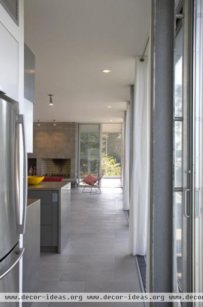
Establishing long sight lines in a small plan increases its apparent size. Use them to your advantage by not revealing the final destination. This not only adds to the interior experience, but enhances privacy and expands the perception of space.
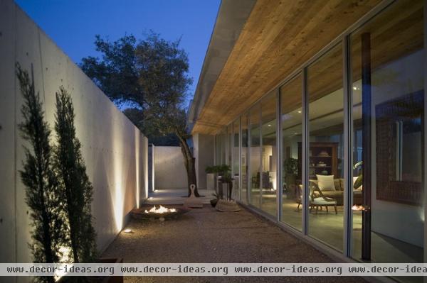
The opportunity to borrow space. By building an architectural wall element parallel to the long axis of the house, the architects have introduced an exterior space as part of the interior layout. The combination of the solid exterior wall and glazed intermediate wall apportions the outdoor area for both interior and exterior use.
A wall can be used in a variety of climates to temper the local weather conditions — positioned on the northerly edge to collect and reflect sunlight into the house or placed as a wind block. It can also act as a visual screen, altering the view to a neighboring property. Narrow lots can be effectively transformed in this way, and a linear plan increases the usable area of the lot. Walls are powerful organizing elements in architecture; use them on narrow lots to create places.
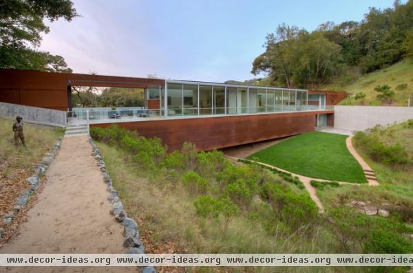
Diversity. One of my favorite tricks for achieving a complex and diverse experience with a simple building shape is to stretch it out on the site. Here the architects have turned the home into a bridge of sorts. Long, lean profiles can connect disparate parts of the site and allow the home to be an active participant in those experiences. From being suspended over the land to being nestled into it, to moving down and around and over it, this home is a clear, linear gesture that links places together in a wonderfully engaging way.
More: Design Lessons From a 10-Foot-Wide Row House
Related Articles Recommended


